
Step into the realm of boundless creativity with Coding Torque, where web development meets immersive experiences! Today, we are embarking on an extraordinary journey that will leave you mesmerized: crafting a captivating 3D Carousel Room using the trifecta of HTML, CSS, and JavaScript. Picture this – a virtual wonderland where images and content come alive, seamlessly swirling and dancing around you in a stunning carousel of visual delight. In this tutorial, we’ll unravel the enchanting world of 3D graphics and animations, unlocking the artistry behind building an interactive room that will leave your visitors in awe. Whether you’re a seasoned coder hungry for a new challenge or an aspiring developer ready to explore uncharted territories, this step-by-step guide will ignite your passion and elevate your skills to soaring heights. So, buckle up and prepare to be transported into a realm where the magic of web development collides with the allure of 3D wonders. Welcome to the 3D Carousel Room – where dreams become reality!
Before we start here are 50 projects to create using HTML CSS and JavaScript –
I would recommend you don’t just copy and paste the code, just look at the code and type by understanding it.
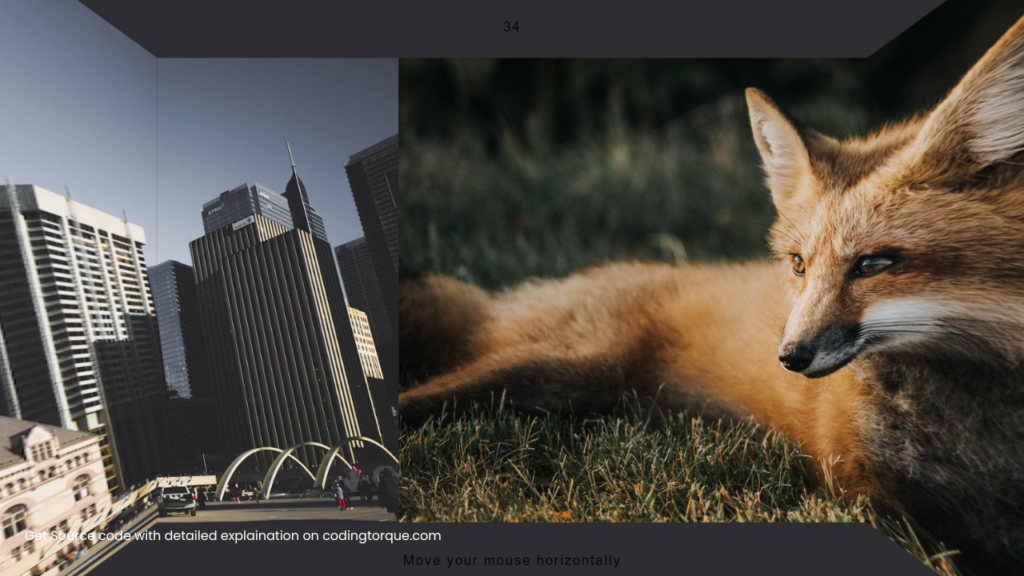
Demo
HTML Code
Starter Template
<!doctype html>
<html lang="en">

<head>
    <!-- Required meta tags -->
    <meta charset="utf-8">
    <meta name="viewport" content="width=device-width, initial-scale=1">

    <!-- CSS -->
    <link rel="stylesheet" href="style.css">

    <title>3D Carousel Room using HTML CSS and JavaScript - Coding Torque</title>
</head>

<body>
    <!-- Further code here -->

    <script src="script.js"></script>
</body>

</html>
Paste the below code in your <body> tag.
<div class='wrapper' id='wrapper'>
  <div class='wrapper-3d'>
    <div class='carousel-wrapper center-3d'>
      <div class='carousel-container' id='center'>
        <div class='slide first'></div>
        <div class='slide second'></div>
        <div class='slide third'></div>
      </div>
      <div class='first image' id='img'></div>
    </div>
    <div class='carousel-wrapper left-3d center-3d'>
      <div class='carousel-container' id='left'>
        <div class='slide first'></div>
        <div class='slide second'></div>
        <div class='slide third'></div>
      </div>
    </div>
    <div class='carousel-wrapper right-3d center-3d'>
      <div class='carousel-container' id='right'>
        <div class='slide first'></div>
        <div class='slide second'></div>
        <div class='slide third'></div>
      </div>
    </div>
  </div>
</div>

<p class='debug debug-top' id='t'>0</p>
<p class='debug debug-bot'>
  <br/>
    Move your mouse horizontally
</p>
CSS Code
Create a file style.css and paste the code below.
body, html {
    width: 100%;
    height: 100%;
    padding: 0;
    margin: 0;
    background: #2e2d31;
    overflow: hidden;
}
.wrapper {
    position: absolute;
    top: 0;
    left: 0;
    display: flex;
    align-items: center;
    justify-content: center;
    width: 100%;
    height: 100%;
}
.wrapper-3d {
    position: relative;
    perspective: 250px;
    transform-style: preserve-3d;
}
.image {
    height: 175px;
    width: 300px;
}
.carousel-wrapper {
    overflow: hidden;
    width: 60vw;
    height: 80vh;
}
.carousel-container {
    display: flex;
    flex-direction: row;
    width: 100%;
    height: 100%;
    transition: all 0.5s ease-out;
}
.slide {
    flex-shrink: 0;
    width: 100%;
    height: 100%;
}
/* The trick is to position them on their respective side Then set transform-origin to that siede And put desired angle */
.left-3d {
    position: absolute;
    transform-origin: right center;
    transform: rotateY(100deg);
    top: 0;
    bottom: 0;
    right: calc(100%);
}
#left {
    transform: translateX(0%);
}
#center {
    transform: translateX(-100%);
}
.right-3d {
    position: absolute;
    transform-origin: left center;
    transform: rotateY(-100deg);
    top: 0;
    bottom: 0;
    left: calc(100%);
}
#right {
    transform: translateX(-200%);
}
.first, .second, .third {
    background-size: cover;
}
.first {
    background-image: url("https://images.unsplash.com/photo-1492970471430-bc6bd7eb2b13?ixlib=rb-0.3.5&ixid=eyJhcHBfaWQiOjEyMDd9&s=9893bc89e46e2b77a5d8c091fbba04e9&auto=format&fit=crop&w=1355&q=80");
}
.second {
    background-image: url("https://images.unsplash.com/photo-1501707305551-9b2adda5e527?ixlib=rb-0.3.5&ixid=eyJhcHBfaWQiOjEyMDd9&s=0cf5887247e17503ce4e542d00d86b9d&auto=format&fit=crop&w=1335&q=80");
    background-position-y: 50%;
}
.third {
    background-image: url("https://images.unsplash.com/photo-1496749843252-699a989877a1?ixlib=rb-0.3.5&ixid=eyJhcHBfaWQiOjEyMDd9&s=fe5da9650707e5a93c8c3cf164c2e74b&auto=format&fit=crop&w=1375&q=80");
    background-position-y: 50%;
}
.debug {
    position: absolute;
    text-align: center;
    width: 100%;
    font-size: 1.1em;
    font-family: sans-serif;
    letter-spacing: 0.1em;
    font-weight: 200;
    margin: 0;
    margin-top: 10px;
    color: #fafafa ee;
}
.debug-top {
    top: 2vh;
}
.debug-bot {
    bottom: 2vh;
}
.fa {
    font-size: 15rem;
    color: #fafafa 99;
    line-height: 20px;
}
@media only screen and (min-width: 1600px) {
    .right-3d {
        transform: none;
        transform: rotateY(-120deg);
   }
    .left-3d {
        transform: none;
        transform: rotateY(120deg);
   }
}
JavaScript Code
Create a file script.js and paste the code below.
const padding = 200;
const slidesCount = 3 - 1;
function map(x, in_min, in_max, out_min, out_max)
    {
        return (x - in_min) * (out_max - out_min) / (in_max - in_min) + out_min;
    }
document.addEventListener('mousemove', (e)=>{
  // Change to bodywidth
  const wrapper = document.getElementById('wrapper')
  const rect = wrapper.getBoundingClientRect();

  // Mouse position in between padding
  const mouseX = Math.min(Math.max(e.clientX - padding,0),rect.width - padding * 2);
  const rawPercent = map(mouseX, 0, rect.width - padding * 2, 100 - 100 * slidesCount, 100);
  const percent = Math.round(rawPercent)
  const left = document.getElementById('left');
  const center = document.getElementById('center');
  const right = document.getElementById('right');
  left.style.transform = `translateX(${percent}%)`;
  center.style.transform = `translateX(${percent - 100}%)`;
  right.style.transform = `translateX(${percent - 200}%)`;

  const paragraph = document.getElementById('t');
  paragraph.innerHTML = percent;
})
Final Output
Written by: Piyush Patil
Code Credits: Anemolo
If you found any mistakes or have any doubts please feel free to Contact Us
Hope you find this post helpful💖


