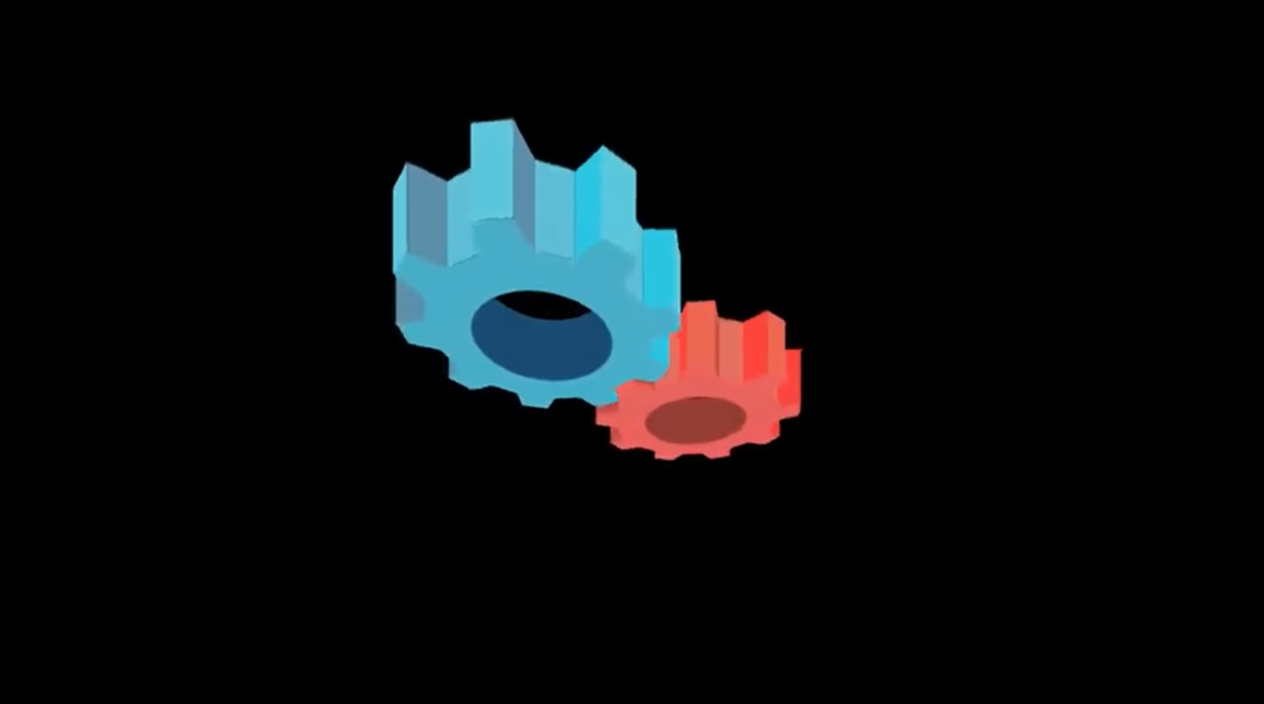
Imagine the intricate beauty of interlocking cogs spinning in harmony—now picture building them entirely with CSS! In this blog, we’ll show you how to design 3D cogs that rotate seamlessly, all without the need for JavaScript. By leveraging advanced CSS techniques like 3D transforms, keyframe animations, and shadows, we’ll bring mechanical precision and depth to your browser. Perfect for creating dynamic visuals or enhancing interactive designs, this project is both a creative challenge and a showcase of CSS’s true potential. Let’s get those gears turning—creativity awaits!


I would recommend you don’t just copy and paste the code, just look at the code and type by understanding it.
Demo
See the Pen Pure CSS 3D cogs by Ana Tudor (@thebabydino) on CodePen.
HTML Code
Starter Template
<!doctype html>
<html lang="en">

<head>
    <!-- Required meta tags -->
    <meta charset="utf-8">
    <meta name="viewport" content="width=device-width, initial-scale=1">

    <!-- CSS -->
    <link rel="stylesheet" href="style.css">

    <title>Coding Torque</title>
</head>

<body>
    <!-- Further code here -->

</body>

</html>
Paste the below code in your <body> tag.
- var n_teeth = 9;
- var rco = 400;

mixin cogface(n_teeth, rco, tooth_wr, tooth_hr)
	- var d = 2*rco; // outer circumcircle diameter
	- var n_poly = 2*n_teeth;
	- var f = 1 - tooth_hr;
	- var ca = 2*Math.PI/n_poly; // central angle
	- var rio = rco*Math.cos(.5*ca); // outer inrad
	- var eo = d*Math.sin(.5*ca); // outer edge len
	- var rii = f*rio; // inner inradius
	- var ei = f*eo; // inner edge
	- var b = .5*tooth_wr*ei; // half tooth tip w
	- var lo = Math.sqrt(rio*rio + b*b);
	- var li = Math.sqrt(rii*rii + b*b);
	- var ao = Math.atan(b/rio);
	- var ai = Math.atan(b/rii);
	- var v = []; // cog poly vertex array
	- for(var i = 0; i < n_poly; i++) {
		- var j = i%2;
		- var r = j?lo:li;
		- for(var k = 0; k < n_poly; k++) {
			- var a = i*ca - Math.pow(-1, k)*(j?ao:ai);
			- var x = r*Math.cos(a);
			- var y = r*Math.sin(a);
			- v.push([Math.round(x), Math.round(y)]);
		- }
	- }
	symbol#g(viewBox=`-${rco} -${rco} ${d} ${d}`)
		polygon(points=v.join(' ') mask='url(#m)')

svg(wisth='0' height='0')
	mask#m
		rect(x=-rco y=-rco width=2*rco height=2*rco)
		circle(r=.5*rco)
	+cogface(n_teeth, rco, .8, .2)

// a3d = 3d shape assembly
.a3d
	- var n_cogs = 2;
	while n_cogs--
		// s3d = 3d shape, s2d = 2d shape
		.s3d
			- var n_faces = 2 + 4*n_teeth
			while n_faces--
				.s2d(class=(n_faces > 1)?null:'cogface')
					if(n_faces < 2)
						svg
							use(xlink:href='#g')
			- var n_hole = 26;
			while n_hole--
				.s2d.lh
CSS Code
Create a file style.css and paste the code below.
@import 'compass/css3';

$rco: 8em; // outer (tooth tip) circumradius
$n-tcomps: 4; // faces making up one tooth
$face-w: 4em; // face width https://en.wikipedia.org/wiki/Gear#General_nomenclature
$palette:
#e8635e #943d33 #ff4538 #e3705e #bf4e40 #ec6853,
#47acc8 #194a72 #29c4e2 #5dbdd5 #5b8ea9 #5cc6dc;

// same as for Jade code
$n-teeth: 9;
$tooth-wratio: .8;
$tooth-hratio: .2;
$n-cogs: 2;
$hole-rratio: .5;
$n-hole: 26;

// computed
$f: 1 - $tooth-hratio;
$n-poly: 2*$n-teeth;
$ca: 360deg/$n-poly;
$n-lat: $n-tcomps*$n-teeth;
$do: 2*$rco;
$off: .5*(2 - $tooth-hratio)*$rco;
$rio: $rco*cos(.5*$ca);
$eo: $do*sin(.5*$ca);
$rii: $f*$rio;
$ei: $f*$eo;
$land: $tooth_wratio*$ei;
$b: .5*$land;
$lo: sqrt(pow($rio, 2) + pow($b, 2));
$li: sqrt(pow($rii, 2) + pow($b, 2));
$ao: atan($b/$rio)*180deg/pi();
$ai: atan($b/$rii)*180deg/pi();
$da: $ca - $ao - $ai;
$d: sqrt($lo*$lo + $li*$li - 2*$lo*$li*cos($da))/1em;
$ho: $li*sin($da);
$aopi: 180deg/pi()*asin($ho/$d);
$hi: $lo*sin($da);
$aopo: 180deg/pi()*asin($hi/$d);
$axo: 90deg + $ao - $aopi;
$axi: $aopo - 90deg + $ai;
$hole-rc: $hole-rratio*$rco;
$hole-ca: 360deg/$n-hole;
$hole-ri: $hole-rc*cos(.5*$hole-ca);
$hole-e: 2*$hole-rc*sin(.5*$hole-ca);
$pmax: 1.5*$do;

mask {
	rect { fill: #fff; }
	circle { fill: #000; }
}

body {
	overflow: hidden;
	height: 100vh;
	perspective: 32em;
	perspective-origin: 50% calc(50% - #{$pmax});
	background: #000;
	will-change: perspective-origin;
	animation: pov 7.3s ease-in-out infinite alternate;
}

@keyframes pov {
	to {
		perspective-origin: 50% calc(50% + #{$pmax});
	}
}

div {
	position: absolute;
	top: 50%; left: 50%;
	transform-style: preserve-3d;
}

.a3d {
	transform: rotateX(90deg) rotate(-45deg);
}

.s3d {
	will-change: transform;
	animation: r 7.3s linear infinite;

	&:nth-child(2n) {
		animation-direction: reverse;
	}

	@for $i from 0 to $n-cogs {
		$c: nth($palette, $i + 1);

		&:nth-child(#{$i + 1}) {
			margin-left: pow(-1, $i)*$off;
			color: nth($c, 1);

			.lh {
				color: nth($c, 2);
			}

			[class='s2d'] {
				@for $j from 0 to 4 {
					&:nth-child(4n + #{$j}) {
						color: nth($c, 3 + $j);
					}
				}
			}
		}
	}
}

@keyframes r { to { transform: rotate(1turn); } }

.s2d { backface-visibility: hidden; }

[class='s2d'] {
	margin: -$b (-.5*$face-w);
	width: $face-w; height: $land;
	box-shadow: 1px 0 2px currentColor,
		 -1px 0 2px currentColor;
	transform: rotateY(90deg) translateZ($rii);
	background: currentColor;

	&:nth-child(even) {
		margin-top: -.5*$d; height: $d;
	}

	@for $i from 0 to $n-teeth {
		@for $j from 0 to 2 {
			$ax: if($j > 0, $axo, $axi);

			@for $k from 0 to 2 {
				$idx: 4*$i + 2*$j + $k + 1;

				&:nth-child(#{$idx}) {
					transform: rotateY(90deg)
						rotateX((2*$i + $j)*$ca)
						translateZ(if($j > 0, $rio, $rii))
						if($k > 0,
							translateY($b) rotateX(-$ax) translateY(.5*$d),
							());
				}
			}
		}
	}
}

.cogface {
	margin: -$rco;
	width: $do; height: $do;
	filter: drop-shadow(0 0 1px currentColor);

	@for $i from 0 to 2 {
		&:nth-child(2n + #{$i}) {
			transform: if($i > 0, rotateY(.5turn), ())
				if(($i*$n-teeth)%2 > 0, rotate($ca), ())
				translateZ(.5*$face-w);
		}
	}

	svg { width: 100%; height: 100%; }
	use { fill: currentColor; }
}

.lh {
	z-index: -1;
	margin: -.5*$hole-e (-.5*$face-w);
	width: $face-w; height: $hole-e;
	box-shadow: 1px 0 2px currentColor;
	background: currentColor;

	@for $i from 0 to $n-hole {
		&:nth-last-child(#{$i + 1}) {
			transform: rotateY(90deg)
				rotateX($i*$hole-ca)
				translateZ(-$hole-ri);
		}
	}
}
Final Output

Written by: Piyush Patil
Code Credits: https://codepen.io/thebabydino/pen/OMZQYQ
If you found any mistakes or have any doubts please feel free to Contact Us
Hope you find this post helpful💖


