Artificial Intelligence (AI) is transforming the world, and what better way to showcase this exciting technology than with a sleek and modern landing page? A well-designed AI-themed landing page can capture the essence of innovation and forward-thinking, engaging visitors with interactive and visually stunning elements.
In this blog post, we’ll embark on a journey to create an AI-themed landing page using HTML, CSS, and JavaScript. We’ll explore how to blend these core web technologies to build a responsive, eye-catching, and interactive landing page that highlights the advancements and possibilities of AI.


I would recommend you don’t just copy and paste the code, just look at the code and type by understanding it.
Demo
See the Pen Landing Page animation by Yudiz Solutions Limited (@yudizsolutions) on CodePen.
HTML Code
Starter Template
<!doctype html>
<html lang="en">

<head>
    <!-- Required meta tags -->
    <meta charset="utf-8">
    <meta name="viewport" content="width=device-width, initial-scale=1">

    <!-- CSS -->
    <link rel="stylesheet" href="style.css">

    <title>AI Theme Landing Page using HTML CSS and JavaScript - Coding Torque</title>
</head>

<body>
    <!-- Further code here -->

    <script src="script.js"></script>
</body>

</html>
Paste the below code in your <body> tag.
<header>
<!-- <iframe src="https://www.yudiz.com/codepen/artificial-intelligence/audio/glitch.mp3" allow="autoplay" style="display:none" id="iframeAudio">
</iframe> -->
<!-- <audio id="audio" controls autoplay loop>
<source src="https://www.yudiz.com/codepen/artificial-intelligence/audio/glitch.mp3" type="audio/mp3">
Your browser does not support the audio tag.
</audio> -->
<audio id="powerOn" controls loop>
<source src="https://www.yudiz.com/codepen/artificial-intelligence/audio/glitch.mp3" type="audio/mpeg">
Your browser does not support the audio element.
</audio>
<audio id="powerOff" controls>
<source src="https://www.yudiz.com/codepen/artificial-intelligence/audio/shut-down.mp3" type="audio/mpeg">
Your browser does not support the audio element.
</audio>
<audio id="hover" controls>
<source src="https://www.yudiz.com/codepen/artificial-intelligence/audio/hover.mp3" type="audio/mpeg">
Your browser does not support the audio element.
</audio>
<div class="container">
<div class="header-content">
<div class="bottom-shape"></div>
<div class="site-logo">
<img src="https://www.yudiz.com/codepen/artificial-intelligence/images/site-logo.svg" alt="site-logo">
</div>
<div class="menu">
<ul>
<li><a href="#">Home</a></li>
<li><a href="#">About</a></li>
<li><a href="#">Blog</a></li>
<li><a href="#">Contact</a></li>
</ul>
</div>
<div class="search-bar">
<!-- <img src="https://www.yudiz.com/codepen/artificial-intelligence/images/search-icon.svg" alt="search-icon"> -->
</div>
</div>
</div>
</header>
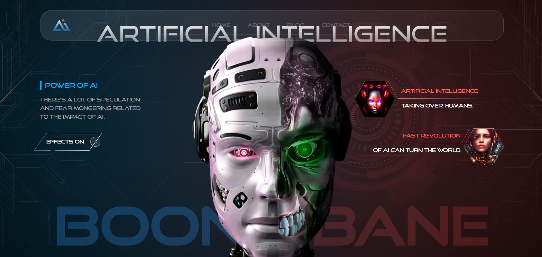
<div class="banner">
<div class="robot">
<img src="https://www.yudiz.com/codepen/artificial-intelligence/images/robot.png" alt="robot">
</div>
<div class="circuit-art">
<img src="https://www.yudiz.com/codepen/artificial-intelligence/images/GoodArtwork.svg" alt="GoodArtwork">
</div>
<div class="machine-art">
<div class="machine-art-container">
<img src="https://www.yudiz.com/codepen/artificial-intelligence/images/machin-rings.svg" alt="GoodArtwork">
<div class="machine-lights-container">
<img src="https://www.yudiz.com/codepen/artificial-intelligence/images/machine-lights.svg" alt="GoodArtwork">
</div>
</div>
</div>
<div class="circuit-art red">
<img src="https://www.yudiz.com/codepen/artificial-intelligence/images/GoodArtwork-red.svg" alt="GoodArtwork">
</div>
<div class="banner-content">
<div class="container">
<div class="banner-title">
<h1>artificial INTElligence</h1>
</div>
<div class="row">
<div class="col-md-3">
<div class="blue-content">
<p class="p-lg text-pipe blue-text">Power of AI</p>
<p>There’s a lot of speculation and fear-mongering related to the impact of AI.</p>
<a href="#" id="play">
<p class="on">EFFECTS ON</p>
<p class="off">EFFECTS OFF</p>
<span>
<span class="arrow"></span>
<img src="https://www.yudiz.com/codepen/artificial-intelligence/images/button-circle.svg" alt="button-circle">
</span>
</a>
</div>
</div>
<div class="col-md-4">
<div class="red-content">
<div class="polygone-container">
<div class="polygone">
<img src="https://www.yudiz.com/codepen/artificial-intelligence/images/ezgif.com-gif-maker (1).jpg" alt="artificial">
</div>
<div class="polygone-content">
<p class="red-text"><span>Artificial Intelligence</span></p>
<p>Taking over Humans.</p>
</div>
</div>
<div class="polygone-container">
<div class="polygone">
<img src="https://www.yudiz.com/codepen/artificial-intelligence/images/ezgif.com-gif-maker.jpg" alt="artificial">
</div>
<div class="polygone-content">
<p class="red-text"><span>Fast Revolution</span></p>
<p>of Ai can turn the World.</p>
</div>
</div>
</div>
</div>
<div class="col-md-12">
<div class="boon-bane-container">
<div class="boon">
<!-- <img src="https://www.yudiz.com/codepen/artificial-intelligence/images/BOON.png" alt="boon"> -->
<h1>B<span>O</span>ON</h1>
</div>
<div class="bane">
<!-- <img src="https://www.yudiz.com/codepen/artificial-intelligence/images/BANE.png" alt="bane"> -->
<h1>BAN<span>E</span>
</h1>
</div>
</div>
</div>
</div>
</div>
</div>
</div>CSS Code
Create a file style.css and paste the code below.
* {
  margin: 0;
  padding: 0;
  box-sizing: border-box;
}

/* ######################### Default Style ############################## */
html {
  font-size: 16px;
}
p,
a,
span,
li {
  font-size: 0.875rem;
  line-height: 1.5rem;
  font-weight: 400;
  margin-bottom: 0;
}
li {
  list-style: none;
}
ul,
ol {
  padding: 0;
  margin: 0;
}
a,
span {
  display: inline-block;
}
a {
  text-decoration: none;
}
img {
  max-width: 100%;
  max-height: 100%;
}
.p-lg {
  font-size: 1.125rem;
  list-style: 1.75rem;
  font-weight: 400;
}
h1,
h2,
h3,
h4,
h5,
h6 {
  margin-bottom: 0;
}
h1 {
  font-size: 9rem;
}

@font-face {
  font-family: "Good Times Rg";
  src: url("https://www.yudiz.com/codepen/artificial-intelligence/fonts/good_times/GoodTimesRg-Regular.eot");
  src: url("https://www.yudiz.com/codepen/artificial-intelligence/fonts/good_times/GoodTimesRg-Regular.eot?#iefix")
      format("embedded-opentype"),
    url("https://www.yudiz.com/codepen/artificial-intelligence/fonts/good_times/GoodTimesRg-Regular.woff2")
      format("woff2"),
    url("https://www.yudiz.com/codepen/artificial-intelligence/fonts/good_times/GoodTimesRg-Regular.woff")
      format("woff"),
    url("https://www.yudiz.com/codepen/artificial-intelligence/fonts/good_times/GoodTimesRg-Regular.ttf")
      format("truetype");
  font-weight: normal;
  font-style: normal;
  font-display: swap;
}
.text-pipe {
  position: relative;
  padding-left: 0.875rem;
}
.red-text {
  color: #ff5858 !important;
}
.blue-text {
  color: #00b2ff !important;
}
.text-pipe::before {
  position: absolute;
  content: "";
  height: 100%;
  width: 0.25rem;
  background: #00b2ff;
  left: 0;
  top: 0;
}
body {
  font-family: "Good Times Rg";
}
header {
  position: fixed;
  top: 2rem;
  left: 0;
  width: 100%;
  z-index: 10000000;
}
.header-content {
  padding: 1.5rem 2rem;
  display: flex;
  align-items: center;
  justify-content: space-between;
  border-radius: 2rem;
  position: relative;
  background: linear-gradient(
    157.68deg,
    rgba(255, 255, 255, 0.1) 16.65%,
    rgba(255, 255, 255, 0) 142.11%
  );
  border: 2px solid rgba(220, 220, 220, 0.11);
}
/* .header-content::before                         { content: ''; position: absolute; top: 50%; left: 50%; transform: translate(-50%,-50%);background: linear-gradient(to right, #383838 , #141414); z-index: -1; height: calc(100% + 4px); width: calc(100% + 4px); border-radius: 2rem;} */
.header-content > div {
  flex-grow: 1;
}
.menu ul {
  display: flex;
  justify-content: center;
  align-items: center;
  width: 100%;
  column-gap: 3rem;
}
.menu li a {
  color: rgba(155, 155, 155, 1);
}
.search-bar {
  text-align: right;
}
.bottom-shape {
  position: absolute;
  width: 50%;
  height: 20%;
  bottom: 0;
  left: 50%;
  transform: translateX(-50%);
  transform-style: preserve-3d;
  perspective: 20px;
  background-color: transparent;
  border: 2px solid rgba(220, 220, 220, 0.11);
  border-bottom: none;
}
.banner {
  height: 100vh;
  background: black;
  position: relative;
  min-height: 850px;
}
.robot {
  position: absolute;
  left: 50%;
  bottom: 0;
  transform: translateX(-50%);
  z-index: 5000;
  max-width: 48%;
  text-align: center;
}
.robot img {
  max-width: 50%;
}
.banner::before,
.banner::after {
  content: "";
  position: absolute;
  height: 100%;
  width: 50%;
  top: 0;
  left: 0;
  background: #00b3ff73;
  filter: blur(595px);
  z-index: 0;
}
.banner::after {
  left: unset;
  right: 0;
  background: #ff585878;
  filter: blur(870px);
}
.banner .circuit-art {
  position: absolute;
  height: 100%;
  width: 50%;
  top: 0;
  left: 0;
  filter: brightness(2);
}
.banner .circuit-art.red {
  position: absolute;
  height: 100%;
  width: 50%;
  top: 0;
  left: unset;
  right: 0;
  text-align: right;
  filter: brightness(2);
}
.banner .machine-art {
  position: absolute;
  height: 100%;
  width: 50%;
  right: 0;
  top: 50%;
  transform: translateY(-50%);
  display: flex;
  align-items: center;
}
.banner .machine-art-container {
  position: relative;
}
.banner .machine-art-container {
  transform-origin: center center;
  display: flex;
  align-items: center;
  justify-content: center;
}
.banner .machine-art-container.active {
  animation: rotate 20s infinite linear alternate-reverse;
}
.banner .machine-art-container .machine-lights-container {
  position: absolute;
  top: 51%;
  left: 50.2%;
  transform: translate(-50%, -50%);
  display: flex;
  align-items: center;
  justify-content: center;
  height: 100%;
  width: 100%;
}
.banner .machine-lights-container img {
  animation: rotate-reverse-shut 2s ease-in;
}
.banner .machine-lights-container.active img {
  animation: rotate-reverse 20s infinite alternate-reverse;
  aspect-ratio: 1 / 1;
  width: 72%;
}
@keyframes rotate {
  0%,
  100% {
    transform: rotate(0);
  }
  25% {
    transform: rotate(180deg);
  }
  50% {
    transform: rotate(150deg);
  }
  75% {
    transform: rotate(360deg);
  }
}
@keyframes rotate-reverse {
  0%,
  100% {
    transform: rotate(360deg);
    opacity: 0.5;
  }
  25% {
    transform: rotate(-180deg);
    opacity: 0.7;
  }
  50% {
    transform: rotate(-150deg);
    opacity: 0.2;
  }
  55% {
    opacity: 1;
  }
  57% {
    filter: brightness(100);
  }
  59% {
    opacity: 0.1;
    filter: brightness(2);
  }
  63% {
    opacity: 1;
    filter: brightness(80);
  }
  70% {
    opacity: 0.2;
    filter: brightness(15);
  }
  71% {
    opacity: 0.7;
    filter: brightness(90);
  }
  72% {
    opacity: 1;
    filter: brightness(5);
  }
  73% {
    opacity: 0.5;
    filter: brightness(73);
  }
  74% {
    opacity: 0.3;
    filter: brightness(1);
  }
  75% {
    opacity: 0.9;
    filter: brightness(0);
  }
  76% {
    opacity: 1;
    filter: brightness(3);
  }
  77% {
    opacity: 0.1;
    filter: brightness(18);
  }
  78% {
    opacity: 0.9;
    filter: brightness(57);
  }
  79% {
    opacity: 0.4;
    filter: brightness(4);
  }
  80% {
    opacity: 0.1;
    filter: brightness(98);
  }
  81% {
    opacity: 1;
    filter: brightness(6);
  }
  82% {
    opacity: 0.7;
    filter: brightness(47);
  }
  83% {
    opacity: 0.7;
    filter: brightness(0);
  }
  84% {
    opacity: 0.3;
    filter: brightness(100);
  }
  85% {
    transform: rotate(-360deg);
    opacity: 1;
    filter: brightness(5);
  }
}
@keyframes rotate-reverse-shut {
  0%,
  100% {
    transform: rotate(0deg);
    opacity: 0.5;
  }
  25% {
    transform: rotate(80deg);
    opacity: 0.7;
  }
  50% {
    transform: rotate(50deg);
    opacity: 0.2;
  }
  55% {
    opacity: 1;
  }
  57% {
    filter: brightness(100);
  }
  59% {
    opacity: 0.9;
    filter: brightness(2);
  }
  63% {
    opacity: 0.8;
    filter: brightness(80);
  }
  70% {
    opacity: 0.7;
    filter: brightness(15);
  }
  71% {
    opacity: 0.6;
    filter: brightness(90);
  }
  72% {
    opacity: 1;
    filter: brightness(5);
  }
  73% {
    opacity: 0.4;
    filter: brightness(73);
  }
}

.banner .banner-content {
  position: relative;
  z-index: 5;
  padding-top: 10rem;
}
.banner .banner-title h1 {
  font-size: 4rem;
  line-height: 4.75rem;
  font-weight: 400;
  text-transform: uppercase;
  text-align: center;
  background: linear-gradient(
    180deg,
    #ffffff 0%,
    rgba(255, 255, 255, 0) 153.82%
  );
  -webkit-background-clip: text;
  -webkit-text-fill-color: transparent;
  background-clip: text;
  text-fill-color: transparent;
}
.banner-content .blue-content .p-lg {
  margin-bottom: 1rem;
}
.banner-content .row {
  margin-top: 6rem;
}
.blue-content p {
  color: #9b9b9b;
}
.blue-content a {
  margin-top: 2rem;
  padding: 0.75rem 2rem 0.75rem 1rem;
  border: 2px solid;
  border-image-source: linear-gradient(
    259.5deg,
    #ffffff -35.16%,
    rgba(255, 255, 255, 0) 153.09%
  );
  position: relative;
  border-image-slice: 1;
  transform: skewX(-36deg);
}
.blue-content a p {
  color: white;
  transform: skewX(36deg);
  position: relative;
  z-index: 1;
}
.blue-content a::before {
  content: "";
  position: absolute;
  left: 30%;
  bottom: -2px;
  height: 2px;
  width: 0.75rem;
  background-color: #0f2133;
}
.blue-content a.active img {
  animation: cd-rotate 2s infinite linear;
}
.blue-content a span:not(.arrow) {
  position: absolute;
  right: 0;
  top: 50%;
  transform: translate(50%, -50%) skewX(36deg);
  z-index: 2;
}
.blue-content a span::before {
  content: "";
  position: absolute;
}
.arrow {
  position: absolute;
  height: 5px;
  width: 5px;
  top: 50%;
  left: 52%;
  transform: translate(-50%, -50%) skewX(15deg);
  border: 1px solid white;
  border-bottom: transparent;
  border-left: transparent;
}
.banner .row {
  justify-content: space-between;
}
.red-content {
  display: flex;
  flex-direction: column;
  gap: 32px;
}
.polygone-container {
  display: flex;
  gap: 2px;
}
.polygone {
  position: relative;
  width: 112px;
  aspect-ratio: 1 / 0.9;
}
.polygone::before {
  content: "";
  position: absolute;
  height: calc(100% + 2px);
  width: calc(100% + 2px);
  top: 50%;
  left: 50%;
  transform: translate(-50%, -50%);
  clip-path: polygon(25% 0%, 75% 0%, 100% 50%, 75% 100%, 25% 100%, 0% 50%);
  background: rgb(0, 0, 0);
  background: linear-gradient(
    0deg,
    rgba(0, 0, 0, 0.3337710084033614) 17%,
    rgba(255, 88, 88, 1) 100%
  );
}
.polygone img {
  object-fit: cover;
  clip-path: polygon(25% 0%, 75% 0%, 100% 50%, 75% 100%, 25% 100%, 0% 50%);
  position: absolute;
  width: 100%;
  height: 100%;
  object-position: center top;
}
.polygone-content {
  margin-left: -8px;
}
.polygone-content p {
  color: white;
  padding: 8px 0 0 24px;
}
.polygone-content .red-text {
  padding: 16px 0 8px 20px;
  border: 1px solid;
  border-image-slice: 1;
  border-image-source: linear-gradient(
    85.3deg,
    #ff5858 14.01%,
    rgba(255, 88, 88, 0) 96.93%
  );
  border-top: transparent;
  transform: skewX(29deg);
}
.polygone-content .red-text span {
  transform: skewX(-29deg);
}
.red-content .polygone-container:nth-child(2) {
  flex-direction: row-reverse;
}
.red-content .polygone-container:nth-child(2) .polygone-content .red-text,
.red-content .polygone-container:nth-child(2) .polygone-content .red-text span {
  transform: skewX(-29deg) scaleX(-1);
}
.red-content .polygone-container:nth-child(2) .polygone-content p {
  padding: 8px 12px 0 14px;
}
.red-content .polygone-container:nth-child(2) .polygone-content .red-text {
  padding: 8px 0 8px 14px;
}
.red-content .polygone-container:nth-child(2) .polygone-content {
  margin-right: -8px;
}
.boon-bane-container {
  padding-inline: 40px;
  margin-top: 80px;
  display: flex;
  justify-content: space-between;
}
.boon,
.bane {
  position: relative;
}
/* .boon::before,.bane::before                                                     { content: ''; position: absolute; top: 50%; right: -20px; width: 120%; height: 180%; background: url('https://www.yudiz.com/codepen/artificial-intelligence/images/boon-border.png') no-repeat center top / contain; transform: translateY(-50%);}
.bane::before                                                                   { background-image: url('https://www.yudiz.com/codepen/artificial-intelligence/images/bane-border.png'); left: -18px; right: unset;}
.boon::before                                                                   { box-shadow: 35px -28px 52px -32px #247db2;}
.bane::before                                                                   { box-shadow: -8px -26px 36px -24px #bf4141;;} */
.boon span,
.bane span {
  font-size: inherit;
  font-weight: inherit;
}
.bane h1.active span {
  animation: flicker 3s alternate-reverse infinite;
}
.boon h1.active span {
  animation: flicker 6s linear infinite;
}
.boon h1 {
  color: #266eb2;
  font-weight: bolder;
  animation: shut-flickers-blue 2s linear;
  opacity: 0.4;
  transition-duration: 0.5s;
}
.bane h1,
.menu a {
  color: rgb(209 73 74 / 55%);
  font-weight: bolder;
  animation: shut-flickers 2s linear;
  opacity: 0.4;
}
.boon h1.active {
  animation: flicker-full 8s cubic-bezier(0.175, 0.885, 0.32, 1.275) infinite;
  text-shadow: 0px 0px 20px #1778d2;
}
.menu a:hover {
  animation: flicker-full 3s alternate-reverse infinite;
  color: rgb(209 73 74 / 55%) !important;
  text-shadow: 0px 0px 20px #b91515;
}
.bane h1.active {
  animation: flicker-full 8s linear infinite;
  text-shadow: 0px 0px 20px #b91515;
}
audio {
  position: fixed;
  top: 0;
  left: 0;
  visibility: hidden;
}
.robot img {
  animation: hue 20s infinite alternate-reverse;
}

@media (min-width: 1399px) {
  .robot img {
    max-width: 448px;
  }
}

@keyframes flicker {
  0%,
  19.999%,
  22%,
  62.999%,
  64%,
  64.999%,
  70%,
  100% {
    opacity: 0.1;
  }
  20%,
  21.999%,
  63%,
  63.999%,
  65%,
  69.999% {
    opacity: 0.8;
  }
}

@keyframes hue {
  from {
    filter: hue-rotate(-360deg);
  }
  to {
    filter: hue-rotate(360deg);
  }
}
@keyframes flicker-full {
  0%,
  19.999%,
  22%,
  62.999%,
  64%,
  64.999%,
  70%,
  100% {
    opacity: 0.99;
  }
  20%,
  21.999%,
  63%,
  63.999%,
  65%,
  69.999% {
    opacity: 0.4;
  }
}

@keyframes shut-flickers {
  from {
    opacity: 1;
    text-shadow: 0px 0px 0px #b91515;
  }
  to {
    opacity: 0.4;
    text-shadow: 0px 0px 20px #b91515;
  }
}
@keyframes shut-flickers-blue {
  from {
    opacity: 1;
    text-shadow: 0px 0px 0px #1778d2;
  }
  to {
    opacity: 0.4;
    text-shadow: 0px 0px 20px #1778d2;
  }
}

@keyframes cd-rotate {
  from {
    transform: rotate(0);
  }
  to {
    transform: rotate(360deg);
  }
}
JavaScript Code
Create a file script.js and paste the code below.
$(document).ready(function () {
  $(".off").hide();
  $("#play").click(function () {
    if ($(this).hasClass("active")) {
      $(".off").hide();
      $(".on").fadeIn();
      $("#powerOn")[0].pause();
      $("#powerOff")[0].play();
      $(this).toggleClass("active");
      $(
        ".machine-art-container, .machine-lights-container, .boon h1, .bane h1"
      ).toggleClass("active");
    } else {
      $(".on").hide();
      $(".off").fadeIn();
      $("#powerOn")[0].play();
      $("#powerOff")[0].pause();
      $("#powerOff")[0].currentTime = 0;
      $(this).toggleClass("active");
      $(
        ".machine-art-container, .machine-lights-container, .boon h1, .bane h1"
      ).toggleClass("active");
    }
  });
  $(".menu a").mouseover(function () {
    $("#hover")[0].play();
  });
  $(".menu a").mouseout(function () {
    $("#hover")[0].pause();
    $("#hover")[0].currentTime = 0;
  });
});
Final Output
Written by: Piyush Patil
Code Credits: https://codepen.io/yudizsolutions/pen/zYLVgwM
If you found any mistakes or have any doubts please feel free to Contact Us
Hope you find this post helpful💖


