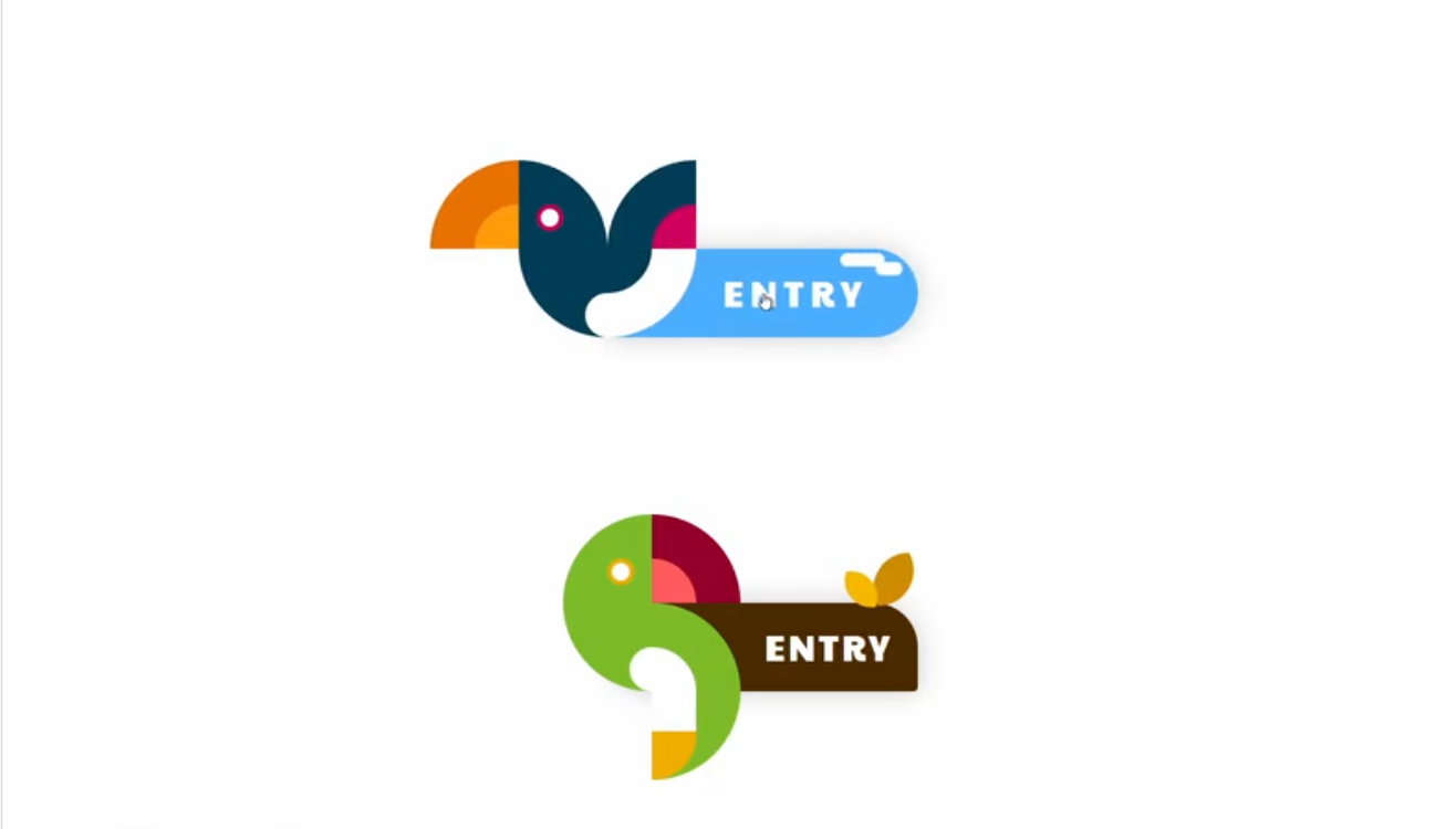
In the vast landscape of web design, adding delightful animations can breathe life into your website and captivate your audience. Imagine an interactive button that not only responds to user input but also incorporates charming visual effects, like the graceful flight of a bird.
In this blog post, we embark on an enchanting journey to create an animated button with a bird effect using only HTML and CSS. By leveraging the power of these core web technologies, we’ll unveil the secrets to infusing your website with creativity and interactivity.


I would recommend you don’t just copy and paste the code, just look at the code and type by understanding it.
Demo
See the Pen バードなトランスフォームボタン by あしざわ – Webクリエイター (@ash_creator) on CodePen.
HTML Code
Starter Template
<!doctype html>
<html lang="en">

<head>
    <!-- Required meta tags -->
    <meta charset="utf-8">
    <meta name="viewport" content="width=device-width, initial-scale=1">

    <!-- CSS -->
    <link rel="stylesheet" href="style.css">

    <title>Animated Button with Bird Effect using HTML and CSS - Coding Torque</title>
</head>

<body>
    <!-- Further code here -->

    <script src="script.js"></script>
</body>

</html>
Paste the below code in your <body> tag.
<div class="container">

    <a href="#" class="button button--typeA">
        <div class="button__wrapper">
            <div class="material1"></div>
            <div class="material2"></div>
        </div>
        <span class="button__text">ENTRY</span>
        <div class="bird">
            <div class="block block_A">
                <div class="inner A_1"></div>
                <div class="inner A_2"></div>
            </div>
            <div class="block block_B">
                <div class="inner B_1"></div>
                <div class="inner B_2"></div>
            </div>
            <div class="block block_C">
                <div class="inner C_1"></div>
                <div class="inner C_2"></div>
            </div>
            <div class="block block_D"></div>
            <div class="block block_E">
                <div class="inner E_1"></div>
                <div class="inner E_2"></div>
            </div>
            <div class="block block_F">
                <div class="inner F_1"></div>
                <div class="inner F_2"></div>
            </div>
        </div>
    </a>


    <a href="#" class="button button--typeB">
        <div class="button__wrapper">
            <div class="material1"></div>
            <div class="material2"></div>
        </div>
        <span class="button__text">ENTRY</span>
        <div class="bird">
            <div class="block block_A">
                <div class="inner A_1"></div>
                <div class="inner A_2"></div>
            </div>
            <div class="block block_B">
                <div class="inner B_1"></div>
                <div class="inner B_2"></div>
            </div>
            <div class="block block_C">
                <div class="inner C_1"></div>
                <div class="inner C_2"></div>
            </div>
            <div class="block block_D"></div>
            <div class="block block_E">
                <div class="inner E_1"></div>
                <div class="inner E_2"></div>
            </div>
            <div class="block block_F">
                <div class="inner F_1"></div>
                <div class="inner F_2"></div>
            </div>
        </div>
    </a>


    <a href="#" class="button button--typeC">
        <div class="button__wrapper">
            <div class="material1"></div>
            <div class="material2"></div>
        </div>
        <span class="button__text">ENTRY</span>
        <div class="bird">
            <div class="block block_A">
                <div class="inner A_1"></div>
                <div class="inner A_2"></div>
            </div>
            <div class="block block_B">
                <div class="inner B_1"></div>
                <div class="inner B_2"></div>
            </div>
            <div class="block block_C">
                <div class="inner C_1"></div>
                <div class="inner C_2"></div>
            </div>
            <div class="block block_D"></div>
            <div class="block block_E">
                <div class="inner E_1"></div>
                <div class="inner E_2"></div>
            </div>
            <div class="block block_F">
                <div class="inner F_1"></div>
                <div class="inner F_2"></div>
            </div>
        </div>
    </a>

</div>
CSS Code
Create a file style.css and paste the code below.
.button--typeA{
    --mainColor   : #003c55 ;
    --subColor_1  : #e97100 ;
    --subColor_2  : #ff9b0a ;
    --accentColor : #cf005e ;
    --treeColor   : #7a5200 ;
    --skyColor    : #4aaeff ;
    --leafColor_1 : #008a49 ;
    --leafColor_2 : #00c94f ;
}
.button--typeB{
    --mainColor   : #7cba27 ;
    --subColor_1  : #94002c ;
    --subColor_2  : #ff5a5e ;
    --accentColor : #efad00 ;
    --treeColor   : #4a2a00 ;
    --skyColor    : #000645 ;
    --leafColor_1 : #cf8b00 ;
    --leafColor_2 : #f4b800 ;
}
.button--typeC{
    --mainColor   : #00c6d4 ;
    --subColor_1  : #ff9b0a ;
    --subColor_2  : #ffc26a ;
    --accentColor : #de8ccf ;
    --treeColor   : #af9667 ;
    --skyColor    : #ff7d5a ;
    --leafColor_1 : #57cf4f ;
    --leafColor_2 : #a9db74 ;
}

.button{
    position : relative ;
    width : 280px ;
    height : 80px ;
    border-radius : 40px 40px 4px 40px ;
    background : var(--treeColor) ;
    transition : all ease .3s ;
    box-shadow : 0 0 24px rgba(0,0,0,.2) ;
}
.button__wrapper{
    position : absolute ;
    z-index : 1 ;
    width : 100% ;
    height : 100% ;
    border-radius : 40px ;
}
.material1{
    position : absolute ;
    top : -45px ;
    right : -24px ;
    width : 64px ;
    height : 64px ;
    border-radius : 50% ;
    overflow : hidden ;
    transform : rotate(30deg) ;
}
.material2{
    position : absolute ;
    top : -44px ;
    right : 18px ;
    width : 48px ;
    height : 48px ;
    border-radius : 50% ;
    overflow : hidden ;
    transform : rotate(-40deg) ;
}
.material1::before{
    content : '' ;
    position : absolute ;
    top : 0 ;
    left : -50% ;
    width : 100% ;
    height : 100% ;
    border-radius : 50% ;
    background : var(--leafColor_1);
}
.material2::before{
    content : '' ;
    position : absolute ;
    top : 0 ;
    left : -50% ;
    width : 100% ;
    height : 100% ;
    border-radius : 50% ;
    background : var(--leafColor_2) ;
}
.button__text{
    display : flex ;
    justify-content : center ;
    align-items : center ;
    position : absolute ;
    z-index : 1 ;
    top : 0 ;
    right: 0 ;
    width : 160px ;
    height : 100% ;
    font-family: 'Paytone One', sans-serif;
    font-size : 32px ;
    color : #fff ;
    letter-spacing : 3px ;
    transition : all ease .3s ;
}
.bird{
    position : absolute ;
    z-index : 2 ;
    top : -80px ;
    left : -120px ;
    display : grid ;
    grid-template-columns : repeat(3 , 80px) ;
    grid-template-rows : repeat(3 , 80px) ;
    position : relative ;
    width : 240px ;
    height : 240px ;
    transition : all ease .3s ;
}
.block{
    position : relative ;
    display : flex ;
    width : 80px ;
    height : 80px ;
    box-sizing : border-box ;
    overflow : hidden ;
}
.block_A{
    grid-column : 1 / 2 ;
    grid-row : 1 / 2 ;
}
.block_B{
    grid-column : 2 / 3 ;
    grid-row : 1 / 2 ;
}
.block_C{
    grid-column : 3 / 4 ;
    grid-row : 1 / 2 ;
}
.block_D{
    grid-column : 2 / 3 ;
    grid-row : 2 / 3 ;
}
.block_E{
    grid-column : 3 / 4 ;
    grid-row : 2 / 3 ;
}
.block_F{
    grid-column : 3 / 4 ;
    grid-row : 3 / 4 ;
}
.inner{
    position : absolute ;
    width : 80px ;
    height : 80px ;
    box-sizing : border-box ;
    overflow : hidden ;
    transition : all ease .4s ;
}
.inner::before,
.inner::after{
    content : '' ;
    position : absolute ;
}
/* A */
.A_1{
    top : 0 ;
    left : 0 ;
}
.A_2{
    transform-origin : top right ;
    bottom : -100% ;
    left : 0 ;
}
.A_2::before{
    z-index : 1 ;
    bottom : 0 ;
    left : 0 ;
    width : 200% ;
    height : 200% ;
    border-radius : 50% ;
    background : var(--subColor_1) ;
}
.A_2::after{
    z-index : 2 ;
    bottom : 50% ;
    left : 50% ;
    width : 100% ;
    height : 100% ;
    border-radius : 50% ;
    background : var(--subColor_2) ;
}
.button:hover .bird .A_2{
    transform : rotate(90deg) ;
}
/* B */
.B_1{
    transform-origin : bottom right ;
    bottom : 0 ;
    right : 0 ;
}
.B_2{
    transform-origin : bottom right ;
    top : 0 ;
    left : -100% ;
}
.B_1::before{
    top : 0 ;
    left : 0 ;
    width : 200% ;
    height : 200% ;
    border-radius : 50% ;
    background : var(--mainColor) ;
}
.B_1::after{
    bottom : 16px ;
    right : 16px ;
    margin : auto ;
    width : 16px ;
    height : 16px ;
    border-radius : 50% ;
    border : solid 4px var(--accentColor) ;
    background : #FFF ;
}
.B_2::before{
    top : 0 ;
    left : 0 ;
    width : 200% ;
    height : 200% ;
    border-radius : 50% ;
    background : var(--mainColor) ;
}
.B_2::after{
    bottom : 16px ;
    right : 16px ;
    margin : auto ;
    width : 16px ;
    height : 16px ;
    border-radius : 50% ;
    border : solid 4px var(--accentColor) ;
    background : #FFF ;
}
.button:hover .bird .B_1{
    transform : rotate(-90deg) ;
}
.button:hover .bird .B_2{
    transform : rotate(90deg) ;
}
/* C */
.C_1{
    transform-origin : bottom left ;
    bottom : 0 ;
    left : 100% ;
}
.C_2{
    transform-origin : bottom left ;
    bottom : 0 ;
    left : 0 ;
}
.C_1::before{
    z-index : 1 ;
    top : 0 ;
    right : 0 ;
    width : 200% ;
    height : 200% ;
    border-radius : 50% ;
    background : var(--mainColor) ;
}
.C_1::after{
    z-index : 2 ;
    top : 50% ;
    right : 50% ;
    width : 100% ;
    height : 100% ;
    border-radius : 50% ;
    background : var(--accentColor)  ;
}
.C_2::before{
    z-index : 1 ;
    top : 0 ;
    right : 0 ;
    width : 200% ;
    height : 200% ;
    border-radius : 50% ;
    background : var(--subColor_1) ;
}
.C_2::after{
    z-index : 2 ;
    top : 50% ;
    right : 50% ;
    width : 100% ;
    height : 100% ;
    border-radius : 50% ;
    background : var(--subColor_2) ;
}
.button:hover .bird .C_1{
    transform : rotate(-90deg) ;
}
.button:hover .bird .C_2{
    transform : rotate(90deg) ;
}
/* D */
.block_D{
    width : 80px ;
}
.block_D::before{
    content : '' ;
    position : absolute ;
    z-index : 1 ;
    bottom : 0 ;
    left : 0 ;
    width : 200% ;
    height : 200% ;
    border-radius : 50% ;
    background : var(--mainColor) ;
}
.block_D::after{
    content : '' ;
    position : absolute ;
    z-index : 2 ;
    bottom : 0  ;
    right : -25% ;
    width : 50% ;
    height : 50% ;
    border-radius : 50% ;
    background : #FFF ;
}
/* E */
.E_1{
    transform-origin : bottom left ;
    top : -100% ;
    right : 0 ;
}
.E_2{
    transform-origin :  bottom left;
    top : 0 ;
    left : 0 ;
}
.E_1::before{
    top : 0 ;
    right : 0 ;
    width : 200% ;
    height : 200% ;
    border-radius : 50% ;
    background : #FFF ;
}
.E_1::after{
    bottom : -50% ;
    left : -50% ;
    width : 100% ;
    height : 100% ;
    border-radius : 50% ;
    background : var(--mainColor) ;
}
.E_2::before{
    top : 0 ;
    right : 0 ;
    width : 200% ;
    height : 200% ;
    border-radius : 50% ;
    background : var(--mainColor) ;
}
.E_2::after{
    bottom : -50% ;
    left : -50% ;
    width : 100% ;
    height : 100% ;
    border-radius : 50% ;
    background : #FFF ;
}
.button:hover .bird .E_1{
    transform : rotate(90deg) ;
}
.button:hover .bird .E_2{
    transform : rotate(90deg) ;
}
/* F */
.F_2{
    transform-origin : top left ;
    top : 0 ;
    left : 0 ;
}
.F_2::before{
    bottom : 0 ;
    right : 0 ;
    width : 200% ;
    height : 200% ;
    border-radius : 50% ;
    background : var(--mainColor) ;
}
.F_2::after{
    bottom : 0 ;
    left : -50% ;
    width : 100% ;
    height : 100% ;
    border-radius : 0 0 40px 0 ;
    border-top : solid 36px #fff ;
    box-sizing : border-box ;
    background : var(--accentColor) ;
}
.button:hover .bird .F_2{
    transform : rotate(90deg) ;
}


.button:hover{
    border-radius : 40px 40px 40px 0 ;
    background : var(--skyColor) ;
}
.button:hover .button__wrapper{
    overflow : hidden ;
}
.button:hover .material1{
    border-radius : 0 ;
    top : 4px ;
    right : -64px ;
    width : 56px ;
    height : 24px ;
    transform : rotate(0) ;
    animation : cloud_move linear infinite 5s ;
}
.button:hover .material2{
    border-radius : 0 ;
    top : 56px ;
    right : -64px ;
    width : 56px ;
    height : 24px ;
    transform : rotate(0) ;
    animation : cloud_move linear infinite 5s 2s;
}
.button:hover .material1::before{
    top : 0 ;
    left : 0 ;
    width : 40px ;
    height : 12px ;
    border-radius : 10px ;
    background : #FFF ;
}
.button:hover .material2::before{
    top : 0 ;
    left : 0 ;
    width : 40px ;
    height : 12px ;
    border-radius : 10px ;
    background : #FFF ;
}
.button:hover .material1::after{
    content : '' ;
    position : absolute ;
    top : 8px ;
    right : 0 ;
    width : 24px ;
    height : 12px ;
    border-radius : 10px ;
    background : #FFF ;
}
.button:hover .material2::after{
    content : '' ;
    position : absolute ;
    top : 8px ;
    right : 0 ;
    width : 24px ;
    height : 12px ;
    border-radius : 10px ;
    background : #FFF ;
}
.button:hover .button__text{
    width : 220px ;
    letter-spacing : 6px ;
}
.button:hover .bird{
    left : -160px ;
}
@keyframes cloud_move{
    0%  { right : -64px ;}
    100%{ right : 280px ;}
}


/* 本体には関係ないスタイル */
.container{
    width : 100% ;
    height : 1000px ;
    display : flex ;
    flex-direction : column ;
    justify-content : center ;
    align-items : center ;
}
.button:not(:last-child){
    margin-bottom : 240px ;
}
Final Output

Written by: Piyush Patil
Code Credits: https://codepen.io/ash_creator/full/OJEbxZr
If you found any mistakes or have any doubts please feel free to Contact Us
Hope you find this post helpful💖


