
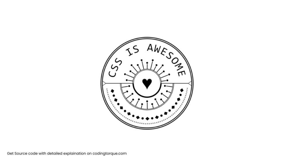
Are you looking to improve your HTML and CSS skills by creating a visually appealing badge for your website or blog? In this tutorial, we’ll show you how to create an eye-catching “Badge” using only HTML and CSS. You’ll learn how to use HTML to create the structure of the badge and style it with CSS to give it a unique and attractive appearance. We’ll also cover how to add hover effects to make your badge stand out even more. By the end of this tutorial, you’ll have a fully-functional and visually stunning “Badge” that you can use to showcase your website or blog’s branding and identity. So, let’s get started on creating a beautiful and interactive “Badge” using HTML and CSS!
Before we start here are 50 projects to create using HTML CSS and JavaScript –
I would recommend you don’t just copy and paste the code, just look at the code and type by understanding it.
Demo
HTML Code
Starter Template
<!doctype html>
<html lang="en">

<head>
    <!-- Required meta tags -->
    <meta charset="utf-8">
    <meta name="viewport" content="width=device-width, initial-scale=1">

    <!-- CSS -->
    <link rel="stylesheet" href="style.css">

    <title>Badge using HTML and CSS - Coding Torque</title>
</head>

<body>
    <!-- Further code here -->
</body>

</html>
Paste the below code in your <body> tag.
<graph>
    <text split>CSS is Awesome</text>
    <belt split="21"></belt>
    <tree split="13"></tree>
    <tree split="13" outer></tree>
    <star split="21"></star>
    <circle></circle>
    <arrow></arrow>
</graph>

<script>
    /* You may want to use splitting.js */
    Array.from(document.querySelectorAll('[split]') || []).forEach(el => {
        let text = el.innerHTML.trim();
        let total = text.length || Number(el.getAttribute('split')) || 0;
        el.style.setProperty('--total', total);
        el.innerHTML = Array(total).fill(0)
            .map((n, i) => `<span style="--n:${i}">${text[i] || ''}</span>`)
            .join('');
    });
</script>
CSS Code
Create a file style.css and paste the code below.
html,
body {
  height: 100%;
  margin: 0;
}
body {
  display: grid;
  place-content: center;
}
graph {
  width: 400px;
  height: 400px;
  border: 10px double #000;
  border-radius: 50%;
  position: relative;
  overflow: hidden;
  background: linear-gradient(#000, #000) 50% / 100% 2px no-repeat;
  font-family: "PT Mono", monospace;
  text-transform: uppercase;
  line-height: 1;
  --circle-up-path: path("M 0 200 A 200 200 0 0 1 400 200");
  --circle-down-path: path("M 0 200 A 200 200 0 0 0 400 200");
}
graph:before {
  content: "";
  position: absolute;
  top: 50%;
  left: 50%;
  width: 58%;
  height: 58%;
  transform: translate(-50%, -50%) rotate(-135deg);
  border: 6px double;
  border-radius: 50%;
  border-color: #000 transparent transparent #000;
}
graph:after {
  content: "♥";
  position: absolute;
  left: 50%;
  top: 50%;
  transform: translate(-50%, -50%);
  font-family: "Nanum Gothic", sans-serif;
  font-size: 80px;
  color: transparent;
  text-shadow: 0 0 #000;
}
[split] > * {
  position: absolute;
}
text > * {
  font-size: 50px;
  transform: translateY(75%);
  offset-path: var(--circle-up-path);
  offset-distance: calc(8% + var(--n) * 89.5% / var(--total));
}
belt > * {
  transform: translateY(-40px);
  offset-path: var(--circle-down-path);
  offset-distance: calc(7% + var(--n) * 91% / var(--total));
  width: 18px;
  height: 16px;
  background: #000;
  clip-path: polygon(50% 0, 100% 50%, 50% 100%, 0 50%);
}
belt > *:nth-child(even) {
  clip-path: circle(30%);
}
tree > * {
  width: 2px;
  height: 30px;
  transform: translateY(-98px);
  background: #000;
  offset-path: var(--circle-down-path);
  offset-distance: calc(5% + var(--n) * 98% / var(--total));
}
tree > *:after {
  content: "";
  position: absolute;
  top: -10px;
  left: calc(50% - 4px);
  width: 8px;
  height: 8px;
  border-radius: 50%;
  background: #000;
}
tree > *:nth-child(even) {
  height: 15px;
  transform: translateY(-90px);
}
tree[outer] > * {
  offset-path: var(--circle-up-path);
  transform: translateY(128px);
  height: 60px;
}
tree[outer] > *:nth-child(odd) {
  height: 30px;
}
star > * {
  offset-path: var(--circle-down-path);
  offset-distance: calc(6% + var(--n) * 93% / var(--total));
  transform: translateY(-15px);
}
star > *:after {
  content: "***";
  font-family: verdana;
  color: #000;
  font-size: 13px;
}
circle {
  position: absolute;
  width: 30%;
  height: 30%;
  left: 50%;
  top: 50%;
  transform: translate(-50%, -50%) rotate(45deg);
  border: 6px solid #000;
  border-style: double solid solid double;
  border-radius: 50%;
  background: #fff;
}
arrow:after,
arrow:before {
  content: "";
  position: absolute;
  top: calc(50% - 11px);
  width: 20px;
  height: 20px;
  transform: rotateX(45deg) rotate(45deg);
  border: 2px solid #000;
  background: #fff;
}
arrow:before {
  left: -13px;
}
arrow:after {
  right: -13px;
}
@media screen and (max-width: 440px) {
  graph {
    transform: scale(0.5);
  }
}
warning {
  background: yellow;
  position: fixed;
  top: 0;
  width: 100%;
  text-align: center;
  padding: 0.5em 0;
}
@supports (offset-path: path("M 0 0 z")) {
  warning {
    display: none;
  }
}
Final Output
Written by: Piyush Patil
Code Credits: @yuanchuan
If you found any mistakes or have any doubts please feel free to Contact Us
Hope you find this post helpful💖


