In the realm of web design, captivating your audience’s attention is key to keeping them engaged with your content. One effective way to achieve this is by incorporating visually appealing elements that not only catch the eye but also provide an interactive and immersive experience for users.
In this blog post, we’re embarking on an exciting journey to create stunning blog cards with a captivating blur hover effect using the dynamic trio of HTML, CSS, and JavaScript. By leveraging the power of these core web technologies, we’ll unlock the potential to transform ordinary blog cards into visually striking and engaging elements that leave a lasting impression on your audience.


I would recommend you don’t just copy and paste the code, just look at the code and type by understanding it.
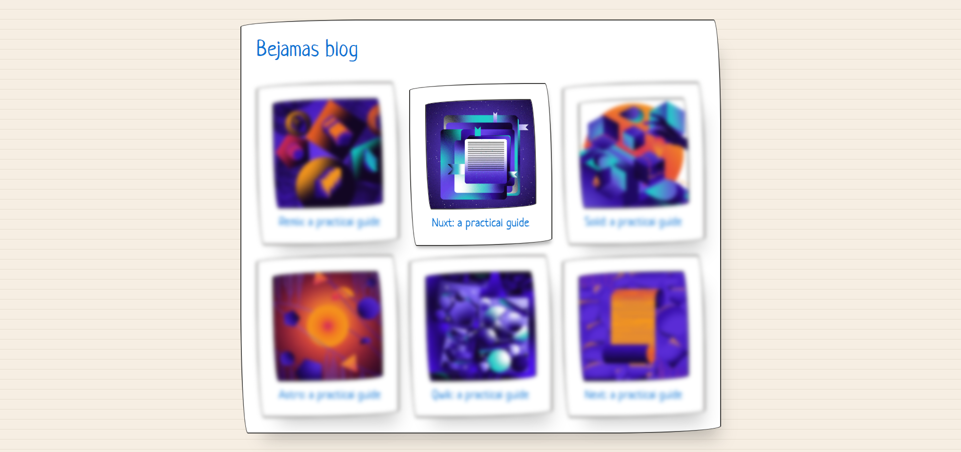
Demo
See the Pen All-but-me query with :has() by Mojtaba Seyedi (@seyedi) on CodePen.
HTML Code
Starter Template
<!doctype html>
<html lang="en">

<head>
    <!-- Required meta tags -->
    <meta charset="utf-8">
    <meta name="viewport" content="width=device-width, initial-scale=1">

    <!-- CSS -->
    <link rel="stylesheet" href="style.css">

    <title>Blog cards with blur hover effect using HTML CSS and JavaScript - Coding Torque</title>
</head>

<body>
    <!-- Further code here -->

    <script src="script.js"></script>
</body>

</html>
Paste the below code in your <body> tag.
<div class="container">
  <section class="paper border shadow shadow-large">
    <h1>
      <a href="https://bejamas.io/blog/">Bejamas blog</a>
    </h1>
      <ul class="card-list">
        <li class="paper border shadow shadow-large shadow-hover">
          <img src="https://bejamas.io/_next/image/?url=https%3A%2F%2Fcdn.sanity.io%2Fimages%2Flxs6x7jp%2Fproduction%2Ff31810d13e2e27f7f502218b8f4f28e0008e1ed7-3000x3000.png&w=640&q=75" alt="">
          <h2>
            <a href="https://bejamas.io/blog/guide-to-remix-framework/">Remix: a practical guide</a>
          </h2>
        </li>
        <li class="paper border shadow shadow-large shadow-hover">
          <img src="https://bejamas.io/_next/image/?url=https%3A%2F%2Fcdn.sanity.io%2Fimages%2Flxs6x7jp%2Fproduction%2Fadffce6e572b1e67f8301c0cd45ea0019a9e0be8-4167x4167.png&w=640&q=75" alt="">
          <h2>
            <a href="https://bejamas.io/blog/practical-guide-to-nuxt-js/">Nuxt: a practical guide</a>
          </h2>
        </li>
        <li class="paper border shadow shadow-large shadow-hover">
          <img src="https://bejamas.io/_next/image/?url=https%3A%2F%2Fcdn.sanity.io%2Fimages%2Flxs6x7jp%2Fproduction%2Fa4b233016f4737136b37909f3c480361c25eb63c-3000x3000.png&w=640&q=75" alt="">
          <h2>
            <a href="https://bejamas.io/blog/practical-guide-to-solidjs-library/">Solid: a practical guide</a>
          </h2>
        </li>
        <li class="paper border shadow shadow-large shadow-hover">
          <img src="https://bejamas.io/_next/image/?url=https%3A%2F%2Fcdn.sanity.io%2Fimages%2Flxs6x7jp%2Fproduction%2F2d2ed3cab93b818475e7a9d45608c0f9767f5a8f-3000x3000.png&w=640&q=75" alt="">
          <h2>
            <a href="https://bejamas.io/blog/practical-guide-to-astro-js-framework/">Astro: a practical guide</a>
          </h2>
        </li>
        <li class="paper border shadow shadow-large shadow-hover">
          <img src="https://bejamas.io/_next/image/?url=https%3A%2F%2Fcdn.sanity.io%2Fimages%2Flxs6x7jp%2Fproduction%2Fbb266c02a530bc5858ef34ba20680f10ffb8929c-3000x3000.png&w=640&q=75" alt="">
          <h2>
            <a href="https://bejamas.io/blog/build-a-quiz-application-with-qwik-framework/">Qwik: a practical guide</a>
          </h2>
        </li>
        <li class="paper border shadow shadow-large shadow-hover">
          <img src="https://bejamas.io/_next/image/?url=https%3A%2F%2Fcdn.sanity.io%2Fimages%2Flxs6x7jp%2Fproduction%2F274fc43c57a8ba8d4e20d2709776232cf365c014-3000x3000.png&w=640&q=75" alt="">
          <h2>
            <a href="https://bejamas.io/blog/how-to-create-next-js-blog-using-notion-as-a-cms/">Next: a practical guide</a>
          </h2>
        </li>
    </ul>
  </section>
</div>
CSS Code
Create a file style.css and paste the code below.
@import url("https://unpkg.com/papercss@1.9.2/dist/paper.css") layer(csspaper);

.card-list:has(li:hover) li:not(:hover) {
  filter: blur(4px)
}

/* Demo style */
body {
  min-height: 100vh;
  background-color: #f6eee3;
  background-size: 20px 20px;
  background-image:  repeating-linear-gradient(0deg, #e5decf, #e5decf 1px, #f6eee3 1px, #f6eee3);
  padding: 1rem;
  color: var(--text-color);
}

h1 {
  font-size: 2.2rem;
  color: var(--primary-color);
  margin: 0 0 2rem;
}

h2 {
  font-size: 1.2rem;
  margin: 0;
}

.card-list {
  display: grid;
  grid-template-columns: 1fr 1fr 1fr;
  gap: 1rem;
  margin: 0;
  padding: 0;
}

li {
  margin: 0;
  transition: all 150ms ease-in-out;
}

li::before {
  content: "";
}

img {
  display: block;
  min-width: 0;
  width: 100%;
  margin-bottom: .6rem;
}

a {
  background: none;
}

.paper {
  padding: 1.5rem;
}

li a {
  padding-inline-start: 1rem;
}
Final Output

Written by: Piyush Patil
Code Credits: https://codepen.io/seyedi/full/RwdrMYw
If you found any mistakes or have any doubts please feel free to Contact Us
Hope you find this post helpful💖


