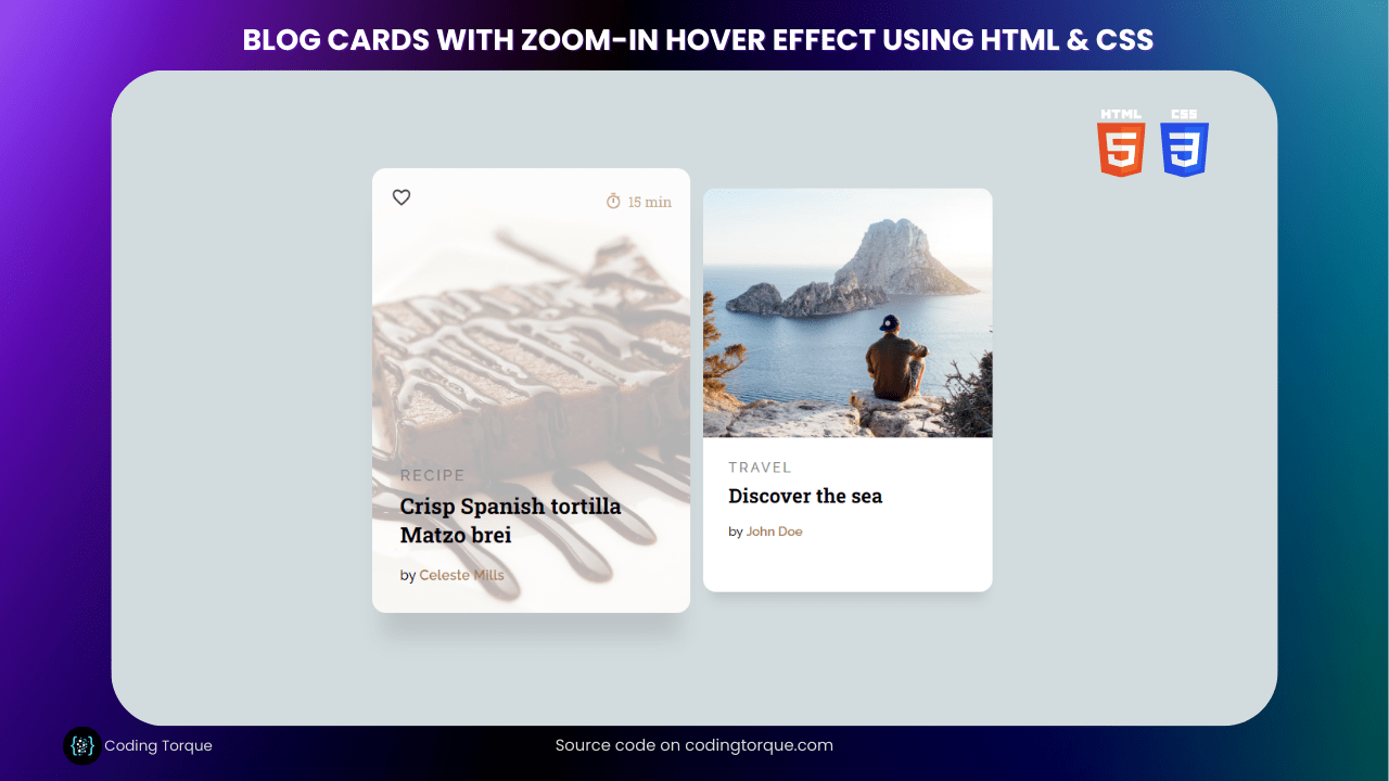
Welcome, fellow coders! Are you ready to add some visual flair to your blog posts? In this tutorial, we’ll be creating stylish blog cards with an eye-catching zoom-in hover effect using HTML and CSS. By the end of this tutorial, you’ll have a sleek design that will make your blog posts stand out from the crowd. Whether you’re a blogger or a web developer looking to enhance your web design skills, this tutorial is perfect for you. So, let’s roll up our sleeves and get creative with HTML and CSS!
- Deploying a MERN App with Multiple Domain Names on VPS
- 3D CSS Logo with Pure CSS
- 3D Santa using HTML and CSS Only
- Crafting a 3D Police Squad Car with Pure CSS
- Crafting a 3D Printer with HTML and Pure CSS
I would recommend you don’t just copy and paste the code, just look at the code and type by understanding it.
HTML Code
Starter Template
<!doctype html>
<html lang="en">

<head>
    <!-- Required meta tags -->
    <meta charset="utf-8">
    <meta name="viewport" content="width=device-width, initial-scale=1">

    <!-- Font Awesome CDN  -->
    <link rel="stylesheet" href="https://cdnjs.cloudflare.com/ajax/libs/font-awesome/5.14.0/css/all.min.css"
        integrity="sha512-1PKOgIY59xJ8Co8+NE6FZ+LOAZKjy+KY8iq0G4B3CyeY6wYHN3yt9PW0XpSriVlkMXe40PTKnXrLnZ9+fkDaog=="
        crossorigin="anonymous" />

    <!-- CSS -->
    <link rel="stylesheet" href="style.css">

    <title>Blog Cards with Hover Effect using HTML & CSS - Coding Torque</title>
</head>

<body>
   <!-- Further code here -->
</body>

</html>
Paste the below code in your <body> tag.
<section class="cards">
<article class="card card--1">
<div class="card__info-hover">
<svg class="card__like" viewBox="0 0 24 24">
<path fill="#000000"
d="M12.1,18.55L12,18.65L11.89,18.55C7.14,14.24 4,11.39 4,8.5C4,6.5 5.5,5 7.5,5C9.04,5 10.54,6 11.07,7.36H12.93C13.46,6 14.96,5 16.5,5C18.5,5 20,6.5 20,8.5C20,11.39 16.86,14.24 12.1,18.55M16.5,3C14.76,3 13.09,3.81 12,5.08C10.91,3.81 9.24,3 7.5,3C4.42,3 2,5.41 2,8.5C2,12.27 5.4,15.36 10.55,20.03L12,21.35L13.45,20.03C18.6,15.36 22,12.27 22,8.5C22,5.41 19.58,3 16.5,3Z" />
</svg>
<div class="card__clock-info">
<svg class="card__clock" viewBox="0 0 24 24">
<path
d="M12,20A7,7 0 0,1 5,13A7,7 0 0,1 12,6A7,7 0 0,1 19,13A7,7 0 0,1 12,20M19.03,7.39L20.45,5.97C20,5.46 19.55,5 19.04,4.56L17.62,6C16.07,4.74 14.12,4 12,4A9,9 0 0,0 3,13A9,9 0 0,0 12,22C17,22 21,17.97 21,13C21,10.88 20.26,8.93 19.03,7.39M11,14H13V8H11M15,1H9V3H15V1Z" />
</svg><span class="card__time">15 min</span>
</div>
</div>
<div class="card__img"></div>
<a href="#" class="card_link">
<div class="card__img--hover"></div>
</a>
<div class="card__info">
<span class="card__category"> Recipe</span>
<h3 class="card__title">Crisp Spanish tortilla Matzo brei</h3>
<span class="card__by">by <a href="#" class="card__author" title="author">Celeste Mills</a></span>
</div>
</article>
<article class="card card--2">
<div class="card__info-hover">
<svg class="card__like" viewBox="0 0 24 24">
<path fill="#000000"
d="M12.1,18.55L12,18.65L11.89,18.55C7.14,14.24 4,11.39 4,8.5C4,6.5 5.5,5 7.5,5C9.04,5 10.54,6 11.07,7.36H12.93C13.46,6 14.96,5 16.5,5C18.5,5 20,6.5 20,8.5C20,11.39 16.86,14.24 12.1,18.55M16.5,3C14.76,3 13.09,3.81 12,5.08C10.91,3.81 9.24,3 7.5,3C4.42,3 2,5.41 2,8.5C2,12.27 5.4,15.36 10.55,20.03L12,21.35L13.45,20.03C18.6,15.36 22,12.27 22,8.5C22,5.41 19.58,3 16.5,3Z" />
</svg>
<div class="card__clock-info">
<svg class="card__clock" viewBox="0 0 24 24">
<path
d="M12,20A7,7 0 0,1 5,13A7,7 0 0,1 12,6A7,7 0 0,1 19,13A7,7 0 0,1 12,20M19.03,7.39L20.45,5.97C20,5.46 19.55,5 19.04,4.56L17.62,6C16.07,4.74 14.12,4 12,4A9,9 0 0,0 3,13A9,9 0 0,0 12,22C17,22 21,17.97 21,13C21,10.88 20.26,8.93 19.03,7.39M11,14H13V8H11M15,1H9V3H15V1Z" />
</svg><span class="card__time">5 min</span>
</div>
</div>
<div class="card__img"></div>
<a href="#" class="card_link">
<div class="card__img--hover"></div>
</a>
<div class="card__info">
<span class="card__category"> Travel</span>
<h3 class="card__title">Discover the sea</h3>
<span class="card__by">by <a href="#" class="card__author" title="author">John Doe</a></span>
</div>
</article>
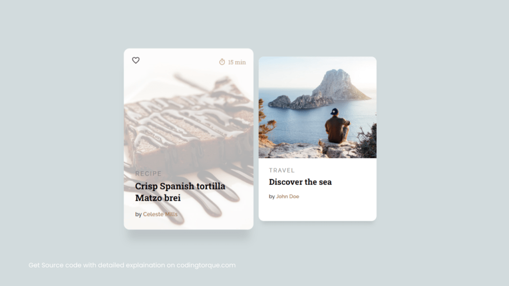
</section>Output Till Now
CSS Code
Create a file style.css and paste the code below.
@import url("https://fonts.googleapis.com/css?family=Roboto+Slab:100,300,400,700");
@import url("https://fonts.googleapis.com/css?family=Raleway:300,300i,400,400i,500,500i,600,600i,700,700i,800,800i,900,900i");

* {
  box-sizing: border-box;
}

body,
html {
  font-family: "Roboto Slab", serif;
  margin: 0;
  width: 100%;
  height: 100%;
  padding: 0;
}

body {
  background-color: #d2dbdd;
  display: flex;
  display: -webkit-flex;
  -webkit-justify-content: center;
  -webkit-align-items: center;
  justify-content: center;
  align-items: center;
}

.cards {
  width: 100%;
  display: flex;
  display: -webkit-flex;
  justify-content: center;
  -webkit-justify-content: center;
  max-width: 820px;
}

.card--1 .card__img,
.card--1 .card__img--hover {
  background-image: url("https://images.pexels.com/photos/45202/brownie-dessert-cake-sweet-45202.jpeg?auto=compress&cs=tinysrgb&h=750&w=1260");
}

.card--2 .card__img,
.card--2 .card__img--hover {
  background-image: url("https://images.pexels.com/photos/307008/pexels-photo-307008.jpeg?auto=compress&cs=tinysrgb&h=750&w=1260");
}

.card__like {
  width: 18px;
}

.card__clock {
  width: 15px;
  vertical-align: middle;
  fill: #ad7d52;
}
.card__time {
  font-size: 12px;
  color: #ad7d52;
  vertical-align: middle;
  margin-left: 5px;
}

.card__clock-info {
  float: right;
}

.card__img {
  visibility: hidden;
  background-size: cover;
  background-position: center;
  background-repeat: no-repeat;
  width: 100%;
  height: 235px;
  border-top-left-radius: 12px;
  border-top-right-radius: 12px;
}

.card__info-hover {
  position: absolute;
  padding: 16px;
  width: 100%;
  opacity: 0;
  top: 0;
}

.card__img--hover {
  transition: 0.2s all ease-out;
  background-size: cover;
  background-position: center;
  background-repeat: no-repeat;
  width: 100%;
  position: absolute;
  height: 235px;
  border-top-left-radius: 12px;
  border-top-right-radius: 12px;
  top: 0;
}
.card {
  margin-right: 25px;
  transition: all 0.4s cubic-bezier(0.175, 0.885, 0, 1);
  background-color: #fff;
  width: 33.3%;
  position: relative;
  border-radius: 12px;
  overflow: hidden;
  box-shadow: 0px 13px 10px -7px rgba(0, 0, 0, 0.1);
}
.card:hover {
  box-shadow: 0px 30px 18px -8px rgba(0, 0, 0, 0.1);
  transform: scale(1.1, 1.1);
}

.card__info {
  z-index: 2;
  background-color: #fff;
  border-bottom-left-radius: 12px;
  border-bottom-right-radius: 12px;
  padding: 16px 24px 24px 24px;
}

.card__category {
  font-family: "Raleway", sans-serif;
  text-transform: uppercase;
  font-size: 13px;
  letter-spacing: 2px;
  font-weight: 500;
  color: #868686;
}

.card__title {
  margin-top: 5px;
  margin-bottom: 10px;
  font-family: "Roboto Slab", serif;
}

.card__by {
  font-size: 12px;
  font-family: "Raleway", sans-serif;
  font-weight: 500;
}

.card__author {
  font-weight: 600;
  text-decoration: none;
  color: #ad7d52;
}

.card:hover .card__img--hover {
  height: 100%;
  opacity: 0.3;
}

.card:hover .card__info {
  background-color: transparent;
  position: relative;
}

.card:hover .card__info-hover {
  opacity: 1;
}
Output Till Now
Written by: Piyush Patil
Code Credits: @veronicadev
If you have any doubts or any project ideas feel free to Contact Us
Hope you find this post helpful💖


