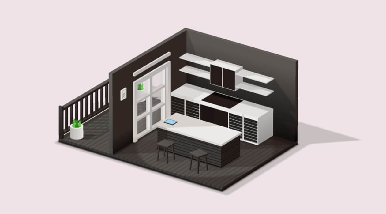
What if you could design a fully functional 3D kitchen entirely in CSS? No images, no JavaScript—just the magic of HTML and CSS! In this blog, we’ll create a visually stunning kitchen scene featuring cabinets, a countertop, appliances, and more. Using CSS 3D transforms, gradients, and shadows, we’ll bring depth and realism to every element of the kitchen. Perfect for honing your front-end skills or showcasing your CSS expertise, this project combines creativity and code to build a space where design truly sizzles. Let’s step into the (virtual) kitchen and start cooking up something amazing!


I would recommend you don’t just copy and paste the code, just look at the code and type by understanding it.
Demo
See the Pen 3D Kitchen – Pure CSS by Ricardo Oliva Alonso (@ricardoolivaalonso) on CodePen.
HTML Code
Starter Template
<!doctype html>
<html lang="en">

<head>
    <!-- Required meta tags -->
    <meta charset="utf-8">
    <meta name="viewport" content="width=device-width, initial-scale=1">

    <!-- CSS -->
    <link rel="stylesheet" href="style.css">

    <title>Coding Torque</title>
</head>

<body>
    <!-- Further code here -->

</body>

</html>
Paste the below code in your <body> tag.
audio#a1: source(src="https://rawcdn.githack.com/ricardoolivaalonso/Codepen/0283d2e98cec2eb2be3911bece095000272bb1ca/Kitchen/audio/door.mp3",type="audio/mpeg")
audio#a2: source(src="https://rawcdn.githack.com/ricardoolivaalonso/Codepen/0283d2e98cec2eb2be3911bece095000272bb1ca/Kitchen/audio/hadoor.mp3",type="audio/mpeg")
audio#a3: source(src="https://rawcdn.githack.com/ricardoolivaalonso/Codepen/0283d2e98cec2eb2be3911bece095000272bb1ca/Kitchen/audio/tablet.mp3",type="audio/mpeg")
audio#a4: source(src="https://rawcdn.githack.com/ricardoolivaalonso/Codepen/0283d2e98cec2eb2be3911bece095000272bb1ca/Kitchen/audio/hac.mp3",type="audio/mpeg")
audio#a5: source(src="https://rawcdn.githack.com/ricardoolivaalonso/Codepen/0283d2e98cec2eb2be3911bece095000272bb1ca/Bedroom/sounds/buro.mp3",type="audio/mpeg")
div.main#h
div.shadow.shadow--1
div.shadow.shadow--2
div.shadow.shadow--3
div.shadow.shadow--4
div.floor
div.floor__front.face
div.floor__back.face
div.floor__right.face
div.floor__left.face
div.floor__top.face
div.floor__bottom.face
div.wall-t
div.wall-t__front.face
div.wall-t__back.face
div.wall-t__right.face
div.wall-t__left.face
div.wall-t__top.face
div.wall-t__bottom.face
div.wall-la
div.wall-la__front.face
div.wall-la__back.face
div.wall-la__right.face
div.wall-la__left.face
div.wall-la__top.face
div.wall-la__bottom.face
div.wall-lb
div.wall-lb__front.face
div.wall-lb__back.face
div.wall-lb__right.face
div.wall-lb__left.face
div.wall-lb__top.face
div.wall-lb__bottom.face
div.wall-lc
div.wall-lc__front.face
div.wall-lc__back.face
div.wall-lc__right.face
div.wall-lc__left.face
div.wall-lc__top.face
div.wall-lc__bottom.face
div.door
div.door-l
div.door-l__front.face
div.door-l__back.face
div.door-l__right.face
div.door-l__left.face
div.door-l__top.face
div.door-l__bottom.face
div.door-r
div.door-r__front.face
div.door-r__back.face
div.door-r__right.face
div.door-r__left.face
div.door-r__top.face
div.door-r__bottom.face
div.door-t
div.door-t__front.face
div.door-t__back.face
div.door-t__right.face
div.door-t__left.face
div.door-t__top.face
div.door-t__bottom.face
div.door-1
div.door__glass
div.door-1r
div.door-1r__front.face
div.door-1r__back.face
div.door-1r__right.face
div.door-1r__left.face
div.door-1r__top.face
div.door-1r__bottom.face
div.door-1l
div.door-1l__front.face
div.door-1l__back.face
div.door-1l__right.face
div.door-1l__left.face
div.door-1l__top.face
div.door-1l__bottom.face
div.door-1b
div.door-1b__front.face
div.door-1b__back.face
div.door-1b__right.face
div.door-1b__left.face
div.door-1b__top.face
div.door-1b__bottom.face
div.door-1c
div.door-1c__front.face
div.door-1c__back.face
div.door-1c__right.face
div.door-1c__left.face
div.door-1c__top.face
div.door-1c__bottom.face
div.door-1c2
div.door-1c2__front.face
div.door-1c2__back.face
div.door-1c2__right.face
div.door-1c2__left.face
div.door-1c2__top.face
div.door-1c2__bottom.face
div.door-1t
div.door-1t__front.face
div.door-1t__back.face
div.door-1t__right.face
div.door-1t__left.face
div.door-1t__top.face
div.door-1t__bottom.face
div.door-2#door
div.door__glass
div.door-1r
div.door-1r__front.face
div.door-1r__back.face
div.door-1r__right.face
div.door-1r__left.face
div.door-1r__top.face
div.door-1r__bottom.face
div.door-1l
div.door-1l__front.face
div.door-1l__back.face
div.door-1l__right.face
div.door-1l__left.face
div.door-1l__top.face
div.door-1l__bottom.face
div.door-1b
div.door-1b__front.face
div.door-1b__back.face
div.door-1b__right.face
div.door-1b__left.face
div.door-1b__top.face
div.door-1b__bottom.face
div.door-1c
div.door-1c__front.face
div.door-1c__back.face
div.door-1c__right.face
div.door-1c__left.face
div.door-1c__top.face
div.door-1c__bottom.face
div.door-1c2
div.door-1c2__front.face
div.door-1c2__back.face
div.door-1c2__right.face
div.door-1c2__left.face
div.door-1c2__top.face
div.door-1c2__bottom.face
div.door-1t
div.door-1t__front.face
div.door-1t__back.face
div.door-1t__right.face
div.door-1t__left.face
div.door-1t__top.face
div.door-1t__bottom.face
div.fence
div.fence__shadow-c
div.fence__shadow
div.fence-l
div.fence-l__front.face
div.fence-l__back.face
div.fence-l__right.face
div.fence-l__left.face
div.fence-l__top.face
div.fence-l__bottom.face
div.fence-r
div.fence-r__front.face
div.fence-r__back.face
div.fence-r__right.face
div.fence-r__left.face
div.fence-r__top.face
div.fence-r__bottom.face
div.fence-b
div.fence-b__front.face
div.fence-b__back.face
div.fence-b__right.face
div.fence-b__left.face
div.fence-b__top.face
div.fence-b__bottom.face
div.fence-t
div.fence-t__front.face
div.fence-t__back.face
div.fence-t__right.face
div.fence-t__left.face
div.fence-t__top.face
div.fence-t__bottom.face
div.fence-mc
- var n = 0
while n < 15
div.fence-m
div.fence-m__front.face
div.fence-m__back.face
div.fence-m__right.face
div.fence-m__left.face
div.fence-m__top.face
div.fence-m__bottom.face
- n++
div.table.flex
div.table-t
div.table-t__front.face
div.table-t__back.face
div.table-t__right.face
div.table-t__left.face
div.table-t__top.face
div.table-t__bottom.face
div.table-b
div.table-b__front.face
div.table-b__back.face
div.table-b__right.face
div.table-b__left.face
div.table-b__top.face
div.table-b__bottom.face
div.tablet#tablet
div.tablet__heart#heart
div.tablet__front.face
div.tablet__back.face
div.tablet__right.face
div.tablet__left.face
div.tablet__top.face
div.tablet__bottom.face
div.ha-c
div.ha1
div.ha-l
div.ha-l__front.face
div.ha-l__back.face
div.ha-l__right.face
div.ha-l__left.face
div.ha-l__top.face
div.ha-l__bottom.face
div.ha-r
div.ha-r__front.face
div.ha-r__back.face
div.ha-r__right.face
div.ha-r__left.face
div.ha-r__top.face
div.ha-r__bottom.face
div.ha-bc
div.ha-bc__front.face
div.ha-bc__back.face
div.ha-bc__right.face
div.ha-bc__left.face
div.ha-bc__top.face
div.ha-bc__bottom.face
div.ha-b
div.ha-b__front.face
div.ha-b__back.face
div.ha-b__right.face
div.ha-b__left.face
div.ha-b__top.face
div.ha-b__bottom.face
div.ha-t
div.ha-t__front.face
div.ha-t__back.face
div.ha-t__right.face
div.ha-t__left.face
div.ha-t__top.face
div.ha-t__bottom.face
div.ha-doors
div.ha-doorl#hadool
div.ha-doorl__front.face
div.ha-doorl__back.face
div.ha-doorl__right.face
div.ha-doorl__left.face
div.ha-doorl__top.face
div.ha-doorl__bottom.face
div.ha-doorr
div.ha-doorr__front.face
div.ha-doorr__back.face
div.ha-doorr__right.face
div.ha-doorr__left.face
div.ha-doorr__top.face
div.ha-doorr__bottom.face
div.hac
div.ha-l
div.ha-l__front.face
div.ha-l__back.face
div.ha-l__right.face
div.ha-l__left.face
div.ha-l__top.face
div.ha-l__bottom.face
div.ha-r
div.ha-r__front.face
div.ha-r__back.face
div.ha-r__right.face
div.ha-r__left.face
div.ha-r__top.face
div.ha-r__bottom.face
div.ha-bc
div.ha-bc__front.face
div.ha-bc__back.face
div.ha-bc__right.face
div.ha-bc__left.face
div.ha-bc__top.face
div.ha-bc__bottom.face
div.ha-b
div.ha-b__front.face
div.ha-b__back.face
div.ha-b__right.face
div.ha-b__left.face
div.ha-b__top.face
div.ha-b__bottom.face
div.ha-t
div.ha-t__front.face
div.ha-t__back.face
div.ha-t__right.face
div.ha-t__left.face
div.ha-t__top.face
div.ha-t__bottom.face
div.ha-doors
div.ha-doorf#hac
div.ha-doorf__front.face
div.ha-doorf__back.face
div.ha-doorf__right.face
div.ha-doorf__left.face
div.ha-doorf__top.face
div.ha-doorf__bottom.face
div.ha2
div.ha-l
div.ha-l__front.face
div.ha-l__back.face
div.ha-l__right.face
div.ha-l__left.face
div.ha-l__top.face
div.ha-l__bottom.face
div.ha-r
div.ha-r__front.face
div.ha-r__back.face
div.ha-r__right.face
div.ha-r__left.face
div.ha-r__top.face
div.ha-r__bottom.face
div.ha-bc
div.ha-bc__front.face
div.ha-bc__back.face
div.ha-bc__right.face
div.ha-bc__left.face
div.ha-bc__top.face
div.ha-bc__bottom.face
div.ha-b
div.ha-b__front.face
div.ha-b__back.face
div.ha-b__right.face
div.ha-b__left.face
div.ha-b__top.face
div.ha-b__bottom.face
div.ha-t
div.ha-t__front.face
div.ha-t__back.face
div.ha-t__right.face
div.ha-t__left.face
div.ha-t__top.face
div.ha-t__bottom.face
div.ha-doors
div.ha-doorl
div.ha-doorl__front.face
div.ha-doorl__back.face
div.ha-doorl__right.face
div.ha-doorl__left.face
div.ha-doorl__top.face
div.ha-doorl__bottom.face
div.ha-doorr#hadoor
div.ha-doorr__front.face
div.ha-doorr__back.face
div.ha-doorr__right.face
div.ha-doorr__left.face
div.ha-doorr__top.face
div.ha-doorr__bottom.face
div.cupboards#cup
div.cupboard-l
div.cupboard-l__front.face
div.cupboard-l__back.face
div.cupboard-l__right.face
div.cupboard-l__left.face
div.cupboard-l__top.face
div.cupboard-l__bottom.face
div.cupboard-r
div.cupboard-r__front.face
div.cupboard-r__back.face
div.cupboard-r__right.face
div.cupboard-r__left.face
div.cupboard-r__top.face
div.cupboard-r__bottom.face
div.cupboard-tl
div.cupboard-tl__front.face
div.cupboard-tl__back.face
div.cupboard-tl__right.face
div.cupboard-tl__left.face
div.cupboard-tl__top.face
div.cupboard-tl__bottom.face
div.cupboard-tr
div.cupboard-tr__front.face
div.cupboard-tr__back.face
div.cupboard-tr__right.face
div.cupboard-tr__left.face
div.cupboard-tr__top.face
div.cupboard-tr__bottom.face
div.cupboard-m
div.cupboard-m__front.face
div.cupboard-m__back.face
div.cupboard-m__right.face
div.cupboard-m__left.face
div.cupboard-m__top.face
div.cupboard-m__bottom.face
div.bursts
div.burst
div.circle.flex
div.circle-a
- var n = 0
while n < 36
div.circle-a__side
- n++
div.circle-a__bottom
div.circle-a__top
div.circle-b
- var n = 0
while n < 36
div.circle-b__side
- n++
div.circle-b__bottom
- var i = 0
while i < 36
div.burst__leaf
- i++
div.burst
div.circle.flex
div.circle-a
- var n = 0
while n < 36
div.circle-a__side
- n++
div.circle-a__bottom
div.circle-a__top
div.circle-b
- var n = 0
while n < 36
div.circle-b__side
- n++
div.circle-b__bottom
- var i = 0
while i < 36
div.burst__leaf
- i++
//- div.pot
div.circle.flex
div.circle-a
- var n = 0
while n < 36
div.circle-a__side
- n++
div.circle-a__bottom
div.circle-a__top
div.circle-b
- var n = 0
while n < 36
div.circle-b__side
- n++
div.circle-b__bottom
div.pic
div.pic__front.face
div.pic__back.face
div.pic__right.face
- var b = '<br>'
span.pic__text.face i!{b}luv!{b}ccs
div.pic__left.face
div.pic__top.face
div.pic__bottom.face
div.chair
div.chair-t
div.chair-t__front.face
div.chair-t__back.face
div.chair-t__right.face
div.chair-t__left.face
div.chair-t__top.face
div.chair-t__bottom.face
div.chair-lb
div.chair-lb__front.face
div.chair-lb__back.face
div.chair-lb__right.face
div.chair-lb__left.face
div.chair-lb__top.face
div.chair-lb__bottom.face
div.chair-lt
div.chair-lt__front.face
div.chair-lt__back.face
div.chair-lt__right.face
div.chair-lt__left.face
div.chair-lt__top.face
div.chair-lt__bottom.face
div.chair-rb
div.chair-rb__front.face
div.chair-rb__back.face
div.chair-rb__right.face
div.chair-rb__left.face
div.chair-rb__top.face
div.chair-rb__bottom.face
div.chair-rt
div.chair-rt__front.face
div.chair-rt__back.face
div.chair-rt__right.face
div.chair-rt__left.face
div.chair-rt__top.face
div.chair-rt__bottom.face
div.chair.chair--2
div.chair-t
div.chair-t__front.face
div.chair-t__back.face
div.chair-t__right.face
div.chair-t__left.face
div.chair-t__top.face
div.chair-t__bottom.face
div.chair-lb
div.chair-lb__front.face
div.chair-lb__back.face
div.chair-lb__right.face
div.chair-lb__left.face
div.chair-lb__top.face
div.chair-lb__bottom.face
div.chair-lt
div.chair-lt__front.face
div.chair-lt__back.face
div.chair-lt__right.face
div.chair-lt__left.face
div.chair-lt__top.face
div.chair-lt__bottom.face
div.chair-rb
div.chair-rb__front.face
div.chair-rb__back.face
div.chair-rb__right.face
div.chair-rb__left.face
div.chair-rb__top.face
div.chair-rb__bottom.face
div.chair-rt
div.chair-rt__front.face
div.chair-rt__back.face
div.chair-rt__right.face
div.chair-rt__left.face
div.chair-rt__top.face
div.chair-rt__bottom.face
div.lamp
div.lamp__front.face
div.lamp__back.face
div.lamp__right.face
div.lamp__left.face
div.lamp__top.face
div.lamp__bottom.face
CSS Code
Create a file style.css and paste the code below.
$bg-1: #EEE3E7;
$bg-2: #c7bfc0;
$black-1: #57524E;
$black-2: #3D3C3A;
$black-3: #251B18;
$pink-1: #e87c80;
$pink-2: #e05e63;
$pink-3: #BE595D;
$pink-1: #6c645e;
$pink-2: #4a4842;
$pink-3: #3e3330;
$pink-1: #615c58;
$pink-2: #474645;
$pink-3: #302622;
$white-1: #ebeae9;
$white-2: #DCD7D3;
$white-3: #b5b1b1;
$door-1: #ebeae9;
$door-2: #DCD7D3;
$door-3: #b5b1b1;
// $brown-1: #BE9A6A;
// $brown-2: #A4815B;
// $brown-3: #986c3b;
$brown-1: #57524E;
$brown-2: #3D3C3A;
$brown-3: #251B18;
$green-1: #65C34C;
$green-2: #53b43a;
$green-3: #33901b;
$orange: #e48d78;
$cyan-1: #acdaf7;
$cyan-2: darken($cyan-1, 5);
/***********************/
@mixin cylinder($base, $sides, $degree, $pi, $width, $color) {
display: flex;
justify-content: center;
align-items: center;
position: absolute;
&__side{
position: absolute;
height: ( 2 * $pi * ($base / 2) ) / $sides ;
width: $width;
background-color: darken($color, 15);
@for $var from 1 to ($sides + 1) {
&:nth-of-type(#{$var}){ transform: rotateX( $var * $degree / $sides ) translateZ($base / 2); }
}
@for $var from 1 to 20 {
&:nth-of-type(#{$var}){ background-color: darken($color, $var * 1.5); }
}
@for $var from 1 to 20 {
&:nth-last-of-type(#{$var}){ background-color: darken($color, $var * 1.5); }
}
}
&__top,
&__bottom{
position: absolute;
width: $base;
height: $base;
border-radius: 50%;
transform: rotateY(90deg) translateZ( $width / 2 );
}
&__bottom{ transform: rotateY(90deg) translateZ( $width / -2 );}
}
@mixin cube($width, $height, $depth) {
&__front{ @include cube-front($width, $height, $depth); }
&__back{ @include cube-back($width, $height, $depth); }
&__right{ @include cube-right($width, $height, $depth); }
&__left{ @include cube-left($width, $height, $depth); }
&__top{ @include cube-top($width, $height, $depth);}
&__bottom{ @include cube-bottom($width, $height, $depth); }
}
//----------------------
@mixin cube-front($width, $height, $depth) {
width: $width;
height: $height;
transform-origin: bottom left;
transform: rotateX(-90deg) translateZ( -($height - ($depth * 2) ) );
}
@mixin cube-back($width, $height, $depth) {
width: $width;
height: $height;
transform-origin: top left;
transform: rotateX(-90deg) rotateY(180deg) translateX(-$width) translateY(-$height) ;
}
@mixin cube-right($width, $height, $depth) {
width: $depth * 2;
height: $height;
transform-origin: top left;
transform: rotateY(90deg) rotateZ(-90deg) translateZ($width) translateX(-$depth * 2) translateY(-$height);
}
@mixin cube-left($width, $height, $depth) {
width: $depth * 2;
height: $height;
transform-origin: top left;
transform: rotateY(-90deg) rotateZ(90deg) translateY(-$height);
}
@mixin cube-top($width, $height, $depth) {
width: $width;
height: $depth * 2;
transform-origin: top left;
transform: translateZ($height) ;
}
@mixin cube-bottom($width, $height, $depth) {
width: $width;
height: $depth * 2;
transform-origin: top left;
transform: rotateY(180deg) translateX(-$width);
}
@mixin face-ani($animation, $time, $side, $width-el, $height-el, $depth-el) {
animation: #{$animation} #{$time} infinite ease;
@keyframes #{$animation} {
0%, 15%, 45%, 60%, 62%, 68%{
@if $side == "cube-front" { @include cube-front($width-el, $height-el, $depth-el); }
@else if $side == "cube-back" { @include cube-back($width-el, $height-el, $depth-el); }
@else if $side == "cube-right" { @include cube-right($width-el, $height-el, $depth-el); }
@else if $side == "cube-left" { @include cube-left($width-el, $height-el, $depth-el); }
@else if $side == "cube-top" { @include cube-top($width-el, $height-el, $depth-el); }
@else if $side == "cube-bottom" { @include cube-bottom($width-el, $height-el, $depth-el); }
}
20%, 40%, 58%, 64%, 70%, 100%{
@if $side == "cube-front" { @include cube-front($width-el, $height-finish, $depth-el); }
@else if $side == "cube-back" { @include cube-back($width-el, $height-finish, $depth-el); }
@else if $side == "cube-right" { @include cube-right($width-el, $height-finish, $depth-el); }
@else if $side == "cube-left" { @include cube-left($width-el, $height-finish, $depth-el); }
@else if $side == "cube-top" { @include cube-top($width-el, $height-finish, $depth-el); }
@else if $side == "cube-bottom" { @include cube-bottom($width-el, $height-el, $depth-el); }
}
}
}
@mixin cube-color($color) {
&__front{ background-color: darken($color, 5); }
&__back{ background-color: darken($color, 10) }
&__right{ background-color: darken($color, 10) }
&__left{ background-color: darken($color, 20); }
&__top{ background-color: $color; }
&__bottom{ background-color: darken($color, 20);}
}
/***********************/
/***********************/
*, *::after, *::before {
margin: 0;
padding: 0;
box-sizing: border-box;
transform-style: preserve-3d;
user-select: none;
-webkit-tap-highlight-color: transparent;
appearance: none;
font-family: sans-serif;
}
/***********************/
/***********************/
body{
display: flex;
justify-content: center;
align-items: center;
height: 100vh;
width: 100%;
overflow: hidden;
cursor: pointer;
background-color: $bg-1;
}
.face{ position: absolute; }
.flex{
display: flex;
justify-content: center;
align-items: center;
}
/***********************/
/***********************/
.main{
position: absolute;
width: 45vw;
height: 30vw;
transform:
perspective(30000px)
rotateX(65deg)
rotateZ(35deg)
translateZ(-10vw)
;
transition: transform 500ms linear;
}
@keyframes main {
to{
transform:
perspective(30000px)
rotateX(65deg)
rotateZ(395deg)
translateZ(-10vw)
;
}
}
.shadow{
background-color: $bg-2;
position: absolute;
transform: translateZ(-.1vw);
&--1{
width: 105%;
height: 125%;
bottom: -.5vw;
left: -.5vw;
box-shadow:
.125vw .125vw .5vw $bg-2,
-.125vw .125vw .5vw $bg-2,
.125vw -.125vw .5vw $bg-2,
-.125vw -.125vw .5vw $bg-2
;
}
&--2{
bottom: 30vw;
left: 15vw;
width: 30vw;
height: 10vw;
transform: skewX(-45deg);
transform-origin: bottom left;
background-color: $bg-2;
box-shadow:
.125vw .125vw .5vw $bg-2,
-.125vw .125vw .5vw $bg-2,
.125vw -.125vw .5vw $bg-2,
-.125vw -.125vw .5vw $bg-2
;
}
&--3{
bottom: 0;
left: 0;
width: 100%;
height: 100%;
background-color: darken($bg-2, 20);
box-shadow:
.125vw .125vw .5vw darken($bg-2, 40),
-.125vw .125vw .5vw darken($bg-2, 40),
.125vw -.125vw .5vw darken($bg-2, 40),
-.125vw -.125vw .5vw darken($bg-2, 40)
;
transform: translateZ(.1vw);
}
&--4{
position: absolute;
width: 6vw;
height: 30vw;
left: 0;
transform-origin: bottom left;
transform: skewY(-35deg);
background-image: repeating-linear-gradient(to top, rgba($black-1, .05) 0, rgba($black-1, .05) 1vw, transparent 1.125vw, transparent 2vw);
border-right: 1.5vw solid rgba($black-1, .05);
border-top: 1vw solid rgba($black-1, .05);
padding-right: 1vw;
}
}
/*---------------------*/
.floor{
$width-el: 45vw;
$height-el: 1vw;
$depth-el: 15vw;
@include cube($width-el, $height-el, $depth-el);
width: $width-el;
height: $depth-el * 2;
position: absolute;
&__front{
background-color: $black-2;
background-image: repeating-linear-gradient(to right, $black-2 0, $black-2 1vw, darken($black-2, 10) 1vw, darken($black-2, 5) 1.1vw, darken($black-2, 5) 1.2vw);
border-bottom: .5vw solid darken($black-2, 10);
}
&__back{
background-color: darken($black-3, 5);
border-bottom: .5vw solid darken($black-3, 10);
}
&__right{
background-color: $black-3;
border-bottom: .5vw solid darken($black-3, 5);
}
&__left{
background-color: $black-1;
border-bottom: .5vw solid darken($black-1, 5);
}
&__top{
background-color: $black-1;
background-image:
linear-gradient(to bottom, rgba(darken($black-3, 4), .5) 2vw, transparent 3.25vw),
linear-gradient(to right, rgba(darken($black-3, 5), .5) .25vw, transparent 1.25vw),
linear-gradient(-40deg, transparent 19vw, rgba($white-1, .035) 19.5vw),
linear-gradient(-40deg, transparent 4vw, rgba($black-3, .3) 4vw),
linear-gradient(-40deg, transparent 19.25vw, rgba($black-3, .3) 19.5vw),
linear-gradient(-40deg, transparent 3.8vw, rgba($black-3, .45) 3.8vw),
radial-gradient(transparent 15vw, rgba($black-3, .4) 16vw),
linear-gradient(-40deg, transparent 19.4vw, rgba($black-3, .3) 19.4vw),
repeating-linear-gradient(to right, transparent 0, transparent 1vw, darken($black-1, 12) 1vw, darken($black-1, 5) 1.1vw, darken($black-1, 5) 1.2vw)
;
background-size:
30vw 30.1vw,
30.1vw 30vw,
30vw 21vw,
24vw 21.75vw,
30vw 15vw,
7vw 7.5vw,
30vw 100%,
30vw 100%,
100% 100%
;
background-position: top right;
background-repeat: no-repeat;
}
&__bottom{
background-color: $black-3;
border-bottom: .5vw solid darken($black-3, 5);
}
}
.wall-t{
$width-el: 30vw;
$height-el: 20vw;
$depth-el: .5vw;
@include cube($width-el, $height-el, $depth-el);
width: $width-el;
height: $depth-el * 2;
position: absolute;
top: 0;
right: 0;
transform: translateZ(1vw);
&__front{
background-color: darken($pink-1, 2);
background-image:
linear-gradient(to bottom, transparent, darken($pink-3, 10)),
linear-gradient(to top, darken($pink-3, 3), $pink-3 10%, transparent 70%),
linear-gradient(to right, darken($pink-3, 3), transparent),
linear-gradient(45deg, lighten($pink-2, .4) 5vw, transparent 5vw),
linear-gradient(45deg, lighten($pink-2, .4) 5vw, transparent 5vw),
linear-gradient(45deg, lighten($pink-2, .4) 5vw, transparent 5vw),
linear-gradient(to top, rgba(darken($pink-3, 10), .35), rgba(darken($pink-2, 4), .6) 20%, rgba($pink-2, .8)),
linear-gradient(65deg, darken(rgba($pink-2, .5), 3) 8.5vw, transparent 8.75vw)
;
background-size:
100% 90%,
100% 10%,
3vw 14vw,
6vw 7vw,
6vw 7vw,
6vw 7vw,
24vw 14vw,
100% 100%
;
background-position:
0 100%,
0 100%,
0 100%,
100% 43%,
100% 66%,
100% 100%,
0 5.5vw,
0 0
;
background-repeat: no-repeat;
}
&__back{
background-color: $pink-3;
background-image: linear-gradient(to top, darken($pink-3, 10), darken($pink-3, 3) 20%, transparent 50%);
}
&__right{
background-color: $pink-3;
background-image: linear-gradient(to top, darken($pink-3, 15), transparent 30%);
}
&__left{ background-color: $pink-1; }
&__top{
background-color: $pink-1;
background-image: linear-gradient(to top, lighten($pink-1, 2), transparent);
}
&__bottom{ background-color: $pink-3; }
}
.wall-la,
.wall-lb{
$width-el: 1vw;
$height-el: 20vw;
$depth-el: 4vw;
@include cube($width-el, $height-el, $depth-el);
width: $width-el;
height: $depth-el * 2;
position: absolute;
right: 30vw;
transform: translateZ(1vw);
}
.wall-la{ top: 0; }
.wall-lb{ bottom: 0; }
.wall-lc{
$width-el: 1vw;
$height-el: 5vw;
$depth-el: 7vw;
@include cube($width-el, $height-el, $depth-el);
width: $width-el;
height: $depth-el * 2;
position: absolute;
top: 8vw;
right: 30vw;
transform: translateZ(16vw);
// &__front{ background-color: $pink-2; }
// &__back{ background-color: $pink-3; }
&__right{ background-color: $pink-3; }
&__left{ background-color: $pink-1; }
&__top{
background-color: $pink-1;
background-image: linear-gradient(to left, lighten($pink-1, 2), transparent);
}
&__bottom{ background-color: $pink-3; }
}
.wall-la,
.wall-lb{
&__front{
background-color: $pink-2;
background-image: linear-gradient(to bottom, lighten($pink-1, 3), transparent);
}
&__back{
background-color: $pink-3;
background-image: linear-gradient(to top, darken($pink-3, 10), darken($pink-3, 3) 20%, transparent 50%);
}
&__right{
background-color: $pink-3;
background-image: linear-gradient(to top, darken($pink-3, 10), transparent );
background-size: 100% 20%;
background-position: 0 100%;
background-repeat: no-repeat;
}
&__left{
background-color: $pink-1;
background-image:
linear-gradient(to bottom, transparent, darken($pink-1, 14)),
linear-gradient(to top, darken($pink-1, 10), transparent)
;
background-size:
100% 70%,
100% 20%
;
background-position: 0 100%;
background-repeat: no-repeat;
}
&__top{
background-color: $pink-1;
background-image: linear-gradient(to left, lighten($pink-1, 2), transparent);
}
&__bottom{ background-color: $pink-3; }
}
.door{
width: 2vw;
height: 14vw;
position: absolute;
right: 29.5vw;
top: 8vw;
transform: translateZ(1vw);
background-color: rgba($black-3, .3);
}
.door-l,
.door-r{
$width-el: 2vw;
$height-el: 15vw;
$depth-el: .5vw;
@include cube($width-el, $height-el, $depth-el);
width: $width-el;
height: $depth-el * 2;
position: absolute;
&__front{
background-color: $door-2;
background-image: linear-gradient(to top, darken($door-2, 15), darken($door-2, 5) 10%, transparent);
}
&__back{ background-color: darken($door-3, 8); }
&__right{
background-color: $door-3;
background-image: linear-gradient(to top, darken($door-2, 15), darken($door-2, 5) 10%, transparent);
}
&__left{
background-color: lighten($door-1, 2);
background-image: linear-gradient(to top, darken($door-1, 8), darken($door-1, 3) 10%, transparent);
}
&__top{ background-color: darken($door-1, 5); }
&__bottom{ background-color: $door-3; }
}
.door-l{ top: 0; }
.door-r{ bottom: 0; }
.door-t{
$width-el: 2vw;
$height-el: 1vw;
$depth-el: 6vw;
@include cube($width-el, $height-el, $depth-el);
width: $width-el;
height: $depth-el * 2;
position: absolute;
top: 1vw;
transform: translateZ(14vw);
&__front{ background-color: $door-2; }
&__back{ background-color: darken($door-3, 5); }
&__right{ background-color: $door-3; }
&__left{ background-color: lighten($door-1, 2); }
&__top{ background-color: darken($door-1, 5); }
&__bottom{ background-color: $door-3; }
}
.door-1,
.door-2{
position: absolute;
left: .5vw;
width: 1vw;
height: 6vw;
}
.door-1{ top: 1vw; }
.door-2{
bottom: 1vw;
transform-origin: bottom left;
transition: transform 1000ms linear;
}
.is-door-open{
transform: rotateZ(45deg);
transition: transform 1000ms linear;
}
.door-1r,
.door-1l{
$width-el: 1vw;
$height-el: 14vw;
$depth-el: .25vw;
@include cube($width-el, $height-el, $depth-el);
width: $width-el;
height: $depth-el * 2;
position: absolute;
&__front{ background-color: darken($door-1, 2); }
&__back{ background-color: darken($door-3, 10); }
&__right{ background-color: darken($door-3, 2); }
&__left{ background-color: darken($door-1, 5); }
&__top{ background-color: $door-2; }
&__bottom{ background-color: $door-3; }
}
.door-1l{ bottom: 0; }
.door-1b,
.door-1c,
.door-1c2,
.door-1t{
$width-el: 1vw;
$height-el: .5vw;
$depth-el: 2.5vw;
@include cube($width-el, $height-el, $depth-el);
width: $width-el;
height: $depth-el * 2;
position: absolute;
top: .5vw;
&__front{ background-color: $door-1; }
&__back{ background-color: darken($door-3, 5); }
&__right{ background-color: darken($door-3, 2); }
&__left{ background-color: darken($door-1, 2); }
&__top{ background-color: darken($door-2, 5); }
&__bottom{ background-color: $door-3; }
}
.door-1c{ transform: translateZ(4.5vw); }
.door-1c2{ transform: translateZ(9vw); }
.door-1t{ transform: translateZ(13.5vw); }
.door__glass{
position: absolute;
top: .5vw;
left: 50%;
width: 14vw;
height: 5vw;
transform-origin: left;
transform: rotateY(-90deg);
background-color: rgba($door-3, .2);
overflow: hidden;
&::after,
&::before{
content: '';
position: absolute;
width: 10vw;
height: 10vw;
border-radius: 50%;
background-color: rgba($door-1, .075);
box-shadow:
.5vw .5vw 1vw rgba($door-1, .025),
-.5vw .5vw 1vw rgba($door-1, .025),
.5vw -.5vw 1vw rgba($door-1, .025),
-.5vw -.5vw 1vw rgba($door-1, .025)
;
}
&::after{
left: 0vw;
top: 2vw;
}
&::before{
bottom: 2vw;
right: 1vw;
width: 5vw;
height: 5vw;
opacity: .5;
}
}
.fence{
width: 1vw;
height: 30vw;
position: absolute;
top: 0;
left: 0;
transform: translateZ(1vw);
background-color: rgba($black-3, .5);
}
.fence__shadow-c,
.fence__shadow{
position: absolute;
width: 6vw;
height: 30vw;
overflow: hidden;
left: 1vw;
}
.fence__shadow{
left: 0;
transform-origin: bottom left;
transform: skewY(-35deg);
background-image: repeating-linear-gradient(to top, rgba($black-2, .65) 0, rgba($black-2, .65) 1vw, transparent 1.125vw, transparent 2vw);
border-right: .5vw solid rgba($black-2, .8);
padding-right: 1vw;
}
.fence-r,
.fence-l{
$width-el: 1vw;
$height-el: 8vw;
$depth-el: .25vw;
@include cube($width-el, $height-el, $depth-el);
width: $width-el;
height: $depth-el * 2;
position: absolute;
}
.fence-l{ bottom: 0; }
.fence-b,
.fence-t{
$width-el: 1vw;
$height-el: .5vw;
$depth-el: 14.5vw;
@include cube($width-el, $height-el, $depth-el);
width: $width-el;
height: $depth-el * 2;
position: absolute;
top: .5vw;
}
.fence-b{
transform: translateZ(1vw);
&__top{ background-image: radial-gradient(rgba($brown-3, .85), transparent); }
}
.fence-t{
transform: translateZ(7vw);
&__top{ background-image: linear-gradient(to right, lighten($brown-1, 4) 50%, transparent); }
}
.fence-l,
.fence-r,
.fence-b,
.fence-t,
.fence-m{
&__front{
background-color: $brown-2;
background-image: linear-gradient(to top, rgba($brown-3, .85), transparent);
}
&__back{ background-color: $brown-3; }
&__right{
background-color: $brown-3;
background-image: linear-gradient(to top, rgba($brown-3, .85) 50%, transparent ); }
&__left{
background-color: $brown-1;
background-image: linear-gradient(to bottom, lighten($brown-1, 8), transparent);
}
&__top{ background-color: $brown-1; }
&__bottom{ background-color: $brown-3; }
}
.fence-m{
$width-el: .5vw;
$height-el: 5.5vw;
$depth-el: .25vw;
@include cube($width-el, $height-el, $depth-el);
width: $width-el;
height: $depth-el * 2;
position: absolute;
transform: translateZ(1.5vw);
top: 2vw;
left: .25vw;
@for $var from 1 to 20 {
&:nth-last-of-type(#{$var}){ top: $var * 1.96vw; }
}
}
.table{
width: 18vw;
height: 8vw;
position: absolute;
bottom: 8vw;
right: 5.75vw;
transform: translateZ(1vw);
background-color: rgba($black-3, .35);
box-shadow:
.25vw .25vw .25vw rgba($black-3, .15),
-.25vw .25vw .25vw rgba($black-3, .15),
.25vw -.25vw .25vw rgba($black-3, .15),
-.25vw -.25vw .25vw rgba($black-3, .15)
;
}
.table-b{
$width-el: 17.5vw;
$height-el: 5.5vw;
$depth-el: 3.75vw;
@include cube($width-el, $height-el, $depth-el);
width: $width-el;
height: $depth-el * 2;
position: absolute;
&__front{
background-color: $brown-2;
background-image:
linear-gradient(to right, rgba($brown-3, .5) 2.75vw, transparent 2.75vw),
linear-gradient(to bottom, rgba($brown-3, .2) .75vw, transparent 1vw),
repeating-linear-gradient(to bottom, $brown-2 0, $brown-2 .6vw, darken($brown-3, 5) .60vw, darken($brown-3, 10) .65vw, darken($black-2, 5) .7vw),
;
}
&__back{
background-color: $brown-3;
background-image:
linear-gradient(to left, rgba( darken($brown-3, 20), .5) 11.5vw, transparent 11.5vw),
repeating-linear-gradient(to bottom, darken($brown-3, 8) 0, darken($brown-3, 8) .6vw, darken($brown-3, 15) .60vw, darken($brown-3, 20) .65vw, darken($black-3, 5) .7vw)
;
}
&__right{
background-color: $brown-3;
background-image:
linear-gradient(to bottom, rgba($brown-3, .9) .75vw, transparent 1vw),
repeating-linear-gradient(to bottom, $brown-3 0, $brown-3 .6vw, darken($brown-3, 10) .60vw, darken($brown-3, 20) .65vw, darken($black-2, 5) .7vw);
}
&__left{
background-color: $brown-3;
background-image:
linear-gradient(to left, rgba(darken($brown-3, 5), .3) 5.25vw, transparent 5vw),
repeating-linear-gradient(to bottom, darken($brown-2, 10) 0, darken($brown-2, 10) .6vw, darken($brown-3, 10) .60vw, darken($brown-3, 20) .65vw, darken($black-2, 5) .7vw);
}
&__top{ background-color: $brown-1; }
&__bottom{ background-color: $brown-3; }
.face{ border-bottom: .35vw solid darken($black-3, 5); }
}
.table-t{
$width-el: 18vw;
$height-el: .5vw;
$depth-el: 4vw;
@include cube($width-el, $height-el, $depth-el);
width: $width-el;
height: $depth-el * 2;
position: absolute;
transform: translateZ(5.5vw);
&__front{
background-color: $white-2;
background-image: linear-gradient(to right, rgba($white-3, .9) 3vw, transparent 3vw);
}
&__back{ background-color: $white-3; }
&__right{ background-color: $white-3; }
&__left{ background-color: $white-1; }
&__top{
background-color: $white-1;
background-image: linear-gradient(-40deg, transparent 9.5vw, rgba(darken($white-2, 3), .9) 10vw);
}
&__bottom{ background-color: $white-3; }
}
.tablet{
$width-el: 2.5vw;
$height-el: .15vw;
$depth-el: 1vw;
@include cube($width-el, $height-el, $depth-el);
width: $width-el;
height: $depth-el * 2;
position: absolute;
transform: translateZ(7vw);
bottom: 10vw;
left: 22vw;
&__front{ background-color: $black-2; }
&__back{ background-color: $black-3; }
&__right{ background-color: $black-3; }
&__left{ background-color: $black-1; }
&__top{
border: .125vw solid $black-1;
background-image: repeating-linear-gradient(to bottom, $cyan-1 0, $cyan-1 .25vw, $cyan-2 .25vw, $cyan-2 .5vw);
background-size: 100% 200%;
background-position: 0 0;
animation: tablet 150ms linear infinite;
}
&__bottom{ background-color: $black-3; }
&__heart{
position:absolute;
left: calc(50% - .25vw);
top: calc(50% - .25vw);
width: .5vw;
height: .5vw;
transform: translateZ(.3vw) rotateZ(-45deg);
background-color: #EB3B5A;
opacity: 0;
&::before,
&::after{
content: '';
position: absolute;
width: 100%;
height: 100%;
background-color: #EB3B5A;
border-radius: 50%;
}
&::before{ top: -50%; }
&::after{ right: -50%; }
}
}
.is-heart-visible{ animation: heart 1000ms linear; }
@keyframes heart {
50%{
opacity: 1;
transform: translateZ(1vw) rotateZ(-45deg);
}
100%{
opacity: 0;
transform: translateZ(2vw) rotateZ(-45deg);
}
}
@keyframes tablet { to{ background-position: 0 100%; } }
.ha-c{
width: 24vw;
height: 6.65vw;
position: absolute;
top: 1vw;
left: 15vw;
transform: translateZ(1vw);
background-color: rgba($black-3, .35);
box-shadow:
.25vw .25vw .5vw rgba($black-3, .195),
-.25vw .25vw .5vw rgba($black-3, .195),
.25vw -.25vw .5vw rgba($black-3, .195),
-.25vw -.25vw .5vw rgba($black-3, .195)
;
}
.ha1,
.hac,
.ha2{
position: absolute;
width: 8vw;
height: 6.5vw;
}
.ha1{
left: 0;
.ha-t{
&__top{
background-image:
linear-gradient(to right, rgba($white-3, .3) 6.25vw, transparent 6.5vw),
linear-gradient(to top, transparent 4vw, rgba($white-3, .9) 4.5vw)
;
}
}
.ha-l{
&__right{
background-color: darken($white-3, 15);
}
}
.ha-doorr{
&__front{
border-color: darken($white-1, 3);
background-image:
linear-gradient(to right, rgba($brown-3, .6) 2vw, transparent 2.25vw),
repeating-linear-gradient(to bottom, darken($brown-2, 8) 0, darken(darken($brown-2, 8), 10) .6vw, darken($white-2, 5) .6vw, darken($white-2, 5) .7vw),
;
&::after{
content: '';
position: absolute;
top: -1vw;
left: -.2vw;
width: 2.35vw;
height: 1vw;
background-color: darken($white-1, 10);
}
}
}
.ha-doorl{
// transform: rotateZ(20deg);
transform-origin: bottom left;
transition: 1000ms linear;
&__front{
border-color: darken($white-1, 10);
background-image:
linear-gradient(to right, rgba($brown-3, .6) 4vw, transparent 4.25vw),
repeating-linear-gradient(to bottom, darken($brown-2, 8) 0, darken(darken($brown-2, 8), 10) .6vw, darken($white-2, 5) .6vw, darken($white-2, 5) .7vw),
;
}
&__top{ background-color: darken($white-1, 8)}
&__back{ background-color: darken($white-3, 8); }
}
}
.hac{
left: 8vw;
.ha-t__top{
border-top: .35vw solid darken($white-3, 5);
background-color: $black-3;
background-image: linear-gradient(to bottom, darken($black-3, 8) 1.5vw, transparent 1.5vw);
}
.ha-doorf{ transition: transform 500ms linear 2800ms; }
}
.is-hac-open{
transform: rotateX(-25deg);
transition: transform 500ms linear ;
}
.ha2{
right: 0;
.ha-t{
&__top{ background-image: linear-gradient(to top, rgba($white-2, .5) 4vw, rgba($white-3, .9) 4.5vw); }
}
.ha-doorr{
transform-origin: bottom right;
transition: transform 1000ms linear;
&__back{ background-color: darken($white-3, 8); }
}
.ha-doorl{
transform-origin: top left;
transition: transform 1000ms linear;
&__back{ background-color: darken($white-3, 8); }
}
.ha-r{
&__left{ background-color: darken($white-3, 15); }
&__right{ background-image: linear-gradient(to top, darken($white-3, 12) , transparent ); }
}
}
.is-hadool-open{
transform: rotateZ(20deg);
transition: transform 1000ms linear;
}
.is-hadoor-open{
transform: rotateZ(-30deg);
transition: transform 1000ms linear;
}
.ha-l,
.ha-r{
$width-el: .75vw;
$height-el: 6vw;
$depth-el: 3vw;
@include cube($width-el, $height-el, $depth-el);
width: $width-el;
height: $depth-el * 2;
position: absolute;
}
.ha-r{ right: 0; }
.ha-bc{
$width-el: 6.75vw;
$height-el: 6vw;
$depth-el: .5vw;
@include cube($width-el, $height-el, $depth-el);
width: $width-el;
height: $depth-el * 2;
position: absolute;
left: .5vw;
}
.ha-b{
$width-el: 6.75vw;
$height-el: .75vw;
$depth-el: 2.75vw;
@include cube($width-el, $height-el, $depth-el);
width: $width-el;
height: $depth-el * 2;
position: absolute;
left: .5vw;
top: .5vw;
}
.ha-t{
$width-el: 8vw;
$height-el: .75vw;
$depth-el: 3vw;
@include cube($width-el, $height-el, $depth-el);
width: $width-el;
height: $depth-el * 2;
position: absolute;
transform: translateZ(6vw);
}
.ha-l,
.ha-r,
.ha-bc,
.ha-b,
.ha-t{
&__front{ background-color: $white-1; }
&__back{ background-color: $white-3; }
&__right{ background-color: $white-3; }
&__left{ background-color: $white-1; }
&__top{ background-color: $white-1; }
&__bottom{ background-color: $white-3; }
}
.ha-bc{ &__front{ background-color: darken($white-3, 10); } }
.ha-r{ &__left{ background-color: $white-3; } }
.ha-b{ &__top{ background-color: darken($white-3, 3); } }
.ha-doorr,
.ha-doorl{
$width-el: 3.9vw;
$height-el: 6.75vw;
$depth-el: .125vw;
@include cube($width-el, $height-el, $depth-el);
width: $width-el;
height: $depth-el * 2;
position: absolute;
bottom: -6.25vw;
&__front{
background-image: repeating-linear-gradient(to bottom, darken($brown-2, 10), darken($brown-2, 10) .6vw, darken($white-2, 5) .6vw, darken($white-2, 5) .7vw);
border-top: .8vw solid $white-1;
border-left: .125vw solid $white-1;
border-right: .125vw solid $white-1;
border-bottom: .4vw solid $white-1;
}
&__back{ background-color: $white-3; }
&__right{ background-color: $white-3; }
&__left{ background-color: $white-2; }
&__top{ background-color: $white-1; }
&__bottom{ background-color: $white-3; }
}
.ha-doorr{ right: 0; }
.ha-doorf{
$width-el: 8vw;
$height-el: 6.75vw;
$depth-el: .25vw;
@include cube($width-el, $height-el, $depth-el);
width: $width-el;
height: $depth-el * 2;
position: absolute;
bottom: -6.25vw;
&__front{
background-color: $black-3;
background-image: linear-gradient(-80deg, darken($black-3, 1.5) 4vw, darken($black-3, 3) 4.5vw);
border-top: .75vw solid $white-1;
border-left: .2vw solid $white-1;
border-right: .2vw solid $white-1;
border-bottom: .35vw solid $white-1;
}
&__back{ background-color: rgba($black-3, .55); }
&__right{ background-color: $white-3; }
&__left{ background-color: $white-1; }
&__top{ background-color: $white-1; }
&__bottom{ background-color: $white-3; }
}
.cupboards{
position: absolute;
top: 1vw;
left: 15.1vw;
width: 24vw;
height: 3vw;
transform: translateZ(12vw);
}
.cupboard-l,
.cupboard-r,
.cupboard-tl,
.cupboard-tr{
$width-el: 8.5vw;
$height-el: .25vw;
$depth-el: 1.5vw;
@include cube($width-el, $height-el, $depth-el);
width: $width-el;
height: $depth-el * 2;
position: absolute;
&__front{ background-color: $white-2; }
&__back{ background-color: $white-3; }
&__right{ background-color: $white-3; }
&__left{ background-color: $white-1; }
&__top{ background-color: $white-1; }
&__bottom{ background-color: $white-3; }
}
.cupboard-l{
&__top{
background-color: darken($white-1, 3);
background-image: linear-gradient(135deg, rgba($white-3, .3) 4vw, transparent 4.25vw);
border-top: 1vw solid darken(rgba($white-3, .5), 10);
}
}
.cupboard-tl{
&__top{
background-color: $white-1;
background-image: linear-gradient(135deg, rgba($white-3, .4) 4vw, transparent 4.25vw);
border-top: 1vw solid darken($white-1, 15);
}
}
.cupboard-r{
&__top{
background-color: darken($white-1, 5);
background-image: linear-gradient(135deg, rgba($white-3, .5) 4vw, transparent 4.25vw);
border-top: 1vw solid darken(rgba($white-3, .5), 10);
}
}
.cupboard-tr{
&__top{
background-color: $white-1;
background-image: linear-gradient(135deg, rgba($white-3, .4) 3vw, transparent 3.25vw);
border-top: 1vw solid darken($white-1, 10);
}
}
.cupboard-r{ right: 0; }
.cupboard-tl{ transform: translateZ(3.125vw); }
.cupboard-tr{ right: 0; transform: translateZ(3.125vw); }
.cupboard-m{
$width-el: 7vw;
$height-el: 5vw;
$depth-el: 1.5vw;
@include cube($width-el, $height-el, $depth-el);
width: $width-el;
height: $depth-el * 2;
position: absolute;
left: 8.5vw;
top: .025vw;
transform: translateZ(-1vw);
&__front{
background-image: linear-gradient(to right, $black-3 48%, $white-2 48%, $white-2 51%, $black-3 51%);
border: .14vw solid $white-2;
}
&__back{ background-color: darken($white-3, 10); }
&__right{
background-color: darken($white-3, 3);
background-image: linear-gradient(to top, rgba(darken($white-3, 5), .9), transparent);
}
&__left{ background-color: $white-3; }
&__top{
background-color: $white-1;
border-top: 1vw solid darken($white-1, 10);
}
&__bottom{ background-color: $white-3; }
}
.bursts{
position: absolute;
left: 0;
height: 100%;
}
.burst{
position: absolute;
width: 3vw;
height: 3.5vw;
left: 2vw;
bottom: 1vw;
transform: translateZ(1.1vw);
border-radius: .5vw;
padding-top: .75vw;
&::before{
content: '';
position: absolute;
width: 4vw;
height: 100%;
background-color: rgba($black-3, .4);
transform-origin: bottom left;
transform: skewY(-35deg);
border-bottom-left-radius: 2vw;
border-top-left-radius: .75vw;
border-top-right-radius: .75vw;
}
&:nth-of-type(2){ top: 1vw; }
}
.burst__leaf{
position: absolute;
width: .5vw;
height: 1.35vw;
border-radius: 50%;
transform: translateZ(-.85vw) rotateX(90deg) rotateY(-25deg);
background-color: $green-1;
&:nth-of-type(1){
left: .1vw; top: .1vw;
transform: translateZ(-.8vw) rotateX(90deg) rotateY(-65deg);
}
&:nth-of-type(2){
left: .5vw; top: .2vw;
background-color: darken($green-2, 5);
}
&:nth-of-type(3){
left: .95vw; top: 0vw;
transform: translateZ(-.75vw) rotateX(90deg) rotateY(50deg);
background-color: $green-3;
}
&:nth-of-type(4){
left: 1.25vw; top: .4vw;
background-color: $green-2;
transform: translateZ(-.75vw) rotateX(90deg) rotateY(70deg);
}
&:nth-of-type(5){
left: .5vw; top: .3vw;
background-color: darken($green-3, 5);
}
&:nth-of-type(7){
left: .55vw; top: 1.46vw;
transform: translateZ(-.75vw) rotateX(90deg) rotateY(50deg);
}
&:nth-of-type(8){
left: .935vw; top: 1.2vw;
transform: translateZ(-.75vw) rotateX(90deg) rotateY(-40deg);
}
&:nth-of-type(9){
left: 1vw; top: 1.2vw;
background-color: $green-3;
}
&:nth-of-type(10){
left: 1.5vw; top: 0vw;
transform: translateZ(-.85vw) rotateX(90deg) rotateY(35deg);
background-color: darken($green-2, 10);
}
&:nth-of-type(11){
left: .1vw; top: .1vw;
transform: translateZ(-.5vw) rotateX(90deg) rotateY(25deg);
}
&:nth-of-type(12){
left: .5vw; top: .2vw;
background-color: $green-2;
}
&:nth-of-type(13){
left: .95vw; top: 0vw;
transform: translateZ(-.75vw) rotateX(90deg) rotateY(90deg);
background-color: $green-3;
}
&:nth-of-type(14){
left: 1.25vw; top: .4vw;
transform: translateZ(-.5vw) rotateX(90deg) rotateY(90deg);
}
&:nth-of-type(15){
left: 1.35vw; top: .6vw;
transform: translateZ(-.75vw) rotateX(90deg) rotateY(20deg);
background-color: $green-2;
}
}
.circle{
$sides: 36;
$degree: 360deg;
$width: 2.75vw;
width: 2vw;
height: 2vw;
border-radius: 50%;
&-a{
$base: 3vw;
$pi: 3.5;
position: absolute;
width: $width;
height: $base;
transform: rotateY(90deg) translateX(-50%);
@include cylinder($base, $sides, $degree, $pi, $width, $white-1);
&__top{ background-color:darken($white-3, 20); }
&__bottom{ border: .5vw solid $white-1; }
}
&-b{
$base: 2vw;
$pi: 3.5;
position: absolute;
width: $width;
height: $base;
transform: rotateY(90deg) translateX(-50%);
@include cylinder($base, $sides, $degree, $pi, $width, $white-1);
&__bottom{
background-color: darken($green-3, 5);
transform: rotateY(90deg) translateZ(-1.25vw);
}
}
}
.pot{
position: absolute;
top: 2vw;
left: 25.5vw;
transform: translateZ(7.76vw);
.circle{
$sides: 36;
$degree: 360deg;
$width: 2vw;
width: 3.25vw;
height: 3.25vw;
border-radius: 50%;
background-color: darken($black-3, 10);
&-a{
$base: 3vw;
$pi: 3.5;
position: absolute;
width: $width;
height: $base;
transform: rotateY(90deg) translateX(-50%);
@include cylinder($base, $sides, $degree, $pi, $width, $white-1);
&__top{ background-color:darken($white-3, 20); }
&__bottom{ border: .3vw solid $white-1; }
}
&-b{
$base: 2.4vw;
$pi: 3.5;
position: absolute;
width: $width;
height: $base;
transform: rotateY(90deg) translateX(-50%);
@include cylinder($base, $sides, $degree, $pi, $width, $white-1);
&__bottom{
transform: rotateY(90deg) translateZ(-.75vw);
background-image: linear-gradient(to bottom, darken($orange, 8) 1.25vw, $orange 1.35vw);
}
}
}
}
.chair{
position: absolute;
width: 3vw;
height: 3vw;
left: 25vw;
bottom: 3vw;
transform: translateZ(1vw);
&::after{
content: '';
position: absolute;
width: 5vw;
height: 3.65vw;
background-color: rgba($black-2, .5);
transform-origin: bottom left;
transform: skewY(-35deg);
}
&--2{
left: 34vw;
transform: translateZ(1vw) rotateZ(15deg);
&::after{
height: 4.65vw;
transform: skewY(-55deg);
border-bottom-left-radius: 2vw;
}
}
}
.chair-t{
$width-el: 3vw;
$height-el: .25vw;
$depth-el: 1.5vw;
@include cube($width-el, $height-el, $depth-el);
width: $width-el;
height: $depth-el * 2;
position: absolute;
transform: translateZ(4vw);
}
.chair-lb,
.chair-lt,
.chair-rb,
.chair-rt{
$width-el: .25vw;
$height-el: 4vw;
$depth-el: .125vw;
@include cube($width-el, $height-el, $depth-el);
width: $width-el;
height: $depth-el * 2;
position: absolute;
}
.chair-t,
.chair-lb,
.chair-lt,
.chair-rb,
.chair-rt{
&__front{ background-color: $brown-2; }
&__back{ background-color: $brown-3; }
&__right{ background-color: $brown-3; }
&__left{ background-color: $brown-1; }
&__top{
background-color: $brown-1;
background-image: linear-gradient(35deg, lighten($brown-1, 3), transparent, darken($brown-1, 2));
}
&__bottom{ background-color: $brown-3; }
}
.chair-lb{
left: 0; bottom: 0;
transform: rotateX(5deg) rotateY(5deg);
}
.chair-lt{
left: 0; top: 0;
transform: rotateX(-5deg) rotateY(5deg);
}
.chair-rb{
right: 0; bottom: 0;
transform: rotateX(5deg) rotateY(-5deg);
}
.chair-rt{
right: 0; top: 0;
transform: rotateX(-5deg) rotateY(-5deg);
}
.pic{
$width-el: .25vw;
$height-el: 2.5vw;
$depth-el: 1vw;
@include cube($width-el, $height-el, $depth-el);
width: $width-el;
height: $depth-el * 2;
position: absolute;
bottom: 3.125vw;
left: 15vw;
transform: translateZ(13.25vw);
&__front{ background-color: $white-1;}
&__back{ background-color: $white-3; }
&__right{
background-color: $white-2;
padding: .2vw;
}
&__left{ background-color: $white-3; }
&__top{ background-color: $white-1; }
&__bottom{ background-color: $white-3; }
&__text{
width: calc(100% - .5vw);
height: calc(100% - .5vw);
padding: .125vw;
font-size: .45vw;
font-weight: bolder;
text-transform: uppercase;
line-height: 1.2;
border: .1vw solid $black-1;
color: $black-1;
}
}
.lamp{
$width-el: 2vw;
$height-el: .75vw;
$depth-el: 7vw;
@include cube($width-el, $height-el, $depth-el);
width: $width-el;
height: $depth-el * 2;
position: absolute;
bottom: 8vw;
right: 29.5vw;
transform: translateZ(17.5vw);
&__front{
background-color: $door-2;
background-image: linear-gradient(to top, darken($door-2, 15), darken($door-2, 5) 10%, transparent);
}
&__back{ background-color: darken($door-3, 8); }
&__right{
background-color: $door-3;
}
&__left{
background-color: $door-1;
background-image: linear-gradient(to top, darken($door-1, 8), darken($door-1, 3) 10%, transparent);
}
&__top{ background-color: darken($door-1, 5); }
&__bottom{ background-color: $door-3; }
}
/***********************/
/***********************/
Final Output
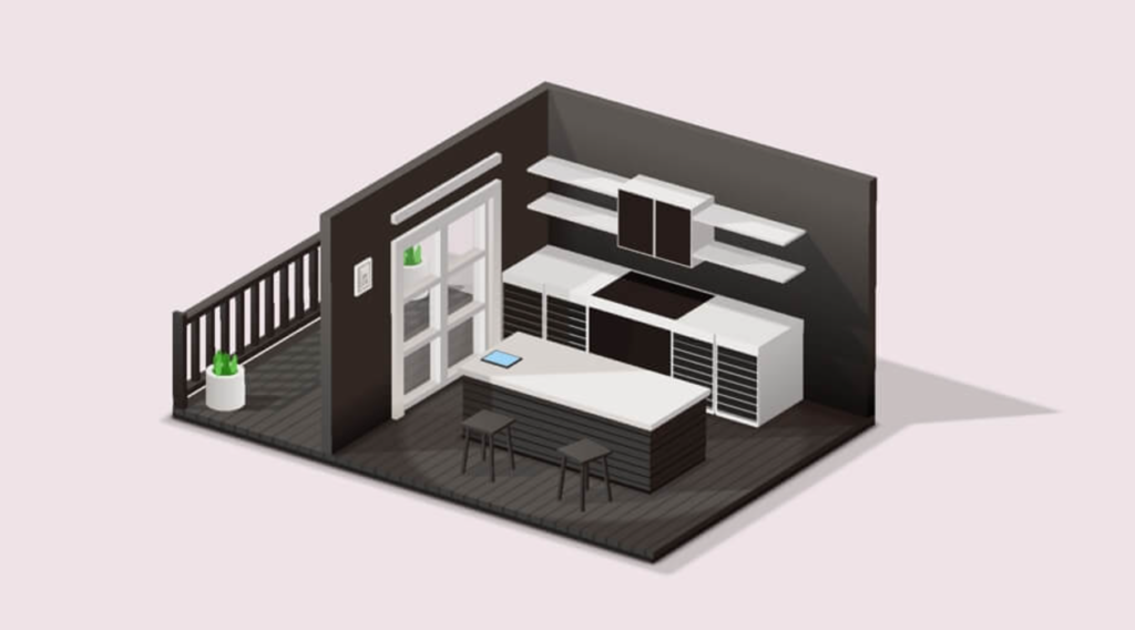
Written by: Piyush Patil
Code Credits: https://codepen.io/ricardoolivaalonso/pen/LYxMWQN
If you found any mistakes or have any doubts please feel free to Contact Us
Hope you find this post helpful💖


