In the realm of web design, engaging user interactions can transform static elements into dynamic experiences that captivate and delight. One effective way to achieve this is by incorporating hover effects into your design, adding an extra layer of interactivity and visual appeal.
In this blog post, we’ll embark on a journey to create stylish cards with captivating hover effects using only HTML and CSS. By harnessing the power of these core web technologies, we’ll unlock the secrets to crafting interactive elements that grab attention and encourage exploration.


I would recommend you don’t just copy and paste the code, just look at the code and type by understanding it.
Demo
See the Pen Hover Panels POC by Jhey (@jh3y) on CodePen.
HTML Code
Starter Template
<!doctype html>
<html lang="en">

<head>
    <!-- Required meta tags -->
    <meta charset="utf-8">
    <meta name="viewport" content="width=device-width, initial-scale=1">

    <!-- CSS -->
    <link rel="stylesheet" href="style.css">

    <title>Cards with hover effect using HTML and CSS - Coding Torque</title>
</head>

<body>
    <!-- Further code here -->

    <script src="script.js"></script>
</body>

</html>
Paste the below code in your <body> tag.
-
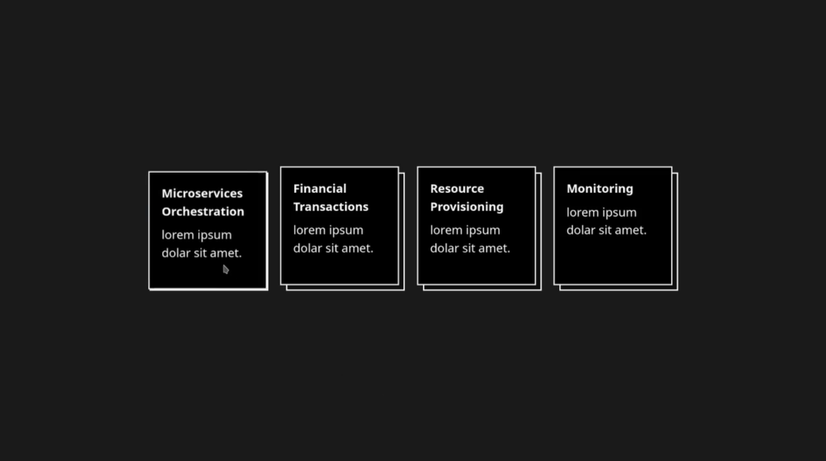
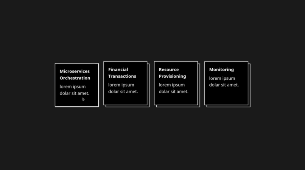
const CASES = [
{
title: 'Microservices Orchestration',
},
{
title: 'Financial Transactions',
},
{
title: 'Resource Provisioning',
},
{
title: 'Monitoring',
},
]
.grid.grid-flow-col.auto-cols-max.gap-6
- for (const item of CASES)
.grid__item.item.w-40.h-40.text-white.relative
.item__content.h-full.w-full.p-4.bg-black.relative.border-2
.font-bold.mb-2= item.title
p lorem ipsum dolar sit amet.CSS Code
Create a file style.css and paste the code below.
*
  box-sizing border-box

body
  min-height 100vh
  display grid
  place-items center
  background hsl(0, 0%, 10%)

.item:before
  content ''
  position absolute
  height 100%
  width 100%
  background hsl(0, 0%, 5%)
  border 2px solid white
  top 0
  left 0

.item__content
  transform translate(-5%, -5%)
  transition transform 0.2s

  &:hover
    transform translate(0, 0)
Final Output
Written by: Piyush Patil
Code Credits: https://codepen.io/jh3y/full/KKWJWbp
If you found any mistakes or have any doubts please feel free to Contact Us
Hope you find this post helpful💖


