In the realm of web design, captivating users’ attention and creating memorable experiences are paramount. One effective way to achieve this is by incorporating interactive elements that engage users and add a touch of flair to your website.
In this blog post, we’ll embark on an exciting journey to create a circular image hover reveal effect using HTML and CSS. By leveraging the power of these core web technologies, we’ll uncover the secrets to adding style and interactivity to your web pages.


I would recommend you don’t just copy and paste the code, just look at the code and type by understanding it.
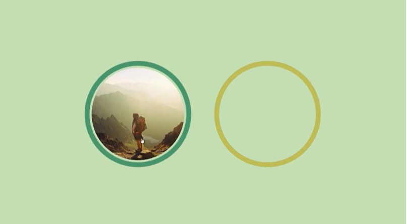
Demo
See the Pen Circular reveal hover effect by Temani Afif (@t_afif) on CodePen.
HTML Code
Starter Template
<!doctype html>
<html lang="en">

<head>
    <!-- Required meta tags -->
    <meta charset="utf-8">
    <meta name="viewport" content="width=device-width, initial-scale=1">

    <!-- CSS -->
    <link rel="stylesheet" href="style.css">

    <title>Circular Image Hover Reveal Effect using HTML and CSS - Coding Torque</title>
</head>

<body>
    <!-- Further code here -->

    <script src="script.js"></script>
</body>

</html>
Paste the below code in your <body> tag.
<img src="https://picsum.photos/id/177/300/300" alt="a man lost in the wild">
<img src="https://picsum.photos/id/325/300/300" alt="a women lost in the wild" style="--c: #BFB35A" class="alt">
CSS Code
Create a file style.css and paste the code below.
@property --a {
  syntax: "<angle>";
  initial-value: 0deg;
  inherits: true;
}

img {
  --w: 200px; /* image width*/
  --b: 10px; /* border thickness */
  --g: 5px; /* the gap */
  --c: #5E8C6A;

  width: var(--w);
  padding: calc(1.5*var(--w));
  margin: calc(var(--b) + var(--g) - 1.5*var(--w));
  border-radius: 50%;
  --_p:calc(var(--w)/2 + var(--g) + var(--b))
    at calc(50% + 25%*cos(var(--a))) calc(75% - 25%*sin(var(--a)));
  background: radial-gradient(var(--_p),
      #0000    calc(100% - var(--b) - 1px),
      var(--c) calc(100%  - var(--b)));
  transform-origin: 50% 75%;
  rotate: calc(var(--a) - 90deg);
  clip-path: circle(var(--_p));
  cursor: pointer;
  --a: 0deg;
  transition: --a .5s;
}
img.alt {
  --_p:calc(var(--w)/2 + var(--g) + var(--b))
    at calc(50% - 25%*cos(var(--a))) calc(75% - 25%*sin(var(--a)));
  rotate: calc(90deg - var(--a));
}
img:hover {
  --a: 90deg;
}


body {
  margin: 0;
  min-height: 100vh;
  display: grid;
  grid-auto-flow: column;
  gap: 50px;
  place-content: center;
  overflow: hidden; /* yes the elements trigger a big overflow but still the effect is cool */
  background: #CAD7B2;
}
Final Output
Written by: Piyush Patil
Code Credits: https://codepen.io/t_afif/full/wvNbXrE
If you found any mistakes or have any doubts please feel free to Contact Us
Hope you find this post helpful💖


