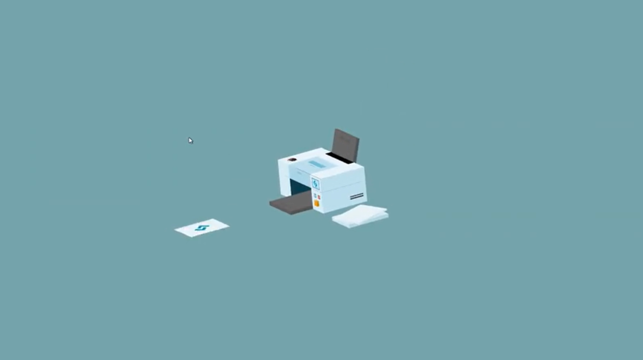
Bring your designs to life by creating a 3D printer using only HTML and CSS! In this blog, we’ll design a visually stunning 3D printer model complete with intricate details like a paper tray, rollers, and a realistic body—all achieved through the power of CSS 3D transforms, gradients, and shadows. Whether you’re replicating a modern gadget for fun or showcasing your CSS expertise, this project will demonstrate how to build depth and detail in your web designs. Ready to print your creativity onto the screen? Let’s start coding!


I would recommend you don’t just copy and paste the code, just look at the code and type by understanding it.
Demo
See the Pen 3D CSS Printer – Press to print! 😅 by Jhey (@jh3y) on CodePen.
HTML Code
Starter Template
<!doctype html>
<html lang="en">

<head>
    <!-- Required meta tags -->
    <meta charset="utf-8">
    <meta name="viewport" content="width=device-width, initial-scale=1">

    <!-- CSS -->
    <link rel="stylesheet" href="style.css">

    <title>Coding Torque</title>
</head>

<body>
    <!-- Further code here -->

</body>

</html>
Paste the below code in your <body> tag.
mixin cuboid()
  .cuboid(class!=attributes.class)
    - let s = 0
    while s < 6
      .cuboid__side
      - s++
.scene
  .printer
    .printer__side.printer__side--left
      +cuboid()(class="cuboid--side")
    .printer__side.printer__side--right
      .cuboid.cuboid--side
        .cuboid__side
        .cuboid__side
        .cuboid__side
        .cuboid__side
          .light.progress-light
          .light.standby-light
          button.print-button
            .button
              +cuboid()(class="cuboid--button")
        .cuboid__side
        .cuboid__side

    .printer__tray.printer__tray--bottom
      +cuboid()(class="cuboid--tray")
    .printer__tray.printer__tray--top
      +cuboid()(class="cuboid--tray")
    .printer__top
      .cuboid.cuboid--top
        .cuboid__side
        .cuboid__side
        .cuboid__side
        .cuboid__side
          .screen
            .screen__preview
              .screen__previews
                img(src="https://assets.codepen.io/605876/css-tricks-icon.svg")
                img(src="https://assets.codepen.io/605876/sitepoint-icon.svg")
                img(src="https://assets.codepen.io/605876/smashing-icon.svg")
                img(src="https://assets.codepen.io/605876/egghead-icon.svg")
                img(src="https://assets.codepen.io/605876/codepen-icon.svg")
        .cuboid__side
        .cuboid__side
    .printer__back
      +cuboid()(class="cuboid--back")
    .printed
      .printed__spinner
        .printed__paper
          .printed__papiere
            .paper-preview
              .paper-preview__previews
                img(src="https://assets.codepen.io/605876/css-tricks-icon.svg")
                img(src="https://assets.codepen.io/605876/sitepoint-icon.svg")
                img(src="https://assets.codepen.io/605876/smashing-icon.svg")
                img(src="https://assets.codepen.io/605876/egghead-icon.svg")
                img(src="https://assets.codepen.io/605876/codepen-icon.svg")
        .printed__paper-back
    .paper-stack.paper-stack--bottom
      +cuboid()(class="cuboid--paper")
    .paper-stack.paper-stack--top
      .cuboid.cuboid--paper
        .cuboid__side
          .paper
            .paper__flyer
        .cuboid__side
        .cuboid__side
        .cuboid__side
        .cuboid__side
        .cuboid__side
CSS Code
Create a file style.css and paste the code below.
.cuboid
  width 100%
  height 100%
  position relative
  // 1 is the top and go t, r, b, l, f, b

  &__side:nth-of-type(1)
    height calc(var(--thickness) * 1vmin)
    width 100%
    position absolute
    top 0
    transform translate(0, -50%) rotateX(90deg)

  &__side:nth-of-type(2)
    height 100%
    width calc(var(--thickness) * 1vmin)
    position absolute
    top 50%
    right 0
    transform translate(50%, -50%) rotateY(90deg)

  &__side:nth-of-type(3)
    width 100%
    height calc(var(--thickness) * 1vmin)
    position absolute
    bottom 0
    transform translate(0%, 50%) rotateX(90deg)

  &__side:nth-of-type(4)
    height 100%
    width calc(var(--thickness) * 1vmin)
    position absolute
    left 0
    top 50%
    transform translate(-50%, -50%) rotateY(90deg)

  &__side:nth-of-type(5)
    height 100%
    width 100%
    transform translate3d(0, 0, calc(var(--thickness) * 0.5vmin))
    position absolute
    top 0
    left 0

  &__side:nth-of-type(6)
    height 100%
    width 100%
    transform translate3d(0, 0, calc(var(--thickness) * -0.5vmin)) rotateY(180deg)
    position absolute
    top 0
    left 0

*
*:after
*:before
  box-sizing border-box
  transform-style preserve-3d
  touch-action none

:root
  --base-size 10
  --depth calc(var(--base-size) * 2.25)
  --height calc(var(--base-size) * 1vmin)
  --width calc(var(--base-size) * 1.4vmin)
  --base-hue 200
  --accent-hue 35
  --bg 'hsl(%s 20% 58%)' % 190
  --shoot-speed 1.5
  --load-speed 2
  --print-speed 1
  // Colors
  --p-1 'hsl(%s, 50%, 94%)' % var(--base-hue)
  --p-2 'hsl(%s, 50%, 90%)' % var(--base-hue)
  --p-3 'hsl(%s, 50%, 84%)' % var(--base-hue)
  --p-4 'hsl(%s, 50%, 80%)' % var(--base-hue)
  --p-5 'hsl(%s, 50%, 76%)' % var(--base-hue)
  --p-6 'hsl(%s, 50%, 72%)' % var(--base-hue)
  --p-7 'hsl(%s, 50%, 68%)' % var(--base-hue)
  --p-8 'hsl(%s, 50%, 20%)' % var(--base-hue)
  --t-1 hsl(0, 0%, 40%)
  --t-2 hsl(0, 0%, 36%)
  --t-3 hsl(0, 0%, 32%)
  --t-4 hsl(0, 0%, 28%)
  --t-5 hsl(0, 0%, 24%)
  --g-1 'hsl(%s, 40%, 94%)' % var(--base-hue)
  --g-2 'hsl(%s, 40%, 90%)' % var(--base-hue)
  --g-3 'hsl(%s, 40%, 86%)' % var(--base-hue)
  --g-4 'hsl(%s, 40%, 80%)' % var(--base-hue)
  --g-5 'hsl(%s, 40%, 96%)' % var(--base-hue)
  --a-1 'hsl(%s, 70%, 65%)' % var(--accent-hue)
  --a-2 'hsl(%s, 70%, 60%)' % var(--accent-hue)
  --a-3 'hsl(%s, 70%, 55%)' % var(--accent-hue)
  --a-4 'hsl(%s, 70%, 50%)' % var(--accent-hue)
  --a-5 'hsl(%s, 70%, 45%)' % var(--accent-hue)


body
  min-height 100vh
  display grid
  place-items center
  background var(--bg)
  overflow hidden
  touch-action none

.light
  height calc(var(--height) * 0.1)
  width calc(var(--height) * 0.1)
  position absolute
  left 50%
  top 20%
  border-radius 0%
  border calc(var(--height) * 0.01) solid var(--p-8)

.standby-light
  background hsla(210, 80%, 80%, 1)
  transform translate(-50%, 0) translate(100%, 0)
.progress-light
  transform translate(-50%, 0) translate(-100%, 0)
  background 'hsla(%s, 80%, 70%)' % var(--progress-hue, 103)

.scene
  position fixed
  top 50%
  left 50%
  height var(--height)
  width var(--width)
  // background hsla(10 80% 70% 0.25)
  transform translate3d(-50%, -50%, 100vmin)
  transform translate3d(-50%, -50%, 100vmin) rotateX(-24deg) rotateY(44deg) rotateX(calc(var(--rotate-x, 0) * 1deg)) rotateY(calc(var(--rotate-y, 0) * 1deg))

.printing
  --progress-hue 14

.printer
  height 100%
  width 100%

  & > *
    position absolute

  &__top
    height 40%
    width 100%

  &__back
    height 60%
    width 50%
    bottom 0
    right 0

  &__side
    height 60%
    width 100%
    bottom 0

    &--right
      transform translate3d(0, 0, calc(var(--depth) * 0.375vmin))

    &--left
      transform translate3d(0, 0, calc(var(--depth) * -0.375vmin))

  &__tray
    height 10%
    width 100%

    &--bottom
      bottom 0
      right 50%

    &--top
      top 0
      right 0
      transform translate(52%, 0) rotate(-75deg)

.paper-stack
  width 90%
  bottom 0
  left -10%
  transform translate3d(0, 0, calc(var(--depth) * 1vmin))

  &--bottom
    height 10%

  &--top
    height 5%
    bottom 10%
    transform translate3d(0, 0, calc(var(--depth) * 1vmin)) rotateY(22deg)

.printed
  right 55%
  width calc(var(--width) * 0.9)
  height calc(var(--depth) * 0.4vmin)
  bottom 10%
  transform translate3d(0, -1px, 0)

  &__spinner
    width calc(var(--width) * 0.9)
    height calc(var(--depth) * 0.4vmin)
    transform-origin 50% 0

  &__paper
    width calc(var(--width) * 0.9)
    height calc(var(--depth) * 0.4vmin)
    bottom 0
    transform translate(0, 50%) rotateX(90deg)
    clip-path inset(0 -20% 0 0)
    backface-visibility hidden

  &__paper-back
    width calc(var(--width) * 0.9)
    height calc(var(--depth) * 0.4vmin)
    bottom 0
    position absolute
    top 0
    left 0
    transform translate(0, 50%) rotateX(90deg) rotateY(180deg)
    backface-visibility hidden
    background var(--g-2)

  &__papiere
    background var(--g-1)
    position absolute
    height 100%
    width 100%
    transform translate(120%, 0)

.paper-preview
  height calc(var(--height) * 0.5)
  width calc(var(--height) * 0.5)
  position absolute
  top 50%
  left 50%
  transform translate(-50%, -50%) rotate(90deg)
  overflow hidden

  &__previews
    height 100%
    width 100%
    opacity 0
    display flex
    flex-direction column
    animation choose 0.1s infinite steps(5)

    img
      height 100%
      width 100%
      object-fit cover

.paper-stack--top .cuboid--paper > div
  &:nth-of-type(1)
    background var(--g-1)
  &:nth-of-type(2)
    background var(--g-1)
  &:nth-of-type(3)
    background var(--g-4)
  &:nth-of-type(4)
    background var(--g-2)
  &:nth-of-type(5)
    background var(--g-3)
  &:nth-of-type(6)
    background var(--g-3)

.paper-stack--top .cuboid--paper .paper
  height 100%
  width 100%
  background transparent

  &__flyer
    position absolute
    height 100%
    width 100%
    top 0
    left 0
    background transparent
    overflow hidden

    &:after
      content ''
      position absolute
      height 100%
      width 100%
      background var(--g-1)


.printing .paper-stack--top .cuboid--paper .paper
  animation transfer calc(var(--load-speed) * 0.5s) ease-in-out forwards
.printing .paper-stack--top .cuboid--paper .paper__flyer
  animation fly calc(var(--load-speed) * 0.5s) ease-in-out forwards
.printing .paper-stack--top .cuboid--paper .paper__flyer:after
  animation feed calc(var(--load-speed) * 0.5s) calc(var(--load-speed) * 0.5s) forwards
.printing .printed
  animation shoot calc(var(--shoot-speed) * 1s) calc(((var(--load-speed) * 0.75) + var(--print-speed)) * 1s) ease-out
.printing .printed__spinner
  animation eject calc(var(--shoot-speed) * 1s) calc(((var(--load-speed) * 0.75) + var(--print-speed)) * 1s) ease-out
.printing .printed__papiere
  animation print calc(var(--print-speed) * 1s) calc(var(--load-speed) * 0.75s) both steps(5, start), fade calc(var(--shoot-speed) * 1s) calc(((var(--load-speed) * 0.75) + var(--print-speed)) * 1s) both

.cuboid--paper
  --thickness calc(var(--depth) * 0.4)

  div
    &:nth-of-type(1)
      background var(--g-2)
    &:nth-of-type(2)
      background var(--g-2)
    &:nth-of-type(3)
      background var(--g-5)
    &:nth-of-type(4)
      background var(--g-3)
    &:nth-of-type(5)
      background var(--g-4)
    &:nth-of-type(6)
      background var(--g-4)


.print-button
  position absolute
  top 60%
  left 50%
  transform translate(-50%, -50%)
  height 44px
  width 44px
  appearance none
  border 0
  background 0
  padding 0
  margin 0
  outline transparent
  cursor pointer

.button
  height calc(var(--height) * 0.14)
  width calc(var(--height) * 0.14)
  position absolute
  top 50%
  left 50%
  transform translate3d(-50%, -50%, 0)

.print-button:active .button
  transform translate3d(-50%, -50%, calc(var(--height) * 0.05))

.cuboid--button
  --thickness calc(var(--base-size) * 0.12)

  div
    &:nth-of-type(1)
      background var(--a-1)
    &:nth-of-type(2)
      background var(--a-1)
    &:nth-of-type(3)
      background var(--a-4)
    &:nth-of-type(4)
      background var(--a-5)
    &:nth-of-type(5)
      background var(--a-3)
    &:nth-of-type(6)
      background var(--a-3)

.printing .screen__previews
.printing .paper-preview__previews
  animation-play-state paused
  opacity 1

.screen
  height calc(var(--height) * 0.25)
  width calc(var(--height) * 0.35)
  left 0
  top 50%
  background hsl(200, 80%, 84%)
  position absolute
  transform translate3d(28%, -50%, -1px)
  outline calc(var(--height) * 0.01) solid var(--p-8)

  &__preview
    height 100%
    width calc(var(--height) * 0.25)
    position absolute
    left 50%
    top 50%
    transform translate(-50%, -50%) scale(0.8) rotateY(180deg) translate3d(0, 0, 1px)
    overflow hidden


.screen__previews
  height 100%
  width 100%
  opacity 0
  display flex
  flex-direction column
  animation choose 0.1s infinite steps(5, end)

  img
    height 100%
    width 100%

@keyframes choose
  to
    transform translate(0, -500%)


.cuboid--top
  --thickness var(--depth)

  & > div
    &:nth-of-type(1)
      background linear-gradient(hsl(0, 0%, 0%), hsl(0, 0%, 0%)) 100% 50% / 14% 54% no-repeat,
        linear-gradient(var(--p-7), var(--p-7)) 40% 50% / 12% 32% no-repeat,
        linear-gradient(var(--p-7), var(--p-7)) 30% 50% / 2% 12% no-repeat,
        linear-gradient(var(--p-3), var(--p-3)) 0% 50% / 66% 50% no-repeat
      background-color var(--p-1)

      &:after
        content ''
        position absolute
        top 7%
        left 10%
        height calc(var(--depth) * 0.12vmin)
        width calc(var(--depth) * 0.12vmin)
        background url(https://assets.codepen.io/605876/avatar.png)
        background-size cover
        transform rotate(90deg)
        filter grayscale(0.5)

    &:nth-of-type(2)
      background var(--p-1)
    &:nth-of-type(3)
      background var(--p-8)
    &:nth-of-type(4)
      background linear-gradient(var(--p-4), var(--p-4)) 50% 0% / 50% 100% no-repeat
      background-color var(--p-2)

      &:after
        content ''
        position absolute
        top 25%
        left 50%
        height 15%
        width 10%
        border-radius 25%
        background var(--p-6)
        transform translate3d(-50%, -50%, -1px)

    &:nth-of-type(5)
      background var(--p-3)
    &:nth-of-type(6)
      background var(--p-3)

.cuboid--back
  --thickness calc(var(--depth) * 0.5)

  div
    &:nth-of-type(1)
      background var(--p-1)
    &:nth-of-type(2)
      background var(--t-1)
    &:nth-of-type(3)
      background var(--p-2)
    &:nth-of-type(4)
      background var(--t-5)
    &:nth-of-type(5)
      background var(--p-3)
    &:nth-of-type(6)
      background var(--p-3)

.printer__tray--top .cuboid--tray div:nth-of-type(1)
  background linear-gradient(var(--t-2), var(--t-2)) 90% 50% / 5% 50% no-repeat
  background-color var(--t-1)

.cuboid--tray
  --thickness calc(var(--depth) * 0.5)

  div
    &:nth-of-type(1)
      background linear-gradient(var(--t-2), var(--t-2)) 10% 50% / 5% 50% no-repeat
      background-color var(--t-1)
    &:nth-of-type(2)
      background var(--t-1)
    &:nth-of-type(3)
      background var(--t-2)
    &:nth-of-type(4)
      background var(--t-2)
    &:nth-of-type(5)
      background var(--t-3)
    &:nth-of-type(6)
      background var(--t-3)

.cuboid--side
  --thickness calc(var(--depth) * 0.25)

  & > div
    &:nth-of-type(1)
      background var(--p-1)
    &:nth-of-type(2)
      background var(--p-1)
    &:nth-of-type(3)
      background var(--p-2)
    &:nth-of-type(4)
      background var(--p-2)
    &:nth-of-type(5)
      background repeating-linear-gradient(var(--t-4) 0 25%, transparent 25% 50%) 90% 70% / 30% 20% no-repeat
      background-color var(--p-3)
    &:nth-of-type(6)
      background repeating-linear-gradient(var(--t-4) 0 25%, transparent 25% 50%) 90% 70% / 30% 25% no-repeat
      background-color var(--p-3)

.printer__side--left > .cuboid > div:nth-of-type(5)
.printer__side--right > .cuboid > div:nth-of-type(6)
  background var(--p-8)

@keyframes fade
  0%, 80%
    opacity 1
  100%
    opacity 0

@keyframes shoot
  0%
    transform translate3d(0%, -1px, 0)
  100%
    transform translate3d(-300%, -1px, 0)

@keyframes eject
  15%
    transform rotate(0deg)
  65%, 100%
    transform rotate(360deg)

@keyframes transfer
  to
    transform translate(0, -270%) rotate(22deg)

@keyframes feed
  to
    transform translate(100%, 0)

@keyframes fly
  0%
    transform translate3d(0, 0, 0) rotateY(0deg) translate(0, 0)
  50%
    transform translate3d(140%, 0, calc(var(--height) * 1.2)) rotateY(-75deg) translate(180%, 0)
  100%
    transform translate3d(140%, 0, var(--height)) rotateY(-75deg) translate(0%, 0) rotate(-180deg)

@keyframes print
  to
    transform translate(0, 0)
Final Output

Written by: Piyush Patil
Code Credits: https://codepen.io/jh3y/pen/gOgjKOO
If you found any mistakes or have any doubts please feel free to Contact Us
Hope you find this post helpful💖


