
Welcome to our latest blog post, where we’re about to embark on a tail-wagging journey into the world of web development! Today, we’re excited to introduce you to the art of creating a Dog Info Card with a delightful transition effect, using the dynamic trio of HTML, CSS, and JavaScript.


I would recommend you don’t just copy and paste the code, just look at the code and type by understanding it.
Demo
See the Pen Figure & Figcaption by Tobias Glaus (@tobiasglaus) on CodePen.
HTML Code
Starter Template
<!doctype html>
<html lang="en">

<head>
    <!-- Required meta tags -->
    <meta charset="utf-8">
    <meta name="viewport" content="width=device-width, initial-scale=1">

    <!-- CSS -->
    <link rel="stylesheet" href="style.css">

    <title> using HTML CSS and JavaScript - Coding Torque</title>
</head>

<body>
    <!-- Further code here -->

    <script src="script.js"></script>
</body>

</html>
Paste the below code in your <body> tag.
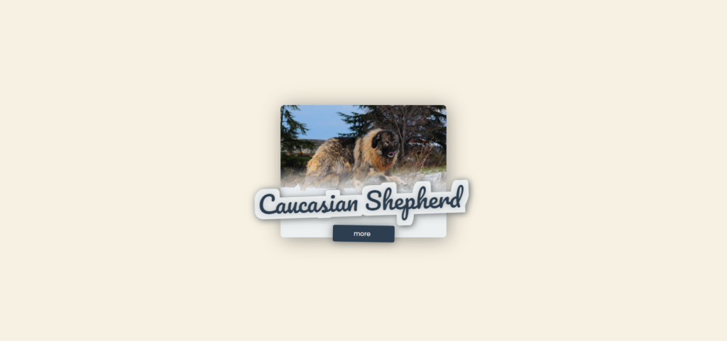
<figure>
  <svg version="1.1" xmlns="http://www.w3.org/2000/svg" xmlns:xlink="http://www.w3.org/1999/xlink">
    <defs>
      <filter id="outline" mask="url(#mask)">
        <feFlood flood-color="#ecf0f1" result="base"/>
        <feMorphology in="SourceGraphic" operator="dilate" radius="10"/>
        <feComposite in="base" operator="in"/>
        <feBlend in="SourceGraphic" mode="normal"/>
        <feDropShadow stdDeviation="6"/>
      </filter>
    </defs>
  </svg>

  <div class="img"></div>

  <figcaption>
    <span>The</span>
    <span>Caucasian Shepherd </span>
    <span>is a large breed of dog that is popular in Russia, Armenia, Azerbaijan, and Mexico. It is extremely popular in Georgia, which has always been the principal region of penetration of Caucasian shepherd dogs.</span>
  </figcaption>

  <button></button>
</figure>
CSS Code
Create a file style.css and paste the code below.
$blue: #2c3e50;
$grey: #ecf0f1;

* {
  margin: 0;
  padding: 0;
  box-sizing: border-box;
  font-family: "Poppins", sans-serif;
  transition: 1s cubic-bezier(.59,-0.43,.17,1.16);
}

// basic styling
body {
  display: flex;
  justify-content: center;
  align-items: center;
  height: 100vh;
  overflow: hidden;
  perspective: 800px;
  background:#f7f1e3;
}

figure {
  width: 350px;
  box-shadow: 3px 3px 40px 0 rgba(0, 0, 0, 0.4);
  border-radius: 8px;
  position: relative;
  pointer-events: none;
  background: #ecf0f1;
  transition: 0.3s ease-in-out;

  .img {
    width: 100%;
    height: 200px;
    border-radius: 8px 8px 0 0;
    background: url("https://animalso.com/wp-content/uploads/2018/04/caucasian-mountain-shepherd-4-809x508.jpg");
    background-size: 350px auto;
    background-repeat: no-repeat;

    &:after{
      content:"";
      position:absolute;
      bottom:0;
      left:0;
      width:100%;
      height:150px;
      background:linear-gradient(transparent, #ecf0f1 44%);
      border-radius:0 0 8px 8px;
    }
  }

  figcaption {
    height: 80px;
    display: flex;
    align-items: center;
    justify-content: center;
    flex-wrap: wrap;
    position: relative;
    overflow: visible;
    background: $grey;
    border-radius: 0 0 8px 8px;
    // max-height: 280px;

    span {
      width: 100%;

      &:nth-child(1) { // The
        position: absolute;
        font-family: "Pacifico", cursive;
        font-size: 30px;
        top: 0;
        opacity: 0;
        left: 0;
        color: $blue;
        text-shadow: 0 0 15px rgba(0, 0, 0, 0.3);
      }
      &:nth-child(2) { // Caucasian Shepherd
        filter: url("#outline");
        font-family: "Pacifico", cursive;
        font-size: 52px;
        overflow: visible;
        position: absolute;
        top: -42px;
        left: -48px;
        white-space: nowrap;
        color: $blue;
        z-index: 10;
        transform: rotate(-2deg);
        text-shadow: 0 0 15px rgba(0, 0, 0, 0.5);
        transition: top 0.3s ease-in-out;
      }
      &:nth-child(3) { // text
        opacity: 0;
        padding: 0 20px;
        height: 20px;
        overflow: hidden;
        cursor: text;
      }
    }
  }

  button {
    position: absolute;
    bottom: -10px;
    width: 130px;
    left: calc(50% - 65px);
    background: $blue;
    color: #fff;
    border: 0;
    height: 35px;
    border-radius: 4px;
    transform: rotate(1deg);
    box-shadow: 0 0 20px 0 rgba(0, 0, 0, 0.5);
    cursor: pointer;
    pointer-events: auto;
    transition: 0.3s ease-in-out;
    overflow: hidden;
    z-index:20;

    &:focus {
      outline: 0;
    }

    &:before {
      content: "more";
      position: absolute;
      top: 8px;
      left: 44px;
      opacity: 1;
      transition: 1s cubic-bezier(0.55, -0.62, 0.27, 1.2);
    }
    &:after {
      content: "back";
      opacity: 0;
      top: 8px;
      left: 0;
      position: absolute;
      transition: 1s cubic-bezier(0.55, -0.62, 0.27, 1.2);
    }
  }

  // hover effect
  &:hover {
    transition: 0.3s ease-in-out;
    transform: rotateX(-2deg);
    box-shadow: 3px -3px 40px 0 rgba(0, 0, 0, 0.4);

    button {
      background: #4f6780;
      bottom: -13px;
      transition: 0.3s ease-in-out;
    }
    span:nth-child(2) {
      top: -39px;
      transition: top 0.3s ease-in-out;
    }
  }

  // when open
  &.open {
    .img {
      height: 0;
    }
    figcaption {
      height: 280px;
      border-radius: 8px;

      span {
        &:nth-child(1) {
          top: -25px;
          opacity: 1;
        }
        &:nth-child(2) {
          top: -18px;
        }
        &:nth-child(3) {
          height: 100%;
          opacity: 1;
          padding: 80px 20px 40px 20px;
        }
      }
    }
    button {
      &:before {
        opacity: 0;
        left: 100%;
      }
      &:after {
        opacity: 1;
        left: 47px;
      }
    }

    // when open and hover
    &:hover {
      figcaption {
        span:nth-child(2) {
          top: -15px;
          transition: top 0.3s ease-in-out;
        }
      }
    }
  }
  svg{
    position:absolute;
    bottom:0;
    width:350px;
  }
}
JavaScript Code
Create a file script.js and paste the code below.
$("button").click(function() {
  $("figure").toggleClass("open");
});
Final Output
Written by: Piyush Patil
Code Credits: https://codepen.io/tobiasglaus/pen/VBpgXM
If you found any mistakes or have any doubts please feel free to Contact Us
Hope you find this post helpful💖


