
As Easter approaches, the air is filled with anticipation and joy, and what better way to celebrate than by adorning your website with a festive Easter-themed hero section? Harnessing the magic of HTML and CSS, we can create an enchanting digital landscape that welcomes visitors with animated delights reminiscent of a springtime wonderland.
In this blog post, we embark on a whimsical journey to craft an Easter hero section complete with charming animations, using only HTML and CSS. From bouncing bunnies to colorful eggs, we’ll explore how to breathe life into our design, captivating users and spreading the joy of the season.


I would recommend you don’t just copy and paste the code, just look at the code and type by understanding it.
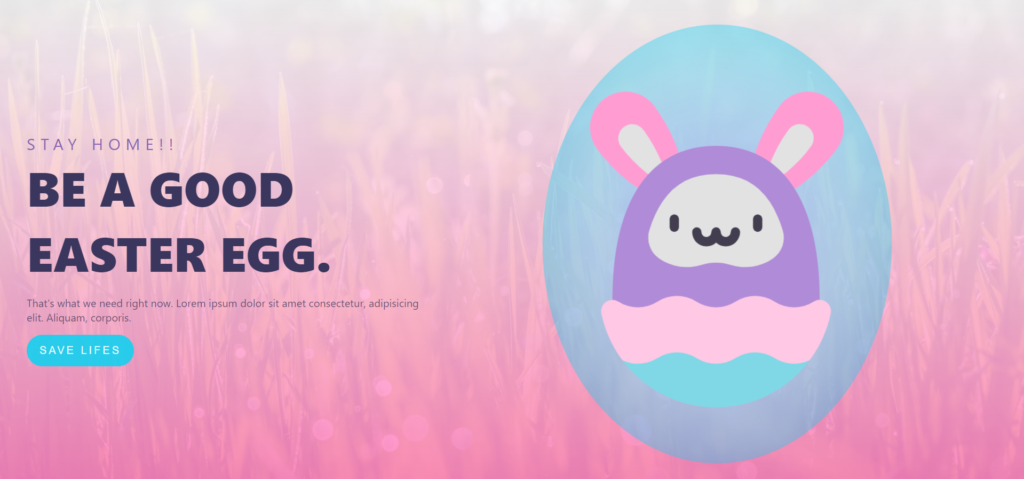
Demo
See the Pen Easter hero – CodePen Challenge by Johana Morales (@hourwinner) on CodePen.
HTML Code
Starter Template
<!doctype html>
<html lang="en">

<head>
    <!-- Required meta tags -->
    <meta charset="utf-8">
    <meta name="viewport" content="width=device-width, initial-scale=1">

    <!-- CSS -->
    <link rel="stylesheet" href="style.css">

    <title>Easter Hero with Animations using HTML and CSS - Coding Torque</title>
</head>

<body>
    <!-- Further code here -->

    <script src="script.js"></script>
</body>

</html>
Paste the below code in your <body> tag.
<div class="background"></div>
<div class="background-texture"></div>
<header class="header">
  <div class="left-content">
    <p class="stay-home">Stay Home!!</p>
    <h1>Be a good Easter egg.</h1>
    <p></p>
    <p class="para">
      That's what we need right now. Lorem ipsum dolor sit amet consectetur,
      adipisicing elit. Aliquam, corporis.
    </p>
    <button>Save Lifes</button>
  </div>
  <svg width="60vw" height="90vh" viewBox="0 0 728 914" fill="none" xmlns="http://www.w3.org/2000/svg">
    <g id="Drawing">
      <g id="Ellipse 1" filter="url(#filter0_b)">
        <ellipse cx="364" cy="457" rx="364" ry="457" fill="#14D0F0" fill-opacity="0.39" style="mix-blend-mode: overlay;" />
        <ellipse cx="364" cy="457" rx="364" ry="457" fill="url(#paint0_angular)" />
      </g>
      <g id="in-drawing">
        <g id="leftEar">
          <path id="Vector" d="M128.977 175.833C161.935 151.115 208.536 157.998 233.067 191.206C311.87 297.883 301.251 409.044 301.251 409.044C301.251 409.044 192.523 387.391 113.72 280.714C89.1897 247.506 96.0204 200.549 128.977 175.833V175.833Z" fill="#FF9DD3" />
          <path id="Vector_2" d="M158.114 254.105C159.183 246.381 163.173 239.539 169.348 234.839C172.064 232.773 175.05 231.222 178.226 230.231C189.849 226.602 202.593 230.744 209.934 240.539C241.972 283.279 257.274 327.301 264.506 361.779C233.568 345.341 195.73 318.473 163.691 275.733C159.027 269.51 157.047 261.829 158.114 254.105V254.105Z" fill="#E2E2E2" />
        </g>
        <g id="rightEar">
          <path id="Vector_3" d="M598.022 175.833C565.065 151.115 518.464 157.998 493.933 191.206C415.13 297.883 425.749 409.044 425.749 409.044C425.749 409.044 534.476 387.391 613.279 280.714C637.81 247.506 630.98 200.549 598.022 175.833V175.833Z" fill="#FF9DD3" />
          <path id="Vector_4" d="M564.833 253.73C563.71 246.014 559.673 239.201 553.465 234.544C550.735 232.498 547.737 230.968 544.555 230C532.907 226.453 520.192 230.686 512.92 240.533C481.181 283.499 466.188 327.628 459.197 362.157C490.018 345.499 527.668 318.364 559.408 275.398C564.028 269.141 565.954 261.446 564.833 253.73V253.73Z" fill="#E2E2E2" />
        </g>
        <path id="Vector_5" d="M166.471 709.899C211.036 769.481 281.857 808 361.619 808C441.38 808 512.202 769.481 556.767 709.899V646.56H166.471V709.899Z" fill="#80D8E6" />
        <path id="body" d="M145.632 584.077C145.632 380.247 221.847 263.415 361.619 263.415C501.39 263.415 577.605 380.247 577.605 584.077L556.767 646.56H166.471L145.632 584.077Z" fill="#B08BD7" />
        <path id="Vector_6" d="M600.606 612.789C593.13 648.645 577.903 681.642 556.767 709.898C533.44 720.932 505.877 719.391 483.717 705.314C471.277 697.415 457.152 693.472 443.026 693.472C428.888 693.472 414.75 697.415 402.323 705.314C389.895 713.214 375.757 717.157 361.619 717.157C347.481 717.157 333.343 713.214 320.915 705.314C308.487 697.415 294.349 693.472 280.211 693.472C266.086 693.472 251.961 697.415 239.52 705.314C227.08 713.214 212.955 717.157 198.817 717.157C187.762 717.157 176.708 714.741 166.471 709.897C145.335 681.641 130.108 648.644 122.631 612.788C119.339 596.988 131.728 584.074 145.634 584.074C149.781 584.074 154.07 585.224 158.113 587.796C170.553 595.695 184.678 599.639 198.817 599.639C212.955 599.639 227.08 595.695 239.52 587.796C251.961 579.897 266.086 575.953 280.211 575.953C294.349 575.953 308.487 579.897 320.915 587.796C333.343 595.695 347.481 599.639 361.619 599.639C375.757 599.639 389.895 595.695 402.323 587.796C414.75 579.897 428.888 575.953 443.026 575.953C457.152 575.953 471.277 579.897 483.717 587.796C508.585 603.596 540.257 603.596 565.125 587.796C582.71 576.621 604.883 592.277 600.606 612.789Z" fill="#FFC8E5" />
        <path id="Vector_7" d="M500.518 438.65C493.47 415.976 484.486 396.345 473.649 380.118C447.601 341.129 410.967 322.169 361.619 322.169C312.27 322.169 275.636 341.129 249.589 380.118C238.752 396.345 229.767 415.976 222.719 438.65C215.853 460.74 224.001 484.771 242.934 497.885C268.751 515.765 301.287 520.714 331.193 511.307C351.005 505.075 372.232 505.075 392.044 511.307C421.949 520.714 454.485 515.765 480.303 497.885C499.237 484.771 507.385 460.74 500.518 438.65V438.65Z" fill="#E2E2E2" />
        <g id="face">
          <g id="eyes">
            <path id="Vector_8" d="M274.598 406.141C269.245 406.141 264.908 410.513 264.908 415.905V432.732C264.908 438.124 269.245 442.496 274.598 442.496C279.95 442.496 284.287 438.124 284.287 432.732V415.905C284.287 410.513 279.949 406.141 274.598 406.141Z" fill="#423E4F" />
            <path id="Vector_9" d="M448.418 406.141C443.065 406.141 438.728 410.513 438.728 415.905V432.732C438.728 438.124 443.065 442.496 448.418 442.496C453.771 442.496 458.108 438.124 458.108 432.732V415.905C458.108 410.513 453.769 406.141 448.418 406.141Z" fill="#423E4F" />
          </g>
          <path id="Vector_10" d="M401.996 433.001C396.643 433.001 392.306 437.373 392.306 442.765C392.306 448.559 387.628 453.273 381.878 453.273C376.129 453.273 371.451 448.559 371.451 442.765C371.451 437.373 367.114 433.001 361.761 433.001C356.408 433.001 352.071 437.373 352.071 442.765C352.071 448.559 347.393 453.273 341.643 453.273C335.894 453.273 331.216 448.559 331.216 442.765C331.216 437.373 326.879 433.001 321.526 433.001C316.173 433.001 311.836 437.373 311.836 442.765C311.836 459.327 325.208 472.8 341.643 472.8C349.39 472.8 356.455 469.805 361.761 464.906C367.067 469.805 374.132 472.8 381.878 472.8C398.315 472.8 411.686 459.327 411.686 442.765C411.686 437.373 407.348 433.001 401.996 433.001Z" fill="#423E4F" />
        </g>
      </g>
    </g>
    <defs>
      <filter id="filter0_b" x="-4" y="-4" width="736" height="922" filterUnits="userSpaceOnUse" color-interpolation-filters="sRGB">
        <feFlood flood-opacity="0" result="BackgroundImageFix" />
        <feGaussianBlur in="BackgroundImage" stdDeviation="2" />
        <feComposite in2="SourceAlpha" operator="in" result="effect1_backgroundBlur" />
        <feBlend mode="normal" in="SourceGraphic" in2="effect1_backgroundBlur" result="shape" />
      </filter>
      <radialGradient id="paint0_angular" cx="0" cy="0" r="1" gradientUnits="userSpaceOnUse" gradientTransform="translate(364 457) rotate(90) scale(457 364)">
        <stop stop-color="#8693E6" />
        <stop offset="1" stop-color="white" stop-opacity="0" />
      </radialGradient>
    </defs>
  </svg>
</header>
<script src="main.js"></script>
CSS(SCSS) Code
Create a file style.css and paste the code below.
:root {
  --blue: #14d0f0e6;
  --pink: rgba(255, 131, 195, 0.4);
  --white: rgba(255, 255, 255, 0.9);
}

body {
  font: 100% system-ui, sans-serif;
  box-sizing: border-box;
  overflow: hidden;
  margin: 0;
}

.background {
  background-image: url(https://images.unsplash.com/photo-1554692760-4b7e52978fb6?ixlib=rb-1.2.1&ixid=eyJhcHBfaWQiOjEyMDd9&auto=format&fit=crop&w=1650&q=80);
  background-size: cover;
  background-repeat: no-repeat;
  background-color: #252746;
  background-position: center;
  width: 100vw;
  height: 100vh;
  position: absolute;
  z-index: 0;
  top: 0;
  left: 0;
}

.background-texture {
  background: linear-gradient(
    to top,
    rgba(255, 131, 195, 0.9),
    rgba(255, 255, 255, 0.9)
  );
  background-size: cover;
  width: 100vw;
  height: 100vh;
  position: absolute;
  z-index: 0;
  top: 0;
  left: 0;
}

.header {
  width: 100%;
  height: 80px;
  height: 100vh;
  display: flex;
  justify-content: space-between;
  align-items: center;
  position: relative;
  z-index: 1;
}

.left-content {
  width: 40vw;
  padding-left: 40px;
}

.stay-home {
  font-size: 1.5rem;
  text-transform: uppercase;
  letter-spacing: 0.5rem;
  margin-bottom: 0;
  color: #8b64b4;
}

h1 {
  margin: 0 0 1rem 0;
  font-weight: 900;
  font-size: 4.5rem;
  text-transform: uppercase;
  color: #3b365e;
}

.para {
  color: #3b365ecb;
}

button {
  padding: 0.9rem 1.2rem;
  border-radius: 25px;
  background-color: var(--blue);
  border: 0;
  text-transform: uppercase;
  letter-spacing: 0.2rem;
  font-size: 1rem;
  color: var(--white);
  cursor: pointer;
}

svg {
  position: absolute;
  min-height: 300px;
  right: 0;
  top: 40px;
}

#rightEar,
#leftEar,
#in-drawing {
  animation: ear 2s linear infinite;
}

@keyframes ear {
  0%,
  20%,
  50%,
  80%,
  100% {
    transform: translateY(0);
  }
  40% {
    transform: translateY(-30px);
  }
  60% {
    transform: translateY(-15px);
  }
}
Final Output
Written by: Piyush Patil
Code Credits: https://codepen.io/hourwinner/full/VwvwgWw
If you found any mistakes or have any doubts please feel free to Contact Us
Hope you find this post helpful💖


