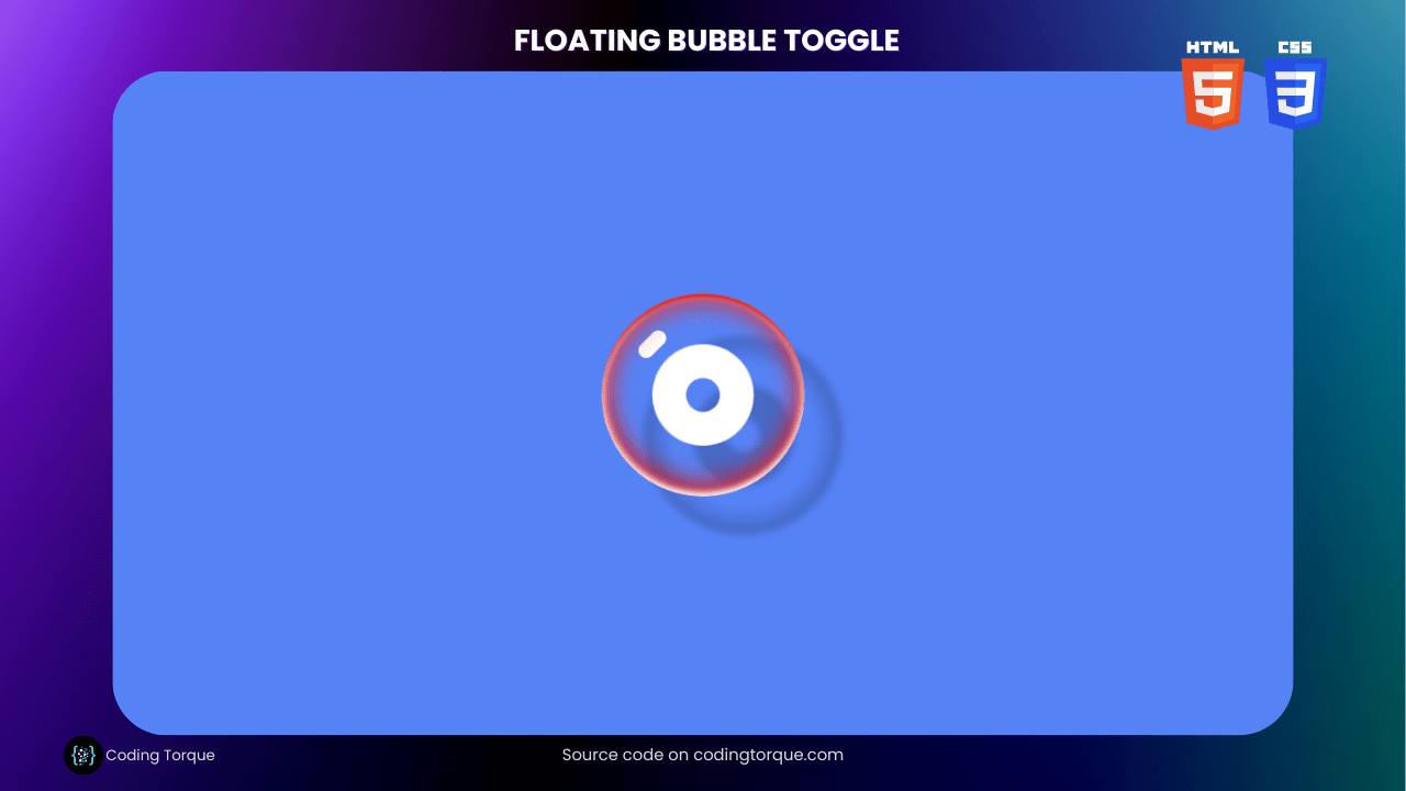
Looking to add some fun and interactive elements to your website or application? A floating bubble toggle button can be a great way to add some visual interest and functionality to your design. In this tutorial, we’ll show you how to create a beautiful and engaging floating bubble toggle button using only HTML and CSS. You’ll learn how to use HTML to create the structure of the button and style it with CSS to give it a unique and eye-catching appearance. We’ll also cover how to add hover and click effects to make your button more interactive and user-friendly. By the end of this tutorial, you’ll have a fully-functional and visually stunning floating bubble toggle button that you can use to enhance the user experience on your website or application. So, let’s get started on creating a beautiful and engaging floating bubble toggle button using HTML and CSS!
Before we start here are 50 projects to create using HTML CSS and JavaScript –
I would recommend you don’t just copy and paste the code, just look at the code and type by understanding it.
Demo
HTML Code
Starter Template
<!doctype html>
<html lang="en">

<head>
    <!-- Required meta tags -->
    <meta charset="utf-8">
    <meta name="viewport" content="width=device-width, initial-scale=1">

    <!-- CSS -->
    <link rel="stylesheet" href="style.css">

    <title>Floating Bubble Toggle Button using HTML and CSS - Coding Torque</title>
</head>

<body>
    <!-- Further code here -->
</body>

</html>
Paste the below code in your <body> tag.
<label><input class="bubble" type="checkbox" name="dummy" value="on"></label>
CSS Code
Create a file style.css and paste the code below.
* {
  border: 0;
  box-sizing: border-box;
  margin: 0;
  padding: 0;
}
:root {
  --bubbleTiming: cubic-bezier(0.5, 0.15, 0.25, 1.75);
  font-size: calc(40px + (60 - 40) * (100vw - 320px) / (1280 - 320));
}
body,
input {
  font: 1em/1.5 sans-serif;
}
body {
  background: hsl(223, 90%, 65%);
  display: grid;
  height: 100vh;
  place-items: center;
}
label,
.bubble {
  display: block;
  -webkit-tap-highlight-color: transparent;
}
label {
  animation: float 4s ease-in-out infinite;
}
.bubble,
.bubble:before,
.bubble:after {
  transition-duration: 0.2s;
}
.bubble,
.bubble:after {
  border-radius: 50%;
}
.bubble {
  background-image: radial-gradient(
      8% 8% at 22% 28%,
      hsl(0, 0%, 100%) 45%,
      hsla(0, 0%, 100%, 0) 50%
    ),
    radial-gradient(
      8% 8% at 23% 27%,
      hsl(0, 0%, 100%) 45%,
      hsla(0, 0%, 100%, 0) 50%
    ),
    radial-gradient(
      8% 8% at 24% 26%,
      hsl(0, 0%, 100%) 45%,
      hsla(0, 0%, 100%, 0) 50%
    ),
    radial-gradient(
      8% 8% at 25% 25%,
      hsl(0, 0%, 100%) 45%,
      hsla(0, 0%, 100%, 0) 50%
    ),
    radial-gradient(
      8% 8% at 26% 24%,
      hsl(0, 0%, 100%) 45%,
      hsla(0, 0%, 100%, 0) 50%
    ),
    radial-gradient(
      8% 8% at 27% 23%,
      hsl(0, 0%, 100%) 45%,
      hsla(0, 0%, 100%, 0) 50%
    ),
    radial-gradient(
      8% 8% at 28% 22%,
      hsl(0, 0%, 100%) 45%,
      hsla(0, 0%, 100%, 0) 50%
    );
  box-shadow: 0 -0.06em 0.1em hsl(0, 90%, 100%) inset,
    0 -0.15em 0.4em hsl(0, 90%, 45%) inset,
    0 0.05em 0.05em hsl(0, 90%, 45%) inset,
    0.05em 0 0.1em hsl(0, 90%, 100%) inset,
    -0.05em 0 0.1em hsl(0, 90%, 100%) inset,
    0 0.1em 0.4em hsl(0, 90%, 60%) inset;
  cursor: pointer;
  position: relative;
  width: 3em;
  height: 3em;
  transform-style: preserve-3d;
  transition-property: box-shadow, transform, width, height;
  transition-timing-function: ease-in-out, ease-in-out, var(--bubbleTiming),
    var(--bubbleTiming);
  will-change: transform;
  -webkit-appearance: none;
  appearance: none;
  z-index: 0;
}
.bubble:before,
.bubble:after {
  content: "";
  display: block;
  position: absolute;
  transition-timing-function: var(--bubbleTiming);
}
.bubble:before {
  border-radius: 0.75em;
  box-shadow: 0 0 0 0.5em hsl(0, 0%, 100%) inset;
  filter: drop-shadow(0.6em 0.6em 4px hsla(0, 0%, 0%, 0.2));
  top: 50%;
  left: 50%;
  width: 1.5em;
  height: 1.5em;
  transform: translate3d(-50%, -50%, -1px);
  z-index: -1;
}
.bubble:after {
  background: radial-gradient(
    100% 100% at center,
    hsla(0, 0%, 0%, 0) 35%,
    hsla(0, 0%, 0%, 0.2) 48%,
    hsla(0, 0%, 0%, 0) 50%
  );
  filter: blur(4px);
  top: 0.6em;
  left: 0.6em;
  width: 100%;
  height: 100%;
  transform: translate3d(0, 0, -1px);
  z-index: -2;
}
.bubble:focus,
.bubble:hover {
  transform: scale(1.1);
  outline: none;
}
.bubble:focus:active,
.bubble:hover:active {
  width: 3.6em;
  height: 2.4em;
}
.bubble:focus:before,
.bubble:hover:before {
  filter: drop-shadow(0.75em 0.75em 4px hsla(0, 0%, 0%, 0.2));
}
.bubble:focus:after,
.bubble:hover:after {
  transform: translate3d(0.15em, 0.15em, -1px);
}
.bubble:checked {
  box-shadow: 0 -0.06em 0.1em hsl(120, 90%, 100%) inset,
    0 -0.15em 0.4em hsl(120, 90%, 45%) inset,
    0 0.05em 0.05em hsl(120, 90%, 45%) inset,
    0.05em 0 0.1em hsl(120, 90%, 100%) inset,
    -0.05em 0 0.1em hsl(120, 90%, 100%) inset,
    0 0.1em 0.4em hsl(120, 90%, 60%) inset;
}
.bubble:checked:before {
  border-radius: 0.25em;
  width: 0.5em;
}
/* Reduced motion */
@media (prefers-reduced-motion: reduce) {
  label {
    animation: none;
  }
  .bubble,
  .bubble:before,
  .bubble:after {
    transition-duration: 0s;
  }
  .bubble:focus,
  .bubble:hover {
    transform: scale(1);
  }
  .bubble:focus:active,
  .bubble:hover:active {
    width: 3em;
    height: 3em;
  }
  .bubble:focus:before,
  .bubble:hover:before {
    filter: drop-shadow(0.6em 0.6em 4px hsla(0, 0%, 0%, 0.2));
  }
  .bubble:focus:after,
  .bubble:hover:after {
    transform: translate3d(0, 0, -1px);
  }
}
/* Animations */
@keyframes float {
  from,
  to {
    transform: translate(0, 3%);
  }
  25% {
    transform: translate(-3%, 0);
  }
  50% {
    transform: translate(0, -3%);
  }
  75% {
    transform: translate(3%, 0);
  }
}
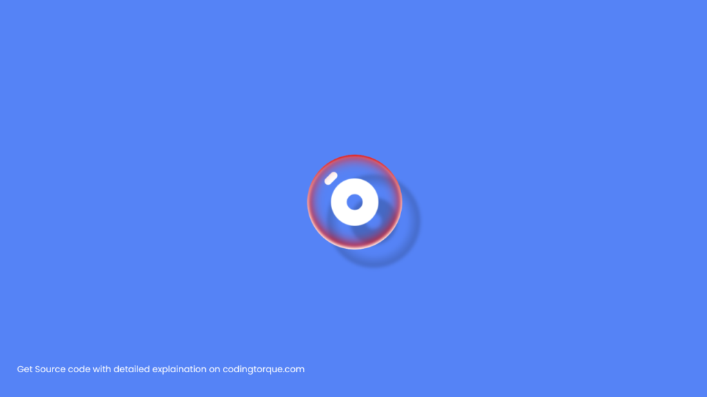
Final Output
Written by: Piyush Patil
Code Credits: @jkantner
If you found any mistakes or have any doubts please feel free to Contact Us
Hope you find this post helpful💖


