Welcome to Coding Torque! Are you ready to take your web development skills to the next level? Today, we’ll be creating a form with floating labels using HTML and CSS. This project is perfect for those who are just starting out in web development and want to get their feet wet with some basic coding. So, let’s get started!
Before we start, here are some cards you might like to create:
I would recommend you don’t just copy and paste the code, just look at the code and type by understanding it.
HTML Code
Starter Template
<!doctype html>
<html lang="en">
<head>
<!-- Required meta tags -->
<meta charset="utf-8">
<meta name="viewport" content="width=device-width, initial-scale=1">
<!-- Font Awesome CDN -->
<link rel="stylesheet" href="https://cdnjs.cloudflare.com/ajax/libs/font-awesome/5.14.0/css/all.min.css"
integrity="sha512-1PKOgIY59xJ8Co8+NE6FZ+LOAZKjy+KY8iq0G4B3CyeY6wYHN3yt9PW0XpSriVlkMXe40PTKnXrLnZ9+fkDaog=="
crossorigin="anonymous" />
<!-- CSS -->
<link rel="stylesheet" href="style.css">
<title>Form with floating label using HTML and CSS - Coding Torque</title>
</head>
<body>
<!-- Further code here -->
</body>
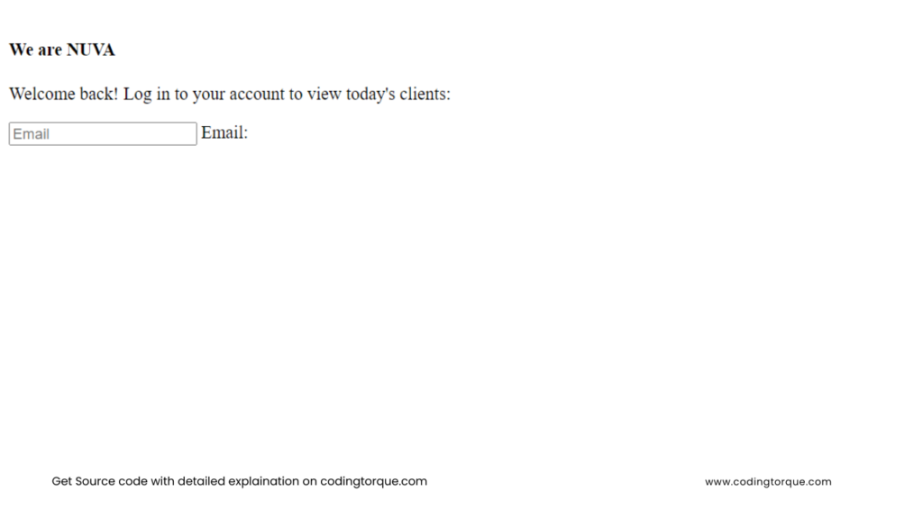
</html>Paste the below code in your <body> tag.
<div class="session">
    <div class="left">
        <?xml version="1.0" encoding="UTF-8"?>
        <svg enable-background="new 0 0 300 302.5" version="1.1" viewBox="0 0 300 302.5" xml:space="preserve"
            xmlns="http://www.w3.org/2000/svg">
            <style type="text/css">
                .st01 {
                    fill: #fff;
                }
            </style>
            <path class="st01"
                d="m126 302.2c-2.3 0.7-5.7 0.2-7.7-1.2l-105-71.6c-2-1.3-3.7-4.4-3.9-6.7l-9.4-126.7c-0.2-2.4 1.1-5.6 2.8-7.2l93.2-86.4c1.7-1.6 5.1-2.6 7.4-2.3l125.6 18.9c2.3 0.4 5.2 2.3 6.4 4.4l63.5 110.1c1.2 2 1.4 5.5 0.6 7.7l-46.4 118.3c-0.9 2.2-3.4 4.6-5.7 5.3l-121.4 37.4zm63.4-102.7c2.3-0.7 4.8-3.1 5.7-5.3l19.9-50.8c0.9-2.2 0.6-5.7-0.6-7.7l-27.3-47.3c-1.2-2-4.1-4-6.4-4.4l-53.9-8c-2.3-0.4-5.7 0.7-7.4 2.3l-40 37.1c-1.7 1.6-3 4.9-2.8 7.2l4.1 54.4c0.2 2.4 1.9 5.4 3.9 6.7l45.1 30.8c2 1.3 5.4 1.9 7.7 1.2l52-16.2z" />
        </svg>
    </div>
    <form action="" class="log-in" autocomplete="off">
        <h4>We are <span>NUVA</span></h4>
        <p>Welcome back! Log in to your account to view today's clients:</p>
        <div class="floating-label">
            <input placeholder="Email" type="email" name="email" id="email" autocomplete="off">
            <label for="email">Email:</label>
            <div class="icon">
                <?xml version="1.0" encoding="UTF-8"?>
                <svg enable-background="new 0 0 100 100" version="1.1" viewBox="0 0 100 100" xml:space="preserve"
                    xmlns="http://www.w3.org/2000/svg">
                    <style type="text/css">
                        .st0 {
                            fill: none;
                        }
                    </style>
                    <g transform="translate(0 -952.36)">
                        <path
                            d="m17.5 977c-1.3 0-2.4 1.1-2.4 2.4v45.9c0 1.3 1.1 2.4 2.4 2.4h64.9c1.3 0 2.4-1.1 2.4-2.4v-45.9c0-1.3-1.1-2.4-2.4-2.4h-64.9zm2.4 4.8h60.2v1.2l-30.1 22-30.1-22v-1.2zm0 7l28.7 21c0.8 0.6 2 0.6 2.8 0l28.7-21v34.1h-60.2v-34.1z" />
                    </g>
                    <rect class="st0" width="100" height="100" />
                </svg>

            </div>
        </div>
        <div class="floating-label">
            <input placeholder="Password" type="password" name="password" id="password" autocomplete="off">
            <label for="password">Password:</label>
            <div class="icon">

                <?xml version="1.0" encoding="UTF-8"?>
                <svg enable-background="new 0 0 24 24" version="1.1" viewBox="0 0 24 24" xml:space="preserve"
                    xmlns="http://www.w3.org/2000/svg">
                    <style type="text/css">
                        .st0 {
                            fill: none;
                        }

                        .st1 {
                            fill: #010101;
                        }
                    </style>
                    <rect class="st0" width="24" height="24" />
                    <path class="st1" d="M19,21H5V9h14V21z M6,20h12V10H6V20z" />
                    <path class="st1"
                        d="M16.5,10h-1V7c0-1.9-1.6-3.5-3.5-3.5S8.5,5.1,8.5,7v3h-1V7c0-2.5,2-4.5,4.5-4.5s4.5,2,4.5,4.5V10z" />
                    <path class="st1"
                        d="m12 16.5c-0.8 0-1.5-0.7-1.5-1.5s0.7-1.5 1.5-1.5 1.5 0.7 1.5 1.5-0.7 1.5-1.5 1.5zm0-2c-0.3 0-0.5 0.2-0.5 0.5s0.2 0.5 0.5 0.5 0.5-0.2 0.5-0.5-0.2-0.5-0.5-0.5z" />
                </svg>
            </div>

        </div>
        <button type="submit" onClick="return false;">Log in</button>
        <a href="https://codepen.io/elujambio/pen/yjwzGP" class="discrete" target="_blank">Basic version</a>
    </form>
</div>
Output Till Now
CSS Code
Create a file style.css and paste the code below.
* {
  font-family: -apple-system, BlinkMacSystemFont, "San Francisco", Helvetica,
    Arial, sans-serif;
  font-weight: 300;
  margin: 0;
}
html,
body {
  height: 100vh;
  width: 100vw;
  margin: 0 0;
  display: flex;
  align-items: flex-start;
  justify-content: flex-start;
  background: #f3f2f2;
}
h4 {
  font-size: 24px;
  font-weight: 600;
  color: #000;
  opacity: 0.85;
}
label {
  font-size: 12.5px;
  color: #000;
  opacity: 0.8;
  font-weight: 400;
}
form {
  padding: 40px 30px;
  background: #fefefe;
  display: flex;
  flex-direction: column;
  align-items: flex-start;
  padding-bottom: 20px;
  width: 300px;
}
form h4 {
  margin-bottom: 20px;
  color: rgba(0, 0, 0, 0.5);
}
form h4 span {
  color: rgba(0, 0, 0, 1);
  font-weight: 700;
}
form p {
  line-height: 155%;
  margin-bottom: 5px;
  font-size: 14px;
  color: #000;
  opacity: 0.65;
  font-weight: 400;
  max-width: 200px;
  margin-bottom: 40px;
}
a.discrete {
  color: rgba(0, 0, 0, 0.4);
  font-size: 14px;
  border-bottom: solid 1px rgba(0, 0, 0, 0);
  padding-bottom: 4px;
  margin-left: auto;
  font-weight: 300;
  transition: all 0.3s ease;
  margin-top: 40px;
}
a.discrete:hover {
  border-bottom: solid 1px rgba(0, 0, 0, 0.2);
}
button {
  -webkit-appearance: none;
  width: auto;
  min-width: 100px;
  border-radius: 24px;
  text-align: center;
  padding: 15px 40px;
  margin-top: 5px;
  background-color: #b08bf8;
  color: #fff;
  font-size: 14px;
  margin-left: auto;
  font-weight: 500;
  box-shadow: 0px 2px 6px -1px rgba(0, 0, 0, 0.13);
  border: none;
  transition: all 0.3s ease;
  outline: 0;
}
button:hover {
  transform: translateY(-3px);
  box-shadow: 0 2px 6px -1px rgba(182, 157, 230, 0.65);
}
button:hover:active {
  transform: scale(0.99);
}
input {
  font-size: 16px;
  padding: 20px 0px;
  height: 56px;
  border: none;
  border-bottom: solid 1px rgba(0, 0, 0, 0.1);
  background: #fff;
  width: 280px;
  box-sizing: border-box;
  transition: all 0.3s linear;
  color: #000;
  font-weight: 400;
  -webkit-appearance: none;
}
input:focus {
  border-bottom: solid 1px #b69de6;
  outline: 0;
  box-shadow: 0 2px 6px -8px rgba(182, 157, 230, 0.45);
}
.floating-label {
  position: relative;
  margin-bottom: 10px;
  width: 100%;
}
.floating-label label {
  position: absolute;
  top: calc(50% - 7px);
  left: 0;
  opacity: 0;
  transition: all 0.3s ease;
  padding-left: 44px;
}
.floating-label input {
  width: calc(100% - 44px);
  margin-left: auto;
  display: flex;
}
.floating-label .icon {
  position: absolute;
  top: 0;
  left: 0;
  height: 56px;
  width: 44px;
  display: flex;
}
.floating-label .icon svg {
  height: 30px;
  width: 30px;
  margin: auto;
  opacity: 0.15;
  transition: all 0.3s ease;
}
.floating-label .icon svg path {
  transition: all 0.3s ease;
}
.floating-label input:not(:placeholder-shown) {
  padding: 28px 0px 12px 0px;
}
.floating-label input:not(:placeholder-shown) + label {
  transform: translateY(-10px);
  opacity: 0.7;
}
.floating-label input:valid:not(:placeholder-shown) + label + .icon svg {
  opacity: 1;
}
.floating-label input:valid:not(:placeholder-shown) + label + .icon svg path {
  fill: #b69de6;
}
.floating-label input:not(:valid):not(:focus) + label + .icon {
  animation-name: shake-shake;
  animation-duration: 0.3s;
}
@keyframes shake-shake {
  0% {
    transform: translateX(-3px);
  }
  20% {
    transform: translateX(3px);
  }
  40% {
    transform: translateX(-3px);
  }
  60% {
    transform: translateX(3px);
  }
  80% {
    transform: translateX(-3px);
  }
  100% {
    transform: translateX(0px);
  }
}
.session {
  display: flex;
  flex-direction: row;
  width: auto;
  height: auto;
  margin: auto auto;
  background: #fff;
  border-radius: 4px;
  box-shadow: 0px 2px 6px -1px rgba(0, 0, 0, 0.12);
}
.left {
  width: 220px;
  height: auto;
  min-height: 100%;
  position: relative;
  background-image: url("https://images.pexels.com/photos/114979/pexels-photo-114979.jpeg?auto=compress&cs=tinysrgb&dpr=2&h=650&w=940");
  background-size: cover;
  border-top-left-radius: 4px;
  border-bottom-left-radius: 4px;
}
.left svg {
  height: 40px;
  width: auto;
  margin: 20px;
}
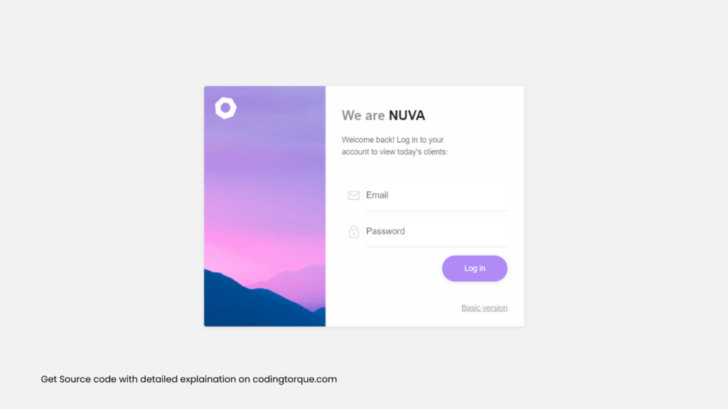
Output Till Now
Written by: Piyush Patil
Credits: @elujambio
If you have any doubts or any project ideas feel free to Contact Us
Hope you find this post helpful💖


