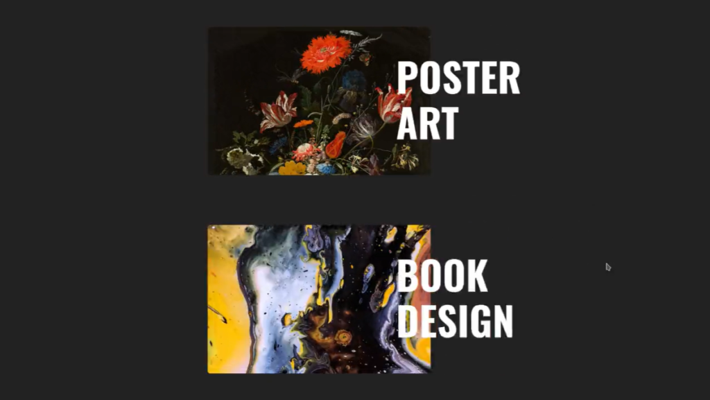
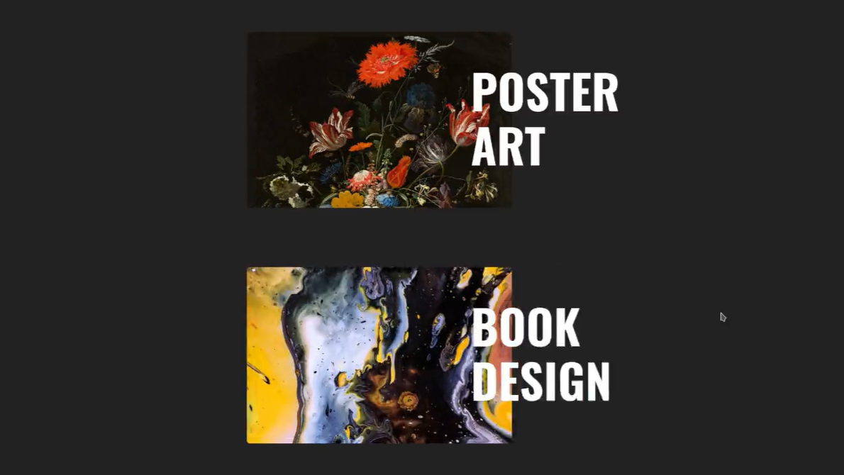
A picture is worth a thousand words, but with the right hover effect, it can tell an entire story. In the realm of web design, creating an immersive and captivating gallery experience can be achieved through the strategic use of hover effects. These effects add an interactive dimension to images, enticing users to explore and engage further.
In this blog post, we’ll embark on an exciting journey to design a mesmerizing gallery with captivating hover effects using only HTML and CSS. By leveraging the power of these core web technologies, we’ll unlock the secrets to creating visually stunning and engaging galleries that leave a lasting impression.
I would recommend you don’t just copy and paste the code, just look at the code and type by understanding it.
Demo
See the Pen Gallery Hover Effect by Bobby Korec (@bobbykorec) on CodePen.
HTML Code
Starter Template
<!doctype html>
<html lang="en">

<head>
    <!-- Required meta tags -->
    <meta charset="utf-8">
    <meta name="viewport" content="width=device-width, initial-scale=1">

    <!-- CSS -->
    <link rel="stylesheet" href="style.css">

    <title>Gallery hover effect using HTML and CSS - Coding Torque</title>
</head>

<body>
    <!-- Further code here -->

    <script src="script.js"></script>
</body>

</html>
Paste the below code in your <body> tag.
<div class="wrapper">
  <div class="image-wrapper">
  <img src="https://images.unsplash.com/photo-1579783902614-a3fb3927b6a5?ixid=MnwxMjA3fDB8MHxwaG90by1wYWdlfHx8fGVufDB8fHx8&ixlib=rb-1.2.1&auto=format&fit=crop&w=1583&q=80" /></div>
  <div class="header-wrapper">
    <h1>Poster Art</h1>
    <h1>See Project</h1>
  </div>
</div>

<div class="wrapper">
  <div class="image-wrapper">
  <img class="book-design-image" src="https://images.unsplash.com/photo-1561214115-f2f134cc4912?ixid=MnwxMjA3fDB8MHxwaG90by1wYWdlfHx8fGVufDB8fHx8&ixlib=rb-1.2.1&auto=format&fit=crop&w=1306&q=80" /></div>
  <div class="header-wrapper">
    <h1>Book Design</h1>
    <h1>See Project</h1>
  </div>
</div>
CSS Code
Create a file style.css and paste the code below.
body {
  height: 100vh;
  display: flex;
  justify-content: center;
  align-items: center;
  flex-direction: column;

  background: #222;
}

.wrapper {
  position: relative;
  height: 300px;
  width: 600px;
  margin: 50px 0;

  display: flex;
  flex-direction: row;

  transition: all 200ms ease-in-out;
}

.image-wrapper {
  height: 300px;
  width: 450px;
  overflow: hidden;
  border-radius: 5px;
  cursor: pointer;

  transition: all 200ms ease-in-out;
}

img {
  height: 300px;
  width: 450px;
  object-fit: cover;
  object-position: top;

  transition: all 200ms ease-in-out;
}

.book-design-image {
  object-position: center;
}

.header-wrapper {
  display: flex;
  flex-direction: column;
  position: absolute;
  height: 300px;
  width: 300px;
  left: 380px;
  transition: all 200ms ease-in-out;
  overflow: hidden;

}

h1 {
  position: relative;
  bottom: 0;
  height: 300px;
  color: #fff;
  font-size: 80px;
  font-family: Oswald;
  text-transform: uppercase;

  transition: all 200ms ease-in-out;
}

.wrapper:hover img {
  transform: scale(2);
  /*object-position: bottom;*/
}

.wrapper:hover h1 {
  bottom: 300px;
  transform: scale(.4);
}

.wrapper:hover .image-wrapper {
  width: 800px;
}
Final Output

Written by: Piyush Patil
Code Credits: https://codepen.io/bobbykorec/full/yLgRwRx
If you found any mistakes or have any doubts please feel free to Contact Us
Hope you find this post helpful💖


