
What’s more exciting than receiving a beautifully wrapped gift? Unwrapping it to reveal the treasure hidden inside! In the world of web design, we can capture that same sense of anticipation and delight by incorporating interactive elements that engage and surprise users.
In this blog post, we’ll embark on a journey to create a charming gift box with a hover reveal effect using only HTML and CSS. By harnessing the power of these fundamental web technologies, we’ll unleash our creativity to build an engaging and visually appealing element that adds a touch of magic to any website.


I would recommend you don’t just copy and paste the code, just look at the code and type by understanding it.
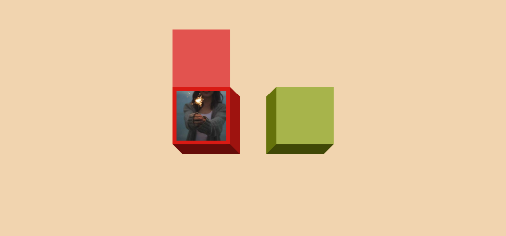
Demo
See the Pen Image gift box (hover to reveal) by Temani Afif (@t_afif) on CodePen.
HTML Code
Starter Template
<!doctype html>
<html lang="en">

<head>
    <!-- Required meta tags -->
    <meta charset="utf-8">
    <meta name="viewport" content="width=device-width, initial-scale=1">

    <!-- CSS -->
    <link rel="stylesheet" href="style.css">

    <title>Gift box with hover reveal effect using HTML and CSS - Coding Torque</title>
</head>

<body>
    <!-- Further code here -->

    <script src="script.js"></script>
</body>

</html>
Paste the below code in your <body> tag.
<img src="https://picsum.photos/id/660/300/300" alt="Fireworks">
<img src="https://picsum.photos/id/696/300/300" alt="Flowers" class="alt">
CSS Code
Create a file style.css and paste the code below.
@property --h {
  syntax: "<length>";
  initial-value: 0px;
  inherits: true;
}

img {
  --s: 150px; /* image size */
  --b: 12px;  /* the border */
  --d: 30px;  /* the 3D depth */
  --c: #d81a14;
  --_c: color-mix(in srgb,var(--c),#fff 25%);

  --_w: calc(var(--s) + 2*var(--b));
  width: calc(var(--_w) + var(--d));
  aspect-ratio: 1;
  padding-top: min(var(--h) - var(--b),var(--s));
  border: solid #0000;
  border-width: var(--b) calc(var(--b) + var(--d)) calc(var(--b) + var(--d)) var(--b);
  box-sizing: border-box;
  object-fit: cover;
  object-position: bottom;
  background:
    linear-gradient(var(--_c) 0 0) no-repeat
     0 0/calc(100% - var(--d)) calc(100% - var(--d) + var(--h) - var(--_w)),
    conic-gradient(at right var(--d) bottom var(--d),
     #0004 37.5%,#0008 0 75%,#0000 0) var(--c);
  background-origin: border-box;
  clip-path: polygon(0 calc(var(--h) - var(--_w)),calc(100% - var(--d)) calc(var(--h) - var(--_w)),calc(100% - var(--d)) 0,100% var(--d),100% 100%,var(--d) 100%,0 calc(100% - var(--d)));
  box-shadow: 0 0 0 999px var(--_c);
  --h: var(--_w);
  transition: --h .6s linear;
  cursor: pointer;
}
.alt {
  --c: #8A9B0F;
  border-width: var(--b) var(--b) calc(var(--b) + var(--d)) calc(var(--b) + var(--d));
  background:
    linear-gradient(var(--_c) 0 0) no-repeat
     100% 0/calc(100% - var(--d)) calc(100% - var(--d) + var(--h) - var(--_w)),
    conic-gradient(at left var(--d) bottom var(--d),
     #0000 25%,#0008 0 62.5%,#0004 0) var(--c);
  background-origin: border-box;
  clip-path: polygon(100% calc(var(--h) - var(--_w)),var(--d) calc(var(--h) - var(--_w)),var(--d) 0,0 var(--d),0 100%,calc(100% - var(--d)) 100%,100% calc(100% - var(--d)));
}

img:hover {
  --h: 0px;
}

/* for firefox you will have a small missalignement */
@supports (-moz-appearance: none) {
  img {
    transition: .6s linear;
  }
}

body {
  margin: 0;
  min-height: 100vh;
  display: grid;
  place-content: center;
  grid-auto-flow: column;
  gap: 80px;
  background: #F1D4AF;
}
Final Output
Written by: Piyush Patil
Code Credits: https://codepen.io/t_afif/full/LYaPPPo
If you found any mistakes or have any doubts please feel free to Contact Us
Hope you find this post helpful💖


