
In the world of web design, creating captivating and elegant effects can elevate the user experience and leave a lasting impression. One such effect that adds a touch of sophistication is the glide to reveal effect. This effect gracefully unveils content as users interact with it, adding an element of surprise and delight.
In this blog post, we’ll embark on a journey to implement the glide to reveal effect using only HTML and CSS. By harnessing the power of these core web technologies, we’ll unlock the secrets to adding elegance and interactivity to your web pages.


I would recommend you don’t just copy and paste the code, just look at the code and type by understanding it.
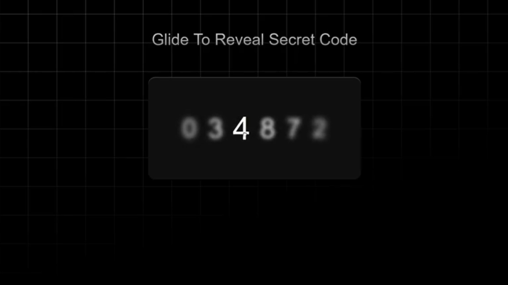
Demo
See the Pen Glide To Reveal with CSS :has() by Jhey (@jh3y) on CodePen.
HTML Code
Starter Template
<!doctype html>
<html lang="en">

<head>
    <!-- Required meta tags -->
    <meta charset="utf-8">
    <meta name="viewport" content="width=device-width, initial-scale=1">

    <!-- CSS -->
    <link rel="stylesheet" href="style.css">

    <title>Glide to Reveal Effect using HTML and CSS - Coding Torque</title>
</head>

<body>
    <!-- Further code here -->

    <script src="script.js"></script>
</body>

</html>
Paste the below code in your <body> tag.
<section>
  <p>Glide To Reveal Secret Code</p>
  <ul class="code">
    <li tabindex="0" class="digit">
      <span>0</span>
    </li>
    <li tabindex="0" class="digit">
      <span>3</span>
    </li>
    <li tabindex="0" class="digit">
      <span>4</span>
    </li>
    <li tabindex="0" class="digit">
      <span>8</span>
    </li>
    <li tabindex="0" class="digit">
      <span>7</span>
    </li>
    <li tabindex="0" class="digit">
      <span>2</span>
    </li>
  </ul>
</section>
CSS Code
Create a file style.css and paste the code below.
* {
  box-sizing: border-box;
}

body {
  min-height: 100vh;
  display: grid;
  place-items: center;
  font-family: "SF Pro Text", "SF Pro Icons", "AOS Icons", "Helvetica Neue", Helvetica, Arial, sans-serif, system-ui;
  background: hsl(0 0% 0%);
  gap: 2rem;
}

body::before {
	--line: hsl(0 0% 95% / 0.25);
	content: "";
	height: 100vh;
	width: 100vw;
	position: fixed;
	background:
		linear-gradient(90deg, var(--line) 1px, transparent 1px 10vmin) 0 -5vmin / 10vmin 10vmin,
		linear-gradient(var(--line) 1px, transparent 1px 10vmin) 0 -5vmin / 10vmin 10vmin;
	mask: linear-gradient(-15deg, transparent 30%, white);
	top: 0;
	z-index: -1;
}

section {
  display: grid;
  gap: 4rem;
  align-items: center;
  justify-content: center;
}

section p {
  margin: 0;
  font-size: 2.25rem;
  color: hsl(0 0% 40%);
  text-align: center;
  background: linear-gradient(hsl(0 0% 80%), hsl(0 0% 50%));
  color: transparent;
  background-clip: text;
}

.code {
  font-size: 3rem;
  display: flex;
  flex-wrap: nowrap;
  color: hsl(0 0% 100%);
  border-radius: 1rem;
  background: hsl(0 0% 6%);
  justify-content: center;
  box-shadow: 0 1px hsl(0 0% 100% / 0.25) inset;
}

.code:hover {
  cursor: grab;
}

.digit {
  display: flex;
  height: 100%;
  padding: 5.5rem 1rem;
}

.digit:focus-visible {
  outline-color: hsl(0 0% 50% / 0.25);
  outline-offset: 1rem;
}

.digit span {
  scale: calc(var(--active, 0) + 0.5);
  filter: blur(calc((1 - var(--active, 0)) * 1rem));
  transition: scale calc(((1 - var(--active, 0)) + 0.2) * 1s), filter calc(((1 - var(--active, 0)) + 0.2) * 1s);
}

ul {
  padding: 0;
  margin: 0;
}

.digit:first-of-type {
  padding-left: 5rem;
}
.digit:last-of-type {
  padding-right: 5rem;
}

:root {
  --lerp-0: 1; /* === sin(90deg) */
  --lerp-1: calc(sin(50deg));
  --lerp-2: calc(sin(45deg));
  --lerp-3: calc(sin(35deg));
  --lerp-4: calc(sin(25deg));
  --lerp-5: calc(sin(15deg));
}

.digit:is(:hover, :focus-visible) {
  --active: var(--lerp-0);
}
.digit:is(:hover, :focus-visible) + .digit,
.digit:has(+ .digit:is(:hover, :focus-visible)) {
  --active: var(--lerp-1);
}
.digit:is(:hover, :focus-visible) + .digit + .digit,
.digit:has(+ .digit + .digit:is(:hover, :focus-visible)) {
  --active: var(--lerp-2);
}
.digit:is(:hover, :focus-visible) + .digit + .digit + .digit,
.digit:has(+ .digit + .digit + .digit:is(:hover, :focus-visible)) {
  --active: var(--lerp-3);
}
.digit:is(:hover, :focus-visible) + .digit + .digit + .digit + .digit,
.digit:has(+ .digit + .digit + .digit + .digit:is(:hover, :focus-visible)) {
  --active: var(--lerp-4);
}
.digit:is(:hover, :focus-visible) + .digit + .digit + .digit + .digit + .digit,
.digit:has(+ .digit + .digit + .digit + .digit + .digit:is(:hover, :focus-visible)) {
  --active: var(--lerp-5);
}
Final Output
Written by: Piyush Patil
Code Credits: https://codepen.io/jh3y/full/JjxPKXz
If you found any mistakes or have any doubts please feel free to Contact Us
Hope you find this post helpful💖


