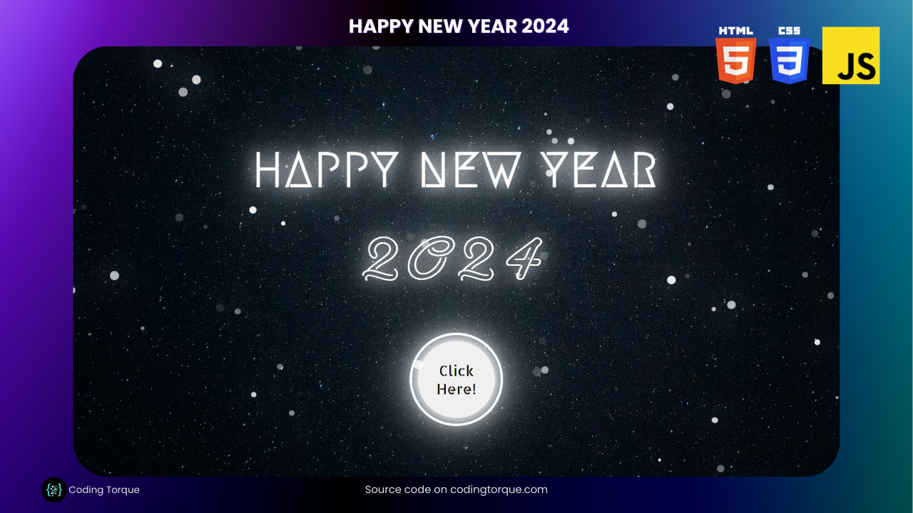
Ready to unleash your inner tech magician and celebrate the arrival of 2024 in style? Buckle up, fellow code enthusiasts, because this blog’s about to show you how to build a breathtaking “Happy New Year 2024” webpage with the power of HTML, CSS, and JavaScript!


I would recommend you don’t just copy and paste the code, just look at the code and type by understanding it.
Demo
HTML Code
Starter Template
<!doctype html>
<html lang="en">

<head>
    <!-- Required meta tags -->
    <meta charset="utf-8">
    <meta name="viewport" content="width=device-width, initial-scale=1">

    <!-- CSS -->
    <link rel="stylesheet" href="style.css">

    <title>Happy New Year 2024 using HTML CSS and JavaScript - Coding Torque</title>
</head>

<body>
    <!-- Further code here -->

    <script src="script.js"></script>
</body>

</html>
Paste the below code in your <body> tag.
<div class="bg"></div>
<main class="new-year-body">
    <h1 class="new-year">Happy New Year</h1>
    <p class="year">2024</p>
    <button class="btn">Click Here!</button>
</main>
CSS Code
Create a file style.css and paste the code below.
@import url("https://fonts.googleapis.com/css2?family=Neonderthaw&display=swap");
@import url("https://fonts.googleapis.com/css2?family=Allerta+Stencil&display=swap");
@import url("https://fonts.googleapis.com/css2?family=Megrim&display=swap");

body {
  height: 100vh;
  margin: 0;
  padding: 0;
  display: flex;
  justify-content: center;
  align-items: center;
  background: url("https://images.unsplash.com/photo-1524334228333-0f6db392f8a1?ixlib=rb-4.0.3&ixid=MnwxMjA3fDB8MHxwaG90by1wYWdlfHx8fGVufDB8fHx8&auto=format&fit=crop&w=1920&q=80")
    no-repeat center center;
  background-size: cover;
  overflow: hidden;
}

.new-year-body {
  text-align: center;
  color: white;
  text-transform: uppercase;
}

.new-year {
  font-size: 5rem;
  letter-spacing: 5px;
  margin-bottom: 0;
  text-shadow: 0 0 25px white, 0 0 50px white, 0 0 100px white;
  font-family: "Megrim", cursive, sans-serif;
}

.year {
  margin: 0;
  font-size: 8rem;
  letter-spacing: 10px;
  font-family: "Neonderthaw", "Poiret One", cursive;
  text-shadow: 0 0 25px white, 0 0 50px white, 0 0 100px white;
}

.btn {
  margin-top: 4rem;
  width: 8rem;
  height: 8rem;
  border-radius: 50%;
  font-size: 1.5rem;
  color: #0c0f0a;
  padding: 1rem;
  font-family: "Allerta Stencil", sans-serif;
  border: none;
  box-shadow: 0 0 25px white, 0 0 50px white, 0 0 100px white;
  outline: 4px solid white;
  outline-offset: 10px;
}

.btn:hover {
  outline-offset: 4px;
}

.snow {
  position: absolute;
  top: -10%;
  border-radius: 50%;
  background-color: white;
  box-shadow: 0 0 0px #fff, 0 0 50px #fff;
}

.snowAnimation1 {
  animation: snowFall1 linear infinite;
}
.snowAnimation2 {
  animation: snowFall2 linear infinite;
}
.snowAnimation3 {
  animation: snowFall3 linear infinite;
}
.snowAnimation4 {
  animation: snowFall4 linear infinite;
}

@keyframes snowFall1 {
  0% {
    transform: translate(0vw, 0vh);
  }
  100% {
    transform: translate(50vw, 150vh);
  }
}
@keyframes snowFall2 {
  0% {
    transform: translate(-10vw, -10vh);
  }
  100% {
    transform: translate(60vw, 150vh);
  }
}
@keyframes snowFall3 {
  0% {
    transform: translate(10vw, 0vh);
  }
  100% {
    transform: translate(40vw, 150vh);
  }
}
@keyframes snowFall4 {
  0% {
    transform: translate(0vw, 0vh);
  }
  100% {
    transform: translate(40vw, 150vh);
  }
}

.white {
  text-shadow: 0 0 25px #fff, 0 0 50px #fff, 0 0 100px #fff;
}
.btn-white {
  box-shadow: 0 0 25px #fff, 0 0 50px #fff, 0 0 100px #fff;
}
.snow-white {
  box-shadow: 0 0 0px #fff, 0 0 50px #fff;
}
.green {
  text-shadow: 0 0 5px #1fd224, 0 0 25px #1fd224, 0 0 50px #1fd224,
    0 0 100px #1fd224, 0 0 200px #1fd224;
}
.btn-green {
  box-shadow: 0 0 5px #1fd224, 0 0 25px #1fd224, 0 0 50px #1fd224,
    0 0 100px #1fd224, 0 0 200px #1fd224;
}
.snow-green {
  box-shadow: 0 0 20px #1fd224, 0 0 50px #1fd224;
}
.orange {
  text-shadow: 0 0 5px #ffaa01, 0 0 25px #ffaa01, 0 0 50px #ffaa01,
    0 0 100px #ffaa01, 0 0 200px #ffaa01;
}
.btn-orange {
  box-shadow: 0 0 5px #ffaa01, 0 0 25px #ffaa01, 0 0 50px #ffaa01,
    0 0 100px #ffaa01, 0 0 200px #ffaa01;
}
.snow-orange {
  box-shadow: 0 0 20px #ffaa01, 0 0 50px #ffaa01;
}
.pink {
  text-shadow: 0 0 5px #ff00aa, 0 0 25px #ff00aa, 0 0 50px #ff00aa,
    0 0 100px #ff00aa, 0 0 200px #ff00aa;
}
.btn-pink {
  box-shadow: 0 0 5px #ff00aa, 0 0 25px #ff00aa, 0 0 50px #ff00aa,
    0 0 100px #ff00aa, 0 0 200px #ff00aa;
}
.snow-pink {
  box-shadow: 0 0 20px #ff00aa, 0 0 50px #ff00aa;
}
.violet {
  text-shadow: 0 0 5px #aa00ff, 0 0 25px #aa00ff, 0 0 50px #aa00ff,
    0 0 100px #aa00ff, 0 0 200px #aa00ff;
}
.btn-violet {
  box-shadow: 0 0 5px #aa00ff, 0 0 25px #aa00ff, 0 0 50px #aa00ff,
    0 0 100px #aa00ff, 0 0 200px #aa00ff;
}
.snow-violet {
  box-shadow: 0 0 20px #aa00ff, 0 0 50px #aa00ff;
}
.blue {
  text-shadow: 0 0 5px #00aaff, 0 0 25px #00aaff, 0 0 50px #00aaff,
    0 0 100px #00aaff, 0 0 200px #00aaff;
}
.btn-blue {
  box-shadow: 0 0 5px #00aaff, 0 0 25px #00aaff, 0 0 50px #00aaff,
    0 0 100px #00aaff, 0 0 200px #00aaff;
}
.snow-blue {
  box-shadow: 0 0 20px #00aaff, 0 0 50px #00aaff;
}
.red {
  text-shadow: 0 0 5px #f00, 0 0 25px #f00, 0 0 50px #f00, 0 0 100px #f00,
    0 0 200px #f00;
}
.btn-red {
  box-shadow: 0 0 5px #f00, 0 0 25px #f00, 0 0 50px #f00, 0 0 100px #f00,
    0 0 200px #f00;
}
.snow-red {
  box-shadow: 0 0 20px #f00, 0 0 50px #f00;
}
.yellow {
  text-shadow: 0 0 5px #ffea00, 0 0 25px #ffea00, 0 0 50px #ffea00,
    0 0 100px #ffea00, 0 0 200px #ffea00;
}
.btn-yellow {
  box-shadow: 0 0 5px #ffea00, 0 0 25px #ffea00, 0 0 50px #ffea00,
    0 0 100px #ffea00, 0 0 200px #ffea00;
}
.snow-yellow {
  box-shadow: 0 0 20px #ffea00, 0 0 50px #ffea00;
}
JavaScript Code
Create a file script.js and paste the code below.
const snowFall = () => {
  const bg = document.querySelector(".bg");
  for (let i = 0; i < 300; i++) {
    const snow = document.createElement("span");
    snow.classList.add("snow");
    if (i % 4 === 0) {
      snow.classList.add("snowAnimation1");
    } else if (i % 4 === 1) {
      snow.classList.add("snowAnimation2");
    } else if (i % 4 === 2) {
      snow.classList.add("snowAnimation3");
    } else {
      snow.classList.add("snowAnimation4");
    }
    const aNumber = -50 + randomNumber(150);
    const timeDelay = randomNumber(10);
    const animDuration = 5 + randomNumber(10) + Math.random() + 0.2;
    const snowOpacity = randomNumber(10) * 0.1;
    const heightWidth = randomNumber(11) + 5;
    snow.style.width = `${heightWidth}px`;
    snow.style.height = `${heightWidth}px`;
    snow.style.left = `${aNumber}%`;
    snow.style.animationDelay = `${timeDelay}s`;
    snow.style.animationDuration = `${animDuration}s`;
    snow.style.opacity = `${snowOpacity}`;
    bg.appendChild(snow);
  }
};

const randomNumber = (limit) => {
  return Math.floor(Math.random() * limit);
};

snowFall();

const textShadowColor = [
  "white",
  "green",
  "orange",
  "pink",
  "violet",
  "blue",
  "red",
  "yellow",
];
const color = [
  "#0c0f0a",
  "#1fd224",
  "#ffaa01",
  "#ff00aa",
  "#aa00ff",
  "#00aaff",
  "#f00",
  "#ffea00",
];
let count = 1;

const glowingText = (count) => {
  const btn = document.querySelector(".btn");
  const newYear = document.querySelector(".new-year");
  const year = document.querySelector(".year");
  const snow = document.querySelectorAll(".snow");

  btn.addEventListener("click", () => {
    if (count !== 0) {
      newYear.classList.remove(textShadowColor[count - 1]);
      year.classList.remove(textShadowColor[count - 1]);
      btn.classList.remove(`btn-${textShadowColor[count - 1]}`);
      snow.forEach((e) => {
        e.classList.remove(`snow-${textShadowColor[count - 1]}`);
      });
    }
    if (count === textShadowColor.length) {
      count = 0;
    }

    newYear.classList.add(textShadowColor[count]);
    year.classList.add(textShadowColor[count]);
    btn.classList.add(`btn-${textShadowColor[count]}`);
    snow.forEach((e) => {
      e.classList.add(`snow-${textShadowColor[count]}`);
    });
    btn.innerHTML = "Click Again!";
    btn.style.color = `${color[count]}`;
    count++;
  });
};
glowingText(count);
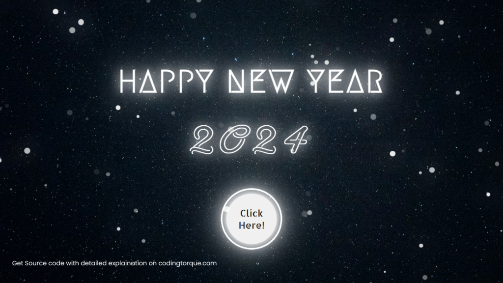
Final Output
Written by: Piyush Patil
Code Credits: https://codepen.io/tin-fung-hk/pen/rNpEPpM
If you found any mistakes or have any doubts please feel free to Contact Us
Hope you find this post helpful💖


