The hero section of a homepage is the first thing visitors see, and it’s your chance to make a powerful first impression. A well-designed hero section can captivate your audience, convey your message clearly, and entice users to explore further.
In this blog post, we’ll guide you through the process of creating a stunning home hero page using HTML and CSS. We’ll cover how to structure your HTML, style your CSS, and ensure your hero section is responsive and visually appealing.


I would recommend you don’t just copy and paste the code, just look at the code and type by understanding it.
Demo
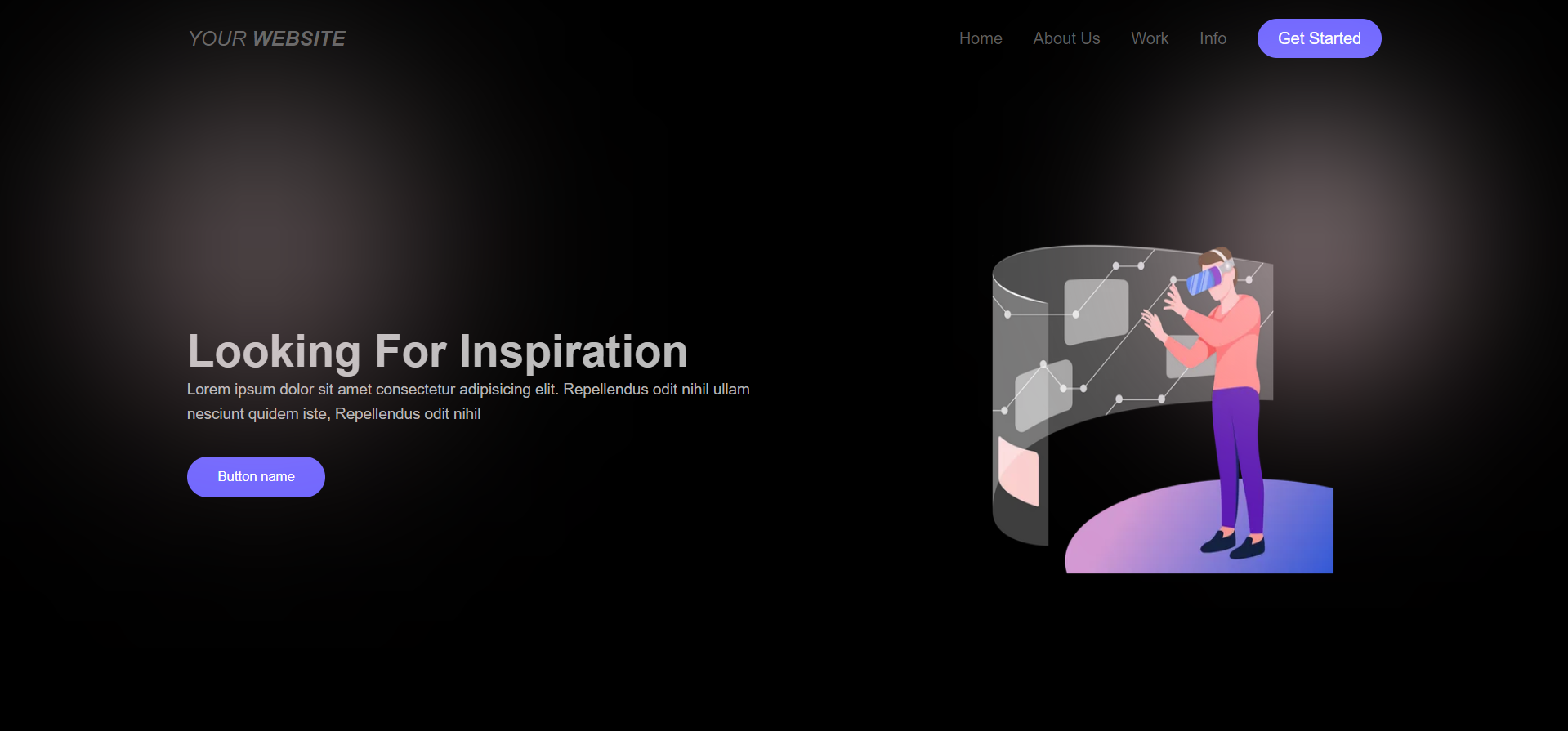
See the Pen Home page ( dark ) by Jack (@e994orr) on CodePen.
HTML Code
Starter Template
<!doctype html>
<html lang="en">

<head>
    <!-- Required meta tags -->
    <meta charset="utf-8">
    <meta name="viewport" content="width=device-width, initial-scale=1">

    <!-- CSS -->
    <link rel="stylesheet" href="style.css">

    <title>Home Hero Page using HTML and CSS - Coding Torque</title>
</head>

<body>
    <!-- Further code here -->

    <script src="script.js"></script>
</body>

</html>
Paste the below code in your <body> tag.
<div class="main-container">
        <div class="blur-circle1">

        </div>
        <div class="blur-circle2">

        </div>
          <!-- Start Landing Page -->
      <div class="landing-page">
        <header>
          <div class="container">
            <a href="#" class="logo">Your <b>Website</b></a>
            <ul class="links">
              <li>Home</li>
              <li>About Us</li>
              <li>Work</li>
              <li>Info</li>
              <li>Get Started</li>
            </ul>
          </div>
        </header>
        <div class="content">
          <div class="container">
            <div class="info">
              <h1>Looking For Inspiration</h1>
              <p>Lorem ipsum dolor sit amet consectetur adipisicing elit. Repellendus odit nihil ullam nesciunt quidem iste, Repellendus odit nihil</p>
              <button>Button name</button>
            </div>
            <div class="image">
              <img class="main-image" src="https://cdni.iconscout.com/illustration/premium/thumb/businessman-working-using-vr-tech-3840669-3202986.png?f=webp">
            </div>
          </div>
        </div>
      </div>
      <!-- End Landing Page -->
    </div>
CSS Code
Create a file style.css and paste the code below.
*{
    padding: 0px;
    margin:0px;
}
.main-container{
    margin:0px;
    padding: 0px;
    background-color: black;
    min-width: 100vw;
    min-height: 100vh;
    position: relative;
}
.blur-circle1{
    width: 200px;
    height: 200px;
    background: linear-gradient(to bottom,white,pink);
    border-radius: 50%;
    filter:blur(120px);
    position: absolute;
    left: 10%;
    top:20%;
    /* transform: translate(50%); */
}
.blur-circle2{
    width: 200px;
    height: 200px;
    background: linear-gradient(to bottom,white,pink);
    border-radius: 50%;
    filter:blur(100px);
    position: absolute;
    right: 10%;
    top:20%;
    /* transform: translate(50%); */
}
body {
    font-family: 'Open Sans', sans-serif;
  }
  a {
    text-decoration: none;
  }
  ul {
    list-style: none;
    padding: 0;
    margin: 0;
  }
  .container {
    padding-left: 15px;
    padding-right: 15px;
    margin-left: auto;
    margin-right: auto;
  }
  /* Small */
  @media (min-width: 768px) {
    .container {
      width: 750px;
    }
  }
  /* Medium */
  @media (min-width: 992px) {
    .container {
      width: 970px;
    }
  }
  /* Large */
  @media (min-width: 1200px) {
    .container {
      width: 1170px;
    }
  }
  /* End Global Rules */

  /* Start Landing Page */
  .landing-page header {
    min-height: 80px;
    display: flex;
  }
  @media (max-width: 767px) {
    .landing-page header {
      min-height: auto;
      display: initial;
    }
  }
  .landing-page header .container {
    display: flex;
    align-items: center;
    justify-content: space-between;
  }
  @media (max-width: 767px) {
    .landing-page header .container {
      flex-direction: column;
      justify-content: center;
    }
  }
  .landing-page header .logo {
    color: #5d5d5d;
    font-style: italic;
    text-transform: uppercase;
    font-size: 20px;
  }
  @media (max-width: 767px) {
    .landing-page header .logo {
      margin-top: 20px;
      margin-bottom: 20px;
    }
  }
  .landing-page header .links {
    display: flex;
    align-items: center;
  }
  @media (max-width: 767px) {
    .landing-page header .links {
      text-align: center;
      gap: 10px;
    }
  }
  .landing-page header .links li {
    margin-left: 30px;
    color: #5d5d5d;
    cursor: pointer;
    transition: .3s;
  }
  @media (max-width: 767px) {
    .landing-page header .links li {
      margin-left: auto;
    }
  }
  .landing-page header .links li:last-child {
    border-radius: 20px;
    padding: 10px 20px;
    color: #FFF;
    background-color: #6c63ff;
  }
  .landing-page header .links li:not(:last-child):hover {
    color: #6c63ff;
  }
  .landing-page .content .container {
    display: flex;
    align-items: center;
    justify-content: space-between;
    gap: 140px;
    min-height: calc(100vh - 80px);
  }
  @media (max-width: 767px) {
    .landing-page .content .container {
      gap: 0;
      min-height: calc(100vh - 101px);
      justify-content: center;
      flex-direction: column-reverse;
    }
  }
  @media (max-width: 767px) {
    .landing-page .content .info {
      text-align: center;
      margin-bottom: 15px
    }
  }
  .landing-page .content .info h1 {
    color: #bbbbbb;
    font-size: 44px;
  }
  .landing-page .content .info p {
    margin: 0;
    line-height: 1.6;
    font-size: 15px;
    color: #b3b3b3;
  }
  .landing-page .content .info button {
    border: 0;
    border-radius: 20px;
    padding: 12px 30px;
    margin-top: 30px;
    cursor: pointer;
    color: #FFF;
    background-color: #6c63ff;
  }
  .landing-page .content .image img {
    max-width: 100%;
  }
  /* End Landing Page */

  .main-image{
    /* mix-blend-mode:exclusion */
    width: 600px;
    height: 400px;
  }
   h1,p{
    color:white;
  }
Final Output

Written by: Piyush Patil
Code Credits: https://codepen.io/e994orr/pen/mdgPbqN
If you found any mistakes or have any doubts please feel free to Contact Us
Hope you find this post helpful💖


