Greetings, fellow coders! Are you ready to learn how to create stunning Info Cards with Hover Effects using HTML and CSS? In this tutorial, we will explore how to use these essential web development languages to design visually appealing info cards that will impress your audience. With the power of hover effects, you can make your web content come alive with dynamic animations and interactive design elements. Whether you are a beginner or an experienced developer, this tutorial will equip you with valuable skills that you can apply to your web development projects. So let’s dive in and create some amazing info cards!
- Deploying a MERN App with Multiple Domain Names on VPS
- 3D CSS Logo with Pure CSS
- 3D Santa using HTML and CSS Only
- Crafting a 3D Police Squad Car with Pure CSS
- Crafting a 3D Printer with HTML and Pure CSS
I would recommend you don’t just copy and paste the code, just look at the code and type by understanding it.
HTML Code
Starter Template
<!doctype html>
<html lang="en">

<head>
    <!-- Required meta tags -->
    <meta charset="utf-8">
    <meta name="viewport" content="width=device-width, initial-scale=1">

    <!-- Font Awesome CDN  -->
    <link rel="stylesheet" href="https://cdnjs.cloudflare.com/ajax/libs/font-awesome/5.14.0/css/all.min.css"
        integrity="sha512-1PKOgIY59xJ8Co8+NE6FZ+LOAZKjy+KY8iq0G4B3CyeY6wYHN3yt9PW0XpSriVlkMXe40PTKnXrLnZ9+fkDaog=="
        crossorigin="anonymous" />

    <!-- CSS -->
    <link rel="stylesheet" href="style.css">

    <title>Info Cards with Hover Effect using HTML & CSS - Coding Torque</title>
</head>

<body>
    <!-- Further code here -->
</body>

</html>
Paste the below code in your <body> tag.
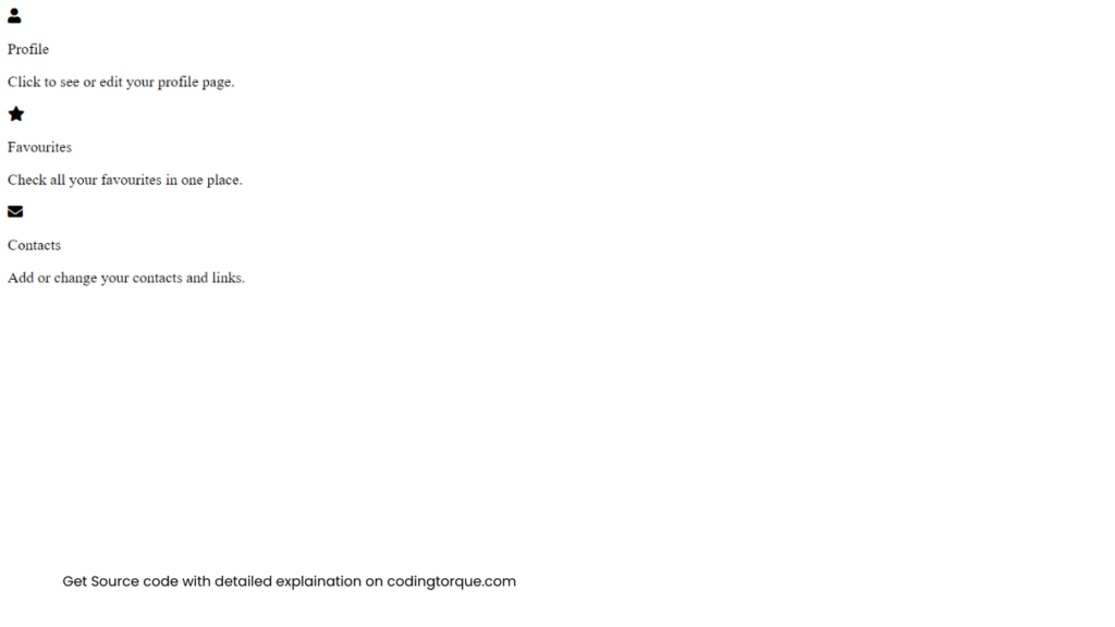
<div class="content">
    <div class="card">

        <div class="icon"><i class="fa fa-user"></i></div>
        <p class="title">Profile</p>
        <p class="text">Click to see or edit your profile page.</p>

    </div>
    <div class="card">

        <div class="icon"><i class="fa fa-star"></i></div>
        <p class="title">Favourites</p>
        <p class="text">Check all your favourites in one place.</p>

    </div>
    <div class="card">

        <div class="icon"><i class="fa fa-envelope"></i></div>
        <p class="title">Contacts</p>
        <p class="text">Add or change your contacts and links.</p>

    </div>
</div>
Output Till Now
CSS Code
Create a file style.css and paste the code below.
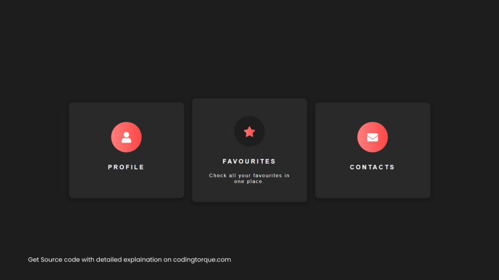
body {
  width: 100vw;
  background-color: #1d1d1d;
  margin: 0;
  font-family: helvetica;
}
.about {
  position: fixed;
  z-index: 10;
  bottom: 10px;
  right: 10px;
  width: 40px;
  height: 40px;
  display: flex;
  justify-content: flex-end;
  align-items: flex-end;
  transition: all 0.2s ease;
}
.about .bg_links {
  width: 40px;
  height: 40px;
  border-radius: 100%;
  display: flex;
  justify-content: center;
  align-items: center;
  background-color: rgba(255, 255, 255, 0.2);
  border-radius: 100%;
  backdrop-filter: blur(5px);
  position: absolute;
}
.about .logo {
  width: 40px;
  height: 40px;
  z-index: 9;
  background-image: url(https://rafaelalucas91.github.io/assets/codepen/logo_white.svg);
  background-size: 50%;
  background-repeat: no-repeat;
  background-position: 10px 7px;
  opacity: 0.9;
  transition: all 1s 0.2s ease;
  bottom: 0;
  right: 0;
}
.about .social {
  opacity: 0;
  right: 0;
  bottom: 0;
}
.about .social .icon {
  width: 100%;
  height: 100%;
  background-size: 20px;
  background-repeat: no-repeat;
  background-position: center;
  background-color: transparent;
  display: flex;
  transition: all 0.2s ease, background-color 0.4s ease;
  opacity: 0;
  border-radius: 100%;
}
.about .social.portfolio {
  transition: all 0.8s ease;
}
.about .social.portfolio .icon {
  background-image: url(https://rafaelalucas91.github.io/assets/codepen/link.svg);
}
.about .social.dribbble {
  transition: all 0.3s ease;
}
.about .social.dribbble .icon {
  background-image: url(https://rafaelalucas91.github.io/assets/codepen/dribbble.svg);
}
.about .social.linkedin {
  transition: all 0.8s ease;
}
.about .social.linkedin .icon {
  background-image: url(https://rafaelalucas91.github.io/assets/codepen/linkedin.svg);
}
.about:hover {
  width: 105px;
  height: 105px;
  transition: all 0.6s cubic-bezier(0.64, 0.01, 0.07, 1.65);
}
.about:hover .logo {
  opacity: 1;
  transition: all 0.6s ease;
}
.about:hover .social {
  opacity: 1;
}
.about:hover .social .icon {
  opacity: 0.9;
}
.about:hover .social:hover {
  background-size: 28px;
}
.about:hover .social:hover .icon {
  background-size: 65%;
  opacity: 1;
}
.about:hover .social.portfolio {
  right: 0;
  bottom: calc(100% - 40px);
  transition: all 0.3s 0s cubic-bezier(0.64, 0.01, 0.07, 1.65);
}
.about:hover .social.portfolio .icon:hover {
  background-color: #698fb7;
}
.about:hover .social.dribbble {
  bottom: 45%;
  right: 45%;
  transition: all 0.3s 0.15s cubic-bezier(0.64, 0.01, 0.07, 1.65);
}
.about:hover .social.dribbble .icon:hover {
  background-color: #ea4c89;
}
.about:hover .social.linkedin {
  bottom: 0;
  right: calc(100% - 40px);
  transition: all 0.3s 0.25s cubic-bezier(0.64, 0.01, 0.07, 1.65);
}
.about:hover .social.linkedin .icon:hover {
  background-color: #0077b5;
}
.wrapper {
  width: 100vw;
  margin: 0 auto;
  height: 400px;
  background-color: #161616;
  display: flex;
  justify-content: center;
  align-items: center;
  position: relative;
  transition: all 0.3s ease;
}
@media screen and (max-width: 767px) {
  .wrapper {
    height: 700px;
  }
}
.content {
  max-width: 1024px;
  width: 100%;
  padding: 0 4%;
  padding-top: 250px;
  margin: 0 auto;
  display: flex;
  justify-content: center;
  align-items: center;
}
@media screen and (max-width: 767px) {
  .content {
    padding-top: 300px;
    flex-direction: column;
  }
}
.card {
  width: 100%;
  max-width: 300px;
  min-width: 200px;
  height: 250px;
  background-color: #292929;
  margin: 10px;
  border-radius: 10px;
  box-shadow: 0px 2px 10px rgba(0, 0, 0, 0.24);
  border: 2px solid rgba(7, 7, 7, 0.12);
  font-size: 16px;
  transition: all 0.3s ease;
  position: relative;
  display: flex;
  justify-content: center;
  align-items: center;
  flex-direction: column;
  cursor: pointer;
  transition: all 0.3s ease;
}
.icon {
  margin: 0 auto;
  width: 100%;
  height: 80px;
  max-width: 80px;
  background: linear-gradient(
    90deg,
    #ff7e7e 0%,
    #ff4848 40%,
    rgba(0, 0, 0, 0.28) 60%
  );
  border-radius: 100%;
  display: flex;
  justify-content: center;
  align-items: center;
  color: white;
  transition: all 0.8s ease;
  background-position: 0px;
  background-size: 200px;
  font-size: 28px;
}
.material-icons.md-18 {
  font-size: 18px;
}
.material-icons.md-24 {
  font-size: 24px;
}
.material-icons.md-36 {
  font-size: 36px;
}
.material-icons.md-48 {
  font-size: 48px;
}
.card .title {
  width: 100%;
  margin: 0;
  text-align: center;
  margin-top: 30px;
  color: white;
  font-weight: 600;
  text-transform: uppercase;
  letter-spacing: 4px;
}
.card .text {
  width: 80%;
  margin: 0 auto;
  font-size: 13px;
  text-align: center;
  margin-top: 20px;
  color: white;
  font-weight: 200;
  letter-spacing: 2px;
  opacity: 0;
  max-height: 0;
  transition: all 0.3s ease;
}
.card:hover {
  height: 270px;
}
.card:hover .info {
  height: 90%;
}
.card:hover .text {
  transition: all 0.3s ease;
  opacity: 1;
  max-height: 40px;
}
.card:hover .icon {
  background-position: -120px;
  transition: all 0.3s ease;
}
.card:hover .icon i {
  background: linear-gradient(90deg, #ff7e7e, #ff4848);
  -webkit-background-clip: text;
  -webkit-text-fill-color: transparent;
  opacity: 1;
  transition: all 0.3s ease;
}
Output Till Now
Written by: Piyush Patil
If you have any doubts or any project ideas feel free to Contact Us
Hope you find this post helpful💖


