
The iPhone 15 is a blend of cutting-edge technology and elegant design, and your landing page should reflect that sophistication. A well-crafted landing page can highlight the features and design of the iPhone 15, engaging visitors and converting them into potential customers.
In this blog post, we’ll guide you through the process of designing a sleek iPhone 15 landing page using HTML and CSS. We’ll focus on creating a visually appealing layout that emphasizes the phone’s key features, advanced technology, and stunning design, ensuring a seamless and responsive user experience.


I would recommend you don’t just copy and paste the code, just look at the code and type by understanding it.
Demo
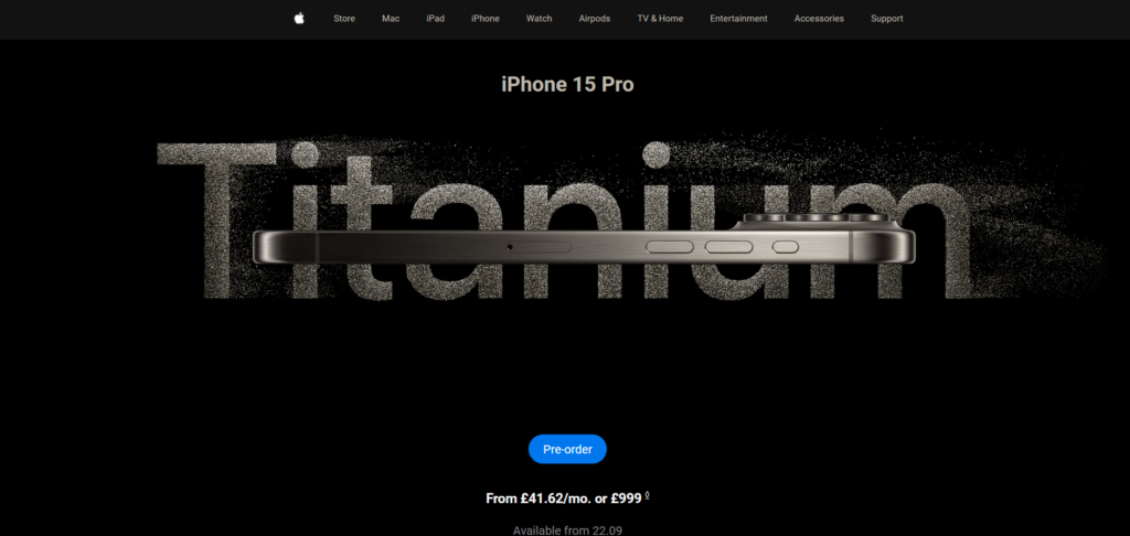
See the Pen Apple Landing page with Sticky Header by DevBilly (@Dev-BillyM) on CodePen.
HTML Code
Starter Template
<!doctype html>
<html lang="en">

<head>
    <!-- Required meta tags -->
    <meta charset="utf-8">
    <meta name="viewport" content="width=device-width, initial-scale=1">

    <!-- CSS -->
    <link rel="stylesheet" href="style.css">

    <title>IPhone 15 Landing Page using HTML and CSS - Coding Torque</title>
</head>

<body>
    <!-- Further code here -->

    <script src="script.js"></script>
</body>

</html>
Paste the below code in your <body> tag.
<body>
	<header id="stickyHeader">
        <nav>
            <ul class="navLinks">
                <li><img src="https://i.imgur.com/0l5Rsw3.png" alt="Logo"></li>
                <li><a href="#">Store</a></li>
                <li><a href="#">Mac</a></li>
                <li><a href="#">iPad</a></li>
                <li><a href="#">iPhone</a></li>
                <li><a href="#">Watch</a></li>
                <li><a href="#">Airpods</a></li>
                <li><a href="#">TV & Home</a></li>
                <li><a href="#">Entertainment</a></li>
                <li><a href="#">Accessories</a></li>
                <li><a href="#">Support</a></li>
            </ul>
        </nav>
    </header>

    <section id="special-section">
				<div class="showcaseHero">
					        <h1>iPhone 15 Pro</h1>
        <img src="https://www.apple.com/euro/iphone-15-pro/a/titles_en/images/overview/welcome/hero__iztc7m63bfiy_large_2x.jpg" alt="iPhone 15 Pro">
				</div>
    </section>
	        <div class="welcome">
            <a href="/uk/shop/goto/buy_iphone/iphone_15_pro" class="cta-button" aria-label="Pre-order iPhone 15 Pro">Pre-order</a>
            <p class="primary-text">
                <span class="price">From £41.62/mo. or £999</span>
                <sup class="footnote"><a href="#footnote-symbol" aria-label="Footnote Symbol">◊</a></sup>
            </p>
            <p class="secondary-text">Available from 22.09</p>
        </div>
</body>
CSS Code
Create a file style.css and paste the code below.
@import url("https://fonts.googleapis.com/css2?family=Nunito+Sans:opsz,wght@6..12,200;6..12,400;6..12,500;6..12,700&family=Roboto:wght@100;300;400;500;700&display=swap");
body,
h1,
h4,
a {
	margin: 0;
	padding: 0;
	font-family: "Roboto", sans-serif;
}
#stickyHeader {
	background-color: #000;
	color: #fff;
	font-size: 12px;
	line-height: 1;
	font-weight: 400;
	letter-spacing: 0.1px;
	font-family: "Roboto", sans-serif;
	padding: 5px 20px;
	position: relative;
	top: 0;
	z-index: 1000;
	transition: background-color 0.3s ease-in-out;
	width: 100%;
}
.scrolled {
	position: fixed !important;
	top: 0;
	transition: all 0.3s ease-in-out;
	background-color: #121212 !important;
}

.navLinks {
	list-style: none;
	display: flex;
	align-items: center;
	justify-content: center;
	gap: 36px;
}

.navLinks li {
	cursor: pointer;
	font-size: 12px;
}

li a {
	color: #beb8ae;
	text-decoration: none;
}

#homeIcon,
#searchIcon,
#accountIcon {
	width: 15px;
	height: 44px;
}

section {
	background-color: #000000;
	color: #beb8ae;
	display: flex;
	flex-direction: column;
	align-items: center;
	justify-content: center;
	height: 50vh;
}

.showcaseHero {
	height: 100vh;
	display: flex;
	flex-direction: column;
	justify-content: center;
	align-items: center;
	margin-top: 150px;
}

h1 {
	margin-bottom: 32px;
	font-size: 28px;
}

li img {
	width: 20px;
	height: 20px;
	padding-right: 0;
}

img {
	width: 85%;
	margin: 0 0 0 auto;
	padding-right: 32px;
	display: block;
}

.welcome {
	display: flex;
	flex-direction: column;
	justify-content: center;
	height: 600px;
	background-color: #000000;
}

.welcome a {
	color: #fff;
}

.cta-button {
	display: block;
	width: fit-content;
	background-color: #0077ed;
	border-radius: 50px;
	color: #fff;
	padding: 10px 20px;
	text-decoration: none;
	margin: 0 auto;
	margin-bottom: 24px;
}

.primary-text {
	font-size: 18px;
	margin-top: 10px;
	text-align: center;
}

.price {
	font-weight: bold;
	color: #f5f5f7;
}

.footnote {
	font-size: 12px;
}

.secondary-text {
	font-size: 16px;
	margin-top: 5px;
	color: #86868b;
	text-align: center;
}

.product-row {
	display: flex;
	flex-direction: row;
	align-items: center;
	justify-content: space-between;
	margin: 20px;
}

.product-card {
	display: flex;
	flex-direction: column;
	align-items: center;
	justify-content: space-between;
	padding: 20px;
	margin: 0 12px;
	border: 1px solid #ccc;
	border-radius: 10px;
	text-align: center;
	background-color: #000;
	box-shadow: 0 4px 8px rgba(0, 0, 0, 0.1);
}

.product-card img {
	width: 100px;
	height: 100px;
	padding: 28px;
	margin: 12px;
}

.product-card h2 {
	font-size: 24px;
	margin: 10px 0;
}

.product-card p {
	font-size: 18px;
}

.scrolled {
	position: fixed;
	top: 0;
	transition: all 0.3s ease-in-out;
	background-color: #000;
}
JavaScript Code
Create a file script.js and paste the code below.
const header = document.getElementById("stickyHeader");
window.addEventListener("scroll", function () {
	if (window.scrollY > 0) {
		header.classList.add("scrolled");
	} else {
		header.classList.remove("scrolled");
	}
});
Final Output
Written by: Piyush Patil
Code Credits: https://codepen.io/Dev-BillyM/full/OJrOXBb
If you found any mistakes or have any doubts please feel free to Contact Us
Hope you find this post helpful💖


