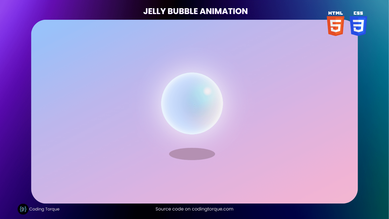
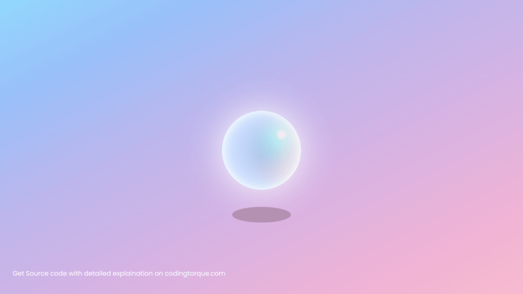
Looking for a creative and playful design project to showcase your HTML and CSS skills? Consider building a “Jelly Bubble Animation” using only these two languages. In this tutorial, we’ll show you step-by-step how to create a “Jelly Bubble Animation” from scratch using HTML and CSS. You’ll learn how to use HTML to create the structure of the bubble, and style it with CSS to give it a playful and animated appearance. Plus, you’ll gain valuable experience in using CSS to create dynamic and responsive designs. By the end of this tutorial, you’ll have a functional and visually stunning “Jelly Bubble” that you can use to showcase your skills and engage your website visitors. So, let’s get started on creating a playful and visually appealing “Jelly Bubble” using HTML and CSS!
Before we start here are 50 projects to create using HTML CSS and JavaScript –
I would recommend you don’t just copy and paste the code, just look at the code and type by understanding it.
Demo
HTML Code
Starter Template
<!doctype html>
<html lang="en">

<head>
    <!-- Required meta tags -->
    <meta charset="utf-8">
    <meta name="viewport" content="width=device-width, initial-scale=1">

    <!-- CSS -->
    <link rel="stylesheet" href="style.css">

   <!-- fontawesome  -->
    <link rel="stylesheet" href="https://use.fontawesome.com/releases/v5.3.1/css/all.css">

    <title>Jelly Bubble using HTML and CSS - Coding Torque</title>
</head>

<body>
    <!-- Further code here -->

     <script src="script.js"></script>
</body>

</html>
Paste the below code in your <body> tag.
 <div class="ball">
    </div>
    <div class="shadow"></div>
CSS Code
Create a file style.css and paste the code below.
body {
  background-image: linear-gradient(
    to bottom right,
    #91defe,
    #99c0f9,
    #bdb6ec,
    #d7b3e3,
    #efb3d5,
    #f9bccc
  );
  display: flex;
  flex-direction: column;
  align-items: center;
  justify-content: center;
  height: 100vh;
  overflow: hidden;
}

.ball {
  animation: float 3.5s ease-in-out infinite;
  height: 200px;
  width: 200px;
  border-radius: 50%;
  position: relative;

  background: radial-gradient(
    circle at 75% 30%,
    white 5px,
    aqua 8%,
    darkblue 60%,
    aqua 100%
  );
  box-shadow: inset 0 0 20px #fff, inset 10px 0 46px #eaf5fc,
    inset 88px 0px 60px #c2d8fe, inset -20px -60px 100px #fde9ea,
    inset 0 50px 140px #fde9ea, 0 0 90px #fff;
}

@keyframes float {
  0% {
    transform: translatey(0px);
  }
  50% {
    transform: translatey(-80px);
  }
  100% {
    transform: translatey(0px);
  }
}

.shadow {
  background: #b490b2;
  width: 150px;
  height: 40px;
  top: 70%;
  animation: expand 4s infinite;
  position: absolute;
  border-radius: 50%;
}
@keyframes expand {
  0%,
  100% {
    transform: scale(0.5);
  }

  50% {
    transform: scale(1);
  }
}

@media only screen and (max-width: 500px) {
  .ball {
    animation: float 4.5s ease-in-out infinite;
    height: 120px;
    width: 120px;

    background: radial-gradient(
      circle at 65% 35%,
      white 5px,
      aqua 15%,
      darkblue 50%,
      aqua 100%
    );
    box-shadow: inset 0 -20px 30px #fff, inset 40px 0 46px #eaf5fc,
      inset 58px 0px 60px #c2d8fe, inset -8px -30px 100px #fde9ea,
      inset 0 20px 110px #fde9ea, 0 0 90px #fff;
  }
  .shadow {
    width: 90px;
    height: 20px;
    top: 78%;
    animation: expand 5s infinite;
  }

  @keyframes float {
    0% {
      transform: translatey(0px);
    }
    50% {
      transform: translatey(-50px);
    }
    100% {
      transform: translatey(0px);
    }
  }
}
Final Output
Written by: Piyush Patil
Code Credits: @Jelilicent
If you found any mistakes or have any doubts please feel free to Contact Us
Hope you find this post helpful💖


