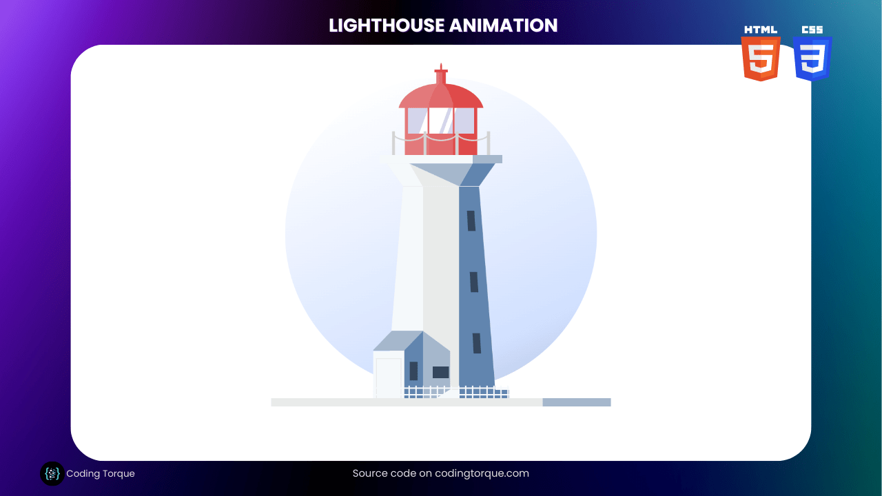
Looking for a fun and creative way to showcase your web development skills? Why not create a “Lighthouse Animation” using only HTML and CSS? In this tutorial, we’ll show you step-by-step how to create a visually stunning and dynamic animation of a lighthouse using these two languages. You’ll learn how to use HTML to create the structure of the lighthouse and style it with CSS to give it a realistic and captivating appearance. Plus, you’ll gain valuable experience in using CSS to create dynamic and interactive animations. By the end of this tutorial, you’ll have a functional and visually appealing “Lighthouse Animation” that you can use to showcase your skills and engage your website visitors. So, let’s get started on creating a beautiful and unique “Lighthouse Animation” using HTML and CSS!
Before we start here are 50 projects to create using HTML CSS and JavaScript –
I would recommend you don’t just copy and paste the code, just look at the code and type by understanding it.
Demo

HTML Code
Starter Template
<!doctype html>
<html lang="en">

<head>
    <!-- Required meta tags -->
    <meta charset="utf-8">
    <meta name="viewport" content="width=device-width, initial-scale=1">

    <!-- CSS -->
    <link rel="stylesheet" href="style.css">

    <title>Lighthouse Animation using HTML and CSS - Coding Torque</title>
</head>

<body>
    <!-- Further code here -->
</body>

</html>
Paste the below code in your <body> tag.
<div class="box">
    <div class="bg-circle"></div>
    <div class="base">
        <div class="base-shadow"></div>
    </div>
    <div class="tower-base">
        <div class="tower-base-shadow"></div>
    </div>
    <div class="entrance-container">
        <div class="entrance-roof"></div>
        <div class="entrance-front">
            <div class="entrance-door"></div>
        </div>
        <div class="entrance-side">
            <div class="entrance-window"></div>
        </div>
    </div>
    <div class="tower-container">
        <div class="tower">
            <div class="dark-side">
                <div class="window top"></div>
                <div class="window middle"></div>
                <div class="window bottom"></div>
            </div>
            <div class="light-side"></div>
        </div>
        <div class="tower-top">
            <div class="dark-side"></div>
            <div class="light-side"></div>
            <div class="shadow-from-platform"></div>
        </div>
        <div class="tower-platform">
            <div class="shadow"></div>
        </div>
        <div class="lantern-pane">
            <div class="dark-side"></div>
            <div class="light-side"></div>
            <div class="window">
                <div class="reflection thick"></div>
                <div class="reflection thin"></div>
                <div class="frame-left"></div>
                <div class="frame-right"></div>
            </div>
        </div>
        <div class="platform-fence">
            <div class="rope"></div>
            <div class="rope"></div>
            <div class="rope"></div>
            <div class="pole"></div>
            <div class="pole"></div>
            <div class="pole"></div>
            <div class="pole"></div>
        </div>
        <div class="cupola">
            <div class="light"></div>
            <div class="shadow"></div>
        </div>
        <div class="solarvalve">
            <div class="tube">
                <div class="shadow"></div>
                <div class="light"></div>
            </div>
            <div class="hat"></div>
            <div class="spike"></div>
        </div>
        <div class="shadow-from-entrance">
            <div class="window-bottom"></div>
        </div>
    </div>
    <div class="fence">
        <div class="pole"></div>
        <div class="pole"></div>
        <div class="pole"></div>
        <div class="pole"></div>
        <div class="pole"></div>
        <div class="pole"></div>
        <div class="pole"></div>
        <div class="pole"></div>
        <div class="pole"></div>
        <div class="pole"></div>
        <div class="pole"></div>
        <div class="pole"></div>
        <div class="pole"></div>
        <div class="pole"></div>
        <div class="pole"></div>
        <div class="pole"></div>
        <div class="pole"></div>
        <div class="pole"></div>
        <div class="pole"></div>
        <div class="pole"></div>
    </div>
    <div class="vertical-pole top"></div>
    <div class="vertical-pole bottom"></div>
</div>
CSS Code
Create a file style.css and paste the code below.
.box {
  width: 650px;
  height: 650px;
  background-color: #fff;
  position: relative;
  margin: 0 auto;
  margin-top: 3em;
}
.link {
  padding-top: 1.5em;
  margin: 0 auto;
  text-align: center;
}
.bg-circle {
  width: 92%;
  height: 92%;
  background-color: #c4eaff;
  border-radius: 50%;
  position: absolute;
  top: 3%;
  right: 4%;
  background: linear-gradient(-25deg, #c2d0ed 10%, #d1e0ff 20%, #fff 90%);
}
.base {
  background-color: #e9ebea;
  width: 100%;
  height: 2.5%;
  position: relative;
  top: 97.5%;
}
.base-shadow {
  height: 100%;
  width: 20%;
  position: absolute;
  right: 0px;
  background-color: #a5b7cc;
}
.entrance-container {
  overflow: hidden;
  z-index: 3;
  position: absolute;
  bottom: 2.5%;
  left: 44.7666666667%;
  height: 19.8%;
  width: 14.8%;
  transform: translateX(-100%);
}
.entrance-roof {
  z-index: 5;
  background-color: #a5b7cc;
  width: 63%;
  height: 30%;
  position: absolute;
  left: 18%;
  transform: skewX(-44deg);
}
.entrance-front {
  background-color: #f5f9fb;
  height: 70%;
  width: 63%;
  position: absolute;
  bottom: 0;
}
.entrance-front .entrance-door {
  height: 83%;
  width: 75%;
  position: absolute;
  left: 9%;
  bottom: 0;
  border: 2px solid #e9ebea;
  border-bottom: none;
}
.entrance-side {
  background-color: #6185af;
  height: 100%;
  width: 38%;
  position: absolute;
  right: 0;
  z-index: 4;
}
.entrance-side .entrance-window {
  background-color: #34465d;
  width: 40%;
  height: 28%;
  position: absolute;
  top: 50%;
  left: 50%;
  transform: translate(-50%, -15%);
}
.shadow-from-entrance {
  background-color: #a5b7cc;
  z-index: 3;
  position: absolute;
  bottom: 0;
  left: 44.6666666667%;
  bottom: 2.5%;
  width: 8%;
  height: 19.8%;
  clip-path: polygon(100% 30%, 100% 87%, 50% 100%, 0 100%, 0 0);
  -webkit-clip-path: polygon(100% 30%, 100% 87%, 50% 100%, 0 100%, 0 0);
  overflow: visible;
}
.shadow-from-entrance .window-bottom {
  height: 17%;
  width: 60%;
  position: absolute;
  top: 53%;
  right: 4%;
  background-color: #34465d;
}
.tower-base {
  background-color: #f5f9fb;
  position: absolute;
  height: 2.5%;
  width: 40%;
  bottom: 2.5%;
  position: absolute;
  left: 50%;
  transform: translateX(-50%);
}
.tower-base .tower-base-shadow {
  width: 36.5%;
  height: 100%;
  right: 0;
  background-color: #6185af;
  position: absolute;
}
.tower {
  overflow: hidden;
  position: absolute;
  bottom: 4.9%;
  background-color: #e9ebea;
  height: 60%;
  width: 32%;
  left: 34%;
  clip-path: polygon(15% 0%, 85% 0%, 100% 100%, 0% 100%);
  /* // DELETE .window-bottom {
    //z-index: ;
    background-color: $window-dark;
    height: 5%;
    width: 16%;
    position: absolute;
    left: 42%;
    bottom: 5%;
 }
 */
}
.tower .dark-side,
.tower .light-side {
  width: 33.3333333333%;
  height: 100%;
  position: absolute;
}
.tower .light-side {
  background-color: #f5f9fb;
  left: 0;
}
.tower .dark-side {
  background-color: #6185af;
  right: 0;
}
.tower .dark-side .window {
  background-color: #34465d;
  width: 20%;
  height: 10%;
  position: absolute;
  transform: skew(3.5deg);
}
.tower .dark-side .window.top {
  top: 12%;
  left: 22.5%;
}
.tower .dark-side .window.middle {
  top: 42%;
  left: 30.5%;
}
.tower .dark-side .window.bottom {
  top: 72%;
  left: 38.5%;
}
.tower-top {
  width: 40%;
  height: 6.7666666667%;
  background-color: #e9ebea;
  position: absolute;
  bottom: 64.9%;
  right: 30%;
  clip-path: polygon(10% 0%, 90% 0%, 78% 100%, 22% 100%);
}
.tower-top .shadow-from-platform {
  background-color: #a5b7cc;
  width: 100%;
  height: 100%;
  clip-path: polygon(10% 0%, 73.3% 0%, 63.5% 100%, 26.5% 0%);
}
.tower-top .dark-side,
.tower-top .light-side {
  width: 31.5%;
  height: 100%;
  position: absolute;
}
.tower-top .dark-side {
  background-color: #6185af;
  right: 0;
  transform: skew(-30deg);
}
.tower-top .light-side {
  background-color: #f5f9fb;
  left: 0;
  transform: skew(30deg);
}
.tower-platform {
  height: 2.5%;
  width: 36%;
  background-color: #f5f9fb;
  position: absolute;
  bottom: 71.6666666667%;
  right: 32%;
}
.tower-platform .shadow {
  background-color: #a5b7cc;
  height: 100%;
  width: 24%;
  float: right;
}
.lantern-pane {
  position: absolute;
  height: 14%;
  width: 21.2%;
  background-color: #e1696b;
  left: 39.4%;
  bottom: 74.1666666667%;
}
.lantern-pane .dark-side,
.lantern-pane .light-side {
  z-index: 2;
  position: relative;
  height: 100%;
  width: 33.3333333333%;
}
.lantern-pane .light-side {
  background-color: #e3797b;
  float: left;
}
.lantern-pane .dark-side {
  background-color: #df4a4a;
  float: right;
}
.window {
  position: relative;
  z-index: 3;
  background-color: #d4d5eb;
  height: 55%;
  width: 92%;
  margin: 0 auto;
}
.window .reflection {
  z-index: 4;
  position: absolute;
  background-color: #fff;
  height: 99%;
}
.window .reflection.thick {
  width: 30%;
  transform: skew(-20deg);
  left: 24%;
}
.window .reflection.thin {
  width: 7%;
  left: 60%;
  transform: skew(-20deg);
}
.window .frame-left,
.window .frame-right {
  z-index: 5;
  height: 100%;
  width: 3%;
  background-color: #e1696b;
  position: absolute;
  top: 0;
}
.window .frame-left {
  left: 29.3333333333%;
}
.window .frame-right {
  right: 29.3333333333%;
}
.platform-fence {
  z-index: 3;
  position: absolute;
  height: 7%;
  width: 28.8%;
  position: absolute;
  left: 50%;
  transform: translateX(-50%);
  bottom: 74.1666666667%;
  display: flex;
  justify-content: space-between;
  overflow: hidden;
}
.platform-fence .pole {
  z-index: 4;
  height: 100%;
  width: 3%;
  background-color: lightgrey;
}
.platform-fence .rope {
  z-index: 3;
  position: absolute;
  bottom: 59%;
  background-color: transparent;
  width: 31.5%;
  padding-bottom: 15%;
  border-radius: 50%;
  border: 3.1px solid lightgrey;
}
.platform-fence .rope:nth-child(2) {
  position: absolute;
  left: 50%;
  transform: translateX(-50%);
}
.platform-fence .rope:nth-child(3) {
  right: 0;
}
/** * Use equation -(2/3)*((x+1/3)^2)+3 of a graph to calculate y values that correspond to x-values running from startX to endX * * @startconditions: * -> startX > endX * -> startX and endX are percentage (%) values * -> y values will run from 100 (paired with startX) to 0 (endX) * * $direction: set to 1 for arch to right and to -1 for arch to left */
.cupola {
  z-index: 3;
  width: 25.44%;
  height: 17.808%;
  border-radius: 50%;
  background-color: #e1696b;
  position: absolute;
  position: absolute;
  left: 50%;
  transform: translateX(-50%);
  bottom: 77.3666666667%;
  clip-path: polygon(0% 0%, 100% 0%, 100% 40%, 0% 40%);
  overflow: hidden;
}
.cupola .light,
.cupola .shadow {
  width: 50%;
  height: 50%;
  position: absolute;
  top: 0;
}
.cupola .light {
  background-color: #e3797b;
  left: 0;
  transform: scaleX(-1);
  clip-path: polygon(
    4.5% 0%,
    100% 0%,
    100% 100%,
    28% 100%,
    28% 66.7309027778%,
    27.9% 66.2606923611%,
    27.8% 65.7921444444%,
    27.7% 65.3252590278%,
    27.6% 64.8600361111%,
    27.5% 64.3964756944%,
    27.4% 63.9345777778%,
    27.3% 63.4743423611%,
    27.2% 63.0157694444%,
    27.1% 62.5588590278%,
    27% 62.1036111111%,
    26.9% 61.6500256944%,
    26.8% 61.1981027778%,
    26.7% 60.7478423611%,
    26.6% 60.2992444444%,
    26.5% 59.8523090278%,
    26.4% 59.4070361111%,
    26.3% 58.9634256944%,
    26.2% 58.5214777778%,
    26.1% 58.0811923611%,
    26% 57.6425694444%,
    25.9% 57.2056090278%,
    25.8% 56.7703111111%,
    25.7% 56.3366756944%,
    25.6% 55.9047027778%,
    25.5% 55.4743923611%,
    25.4% 55.0457444444%,
    25.3% 54.6187590278%,
    25.2% 54.1934361111%,
    25.1% 53.7697756944%,
    25% 53.3477777778%,
    24.9% 52.9274423611%,
    24.8% 52.5087694444%,
    24.7% 52.0917590278%,
    24.6% 51.6764111111%,
    24.5% 51.2627256944%,
    24.4% 50.8507027778%,
    24.3% 50.4403423611%,
    24.2% 50.0316444444%,
    24.1% 49.6246090278%,
    24% 49.2192361111%,
    23.9% 48.8155256944%,
    23.8% 48.4134777778%,
    23.7% 48.0130923611%,
    23.6% 47.6143694444%,
    23.5% 47.2173090278%,
    23.4% 46.8219111111%,
    23.3% 46.4281756944%,
    23.2% 46.0361027778%,
    23.1% 45.6456923611%,
    23% 45.2569444444%,
    22.9% 44.8698590278%,
    22.8% 44.4844361111%,
    22.7% 44.1006756944%,
    22.6% 43.7185777778%,
    22.5% 43.3381423611%,
    22.4% 42.9593694444%,
    22.3% 42.5822590278%,
    22.2% 42.2068111111%,
    22.1% 41.8330256944%,
    22% 41.4609027778%,
    21.9% 41.0904423611%,
    21.8% 40.7216444444%,
    21.7% 40.3545090278%,
    21.6% 39.9890361111%,
    21.5% 39.6252256944%,
    21.4% 39.2630777778%,
    21.3% 38.9025923611%,
    21.2% 38.5437694444%,
    21.1% 38.1866090278%,
    21% 37.8311111111%,
    20.9% 37.4772756944%,
    20.8% 37.1251027778%,
    20.7% 36.7745923611%,
    20.6% 36.4257444444%,
    20.5% 36.0785590278%,
    20.4% 35.7330361111%,
    20.3% 35.3891756944%,
    20.2% 35.0469777778%,
    20.1% 34.7064423611%,
    20% 34.3675694444%,
    19.9% 34.0303590278%,
    19.8% 33.6948111111%,
    19.7% 33.3609256944%,
    19.6% 33.0287027778%,
    19.5% 32.6981423611%,
    19.4% 32.3692444444%,
    19.3% 32.0420090278%,
    19.2% 31.7164361111%,
    19.1% 31.3925256944%,
    19% 31.0702777778%,
    18.9% 30.7496923611%,
    18.8% 30.4307694444%,
    18.7% 30.1135090278%,
    18.6% 29.7979111111%,
    18.5% 29.4839756944%,
    18.4% 29.1717027778%,
    18.3% 28.8610923611%,
    18.2% 28.5521444444%,
    18.1% 28.2448590278%,
    18% 27.9392361111%,
    17.9% 27.6352756944%,
    17.8% 27.3329777778%,
    17.7% 27.0323423611%,
    17.6% 26.7333694444%,
    17.5% 26.4360590278%,
    17.4% 26.1404111111%,
    17.3% 25.8464256944%,
    17.2% 25.5541027778%,
    17.1% 25.2634423611%,
    17% 24.9744444444%,
    16.9% 24.6871090278%,
    16.8% 24.4014361111%,
    16.7% 24.1174256944%,
    16.6% 23.8350777778%,
    16.5% 23.5543923611%,
    16.4% 23.2753694444%,
    16.3% 22.9980090278%,
    16.2% 22.7223111111%,
    16.1% 22.4482756944%,
    16% 22.1759027778%,
    15.9% 21.9051923611%,
    15.8% 21.6361444444%,
    15.7% 21.3687590278%,
    15.6% 21.1030361111%,
    15.5% 20.8389756944%,
    15.4% 20.5765777778%,
    15.3% 20.3158423611%,
    15.2% 20.0567694444%,
    15.1% 19.7993590278%,
    15% 19.5436111111%,
    14.9% 19.2895256944%,
    14.8% 19.0371027778%,
    14.7% 18.7863423611%,
    14.6% 18.5372444444%,
    14.5% 18.2898090278%,
    14.4% 18.0440361111%,
    14.3% 17.7999256944%,
    14.2% 17.5574777778%,
    14.1% 17.3166923611%,
    14% 17.0775694444%,
    13.9% 16.8401090278%,
    13.8% 16.6043111111%,
    13.7% 16.3701756944%,
    13.6% 16.1377027778%,
    13.5% 15.9068923611%,
    13.4% 15.6777444444%,
    13.3% 15.4502590278%,
    13.2% 15.2244361111%,
    13.1% 15.0002756944%,
    13% 14.7777777778%,
    12.9% 14.5569423611%,
    12.8% 14.3377694444%,
    12.7% 14.1202590278%,
    12.6% 13.9044111111%,
    12.5% 13.6902256944%,
    12.4% 13.4777027778%,
    12.3% 13.2668423611%,
    12.2% 13.0576444444%,
    12.1% 12.8501090278%,
    12% 12.6442361111%,
    11.9% 12.4400256944%,
    11.8% 12.2374777778%,
    11.7% 12.0365923611%,
    11.6% 11.8373694444%,
    11.5% 11.6398090278%,
    11.4% 11.4439111111%,
    11.3% 11.2496756944%,
    11.2% 11.0571027778%,
    11.1% 10.8661923611%,
    11% 10.6769444444%,
    10.9% 10.4893590278%,
    10.8% 10.3034361111%,
    10.7% 10.1191756944%,
    10.6% 9.9365777778%,
    10.5% 9.7556423611%,
    10.4% 9.5763694444%,
    10.3% 9.3987590278%,
    10.2% 9.2228111111%,
    10.1% 9.0485256944%,
    10% 8.8759027778%,
    9.9% 8.7049423611%,
    9.8% 8.5356444444%,
    9.7% 8.3680090278%,
    9.6% 8.2020361111%,
    9.5% 8.0377256944%,
    9.4% 7.8750777778%,
    9.3% 7.7140923611%,
    9.2% 7.5547694444%,
    9.1% 7.3971090278%,
    9% 7.2411111111%,
    8.9% 7.0867756944%,
    8.8% 6.9341027778%,
    8.7% 6.7830923611%,
    8.6% 6.6337444444%,
    8.5% 6.4860590278%,
    8.4% 6.3400361111%,
    8.3% 6.1956756944%,
    8.2% 6.0529777778%,
    8.1% 5.9119423611%,
    8% 5.7725694444%,
    7.9% 5.6348590278%,
    7.8% 5.4988111111%,
    7.7% 5.3644256944%,
    7.6% 5.2317027778%,
    7.5% 5.1006423611%,
    7.4% 4.9712444444%,
    7.3% 4.8435090278%,
    7.2% 4.7174361111%,
    7.1% 4.5930256944%,
    7% 4.4702777778%,
    6.9% 4.3491923611%,
    6.8% 4.2297694444%,
    6.7% 4.1120090278%,
    6.6% 3.9959111111%,
    6.5% 3.8814756944%,
    6.4% 3.7687027778%,
    6.3% 3.6575923611%,
    6.2% 3.5481444444%,
    6.1% 3.4403590278%,
    6% 3.3342361111%,
    5.9% 3.2297756944%,
    5.8% 3.1269777778%,
    5.7% 3.0258423611%,
    5.6% 2.9263694444%,
    5.5% 2.8285590278%,
    5.4% 2.7324111111%,
    5.3% 2.6379256944%,
    5.2% 2.5451027778%,
    5.1% 2.4539423611%,
    5% 2.3644444444%,
    4.9% 2.2766090278%,
    4.8% 2.1904361111%,
    4.7% 2.1059256944%,
    4.6% 2.0230777778%
  );
}
.cupola .shadow {
  background-color: #df4a4a;
  right: 0;
  clip-path: polygon(
    4.5% 0%,
    100% 0%,
    100% 100%,
    28% 100%,
    28% 66.7309027778%,
    27.9% 66.2606923611%,
    27.8% 65.7921444444%,
    27.7% 65.3252590278%,
    27.6% 64.8600361111%,
    27.5% 64.3964756944%,
    27.4% 63.9345777778%,
    27.3% 63.4743423611%,
    27.2% 63.0157694444%,
    27.1% 62.5588590278%,
    27% 62.1036111111%,
    26.9% 61.6500256944%,
    26.8% 61.1981027778%,
    26.7% 60.7478423611%,
    26.6% 60.2992444444%,
    26.5% 59.8523090278%,
    26.4% 59.4070361111%,
    26.3% 58.9634256944%,
    26.2% 58.5214777778%,
    26.1% 58.0811923611%,
    26% 57.6425694444%,
    25.9% 57.2056090278%,
    25.8% 56.7703111111%,
    25.7% 56.3366756944%,
    25.6% 55.9047027778%,
    25.5% 55.4743923611%,
    25.4% 55.0457444444%,
    25.3% 54.6187590278%,
    25.2% 54.1934361111%,
    25.1% 53.7697756944%,
    25% 53.3477777778%,
    24.9% 52.9274423611%,
    24.8% 52.5087694444%,
    24.7% 52.0917590278%,
    24.6% 51.6764111111%,
    24.5% 51.2627256944%,
    24.4% 50.8507027778%,
    24.3% 50.4403423611%,
    24.2% 50.0316444444%,
    24.1% 49.6246090278%,
    24% 49.2192361111%,
    23.9% 48.8155256944%,
    23.8% 48.4134777778%,
    23.7% 48.0130923611%,
    23.6% 47.6143694444%,
    23.5% 47.2173090278%,
    23.4% 46.8219111111%,
    23.3% 46.4281756944%,
    23.2% 46.0361027778%,
    23.1% 45.6456923611%,
    23% 45.2569444444%,
    22.9% 44.8698590278%,
    22.8% 44.4844361111%,
    22.7% 44.1006756944%,
    22.6% 43.7185777778%,
    22.5% 43.3381423611%,
    22.4% 42.9593694444%,
    22.3% 42.5822590278%,
    22.2% 42.2068111111%,
    22.1% 41.8330256944%,
    22% 41.4609027778%,
    21.9% 41.0904423611%,
    21.8% 40.7216444444%,
    21.7% 40.3545090278%,
    21.6% 39.9890361111%,
    21.5% 39.6252256944%,
    21.4% 39.2630777778%,
    21.3% 38.9025923611%,
    21.2% 38.5437694444%,
    21.1% 38.1866090278%,
    21% 37.8311111111%,
    20.9% 37.4772756944%,
    20.8% 37.1251027778%,
    20.7% 36.7745923611%,
    20.6% 36.4257444444%,
    20.5% 36.0785590278%,
    20.4% 35.7330361111%,
    20.3% 35.3891756944%,
    20.2% 35.0469777778%,
    20.1% 34.7064423611%,
    20% 34.3675694444%,
    19.9% 34.0303590278%,
    19.8% 33.6948111111%,
    19.7% 33.3609256944%,
    19.6% 33.0287027778%,
    19.5% 32.6981423611%,
    19.4% 32.3692444444%,
    19.3% 32.0420090278%,
    19.2% 31.7164361111%,
    19.1% 31.3925256944%,
    19% 31.0702777778%,
    18.9% 30.7496923611%,
    18.8% 30.4307694444%,
    18.7% 30.1135090278%,
    18.6% 29.7979111111%,
    18.5% 29.4839756944%,
    18.4% 29.1717027778%,
    18.3% 28.8610923611%,
    18.2% 28.5521444444%,
    18.1% 28.2448590278%,
    18% 27.9392361111%,
    17.9% 27.6352756944%,
    17.8% 27.3329777778%,
    17.7% 27.0323423611%,
    17.6% 26.7333694444%,
    17.5% 26.4360590278%,
    17.4% 26.1404111111%,
    17.3% 25.8464256944%,
    17.2% 25.5541027778%,
    17.1% 25.2634423611%,
    17% 24.9744444444%,
    16.9% 24.6871090278%,
    16.8% 24.4014361111%,
    16.7% 24.1174256944%,
    16.6% 23.8350777778%,
    16.5% 23.5543923611%,
    16.4% 23.2753694444%,
    16.3% 22.9980090278%,
    16.2% 22.7223111111%,
    16.1% 22.4482756944%,
    16% 22.1759027778%,
    15.9% 21.9051923611%,
    15.8% 21.6361444444%,
    15.7% 21.3687590278%,
    15.6% 21.1030361111%,
    15.5% 20.8389756944%,
    15.4% 20.5765777778%,
    15.3% 20.3158423611%,
    15.2% 20.0567694444%,
    15.1% 19.7993590278%,
    15% 19.5436111111%,
    14.9% 19.2895256944%,
    14.8% 19.0371027778%,
    14.7% 18.7863423611%,
    14.6% 18.5372444444%,
    14.5% 18.2898090278%,
    14.4% 18.0440361111%,
    14.3% 17.7999256944%,
    14.2% 17.5574777778%,
    14.1% 17.3166923611%,
    14% 17.0775694444%,
    13.9% 16.8401090278%,
    13.8% 16.6043111111%,
    13.7% 16.3701756944%,
    13.6% 16.1377027778%,
    13.5% 15.9068923611%,
    13.4% 15.6777444444%,
    13.3% 15.4502590278%,
    13.2% 15.2244361111%,
    13.1% 15.0002756944%,
    13% 14.7777777778%,
    12.9% 14.5569423611%,
    12.8% 14.3377694444%,
    12.7% 14.1202590278%,
    12.6% 13.9044111111%,
    12.5% 13.6902256944%,
    12.4% 13.4777027778%,
    12.3% 13.2668423611%,
    12.2% 13.0576444444%,
    12.1% 12.8501090278%,
    12% 12.6442361111%,
    11.9% 12.4400256944%,
    11.8% 12.2374777778%,
    11.7% 12.0365923611%,
    11.6% 11.8373694444%,
    11.5% 11.6398090278%,
    11.4% 11.4439111111%,
    11.3% 11.2496756944%,
    11.2% 11.0571027778%,
    11.1% 10.8661923611%,
    11% 10.6769444444%,
    10.9% 10.4893590278%,
    10.8% 10.3034361111%,
    10.7% 10.1191756944%,
    10.6% 9.9365777778%,
    10.5% 9.7556423611%,
    10.4% 9.5763694444%,
    10.3% 9.3987590278%,
    10.2% 9.2228111111%,
    10.1% 9.0485256944%,
    10% 8.8759027778%,
    9.9% 8.7049423611%,
    9.8% 8.5356444444%,
    9.7% 8.3680090278%,
    9.6% 8.2020361111%,
    9.5% 8.0377256944%,
    9.4% 7.8750777778%,
    9.3% 7.7140923611%,
    9.2% 7.5547694444%,
    9.1% 7.3971090278%,
    9% 7.2411111111%,
    8.9% 7.0867756944%,
    8.8% 6.9341027778%,
    8.7% 6.7830923611%,
    8.6% 6.6337444444%,
    8.5% 6.4860590278%,
    8.4% 6.3400361111%,
    8.3% 6.1956756944%,
    8.2% 6.0529777778%,
    8.1% 5.9119423611%,
    8% 5.7725694444%,
    7.9% 5.6348590278%,
    7.8% 5.4988111111%,
    7.7% 5.3644256944%,
    7.6% 5.2317027778%,
    7.5% 5.1006423611%,
    7.4% 4.9712444444%,
    7.3% 4.8435090278%,
    7.2% 4.7174361111%,
    7.1% 4.5930256944%,
    7% 4.4702777778%,
    6.9% 4.3491923611%,
    6.8% 4.2297694444%,
    6.7% 4.1120090278%,
    6.6% 3.9959111111%,
    6.5% 3.8814756944%,
    6.4% 3.7687027778%,
    6.3% 3.6575923611%,
    6.2% 3.5481444444%,
    6.1% 3.4403590278%,
    6% 3.3342361111%,
    5.9% 3.2297756944%,
    5.8% 3.1269777778%,
    5.7% 3.0258423611%,
    5.6% 2.9263694444%,
    5.5% 2.8285590278%,
    5.4% 2.7324111111%,
    5.3% 2.6379256944%,
    5.2% 2.5451027778%,
    5.1% 2.4539423611%,
    5% 2.3644444444%,
    4.9% 2.2766090278%,
    4.8% 2.1904361111%,
    4.7% 2.1059256944%,
    4.6% 2.0230777778%
  );
}
.solarvalve {
  height: 5%;
  width: 4%;
  position: absolute;
  position: absolute;
  left: 50%;
  transform: translateX(-50%);
  top: 0;
  overflow: visible;
}
.solarvalve .tube,
.solarvalve .hat,
.solarvalve .spike {
  background-color: #e1696b;
  position: absolute;
  left: 50%;
  transform: translateX(-50%);
}
.solarvalve .tube {
  height: 75%;
  width: 70%;
  bottom: 0;
}
.solarvalve .tube .shadow,
.solarvalve .tube .light {
  height: 100%;
  width: 33.3333333333%;
  position: absolute;
  top: 0;
}
.solarvalve .tube .shadow {
  right: 0;
  background-color: #df4a4a;
}
.solarvalve .tube .light {
  left: 0;
  background-color: #e3797b;
}
.solarvalve .hat {
  width: 100%;
  height: 15%;
  bottom: 70%;
  background-color: #df4a4a;
}
.solarvalve .spike {
  bottom: 70%;
  height: 1.1em;
  width: 15%;
  background-color: #df4a4a;
  border-radius: 60% 60% 0% 0%;
}
.fence {
  z-index: 3;
  width: 40%;
  height: 3.75%;
  position: absolute;
  bottom: 2.5%;
  position: absolute;
  left: 50%;
  transform: translateX(-50%);
  display: flex;
  flex-wrap: nowrap;
  justify-content: space-between;
}
.fence .pole {
  z-index: 4;
  background-color: #f5f9fb;
  width: 2.5px;
  height: 100%;
}
.vertical-pole {
  z-index: 5;
  background-color: #f5f9fb;
  width: 40%;
  height: 2.5px;
  position: absolute;
  left: 0;
  position: absolute;
  left: 50%;
  transform: translateX(-50%);
}
.vertical-pole.bottom {
  bottom: 3.375%;
}
.vertical-pole.top {
  bottom: 5.25%;
}
Final Output
Written by: Piyush Patil
Code Credits: @Rikkokiri
If you found any mistakes or have any doubts please feel free to Contact Us
Hope you find this post helpful💖


