Welcome to Coding Torque – your ultimate destination for all things web development and design! In this exhilarating journey, we are about to embark on a thrilling quest: crafting a mesmerizing Notification Bell Animation using nothing but the power of HTML and CSS.
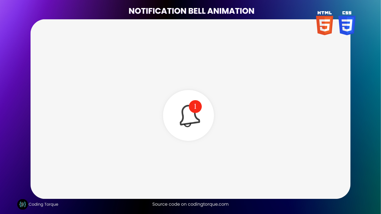
Picture this – a sleek, modern bell icon adorning your website, ready to spring into life with every update, delivering a seamless and delightful user experience. Gone are the days of static, mundane notifications. Today, we rise to the challenge of bringing our designs to life, captivating users with an animation that commands attention and sparks intrigue.
Whether you’re a curious coder seeking to level up your skills or a design aficionado eager to add that extra touch of magic to your website, this tutorial is tailor-made for you. Guided by our expert developers, you’ll unveil the secrets behind creating smooth, elegant animations that dance with the rhythm of your users’ interactions.
But hold onto your seats, for our exploration goes beyond the technical realm. We’ll delve into the psychology of user engagement, understanding how subtle animations can elevate your website’s impact and foster lasting connections with your audience.
So, buckle up and get ready to harness the prowess of HTML and CSS as we venture into the realm of Notification Bell Animation. Let’s unleash the full potential of your web projects and breathe life into your designs. Ready to code with torque? Let’s dive in!
Before we start here are 50 projects to create using HTML CSS and JavaScript –
I would recommend you don’t just copy and paste the code, just look at the code and type by understanding it.
Demo
HTML Code
Starter Template
<!doctype html>
<html lang="en">

<head>
    <!-- Required meta tags -->
    <meta charset="utf-8">
    <meta name="viewport" content="width=device-width, initial-scale=1">

    <!-- CSS -->
    <link rel="stylesheet" href="style.css">

    <title>Notification Bell Hover Animation using HTML and CSS - Coding Torque</title>
</head>

<body>
    <!-- Further code here -->
</body>

</html>
Paste the below code in your <body> tag.
<div class="bell-icon" tabindex="0">
    <svg version="1.1" xmlns="http://www.w3.org/2000/svg" xmlns:xlink="http://www.w3.org/1999/xlink" x="0px" y="0px" width="50px" height="30px" viewBox="0 0 50 30" enable-background="new 0 0 50 30" xml:space="preserve">
      <g class="bell-icon__group">
        <path class="bell-icon__ball" id="ball" fill-rule="evenodd" stroke-width="1.5" clip-rule="evenodd" fill="none" stroke="#currentColor" stroke-miterlimit="10" d="M28.7,25 c0,1.9-1.7,3.5-3.7,3.5s-3.7-1.6-3.7-3.5s1.7-3.5,3.7-3.5S28.7,23,28.7,25z"/>
        <path class="bell-icon__shell" id="shell" fill-rule="evenodd" clip-rule="evenodd" fill="#FFFFFF" stroke="#currentColor" stroke-width="2" stroke-miterlimit="10" d="M35.9,21.8c-1.2-0.7-4.1-3-3.4-8.7c0.1-1,0.1-2.1,0-3.1h0c-0.3-4.1-3.9-7.2-8.1-6.9c-3.7,0.3-6.6,3.2-6.9,6.9h0 c-0.1,1-0.1,2.1,0,3.1c0.6,5.7-2.2,8-3.4,8.7c-0.4,0.2-0.6,0.6-0.6,1v1.8c0,0.2,0.2,0.4,0.4,0.4h22.2c0.2,0,0.4-0.2,0.4-0.4v-1.8 C36.5,22.4,36.3,22,35.9,21.8L35.9,21.8z"/>
      </g>
    </svg>
    <div class="notification-amount">
      <span>1</span>
    </div>
  </div>
CSS Code
Create a file style.css and paste the code below.
body {
  background: #f6f6f6;
  display: flex;
  align-items: center;
  justify-content: center;
  height: 100vh;
}
.bell-icon {
  position: relative;
  width: 100px;
  height: 100px;
  background: #fff;
  border-radius: 50%;
  display: flex;
}
.bell-icon svg {
  margin: auto;
  position: relative;
  right: 2%;
  width: 80%;
  height: 80%;
  stroke: rgba(0, 0, 0, 0.75);
}
.bell-icon .bell-icon__group {
  transform-origin: 50% 2px;
  transform: rotate(-8deg);
  animation-fill-mode: both;
  animation-iteration-count: 1;
  animation-timing-function: ease-in-out;
}
.bell-icon .bell-icon__ball {
  transform-origin: 50% 2px;
  transform: translateX(-6.5%);
  animation-fill-mode: both;
  animation-iteration-count: 1;
  animation-timing-function: ease-in-out;
}
.bell-icon:focus, .bell-icon:hover {
  outline: none;
  box-shadow: 0 0 12px -8px rgba(0, 0, 0, 0.6);
}
.bell-icon:focus .bell-icon__group, .bell-icon:hover .bell-icon__group {
  animation: animateGroup 2.3s;
}
.bell-icon:focus .bell-icon__ball, .bell-icon:hover .bell-icon__ball {
  animation: animateBall 2.3s;
}
.bell-icon:focus .notification-amount, .bell-icon:hover .notification-amount {
  opacity: 1;
  visibility: visible;
}
.bell-icon:focus .notification-amount::before, .bell-icon:hover .notification-amount::before {
  animation-name: bounce;
  animation-delay: 450ms;
}
.notification-amount {
  opacity: 0;
  visibility: hidden;
  position: absolute;
  top: 20%;
  right: 24%;
  width: 25px;
  height: 25px;
  color: white;
  border-radius: 50%;
  display: flex;
  align-items: center;
  justify-content: center;
  font-family: "Copse", serif;
  font-size: 14px;
}
.notification-amount span {
  position: relative;
}
.notification-amount::before {
  content: "";
  position: absolute;
  width: 100%;
  height: 100%;
  background-color: #f72918;
  border-radius: 50%;
  z-index: 0;
  transform: scale(0);
  animation-duration: 800ms;
  animation-fill-mode: both;
}
@keyframes animateGroup {
  0%, 100% {
    transform: rotate(-8deg);
 }
  17.542% {
    transform: rotate(0deg);
 }
  35.084% {
    transform: rotate(-20deg);
 }
  48.2405% {
    transform: rotate(20deg);
 }
  57.0115% {
    transform: rotate(-20deg);
 }
  64.9054% {
    transform: rotate(8deg);
 }
  74.5535% {
    transform: rotate(-15deg);
 }
  78.939% {
    transform: rotate(-7deg);
 }
}
@keyframes animateBall {
  0%, 100% {
    transform: translateX(-6.5%);
 }
  17.542% {
    transform: translateX(0%);
 }
  21.9275% {
    transform: translateX(-1%);
 }
  35.084% {
    transform: translateX(11%);
 }
  48.2405% {
    transform: translateX(-11%);
 }
  52.626% {
    transform: translateX(0%);
 }
  59.6428% {
    transform: translateX(10%);
 }
  68.4138% {
    transform: translateX(-11%);
 }
  78.939% {
    transform: translateX(11%);
 }
  85.9558% {
    transform: translateX(-11%);
 }
}
@keyframes bounce {
  0% {
    transform: scale(0);
 }
  14% {
    transform: scale(1.15);
 }
  28% {
    transform: scale(1);
 }
  42% {
    transform: scale(1.15);
 }
  70% {
    transform: scale(1);
 }
  100% {
    transform: scale(1);
 }
}
Final Output

Written by: Piyush Patil
Code Credits: ben_sterling
If you found any mistakes or have any doubts please feel free to Contact Us
Hope you find this post helpful💖


