
In the realm of web design, capturing the attention of visitors and immersing them in a captivating digital experience is paramount. One powerful technique for achieving this is the use of parallax scrolling, where background elements move at a different speed than foreground elements, creating a sense of depth and immersion.
In this blog post, we’re embarking on a journey to craft an immersive parallax background hero using nothing but HTML and CSS. By harnessing the capabilities of these core web technologies, we’ll unlock the secrets to creating a visually stunning and engaging centerpiece for your website.


I would recommend you don’t just copy and paste the code, just look at the code and type by understanding it.
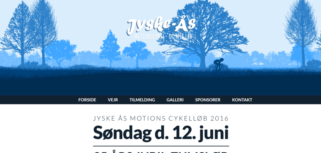
Demo
See the Pen Parallax background hero by Rasmus Jürs (@Jursdotme) on CodePen.
HTML Code
Starter Template
<!doctype html>
<html lang="en">

<head>
    <!-- Required meta tags -->
    <meta charset="utf-8">
    <meta name="viewport" content="width=device-width, initial-scale=1">

    <!-- CSS -->
    <link rel="stylesheet" href="style.css">

    <title>Parallax background Hero using HTML and CSS - Coding Torque</title>
</head>

<body>
    <!-- Further code here -->

    <script src="script.js"></script>
</body>

</html>
Paste the below code in your <body> tag.
<div class="hero">

  <div class="parallax-layer layer-6"></div>
  <div class="parallax-layer layer-5"></div>
  <div class="parallax-layer layer-4"></div>
  <div class="parallax-layer bike-1"></div>
  <div class="parallax-layer bike-2"></div>
  <div class="parallax-layer layer-3"></div>
  <div class="parallax-layer layer-2"></div>
  <div class="parallax-layer layer-1"></div>
  <div class="logo">
    <img src="https://s3-us-west-2.amazonaws.com/s.cdpn.io/24650/logo.svg" alt=""  />
  </div>
</div>

<nav>
  <ul>
    <li><a href="#">Forside</a></li>
    <li><a href="#">Vejr</a></li>
    <li><a href="#">Tilmelding</a></li>
    <li><a href="#">Galleri</a></li>
    <li><a href="#">Sponsorer</a></li>
    <li><a href="#">kontakt</a></li>
  </ul>
</nav>

<div class="light-bg">
  <img src="https://s3-us-west-2.amazonaws.com/s.cdpn.io/24650/Group_4.svg" alt="" />
</div>


<div class="dark-bg">
  <img src="https://s3-us-west-2.amazonaws.com/s.cdpn.io/24650/Group_5.svg" alt="" />
</div>

<div class="light-bg">
<p class="extra">Jyske Ås arrangeres af Lions Club Dronninglund med det formål at samle midler ind til uddeling i henhold til Lions formålet. Alt indsamlet bliver uddelt og alt arbejde er frivilligt arbejde. Alt administration betales af Lions medlemmerne.</p>
  </div>


<script>
WebFontConfig = {
    google: { families: [ 'Lato:400,300,300italic,400italic,700,700italic,900,900italic:latin' ] }
  };
  (function() {
    var wf = document.createElement('script');
    wf.src = 'https://ajax.googleapis.com/ajax/libs/webfont/1/webfont.js';
    wf.type = 'text/javascript';
    wf.async = 'true';
    var s = document.getElementsByTagName('script')[0];
    s.parentNode.insertBefore(wf, s);
  })();
</script>
CSS(SCSS) Code
Create a file style.css and paste the code below.
* {
  box-sizing: border-box;
}
body {
  font-family: 'Lato', sans-serif;
}

.hero {
  width: 100%;
  // height: 100%;
  min-height: 450px;
  position: relative;
  top: 0;
  left: 0;
  background-color: #d9edfd,
  //transform: translate3d(0,0,0);
}

@each $index, $speed, $height in (1, 20s, 136px),
                                 (2, 30s, 145px),
                                 (3, 55s, 158px),
                                 (4, 75s, 468px),
                                 (5, 95s, 311px),
                                 (6, 120s, 222px) {
  .layer-#{$index} {
    animation: parallax_fg linear $speed infinite both;
    background:  url(https://s3-us-west-2.amazonaws.com/s.cdpn.io/24650/#{$index}.png) 0 100% repeat-x;
    z-index: 1;
    position: absolute;
    bottom: 0;
    left: 0;
    width: 100%;
    height: 100%;
    background-size:  auto $height;
  }
}

.bike-1,
.bike-2 {
  background:  url(https://s3-us-west-2.amazonaws.com/s.cdpn.io/24650/bike.png) 0 100% no-repeat;
  z-index: 1;
  position: absolute;
  bottom: 100px;
  left: 0;
  width: 100%;
  height: 100%;
  background-size:  auto 75px;
}

.bike-1 {
  animation: parallax_bike linear 10s infinite both;
}

.bike-2 {
  animation: parallax_bike linear 15s infinite both;
}


@keyframes parallax_fg {
  0% { background-position: 2765px 100%; }
  100% {background-position: 550px 100%; }
}

@keyframes parallax_bike {
  0% { background-position: -300px 100%;}
  100% {background-position: 2000px 100%; }
}

.logo {
  margin: 70px auto;
  // left: 50%;
  // display: block;
  position: absolute;
  z-index: 2;
  width: 100%;

  img {
    display: block;
    margin: 0 auto;
    max-width: 100%;
    @media (max-width: 700px) {
      max-width: 90%;
    }
  }
}

nav {
  background-color: #12212f;
  overflow: hidden;
  ul {
    list-style: none;
    max-width: 900px;
    margin: 0 auto;
    display: flex;
    flex-wrap: wrap;
    justify-content: space-between;
  }
  li {
    @media (max-width: 700px) {
      width: 50%;
      text-align: center;
    }
    padding: 10px 20px;
  }
  a {
    /* Tilmelding: */
    font-weight: 700;
    font-size: 1.25em;
    text-transform: uppercase;
    color: #fff;
    text-decoration: none;
  }
}

.dark-bg {
  background-color: #12212f;
  padding: 50px 50px;
  img {
    display: block;
    margin: 0 auto;
    width: auto;
    max-width: 100%;
  }
}

.light-bg {
  background-color: #fff;
  padding: 50px 50px;
  img {
    display: block;
    margin: 0 auto;
    width: auto;
    max-width: 100%;
  }
}

.extra {
  max-width: 700px;
  margin: 0 auto;
  font-size: 18px;
  color: #12202F;
  letter-spacing: 0px;
  line-height: 27px;
}
Final Output
Written by: Piyush Patil
Code Credits: https://codepen.io/Jursdotme/full/wWMKmo
If you found any mistakes or have any doubts please feel free to Contact Us
Hope you find this post helpful💖


