Welcome, aspiring developers! Are you eager to showcase your coding skills and creativity to potential employers or clients? In this blog post, we will embark on an exciting journey to create a stunning personal portfolio website using the powerful duo of HTML and CSS. A personal portfolio website is an excellent way to demonstrate your proficiency in web development, highlight your previous projects, and showcase your personality and unique style. With this step-by-step guide, you will learn valuable web design techniques, including responsive design, layout, typography, and color schemes, to create a website that truly represents you. So, let’s roll up our sleeves and get started on crafting a standout portfolio website that will make you shine in the eyes of the tech world!
Before we start here are some more projects you might like to create –
- Deploying a MERN App with Multiple Domain Names on VPS
- 3D CSS Logo with Pure CSS
- 3D Santa using HTML and CSS Only
- Crafting a 3D Police Squad Car with Pure CSS
- Crafting a 3D Printer with HTML and Pure CSS
I would recommend you don’t just copy and paste the code, just look at the code and type by understanding it.
HTML Code
Starter Template
<!doctype html>
<html lang="en">

<head>
    <!-- Required meta tags -->
    <meta charset="utf-8">
    <meta name="viewport" content="width=device-width, initial-scale=1">

    <!-- Font Awesome CDN  -->
    <link rel="stylesheet" href="https://cdnjs.cloudflare.com/ajax/libs/font-awesome/5.14.0/css/all.min.css"
        integrity="sha512-1PKOgIY59xJ8Co8+NE6FZ+LOAZKjy+KY8iq0G4B3CyeY6wYHN3yt9PW0XpSriVlkMXe40PTKnXrLnZ9+fkDaog=="
        crossorigin="anonymous" />

    <!-- CSS -->
    <link rel="stylesheet" href="style.css">

    <title>Photography Landing Page using HTML CSS and JavaScript - Coding Torque</title>
</head>

<body>
    <!-- Further code here -->

    <script src="script.js"></script>
</body>

</html>
Paste the below code in your <body> tag.
<nav id="navbar" class="navbar"><a href="#"></a></nav>
<div class="container">
<!--=============== NAVIGATION MENU ===============-->
<div class="menu">
<a href="#welcome-section" class="menu-icon fas fa-home"></a>
<a href="#about" class="menu-icon fas fa-user"></a>
<a href="#projects" class="menu-icon fas fa-code"></a>
<a href="#experience" class="menu-icon fas fa-briefcase"></a>
<a href="#contact" class="menu-icon fas fa-envelope"></a>
</div>
<!--=============== MAIN "WINDOW" ===============-->
<div class="portfolio">
<!--=============== HEADER SECTION ===============-->
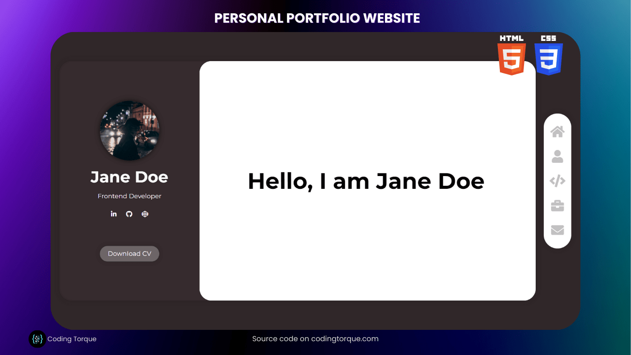
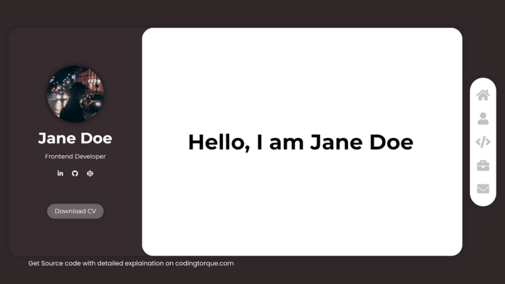
<section class="header">
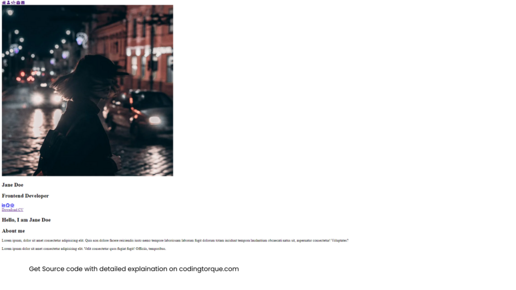
<img class="header-img"
src="https://images.pexels.com/photos/2389349/pexels-photo-2389349.jpeg?auto=compress&cs=tinysrgb&w=1260&h=750&dpr=1"
alt="" />
<h1>Jane Doe</h1>
<h2>Frontend Developer</h2>
<div class="socials">
<a href="#" target="_blank" class="fab fa-linkedin-in" id="profile-link"></a>
<a href="#" target="_blank" class="fab fa-github"></a>
<a href="#" target="_blank" class="fab fa-codepen"></a>
</div>
<a href="" class="cta">DownIoad CV</a>
</section>
<!--=============== CONTENT SECTION ===============-->
<div class="content">
<!--=============== HOME ===============-->
<section class="content-card home" id="welcome-section">
<h1>Hello, I am Jane Doe</h1>
</section>
<!--=============== ABOUT ME ===============-->
<section class="content-card about" id="about">
<h1>About me</h1>
<div class="about-item about-me">
<p>
Lorem ipsum, dolor sit amet consectetur adipisicing elit. Quis
non dolore facere reiciendis iusto nemo tempore laboriosam
laborum fugit dolorum totam incidunt tempora laudantium
obcaecati natus sit, aspernatur consectetur! Voluptates?
</p>
<p>
Lorem ipsum dolor sit amet consectetur adipisicing elit. Velit
consectetur quos fugiat fugit! Officiis, temporibus.
</p>
</div>
<div class="col-2">
<div class="about-item skills">
<h1>Skills</h1>
<span class="skill">HTML</span>
<span class="skill">CSS</span>
<span class="skill">JavaScript</span>
<span class="skill">Node.js</span>
<span class="skill">React</span>
<span class="skill">SQL</span>
<span class="skill">Git</span>
<span class="skill">API</span>
<span class="skill">Unix/Linux</span>
<span class="skill">Jira</span>
<span class="skill">Confluence</span>
<span class="skill">Figma</span>
</div>
<div class="about-item languages">
<h1>Languages</h1>
<div class="language">
<p>polish</p>
<span class="bar"><span class="polish"></span></span>
</div>
<div class="language">
<p>english</p>
<span class="bar"><span class="english"></span></span>
</div>
<div class="language">
<p>french</p>
<span class="bar"><span class="french"></span></span>
</div>
</div>
</div>
</section>
<!--=============== PROJECTS ===============-->
<section class="content-card projects" id="projects">
<h1>Projects</h1>
<div class="col-2 project-list">
<div class="project-tile">
<img src="https://shots.codepen.io/nietoperq/pen/BaPJqGW-512.webp?version=1674304822"
alt="" />
<div class="overlay">
<div class="project-description">
<h3>Project 1</h3>
<p>
Lorem ipsum dolor sit amet, consectetur adipisicing elit.
Nisi aperiam voluptate accusamus velit omnis.
</p>
</div>
</div>
</div>
<div class="project-tile">
<img src="https://shots.codepen.io/nietoperq/pen/GRBOjyV-512.webp?version=1674084446"
alt="" />
<div class="overlay">
<div class="project-description">
<h3>Project 2</h3>
<p>
Lorem ipsum dolor sit amet, consectetur adipisicing elit.
Nisi aperiam voluptate accusamus velit omnis.
</p>
</div>
</div>
</div>
<div class="project-tile">
<img src="https://shots.codepen.io/nietoperq/pen/dyjWxgX-512.webp?version=1673554073"
alt="" />
<div class="overlay">
<div class="project-description">
<h3>Project 3</h3>
<p>
Lorem ipsum dolor sit amet, consectetur adipisicing elit.
Nisi aperiam voluptate accusamus velit omnis.
</p>
</div>
</div>
</div>
<div class="project-tile">
<img src="https://shots.codepen.io/nietoperq/pen/vYagdwo-512.webp?version=1673549480"
alt="" />
<div class="overlay">
<div class="project-description">
<h3>Project 4</h3>
<p>
Lorem ipsum dolor sit amet, consectetur adipisicing elit.
Nisi aperiam voluptate accusamus velit omnis.
</p>
</div>
</div>
</div>
</div>
<a href="https://github.com/nietoperq">see more...</a>
</section>
<!--=============== EXPERIENCE ===============-->
<section class="content-card experience" id="experience">
<h1>Experience</h1>
<div class="timeline">
<div class="timeline-items">
<div class="timeline-item">
<div class="timeline-date">2022 - now</div>
<div class="timeline-content">
<h3>timeline item 1</h3>
<p>
Lorem ipsum dolor sit, amet consectetur adipisicing elit.
Ab iusto accusantium nostrum eligendi debitis quisquam.
Corporis at voluptatem culpa officia.
</p>
</div>
</div>
<div class="timeline-item">
<div class="timeline-date">2015 - 2022</div>
<div class="timeline-content">
<h3>timeline item 2</h3>
<p>
Lorem ipsum dolor sit, amet consectetur adipisicing elit.
Ab iusto accusantium nostrum eligendi debitis quisquam.
Corporis at voluptatem culpa officia.
</p>
</div>
</div>
<div class="timeline-item">
<div class="timeline-date">2014 - 2015</div>
<div class="timeline-content">
<h3>timeline item 3</h3>
<p>
Lorem ipsum dolor sit, amet consectetur adipisicing elit.
Ab iusto accusantium nostrum eligendi debitis quisquam.
Corporis at voluptatem culpa officia.
</p>
</div>
</div>
</div>
</div>
</section>
<!--=============== CONTACT ===============-->
<section class="content-card contact" id="contact">
<h1>Contact</h1>
<form class="form" id="form" action="https://www.freecodecamp.com/email-submit">
<div class="input-box">
<input type="text" class="text-input" name="name" placeholder="Name" />
</div>
<div class="input-box">
<input type="email" class="text-input" name="email" id="email" placeholder="Email" />
</div>
<div class="input-box">
<input type="subject" class="text-input" name="subject" id="subject"
placeholder="Subject" />
</div>
<div class="input-box">
<textarea name="text" class="message" placeholder="Message..."></textarea>
</div>
<div class="input-box">
<input type="submit" class="submit-btn" id="submit" value="submit" />
</div>
</form>
</section>
</div>
</div>
</div>Output Till Now
CSS Code
Create a file style.css and paste the code below.
/*=============== GOOGLE FONTS ===============*/

@import url("https://fonts.googleapis.com/css2?family=Montserrat:wght@100;200;300;400;500;600;700;800;900&display=swap");

/*=============== VARIABLES ===============*/

:root {
  --accent-color: #a8858f;
  --background-color: #302729;
  --background-color-2: #362b2e;
  --light-grey: rgb(194, 194, 194);
  --border-radius: 30px;
}

/*=============== SCROLLBAR ===============*/

::-webkit-scrollbar {
  width: 8px;
}

::-webkit-scrollbar-track {
  background: transparent;
}

::-webkit-scrollbar-thumb {
  background: transparent;
  border-radius: 10px;
}

.content:hover::-webkit-scrollbar-thumb {
  background: var(--light-grey);
}

/*=============== BASE ===============*/

* {
  padding: 0;
  margin: 0;
  font-family: "Montserrat", sans-serif;
}

html {
  font-size: 16px;
  font-family: "Montserrat", sans-serif;
  background-color: var(--background-color);
}

a {
  text-decoration: none;
  color: var(--accent-color);
}

p {
  line-height: 1.5rem;
  margin-bottom: 0.7rem;
}

h1 {
  line-height: 4rem;
}

h2 {
  line-height: 2rem;
  font-weight: normal;
}

.col-2 {
  display: grid;
  grid-template-columns: 1fr 1fr;
  gap: 20px;
  width: 100%;
}

.container {
  display: flex;
  align-items: center;
  justify-content: center;
  height: 100vh;
}

/*=============== MENU ===============*/

.menu {
  display: flex;
  flex-direction: column;
  align-items: center;
  justify-content: center;
  order: 2;
  background: #fff;
  width: 70px;
  margin-left: 20px;
  border-radius: 35px;
  padding: 15px 0;
  box-shadow: 0px 0px 20px 1px rgba(0, 0, 0, 0.1);
}

.menu-icon {
  font-size: 2rem;
  color: var(--light-grey);
  margin: 15px;
}

.menu-icon:hover {
  color: var(--accent-color);
}

/*=============== PORTFOLIO CONTAINER ===============*/

.portfolio {
  display: flex;
  background: var(--background-color-2);
  height: 80vh;
  width: 85vw;
  max-width: 1200px;
  border-radius: var(--border-radius);
  box-shadow: 0px 0px 20px 1px rgba(0, 0, 0, 0.1);
}

/*=============== HEADER ===============*/

.header {
  display: flex;
  flex-direction: column;
  align-items: center;
  width: 500px;
  height: 100%;
  border-radius: var(--border-radius);
  color: white;
  overflow: auto;
}

.header-img {
  width: 150px;
  height: auto;
  border-radius: 50%;
  margin: 10px;
  margin-top: 100px;
  box-shadow: 0px 0px 10px 2px rgba(0, 0, 0, 0.5);
}

.header h1 {
  font-size: 2.5rem;
}

.header h2 {
  font-size: 1rem;
}

.socials {
  margin: 20px;
}

.socials a {
  color: white;
  margin: 0 10px;
  transition: 0.2s linear;
  transition-property: background-color, color;
}

.socials a:hover {
  color: var(--accent-color);
  transition: 0.2s linear;
  transition-property: background-color, color;
}

.header .cta {
  color: #fff;
  background-color: rgba(255, 255, 255, 0.274);
  padding: 10px 20px;
  margin: 50px 0;
  border-radius: 30px;
  transition: 0.2s linear;
  transition-property: background-color, color;
  box-shadow: 0px 0px 10px 2px rgba(0, 0, 0, 0.1);
}

.header .cta:hover {
  color: var(--accent-color);
  background-color: #fff;
  transition: 0.2s linear;
  transition-property: background-color, color;
}

/*=============== CONTENT ===============*/

.content {
  border-radius: var(--border-radius);
  background: white;
  width: 100%;
  height: 100%;
  overflow: auto;
  scroll-behavior: smooth;
}

.content-card {
  display: flex;
  flex-direction: column;
  align-items: center;
  justify-content: center;
  min-height: 100%;
  margin: 0 50px;
}

/*=============== HOME SECTION ===============*/

.home h1 {
  font-size: 3.5rem;
  font-weight: bolder;
  text-align: center;
  margin: 20px;
}

/*=============== ABOUT SECTION ===============*/

.about {
  display: flex;
  flex-direction: column;
}

.about-item {
  width: 100%;
  margin: 0.5rem 0;
}

.language {
  margin-bottom: 15px;
}

.language p {
  margin: 0;
}

.bar {
  background: rgba(0, 0, 0, 0.1);
  display: block;
  height: 8px;
  border-radius: 10px;
  overflow: hidden;
}

.bar span {
  height: 8px;
  float: left;
  background: var(--accent-color);
}

.polish {
  width: 100%;
}

.english {
  width: 75%;
}

.french {
  width: 50%;
}

.skill {
  background-color: var(--accent-color);
  color: #fff;
  line-height: 35px;
  padding: 5px 10px;
  border-radius: 15px;
}

/*=============== PROJECTS SECTION ===============*/

.project-list {
  margin: 20px 0;
}

.project-tile {
  position: relative;
  display: flex;
  flex-direction: column;
  justify-content: end;
  background: var(--light-grey);
  color: transparent;
  width: 100%;
  height: 300px;
  margin: auto;
  overflow: hidden;
  box-shadow: 0px 0px 10px 1px rgba(0, 0, 0, 0.1);
}

.project-tile img {
  position: absolute;
  width: 100%;
  height: 100%;
  object-fit: cover;
  z-index: 1;
  filter: contrast(70%) brightness(110%) grayscale(20%);
}

.overlay {
  background: #a8858fe0;
  display: flex;
  flex-direction: column;
  justify-content: end;
  width: 0%;
  height: 100%;
  color: white;
  z-index: 2;
  transition: 0.5s ease;
}

.project-description {
  line-height: normal;
  max-width: 200px;
  margin: 20px;
  position: absolute;
  left: -250px;
  transition: 0.5s ease;
}

.project-tile:hover .overlay {
  width: 100%;
  cursor: pointer;
  transition: 0.5s ease;
}

.project-tile:hover .project-description {
  left: 0;
  cursor: pointer;
  transition: 0.5s ease;
}

/*=============== EXPERIENCE SECTION ===============*/

.timeline {
  position: relative;
}

.timeline::before {
  content: "";
  position: absolute;
  width: 2px;
  top: 55px;
  height: calc(100% - 100px);
  background-color: var(--accent-color);
  z-index: 100;
}

.timeline-date {
  position: relative;
}

.timeline-date::before {
  content: "";
  position: absolute;
  background-color: var(--accent-color);
  left: -25px;
  top: 5px;
  width: 12px;
  height: 12px;
  border-radius: 50%;
}

.timeline-items {
  margin-left: 20px;
}

.timeline-item {
  margin: 50px 0;
}

/*=============== FORM ===============*/

form {
  width: 100%;
  max-width: 600px;
}

.input-box {
  display: flex;
  align-items: center;
}

.input-box input,
textarea {
  width: 100%;
  margin: 1rem;
  color: var(--accent-color);
  font-size: 1rem;
  padding-left: 0.3rem;
}

.input-box input::placeholder,
textarea::placeholder {
  color: var(--accent-color);
  font-size: 1rem;
  padding-left: 0.3rem;
}

.input-box textarea::placeholder {
  padding-top: 0.3rem;
}

.input-box input:focus,
textarea:focus {
  box-shadow: 0px 0px 10px 1px rgba(0, 0, 0, 0.1);
  outline: none;
}

.text-input {
  height: 2rem;
  background-color: transparent;
  border: none;
  border-bottom: solid 2px var(--accent-color);
}

textarea {
  height: 4rem;
  border: none;
  border-bottom: solid 2px var(--accent-color);
}

.submit-btn {
  color: var(--accent-color);
  background-color: #fff;
  padding: 10px 20px;
  margin: 50px 0;
  border-radius: 30px;
  border: none;
  transition: 0.2s linear;
  transition-property: background-color, color;
  box-shadow: 0px 0px 10px 2px rgba(0, 0, 0, 0.1);
}

.submit-btn:hover {
  color: #fff;
  background-color: var(--accent-color);
  transition: 0.2s linear;
  transition-property: background-color, color;
  cursor: pointer;
}

/*=============== MEDIA QUERY ===============*/

@media screen and (max-width: 1200px) {
  html {
    scroll-behavior: smooth;
  }
  .container {
    height: auto;
    flex-direction: column;
  }
  .portfolio {
    flex-direction: column;
    height: 100%;
    margin: 30px 0 100px;
  }
  .content {
    padding-bottom: 100px;
  }
  .header {
    width: 100%;
    height: 100%;
  }
  .content-card {
    padding: 100px 0 0;
  }
  .menu {
    flex-direction: row;
    position: fixed;
    bottom: 15px;
    z-index: 1000;
    width: auto;
    height: fit-content;
    border-radius: 50px;
    margin: 0;
  }
  .menu-icon {
    font-size: 2rem;
    margin: 0 15px;
  }
  .home h1 {
    font-size: 3rem;
  }

  ::-webkit-scrollbar {
    width: 8px;
  }

  ::-webkit-scrollbar-track {
    background: var(--background-color);
  }

  ::-webkit-scrollbar-thumb {
    background: #fff;
    border-radius: 10px;
  }
}

@media screen and (max-width: 750px) {
  .col-2 {
    grid-template-columns: 1fr;
  }

  .menu-icon {
    font-size: 1.5rem;
  }

  ::-webkit-scrollbar {
    display: none;
  }

@media screen and (max-width: 400px) {
  .content-card {
    margin: 0 30px;
  }
  .home h1 {
    font-size: 2rem;
    line-height: 2.5rem;
  }
}

/* A little cheat to trick the freecodecamp certification test. It requires
the navbar to be on top of the viewport, but I've already done that in previous
projects and I think in this one it looks more interesting on the side.
I hope the freecodecamp team won't be mad at me :) */
#navbar {
  position: fixed;
  margin: 0;
  padding: 0;
  width: 0;
  height: 0;
}
Output Till Now
Written by: Piyush Patil
Code Credits: @nietoperq
If you found any mistakes or have any doubts please feel free to Contact Us
Hope you find this post helpful💖


