As the temperatures rise, what better way to beat the heat than with a refreshing popsicle? In the world of web design, capturing the essence of summer and fun is key to creating engaging and eye-catching banners.
In this blog post, we’ll embark on an exciting journey to design a popsicles ad banner using only HTML and CSS. By leveraging the power of these core web technologies, we’ll unleash our creativity to create a visually appealing and enticing banner that draws users in.


I would recommend you don’t just copy and paste the code, just look at the code and type by understanding it.
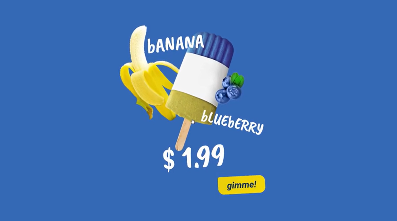
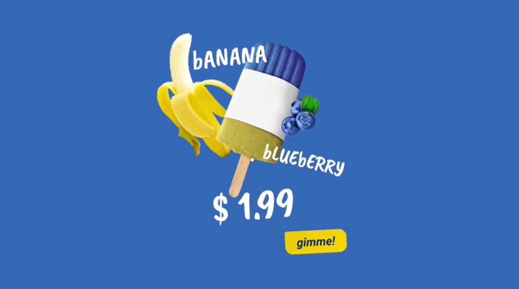
Demo
See the Pen PopCSSicle by Piotr Galor (@pgalor) on CodePen.
HTML Code
Starter Template
<!doctype html>
<html lang="en">

<head>
    <!-- Required meta tags -->
    <meta charset="utf-8">
    <meta name="viewport" content="width=device-width, initial-scale=1">

    <!-- CSS -->
    <link rel="stylesheet" href="style.css">

    <title>Popsicles Ad Banner using HTML and CSS - Coding Torque</title>
</head>

<body>
    <!-- Further code here -->

    <script src="script.js"></script>
</body>

</html>
Paste the below code in your <body> tag.
 <div class="📺">
  <div class="🍌"></div>
  <div class="🍦"></div>
  <div class="🍇"></div>
  <button class="🆗"></button>
</div>
CSS Code
Create a file style.css and paste the code below.
@import url('https://fonts.googleapis.com/css?family=Caveat+Brush|Roboto:700i');

:root{
  --acc-bounce: cubic-bezier(0.175, 0.885, 0.320, 1.275);
  --acc-sine: cubic-bezier(0.390, 0.575, 0.565, 1.000);
  --base-delay: 255ms;
  --variable-delay: 55ms;
}

* {
  margin: 0px;
  padding: 0px;
  box-sizing: border-box;
  transform-style: preserve-3d;
  backface-visibility: hidden;
  outline: 1px solid rgba(255,255,255,0);
  -webkit-tap-highlight-color: rgba(255,255,255,0);
}


*:before,
*:after{
 content: '';
 display: block;
 background-size: contain;
 background-repeat: no-repeat;
 position: absolute;
}

html, body {
  width: 100vw;
  height: 100vh;
  font-family: 'Caveat Brush', cursive;
  color: #fff;
  font-size: 60px;
}

body{
  display: flex;
  align-items: center;
  justify-content: center;
  background: #3568b5;
  overflow: hidden;
}

.📺{
  width: 500px;
  height: 600px;
  position: relative;
  transform: scale(.67);
  perspective: 500px;
  animation: float-wrapper 5s var(--acc-sine) infinite;
}

@keyframes float-wrapper{
  0%{
    transform: scale(.67);
  }
  50%{
    transform: scale(.67,.68) translate3d(0, -8px, 0);
  }
  100%{
    transform: scale(.67);
  }
}

.🍌,
.🍇,
.🍦{
  position: absolute;
  left: 0; top: 0;
  width: 100%;
  height: 100%;
  transition: all var(--acc-sine) 255ms;
  cursor: pointer;
}

.🍦{
  transform: scale(.99) translate3d(1%,1%,0);
}

.📺:hover .🍦{
  transform: none;
}

.🍦:before{
  background-image: url('https://s3-us-west-2.amazonaws.com/s.cdpn.io/577128/popsicle-tin.png');
  width: 263px;
  height: 454px;
  left: 50%;
  transform: translateX(-50%);
  animation: fadeIn-popsicle-before .5s var(--acc-bounce) 1 forwards;
  animation-delay: var(--base-delay);
  opacity: 0;
}


@keyframes fadeIn-popsicle-before{
  0%{
    opacity: 0;
    transform: translateX(-50%) scale(.89);
  }
  100%{
    opacity: 1;
    transform: translateX(-50%);
  }
}

.🍦:after{
  content: '$ 1.99';
  transform: rotateZ(-5deg);
  font-size: 120px;
  bottom: 8%;
  right: 30%;
  animation: fadeIn-popsicle-after .5s var(--acc-bounce) 1 forwards;
  animation-delay: calc(var(--base-delay) + var(--variable-delay) * 5);
  opacity: 0;
}

@keyframes fadeIn-popsicle-after{
  0%{
    opacity: 0;
    transform:scale(.96);
  }
  100%{
    opacity: 1;
    transform: rotateZ(-5deg);
  }
}

.🍌{
  transform: scale(1.01) translate3d(-1%, 1%, 0);
}

.📺:hover .🍌{
  transform: none;
}

.🍌:before{
  background-image: url('https://s3-us-west-2.amazonaws.com/s.cdpn.io/577128/banana-tin.png');
  width: 250px;
  height: 363px;
  left: -11%;
  top: -4%;
  animation: fadeIn-banana-before .5s  var(--acc-bounce) 1 forwards;
  animation-delay: calc(var(--base-delay) + var(--variable-delay) * 1);
  opacity: 0;
}

@keyframes fadeIn-banana-before{
  0%{
    opacity: 0;
    transform: scale(.96) translateY(-13%);
  }
  100%{
    opacity: 1;
    transform: none;
  }
}

.🍌:after{
  content: 'bANANA';
  top: 0;
  font-size: 75px;
  transform: rotateZ(-5deg) translateZ(5px);
  left: 10%;
  animation: fadeIn-banana-after .5s  var(--acc-bounce) 1 forwards;
  animation-delay: calc(var(--base-delay) + var(--variable-delay) * 2);
  opacity: 0;
}

@keyframes fadeIn-banana-after{
  0%{
    opacity: 0;
    transform: scale(.96) translateY(-13%) translateZ(21px);
  }
  100%{
    opacity: 1;
    transform: rotateZ(-5deg) translateZ(5px);
  }
}

.🍇{
  /* Grapes... yep - there's no blueberry emoji, OUTRAGEOUS */
}

.📺:hover .🍇{
  transform: scale(1.01) translate3d(-1%, 1%, 0);
}

.🍇:before{
  background-image: url('https://s3-us-west-2.amazonaws.com/s.cdpn.io/577128/blueberry-tin.png');
  width: 111px;
  height: 121px;
  right: 15%;
  top: 25%;
  animation: fadeIn-berry-before .5s var(--acc-bounce) 1 forwards;
  animation-delay: calc(var(--base-delay) + var(--variable-delay) * 4);
  opacity: 0;
}

@keyframes fadeIn-berry-before{
  0%{
    opacity: 0;
    transform: scale(.96) translateY(8%);
  }
  100%{
    opacity: 1;
    transform: none;
  }
}

.🍇:after{
  content: 'bLUEbERRY';
  font-size: 60px;
  right: 0;
  transform: rotateZ(13deg);
  top: 50%;
  animation: fadeIn-berry-after .5s var(--acc-bounce) 1 forwards;
  animation-delay: calc(var(--base-delay) + var(--variable-delay) * 5);
  opacity: 0;
}

@keyframes fadeIn-berry-after{
  0%{
    opacity: 0;
    transform: scale(.96) translateY(13%);
  }
  100%{
    opacity: 1;
    transform: rotateZ(13deg);
  }
}

.🆗{
  outline: 0;
  border: 0;
  padding: 0;
  background: none;
  font: inherit;
  color: inherit;
  position: absolute;
  right: 0;
  bottom: -21px;
  transition: all 144ms var(--acc-sine);
  transform-origin: top left;
  perspective: 600px;
  transform: scale(.96) translate3d(3%,3%,0) rotateZ(-5deg);
}

.📺:hover .🆗{
  transform: rotateZ(-3deg);
}

.🆗:after{
  content: 'gimme!';
  display: block;
  position: relative;
  padding: 13px 34px;
  font-family: 'Roboto';
  font-weight: 700;
  font-style: italic;
  color: #0d2e60;
  background-image: linear-gradient(120deg, #e8cd09 0%, #ffe000 100%);
  font-size: 34px;
  border-radius: 6.5px 22.5px 22.5px 22.5px;
  animation: fadeIn-button .5s var(--acc-bounce) 1 forwards;
  opacity: 0;
  animation-delay: calc(var(--base-delay) + var(--variable-delay) * 6);
  cursor: pointer;
  transform-origin: top left;
  background-size: 200% 100%;
}

@keyframes fadeIn-button{
  0%{
    opacity: 0;
    transform: translate3d(-13%,-13%,0) scaleX(.55) scaleY(.96);
  }
  100%{
    opacity: 1;
    transform: translate3d(0%,0%,0) ;
  }
}

.🆗:hover:after {
  background-position: 100% 0;
}

@media only screen and (max-height: 600px){
  .📺{
    transform: scale(.6);
  }

  @keyframes float-wrapper{
    0%{
      transform: scale(.6);
    }
    50%{
      transform: scale(.6,.61) translate3d(0, -8px, 0);
    }
    100%{
      transform: scale(.6);
    }
  }
}
Final Output
Written by: Piyush Patil
Code Credits: https://codepen.io/pgalor/full/RqwPoe
If you found any mistakes or have any doubts please feel free to Contact Us
Hope you find this post helpful💖


