
In the ever-evolving landscape of web design, captivating users from the moment they land on your page is paramount. The hero section, with its prominent placement and attention-grabbing visuals, sets the tone for the entire website experience. If you’re aiming to make a lasting impression, why not adorn your hero section with a stunning rays background?
In this blog post, we’re embarking on an exciting journey to create a mesmerizing hero section featuring a radiant rays background using nothing but HTML and CSS. By delving into the intricacies of these two fundamental web development languages, we’ll unlock the secrets to crafting a visually striking centerpiece that captivates visitors and draws them deeper into your digital realm.


I would recommend you don’t just copy and paste the code, just look at the code and type by understanding it.
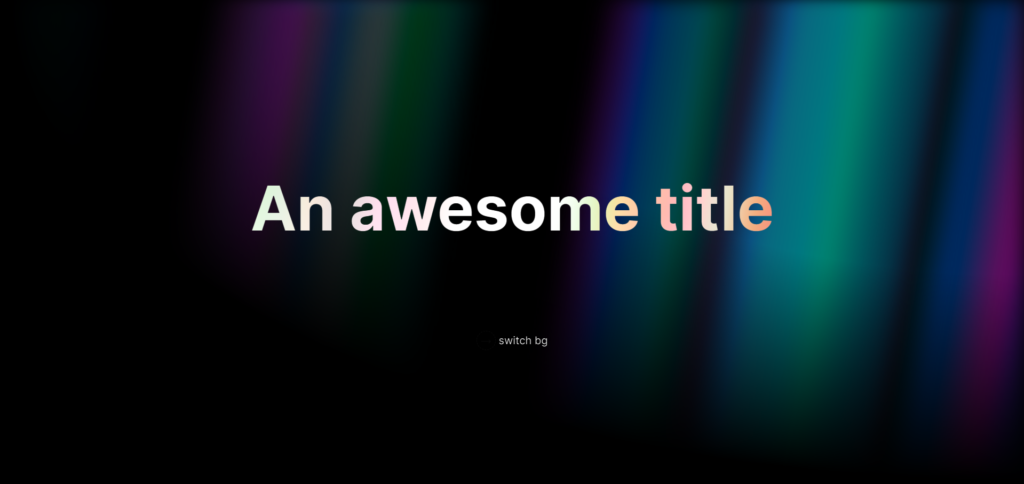
Demo
See the Pen Rays background by Dennys Dionigi (@DedaloD) on CodePen.
HTML Code
Starter Template
<!doctype html>
<html lang="en">

<head>
    <!-- Required meta tags -->
    <meta charset="utf-8">
    <meta name="viewport" content="width=device-width, initial-scale=1">

    <!-- CSS -->
    <link rel="stylesheet" href="style.css">

    <title>Rays Background Hero Section using HTML and CSS - Coding Torque</title>
</head>

<body>
    <!-- Further code here -->

    <script src="script.js"></script>
</body>

</html>
Paste the below code in your <body> tag.
<section class='wrapper'>
  <div class='hero'>
  </div>
  <div class='content'>
    <h1 class='h1--scalingSize' data-text='An awesome title'>An awesome title</h1>
    <input type='checkbox' id='switch'>
    <label for='switch'><span><span class='icon'>→</span> switch bg</span></label>
  </div>
</section>
CSS Code
Create a file style.css and paste the code below.
/*houdini*/
@property --blink-opacity {
  syntax: "<number>";
  inherits: false;
  initial-value: 1;
}

/* #fallback @keyframes blink-animation {
  0%,
  100% {
    opacity: 1;
  }
  50% {
    opacity: 0;
  }
}*/

@keyframes blink-animation {
  0%,
  100% {
    opacity: var(--blink-opacity, 1);
  }
  50% {
    opacity: 0;
  }
}
/*houdini*/

/*base*/
:root {
  font-family: Inter, sans-serif;

  --stripe-color: #fff;
  --bg: var(--stripe-color);
  --maincolor: var(--bg);
}

body {
  width: 100cqw;
  min-height: 100cqh;
  display: flex;
  place-content: center;
  place-items: flex-start center;
  background: var(--bg);
}

/*custom*/

@keyframes smoothBg {
  from {
    background-position: 50% 50%, 50% 50%;
  }
  to {
    background-position: 350% 50%, 350% 50%;
  }
}

.wrapper {
  width: 100%;
  height: auto;
  position: relative;
}

.hero {
  width: 100%;
  height: 100%;
  min-height: 100vh;
  position: relative;
  display: flex;
  place-content: center;
  place-items: center;
  --stripes: repeating-linear-gradient(
    100deg,
    var(--stripe-color) 0%,
    var(--stripe-color) 7%,
    transparent 10%,
    transparent 12%,
    var(--stripe-color) 16%
  );

  --rainbow: repeating-linear-gradient(
    100deg,
    #60a5fa 10%,
    #e879f9 15%,
    #60a5fa 20%,
    #5eead4 25%,
    #60a5fa 30%
  );
  background-image: var(--stripes), var(--rainbow);
  background-size: 300%, 200%;
  background-position: 50% 50%, 50% 50%;

  filter: blur(10px) invert(100%);

  mask-image: radial-gradient(ellipse at 100% 0%, black 40%, transparent 70%);
  &::after {
    content: "";
    position: absolute;
    inset: 0;
    background-image: var(--stripes), var(--rainbow);
    background-size: 200%, 100%;
    animation: smoothBg 60s linear infinite;
    background-attachment: fixed;
    mix-blend-mode: difference;
  }
}

:has(:checked) {
  --stripe-color: #000;
}
:has(:checked) .hero,
:has(:checked) .hero::after {
  filter: blur(10px) opacity(50%) saturate(200%);
}

.content {
  position: absolute;
  inset: 0;
  width: 100%;
  height: 100%;
  display: flex;
  place-content: center;
  place-items: center;
  flex-flow: column;
  gap: 4.5%;
  text-align: center;
  mix-blend-mode: difference;
  -webbkit-mix-blend-mode: difference;
  filter: invert(1);
}

.h1--scalingSize {
  font-size: calc(1rem - -5vw);
  position: relative;
}

#switch {
  appearance: none;
  -webkit-appearance: none;
  opacity: 0;
}

[for="switch"] {
  cursor: pointer;
  transition: 0.15s linear(0 0%, 0.16 16.85%, 0.32 31.73%, 1 100%);
  will-change: transform, font-weight;
  padding: 0.5rem;
}

[for="switch"]:where(:hover, :active, :focus-within) {
  /*transform: scale(1.2);
  font-weight: 900;*/
  transition: 0.3s ease;
  animation: animSwitch 0.2s alternate;
  & .icon {
    animation-play-state: paused;
  }
}

@keyframes animSwitch {
  50% {
    transform: scale(1.2);
    font-weight: 900;
  }
}

/*icon houdini*/
.icon {
  width: 1lh;
  height: 1lh;
  aspect-ratio: 1/1;
  padding: 0.25em 0.35rem;
  border-radius: calc(1px / 0);
  border: 1px dashed;
  --blink-opacity: 1;
  animation: blink-animation 2s ease-in-out infinite running;
}

/*challenge*/
.h1--scalingSize::before {
  content: attr(data-text);
  position: absolute;
  inset: 0;
  background: white;
  text-shadow: 0 0 1px #ffffff;
  background-clip: text;
  -webkit-text-fill-color: transparent;
  background-color: white;
  -webkit-mask: linear-gradient(#000 0 0) luminance;
  mask: linear-gradient(#000 0 0) luminance, alpha;
  backdrop-filter: blur(19px) brightness(12.5);
  -webkit-text-stroke: 1px white;
  display: flex;
  margin: auto;
  z-index: 1;
  pointer-events: none;
}
Final Output
Written by: Piyush Patil
Code Credits: https://codepen.io/DedaloD/full/qBgmovJ
If you found any mistakes or have any doubts please feel free to Contact Us
Hope you find this post helpful💖


