In the dynamic realm of web design, the hero section stands as the gateway to captivating user engagement. It’s the first impression, the visual handshake that welcomes visitors to your digital domain. But in today’s ever-evolving landscape, a static hero just won’t cut it. Users demand responsiveness, adaptability, and even customization options like dark mode.
In this blog post, we embark on a journey to construct a responsive hero section that seamlessly transitions between light and dark modes. Armed with HTML, CSS, and JavaScript, we’ll unravel the intricacies of crafting a visually stunning and functionally dynamic centerpiece for your website.


I would recommend you don’t just copy and paste the code, just look at the code and type by understanding it.
Demo
See the Pen Responsive Hero with Dark Mode by Syahrizal (@syrizaldev) on CodePen.
HTML Code
Starter Template
<!doctype html>
<html lang="en">

<head>
    <!-- Required meta tags -->
    <meta charset="utf-8">
    <meta name="viewport" content="width=device-width, initial-scale=1">

    <!-- CSS -->
    <link rel="stylesheet" href="style.css">

    <title>Responsive Hero with Dark Mode using HTML CSS and JavaScript - Coding Torque</title>
</head>

<body>
    <!-- Further code here -->

    <script src="script.js"></script>
</body>

</html>
Paste the below code in your <body> tag.
<header class="header" id="header">
<nav class="navbar container">
<a href="#" class="brand">Brand</a>
<div class="burger" id="burger">
<span class="burger-line"></span>
<span class="burger-line"></span>
<span class="burger-line"></span>
</div>
<div class="menu" id="menu">
<ul class="menu-inner">
<li class="menu-item"><a href="#" class="menu-link">Home</a></li>
<li class="menu-item"><a href="#" class="menu-link">Feature</a></li>
<li class="menu-item"><a href="#" class="menu-link">Pricing</a></li>
<li class="menu-item"><a href="#" class="menu-link">Support</a></li>
</ul>
</div>
<button class="switch" id="switch">
<i class="switch-light bx bx-sun"></i>
<i class="switch-dark bx bx-moon"></i>
</button>
</nav>
</header>
<main class="main">
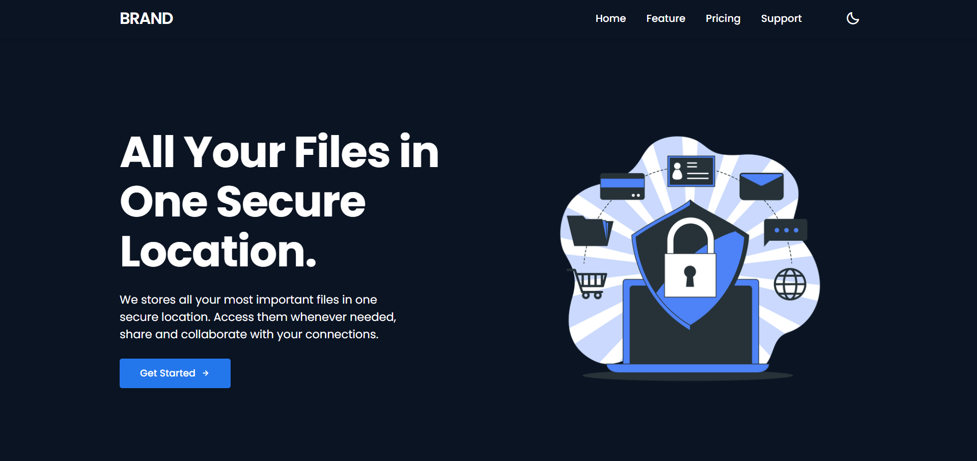
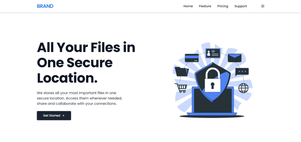
<section class="section banner banner-section">
<div class="container banner-column">
<img class="banner-image" src="https://i.ibb.co/sVqYmS2/Illustration.png" alt="Illustration">
<div class="banner-inner">
<h1 class="heading-xl">All Your Files in One Secure Location.</h1>
<p class="paragraph">
We stores all your most important files in one secure location.
Access them whenever needed, share and collaborate with
your connections.
</p>
<button class="btn btn-darken btn-inline">
Get Started<i class="bx bx-right-arrow-alt"></i>
</button>
</div>
</div>
</section>
</main>CSS Code
Create a file style.css and paste the code below.
:root {
   --color-white-100: hsl(206, 0%, 100%);
   --color-white-200: hsl(206, 0%, 90%);
   --color-white-300: hsl(206, 0%, 80%);
   --color-white-400: hsl(206, 0%, 65%);
   --color-white-500: hsl(206, 0%, 50%);

   --color-black-100: hsl(217, 30%, 18%);
   --color-black-200: hsl(217, 27%, 15%);
   --color-black-300: hsl(217, 27%, 12%);
   --color-black-400: hsl(217, 52%, 9%);

   --color-blue-100: hsl(215, 97%, 87%);
   --color-blue-200: hsl(215, 96%, 78%);
   --color-blue-300: hsl(215, 94%, 68%);
   --color-blue-400: hsl(215, 91%, 60%);
   --color-blue-500: hsl(215, 83%, 53%);
   --color-blue-600: hsl(215, 76%, 48%);

   --shadow-small: 0 1px 3px 0 rgba(0, 0, 0, 0.1),
      0 1px 2px 0 rgba(0, 0, 0, 0.06);
   --shadow-medium: 0 4px 6px -1px rgba(0, 0, 0, 0.1),
      0 2px 4px -1px rgba(0, 0, 0, 0.06);
   --shadow-large: 0 10px 15px -3px rgba(0, 0, 0, 0.1),
      0 4px 6px -2px rgba(0, 0, 0, 0.05);
}

*,
*::before,
*::after {
   padding: 0;
   margin: 0;
   box-sizing: border-box;
   list-style: none;
   list-style-type: none;
   text-decoration: none;
   -webkit-font-smoothing: antialiased;
   -moz-osx-font-smoothing: grayscale;
   text-rendering: optimizeLegibility;
}

html {
   font-size: 100%;
   box-sizing: inherit;
   scroll-behavior: smooth;
   height: -webkit-fill-available;
}

body {
   font-family: "Poppins", sans-serif;
   font-size: clamp(1rem, 2vw, 1.125rem);
   font-weight: 400;
   line-height: 1.5;
   color: var(--color-black-400);
   background-color: var(--color-white-100);

   &.darkmode {
      color: var(--color-white-100);
      background-color: var(--color-black-400);
   }
}

main {
   overflow: hidden;
}

p {
   text-wrap: balance;
}

a,
button {
   cursor: pointer;
   user-select: none;
   border: none;
   outline: none;
   background: none;
}

img,
video {
   display: block;
   max-width: 100%;
   height: auto;
   object-fit: cover;
}

// Elements
.section {
   margin: 0 auto;
   padding: 5rem 0 2rem;
}

.container {
   max-width: 75rem;
   height: auto;
   margin: 0 auto;
   padding: 0 1.25rem;
}

.paragraph {
   font-family: inherit;
   text-wrap: balance;
   color: inherit;
}

.heading {
   &-xl {
      font-family: inherit;
      font-size: clamp(2.648rem, 6vw, 4.241rem);
      font-weight: 700;
      line-height: 1.15;
      letter-spacing: -1px;
   }

   &-lg {
      font-family: inherit;
      font-size: clamp(2.179rem, 5vw, 3.176rem);
      font-weight: 700;
      line-height: 1.15;
      letter-spacing: -1px;
   }

   &-md {
      font-family: inherit;
      font-size: clamp(1.794rem, 4vw, 2.379rem);
      font-weight: 700;
      line-height: 1.25;
      letter-spacing: -1px;
   }
}

.btn {
   display: inline-block;
   font-family: inherit;
   font-size: 0.95rem;
   font-weight: 500;
   line-height: 1.5;
   text-align: center;
   vertical-align: middle;
   white-space: nowrap;
   user-select: none;
   outline: none;
   border: none;
   border-radius: 0.25rem;
   text-transform: unset;
   transition: all 0.3s ease-in-out;

   &-inline {
      display: inline-flex;
      align-items: center;
      justify-content: center;
      column-gap: 0.5rem;
   }

   &-darken {
      padding: 0.75rem 2rem;
      color: var(--color-white-100);
      background-color: var(--color-black-200);
      box-shadow: var(--shadow-medium);

      .darkmode & {
         background-color: var(--color-blue-500);
      }
   }
}

// Headers
.header {
   position: fixed;
   top: 0;
   left: 0;
   z-index: 100;
   width: 100%;
   height: auto;
   margin: 0 auto;
   background-color: var(--color-white-100);
   box-shadow: var(--shadow-medium);

   .darkmode & {
      background-color: var(--color-black-400);
   }
}

.navbar {
   display: flex;
   flex-direction: row;
   align-items: center;
   align-content: center;
   justify-content: space-between;
   width: 100%;
   height: 4rem;
   margin: 0 auto;
}

.brand {
   font-family: inherit;
   font-size: 1.6rem;
   font-weight: 600;
   line-height: 1.25;
   margin-right: auto;
   letter-spacing: -1px;
   text-transform: uppercase;
   color: var(--color-blue-500);

   .darkmode & {
      color: var(--color-white-100);
   }
}

.menu {
   position: fixed;
   top: 0;
   left: -100%;
   z-index: 10;
   width: 100%;
   height: 100vh;
   overflow: hidden;
   color: var(--color-black-400);
   background-color: var(--color-white-100);
   box-shadow: var(--shadow-medium);
   transition: all 0.4s ease-in-out;

   .darkmode & {
      color: var(--color-white-100);
      background-color: var(--color-black-400);
   }

   &.is-active {
      left: 0;
   }

   &-inner {
      display: flex;
      flex-direction: column;
      align-items: center;
      justify-content: center;
      row-gap: 1.25rem;
      margin-top: 7rem;
   }

   &-link {
      font-family: inherit;
      font-size: 1rem;
      font-weight: 500;
      line-height: 1.5;
      color: inherit;
      text-transform: uppercase;
      transition: all 0.3s ease;
   }

   // Responsive Media Query
   @media only screen and (min-width: 48rem) {
      position: relative;
      top: 0;
      left: 0;
      width: auto;
      height: auto;
      padding: 0rem;
      margin-left: auto;
      background: none;
      box-shadow: none;
      transition: none;

      &-inner {
         display: flex;
         flex-direction: row;
         column-gap: 2rem;
         margin: 0 auto;
      }

      &-link {
         text-transform: capitalize;
      }
   }
}

.burger {
   position: relative;
   display: block;
   cursor: pointer;
   user-select: none;
   order: -1;
   z-index: 12;
   width: 1.6rem;
   height: 1.15rem;
   margin-right: 1.25rem;
   border: none;
   outline: none;
   background: none;
   visibility: visible;
   transform: rotate(0deg);
   transition: 0.35s ease;

   @media only screen and (min-width: 48rem) {
      display: none;
      visibility: hidden;
   }

   &-line {
      position: absolute;
      display: block;
      left: 0;
      width: 100%;
      height: 2px;
      border: none;
      outline: none;
      opacity: 1;
      border-radius: 1rem;
      transform: rotate(0deg);
      background-color: var(--color-black-300);
      transition: 0.25s ease-in-out;

      .darkmode & {
         background-color: var(--color-white-100);
      }

      &:nth-child(1) {
         top: 0px;
      }
      &:nth-child(2) {
         top: 0.5rem;
         width: 70%;
      }
      &:nth-child(3) {
         top: 1rem;
      }
   }

   &.is-active .burger-line {
      &:nth-child(1) {
         top: 0.5rem;
         transform: rotate(135deg);
      }
      &:nth-child(2) {
         opacity: 0;
         visibility: hidden;
      }
      &:nth-child(3) {
         top: 0.5rem;
         transform: rotate(-135deg);
      }
   }
}

.switch {
   position: relative;
   display: block;
   cursor: pointer;
   user-select: none;
   z-index: 9;
   margin-left: 5rem;
   margin-right: 0.5rem;

   &-light,
   &-dark {
      position: absolute;
      top: 50%;
      left: 50%;
      transform-origin: center;
      transform: translate(-50%, -50%);
      transition: all 0.3s ease-in;
   }

   &-light {
      font-size: 1.45rem;
      visibility: visible;
      color: var(--color-black-300);

      .darkmode & {
         font-size: 0rem;
         visibility: hidden;
      }
   }

   &-dark {
      font-size: 0rem;
      visibility: hidden;
      color: var(--color-white-100);

      .darkmode & {
         font-size: 1.45rem;
         visibility: visible;
      }
   }
}

// Banners
.banner {
   &-column {
      position: relative;
      display: grid;
      align-items: center;
      row-gap: 2rem;

      // Responsive Media Query
      @media only screen and (min-width: 48rem) {
         grid-template-columns: repeat(2, minmax(0, 1fr));
         justify-content: center;
         margin-top: 4rem;
      }

      @media only screen and (min-width: 64rem) {
         grid-template-columns: 1fr max-content;
         column-gap: 2rem;
      }
   }

   &-image {
      display: block;
      max-width: 25rem;
      height: auto;
      object-fit: cover;
      justify-self: center;

      // Responsive Media Query
      @media only screen and (min-width: 48rem) {
         order: 1;
         max-width: 28rem;
         height: auto;
      }

      @media only screen and (min-width: 64rem) {
         max-width: 33rem;
         height: auto;
      }
   }

   &-inner {
      display: flex;
      flex-direction: column;
      align-items: flex-start;
      row-gap: 1.5rem;
   }
}
JavaScript Code
Create a file script.js and paste the code below.
const navbarMenu = document.getElementById("menu");
const burgerMenu = document.getElementById("burger");
const headerMenu = document.getElementById("header");
const overlayMenu = document.querySelector(".overlay");

// Open Close Navbar Menu on Click Burger
if (burgerMenu && navbarMenu) {
   burgerMenu.addEventListener("click", () => {
      burgerMenu.classList.toggle("is-active");
      navbarMenu.classList.toggle("is-active");
   });
}

// Close Navbar Menu on Click Links
document.querySelectorAll(".menu-link").forEach((link) => {
   link.addEventListener("click", () => {
      burgerMenu.classList.remove("is-active");
      navbarMenu.classList.remove("is-active");
   });
});

// Fixed Navbar Menu on Window Resize
window.addEventListener("resize", () => {
   if (window.innerWidth >= 992) {
      if (navbarMenu.classList.contains("is-active")) {
         navbarMenu.classList.remove("is-active");
         overlayMenu.classList.remove("is-active");
      }
   }
});

// Dark and Light Mode on Switch Click
document.addEventListener("DOMContentLoaded", () => {
   const darkSwitch = document.getElementById("switch");

   darkSwitch.addEventListener("click", () => {
      document.documentElement.classList.toggle("darkmode");
      document.body.classList.toggle("darkmode");
   });
});
Final Output

Written by: Piyush Patil
Code Credits: https://codepen.io/syrizaldev/full/eYrddze
If you found any mistakes or have any doubts please feel free to Contact Us
Hope you find this post helpful💖


