
A team page on a website is more than just a list of names and titles; it’s an opportunity to showcase the personalities and talents behind the brand. Adding interactive hover effects to team profiles can inject life into static images and provide users with a more engaging browsing experience.
In this blog post, we’ll embark on an exploration of creating dynamic team profiles with hover effects using only HTML and CSS. By tapping into the versatility of these core web technologies, we’ll uncover the secrets to crafting visually appealing and interactive elements that shine a spotlight on each team member.


I would recommend you don’t just copy and paste the code, just look at the code and type by understanding it.
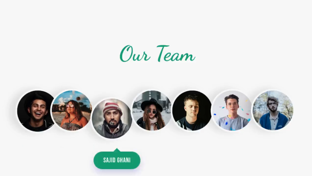
Demo
See the Pen Team Profile Hover Effect by Sparshcodes (@sparshgupta007) on CodePen.
HTML Code
Starter Template
<!doctype html>
<html lang="en">

<head>
    <!-- Required meta tags -->
    <meta charset="utf-8">
    <meta name="viewport" content="width=device-width, initial-scale=1">

    <!-- CSS -->
    <link rel="stylesheet" href="style.css">

    <title>Team Profile with hover effect using HTML and CSS - Coding Torque</title>
</head>

<body>
    <!-- Further code here -->

    <script src="script.js"></script>
</body>

</html>
Paste the below code in your <body> tag.
    <!-- Embedding Fonts from google fonts -->
    <link rel="preconnect" href="https://fonts.gstatic.com" />
    <link
      href="https://fonts.googleapis.com/css2?family=Bebas+Neue&family=Dancing+Script:wght@700&display=swap"
      rel="stylesheet"
    />

    <link rel="stylesheet" href="style.css" />
    <section class="team">
      <h2 class="section-heading">Our Team</h2>
      <div class="container">
        <div class="profile">
          <img src="https://images.unsplash.com/photo-1595152772835-219674b2a8a6?ixid=MnwxMjA3fDB8MHxwaG90by1wYWdlfHx8fGVufDB8fHx8&ixlib=rb-1.2.1&auto=format&fit=crop&w=800&q=80" alt=""/><span class="name">Kalyan</span>
        </div>
        <div class="profile">
          <img src="https://images.unsplash.com/photo-1530577197743-7adf14294584?ixid=MnwxMjA3fDB8MHxwaG90by1wYWdlfHx8fGVufDB8fHx8&ixlib=rb-1.2.1&auto=format&fit=crop&w=801&q=80" alt=""/><span class="name">Suchitra Tiwari</span>
        </div>

        <div class="profile">
          <img src="https://images.unsplash.com/photo-1598641795816-a84ac9eac40c?ixid=MnwxMjA3fDB8MHxwaG90by1wYWdlfHx8fGVufDB8fHx8&ixlib=rb-1.2.1&auto=format&fit=crop&w=801&q=80" alt=""/><span class="name">Sajid Ghani</span>
        </div>
        <div class="profile">
          <img src="https://images.unsplash.com/photo-1484186139897-d5fc6b908812?ixid=MnwxMjA3fDB8MHxwaG90by1wYWdlfHx8fGVufDB8fHx8&ixlib=rb-1.2.1&auto=format&fit=crop&w=800&q=80" alt=""/><span class="name">Dhriti</span>
        </div>
        <div class="profile">
          <img src="https://images.unsplash.com/photo-1618018352910-72bdafdc82a6?ixid=MnwxMjA3fDB8MHxwaG90by1wYWdlfHx8fGVufDB8fHx8&ixlib=rb-1.2.1&auto=format&fit=crop&w=800&q=80" alt=""/><span class="name">Milind</span>
        </div>
        <div class="profile">
          <img src="https://images.unsplash.com/photo-1529068755536-a5ade0dcb4e8?ixlib=rb-1.2.1&ixid=MnwxMjA3fDB8MHxwaG90by1wYWdlfHx8fGVufDB8fHx8&auto=format&fit=crop&w=801&q=80" alt=""/><span class="name">Srikant Tiwari</span>
        </div>
        <div class="profile">
          <img src="https://images.unsplash.com/photo-1485206412256-701ccc5b93ca?ixlib=rb-1.2.1&ixid=MnwxMjA3fDB8MHxwaG90by1wYWdlfHx8fGVufDB8fHx8&auto=format&fit=crop&w=812&q=80" alt=""/><span class="name">Major Sameer</span>
        </div>
      </div>
    </section>
CSS Code
Create a file style.css and paste the code below.
body {
    margin: 0;
    min-height: 100vh;
    display: flex;
    justify-content: center;
    align-items: center;
    background-color: #f7f7f7;
  }

  .section-heading {
    font-family: "Dancing Script", cursive;
    text-align: center;
    font-size: 64px;
    color: #10996d;
    margin: 0 0 70px;
  }

  .container {
    display: flex;
    justify-content: center;
    width: 90%;
    max-width: 1440px;
    margin: 0 auto;
  }

  .profile {
    position: relative;
    transition: all 0.3s;
  }

  .profile:hover {
    transform: translateY(25px);
  }

  .profile img {
    max-width: 100%;
    border-radius: 50%;
    border: 5px solid #f7f7f7;
    filter: drop-shadow(-20px 0 10px rgba(0, 0, 0, 0.1));
    cursor: pointer;
  }

  .profile:not(:first-child) img {
    margin-left: -20px;
  }

  .profile .name {
    position: absolute;
    background-color: #10996d;
    color: #fff;
    font-family: "Bebas Neue", cursive;
    padding: 15px 30px;
    border-radius: 100px;
    bottom: -80px; left: 50%;
    white-space: nowrap;
    transform: translate(-50%, -50px);
    letter-spacing: 1px;
    font-size: 20px;
    opacity: 0;
    transition: all 0.3s;
  }

  .profile .name::before {
    content: "";
    position: absolute;
    width: 15px; height: 15px;
    background-color: #10996d;
    top: 0; left: 50%;
    transform: translate(-50%, -50%) rotate(45deg);
  }

  .profile img:hover + .name {
    opacity: 1;
    transform: translateX(-50%);
    box-shadow: 0 10px 20px rgba(86, 86, 198, 0.3);
  }
Final Output
Written by: Piyush Patil
Code Credits: https://codepen.io/sparshgupta007/full/mdWzmxW
If you found any mistakes or have any doubts please feel free to Contact Us
Hope you find this post helpful💖


