Greetings, fellow coders! Are you ready to embark on a journey to create something unique and useful? Today, we are going to dive into the world of web design and learn how to create a Virtual Credit Card Design using the power of HTML and CSS. This project will not only hone your coding skills but also provide a valuable tool that can be used in various applications. So, let’s roll up our sleeves, fire up our coding tools, and get ready to bring our virtual credit card design to life!
Before we start here are some more articles you might like to read-
- Deploying a MERN App with Multiple Domain Names on VPS
- 3D CSS Logo with Pure CSS
- 3D Santa using HTML and CSS Only
- Crafting a 3D Police Squad Car with Pure CSS
- Crafting a 3D Printer with HTML and Pure CSS
I would recommend you don’t just copy and paste the code, just look at the code and type by understanding it.
HTML Code
Starter Template
<!doctype html>
<html lang="en">

<head>
    <!-- Required meta tags -->
    <meta charset="utf-8">
    <meta name="viewport" content="width=device-width, initial-scale=1">

    <!-- Font Awesome CDN  -->
    <link rel="stylesheet" href="https://cdnjs.cloudflare.com/ajax/libs/font-awesome/5.14.0/css/all.min.css"
        integrity="sha512-1PKOgIY59xJ8Co8+NE6FZ+LOAZKjy+KY8iq0G4B3CyeY6wYHN3yt9PW0XpSriVlkMXe40PTKnXrLnZ9+fkDaog=="
        crossorigin="anonymous" />

    <!-- CSS -->
    <link rel="stylesheet" href="style.css">

    <title>Virtual Credit Card Design using HTML & CSS - Coding Torque</title>
</head>

<body>
    <!-- Further code here -->

    <script src="script.js"></script>
</body>

</html>
Paste the below code in your <body> tag.
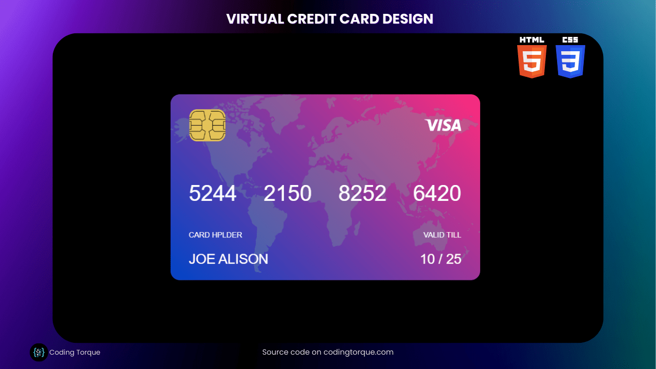
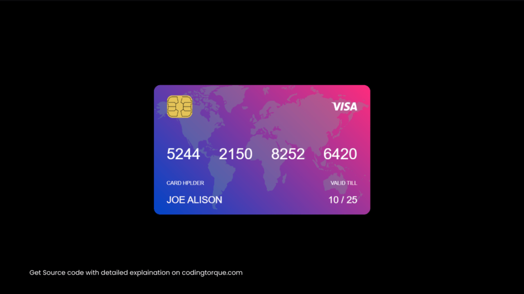
<div class="container">
        <div class="card">
            <div class="card-inner">
                <div class="front">
                    <img src="https://i.ibb.co/PYss3yv/map.png" class="map-img">
                    <div class="row">
                        <img src="https://i.ibb.co/G9pDnYJ/chip.png" width="60px">
                        <img src="https://i.ibb.co/WHZ3nRJ/visa.png" width="60px">
                    </div>
                    <div class="row card-no">
                        <p>5244</p>
                        <p>2150</p>
                        <p>8252</p>
                        <p>6420</p>
                    </div>
                    <div class="row card-holder">
                        <p>CARD HPLDER</p>
                        <p>VALID TILL</p>
                    </div>
                    <div class="row name">
                        <p>JOE ALISON</p>
                        <p>10 / 25</p>
                    </div>
                </div>
                <div class="back">
                    <img src="https://i.ibb.co/PYss3yv/map.png" class="map-img">
                    <div class="bar"></div>
                    <div class="row card-cvv">
                        <div>
                            <img src="https://i.ibb.co/S6JG8px/pattern.png">
                        </div>
                        <p>824</p>
                    </div>
                    <div class="row card-text">
                        <p>this is a virtual card design using HTML and CSS. You can aslo design something like this.</p>
                    </div>
                    <div class="row signature">
                        <p>CUSTOMER SIGNATURE</p>
                        <img src="https://i.ibb.co/WHZ3nRJ/visa.png" width="80px">
                    </div>
                </div>
            </div>
        </div>
    </div>
CSS Code
Create a file style.css and paste the code below.
@import url('https://fonts.googleapis.com/css2?family=josefin+Sans:wght@400;500;600;700&display=swap');

* {
    margin: 0;
    padding: 0;
    box-sizing: border-box;
    font-family: 'Josefin Sans', sans-serif;
}

.container {
    min-height: 100vh;
    width: 100%;
    background: #000;
    display: flex;
    align-items: center;
    justify-content: center;
}

.card {
    width: 500px;
    height: 300px;
    color: #fff;
    cursor: pointer;
    perspective: 1000px;
}

.card-inner {
    width: 100%;
    height: 100%;
    position: relative;
    transition: transform 1s;
    transform-style: preserve-3d;
}

.front, .back {
    width: 100%;
    height: 100%;
    background-image: linear-gradient(45deg, #0045c7, #ff2c7d);
    position: absolute;
    top: 0;
    left: 0;
    padding: 20px 30px;
    border-radius: 15px;
    overflow: hidden;
    z-index: 1;
    backface-visibility: hidden;
}

.row {
    display: flex;
    align-items: center;
    justify-content: space-between;
}

.map-img {
    width: 100%;
    position: absolute;
    top: 0;
    left: 0;
    opacity: 0.3;
    z-index: -1;
}

.card-no {
    font-size: 35px;
    margin-top: 60px;
}

.card-holder {
    font-size: 12px;
    margin-top: 40px;
}

.name {
    font-size: 22px;
    margin-top: 20px;
}

.bar {
    background: #222;
    margin-left: -30px;
    margin-right: -30px;
    height: 60px;
    margin-top: 10px;
}

.card-cvv {
    margin-top: 20px;
}

.card-cvv div {
    flex: 1;
}

.card-cvv img {
    width: 100%;
    display: block;
    line-height: 0;
}

.card-cvv p {
    background: #fff;
    color: #000;
    font-size: 22px;
    padding: 10px 20px;
}

.card-text {
    margin-top: 30px;
    font-size: 14px;
}

.signature {
    margin-top: 30px;
}

.back {
    transform: rotateY(180deg);
}

.card:hover .card-inner {
    transform: rotateY(-180deg);
}
Output Till Now
Written by: Piyush Patil
Code Credits: @Darkseens
If you found any mistakes or have any doubts please feel free to Contact Us
Hope you find this post helpful💖


