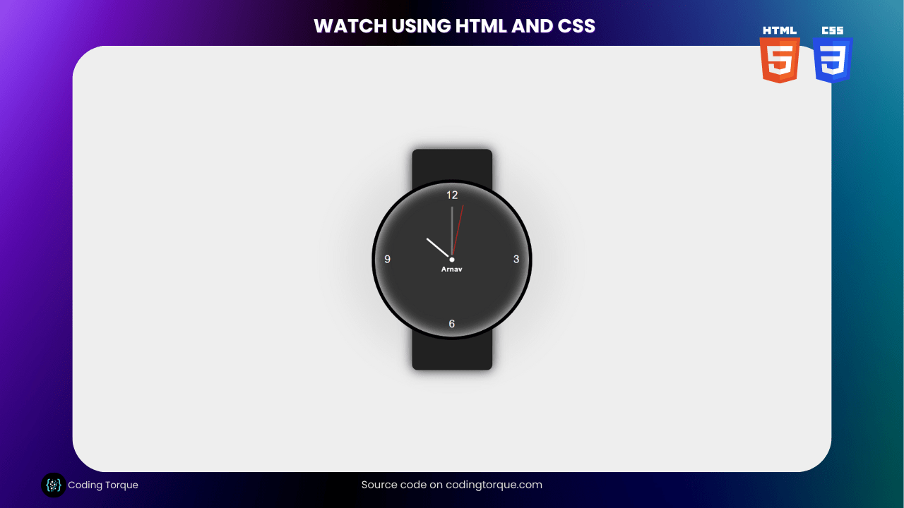
Watches are a classic accessory that have been around for centuries. In this tutorial, we’ll show you how to create a watch using HTML and CSS. We’ll start by creating a basic HTML structure for the watch, then use CSS to style the watch face, hands, and numbers. We’ll also add a subtle shadow effect to give the watch a more realistic look. Next, we’ll use JavaScript to make the hands move in real-time, simulating the motion of a real watch. We’ll also show you how to customize the watch to your liking, including changing the color scheme, adding a stopwatch or timer function, and more. By the end of this tutorial, you’ll have a good understanding of how to create a fully functional watch using HTML and CSS, and be able to apply these techniques to your own web projects. So, let’s dive in and create a watch using HTML and CSS!
Before we start here are 50 projects to create using HTML CSS and JavaScript –
I would recommend you don’t just copy and paste the code, just look at the code and type by understanding it.
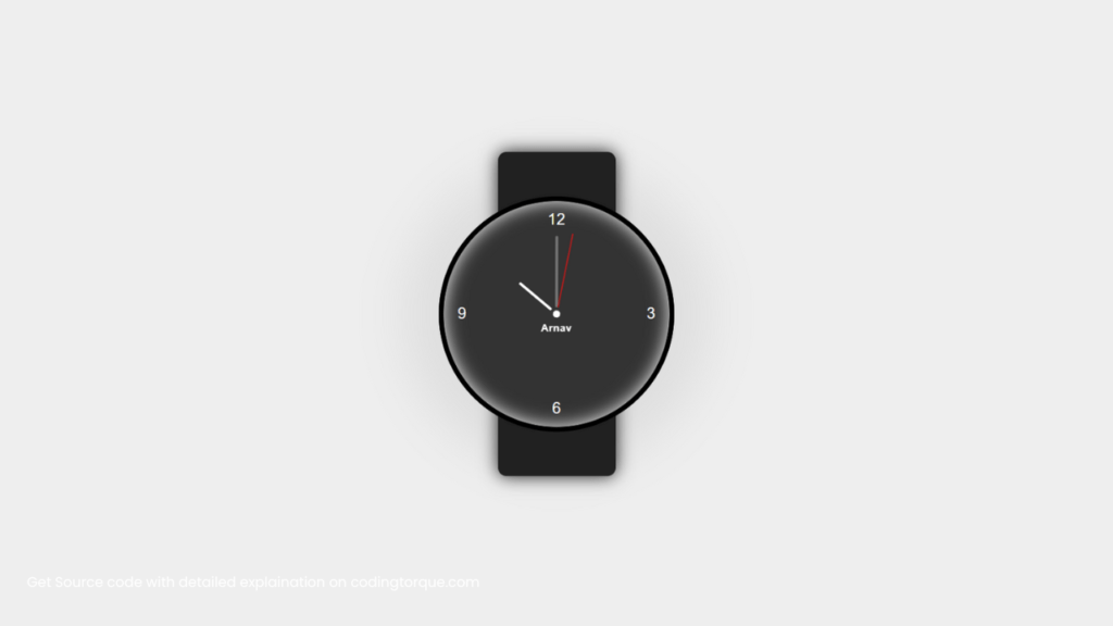
Demo
HTML Code
Starter Template
<!doctype html>
<html lang="en">

<head>
    <!-- Required meta tags -->
    <meta charset="utf-8">
    <meta name="viewport" content="width=device-width, initial-scale=1">

    <!-- CSS -->
    <link rel="stylesheet" href="style.css">

    <title>Watch using HTML and CSS - Coding Torque</title>
</head>

<body>
    <!-- Further code here -->
</body>

</html>
Paste the below code in your <body> tag.
<div class="d-flex flex-column flex-1 align-items-center justify-content-center">

    <div class="watch-container d-flex align-items-center justify-content-center">

        <div class="watch">

            <div class="pointers h-100 w-100 d-flex align-items-center justify-content-center">

                <div class="pointer-container seconds">

                    <div class="dot d-flex justify-content-center">

                        <div class="pointer seconds"></div>

                    </div>

                </div>

                <div class="pointer-container minutes">

                    <div class="dot d-flex justify-content-center">

                        <div class="pointer minutes"></div>

                    </div>

                </div>

                <div class="pointer-container hours">

                    <div class="dot d-flex justify-content-center">

                        <div class="pointer hours"></div>

                    </div>

                </div>

                <div class="watch-name">

                    <h6>Arnav</h6>

                </div>

            </div>

            <div class="numbers h-100 d-flex flex-column justify-content-between">

                <div class="top d-flex justify-content-center"></div>

                <div class="middle d-flex justify-content-between"></div>

                <div class="bottom d-flex justify-content-center"></div>

            </div>

        </div>

        <div class="belt"></div>

    </div>

</div>
CSS Code
Create a file style.css and paste the code below.
* {
  padding: 0;

  margin: 0;

  box-sizing: border-box;
}

html {
  height: 100%;
}

body {
  color: #fff;

  height: 100%;

  font-family: "Roboto", sans-serif;

  font-weight: 400;

  font-size: 18px;

  letter-spacing: 0.5px;

  background-color: #eeeeee;

  display: flex;

  flex-direction: column;
}

.d-flex {
  display: flex;
}

.flex-column {
  flex-direction: column;
}

.align-items-center {
  align-items: center;
}

.justify-content-center {
  justify-content: center;
}

.justify-content-between {
  justify-content: space-between;
}

.flex-1 {
  flex-grow: 1;
}

.h-100 {
  height: 100%;
}

.w-100 {
  width: 100%;
}

.watch-container {
  position: relative;

  width: 280px;
}

.watch-container::after {
  content: "";

  position: absolute;

  height: 280px;

  width: 280px;

  background-color: #333333;

  -webkit-box-shadow: 0 0 60px 40px rgba(80, 80, 80, 0.1);

  -moz-box-shadow: 0 0 60px 40px rgba(80, 80, 80, 0.1);

  box-shadow: 0 0 60px 40px rgba(80, 80, 80, 0.1);

  border-radius: 50%;

  z-index: -1;
}

.watch-container .watch {
  height: 280px;

  width: 280px;

  border: 6px solid #000;

  background-color: #333333;

  padding: 6px;

  border-radius: 50%;

  position: absolute;

  box-shadow: inset 0px 0px 20px 0px #ffffff;
}

.watch-container .watch .pointers {
  position: absolute;

  left: 0;

  top: 0;
}

.watch-container .watch .pointers .pointer-container.seconds .dot,
.watch-container .watch .pointers .pointer-container.minutes .dot,
.watch-container .watch .pointers .pointer-container.hours .dot {
  height: 8px;

  width: 8px;

  border-radius: 50%;

  background-color: #fff;

  position: relative;
}

.watch-container .watch .pointers .pointer-container.seconds {
  z-index: 2;

  transform: rotateZ(0deg);

  -webkit-animation: animate-seconds 60s infinite linear;

  -o-animation: animate-seconds 60s infinite linear;

  animation: animate-seconds 60s infinite linear;
}

@keyframes animate-seconds {
  to {
    transform: rotateZ(360deg);
  }
}

.watch-container
  .watch
  .pointers
  .pointer-container.seconds
  .dot
  .pointer.seconds {
  height: 90px;

  width: 2px;

  border-radius: 1px;

  background-color: #b71c1c;

  position: absolute;

  bottom: 12px;
}

.watch-container .watch .pointers .pointer-container.minutes {
  z-index: 1;

  position: absolute;

  transform: rotateZ(0deg);

  -webkit-animation: animate-minutes 3600s infinite linear;

  -o-animation: animate-minutes 3600s infinite linear;

  animation: animate-minutes 3600s infinite linear;
}

@keyframes animate-minutes {
  to {
    transform: rotateZ(360deg);
  }
}

.watch-container
  .watch
  .pointers
  .pointer-container.minutes
  .dot
  .pointer.minutes {
  height: 85px;

  width: 3px;

  border-radius: 1.5px;

  background-color: #757575;

  position: absolute;

  bottom: 12px;
}

.watch-container .watch .pointers .pointer-container.hours {
  z-index: 0;

  position: absolute;

  transform: rotateZ(310deg);

  -webkit-animation: animate-hours 43200s infinite linear;

  -o-animation: animate-hours 43200s infinite linear;

  animation: animate-hours 43200s infinite linear;
}

@keyframes animate-hours {
  to {
    transform: rotateZ(670deg);
  }
}

.watch-container .watch .pointers .pointer-container.hours .dot .pointer.hours {
  height: 50px;

  width: 3px;

  border-radius: 1.5px;

  background-color: #fff;

  position: absolute;

  bottom: 12px;
}

.watch-container .watch .numbers .top::before,
.watch-container .watch .numbers .middle::before,
.watch-container .watch .numbers .middle::after,
.watch-container .watch .numbers .bottom::before {
  display: flex;

  align-items: center;

  justify-content: center;

  height: 32px;

  width: 32px;

  border-radius: 50%;
}

.watch-container .watch .numbers .top {
  text-align: center;
}

.watch-container .watch .numbers .top::before {
  content: "12";
}

.watch-container .watch .numbers .middle::before {
  content: "9";
}

.watch-container .watch .numbers .middle::after {
  content: "3";
}

.watch-container .watch .numbers .bottom::before {
  content: "6";
}

.watch-container .watch .pointers .watch-name {
  position: absolute;
  top: 9rem;
}

.watch-container .belt {
  width: 140px;
  height: 385px;
  border-radius: 10px;
  background-color: #212121;
  box-shadow: 0px 0px 20px #000000eb;
}
Final Output
Written by: Piyush Patil
Code Credits: @AAbro
If you found any mistakes or have any doubts please feel free to Contact Us
Hope you find this post helpful💖


