
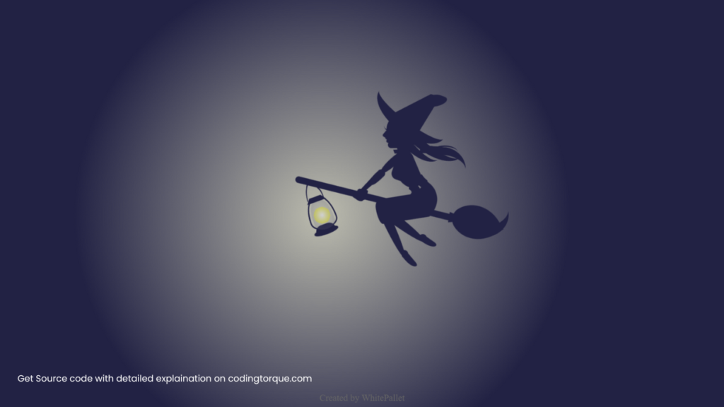
Are you interested in creating whimsical and creative illustrations using HTML and CSS? Consider building a “Witch Illustration” using only these two languages. In this tutorial, we’ll show you step-by-step how to create a “Witch Illustration” from scratch. You’ll learn how to create the witch’s body, clothing, and hat using HTML, and style them using CSS to create a realistic and detailed illustration. Plus, you’ll gain valuable experience in using CSS to create dynamic and responsive designs. By the end of this tutorial, you’ll have a functional and visually stunning “Witch Illustration” that you can use to showcase your skills and engage your website visitors. So, let’s get started on creating a beautiful and whimsical witch illustration using HTML and CSS!
Before we start here are 50 projects to create using HTML CSS and JavaScript –
I would recommend you don’t just copy and paste the code, just look at the code and type by understanding it.
Demo
HTML Code
Starter Template
<!doctype html>
<html lang="en">

<head>
    <!-- Required meta tags -->
    <meta charset="utf-8">
    <meta name="viewport" content="width=device-width, initial-scale=1">

    <!-- CSS -->
    <link rel="stylesheet" href="style.css">

   <!-- fontawesome  -->
    <link rel="stylesheet" href="https://use.fontawesome.com/releases/v5.3.1/css/all.css">

    <title>Witch illustration using HTML and CSS - Coding Torque</title>
</head>

<body>
    <!-- Further code here -->

     <script src="script.js"></script>
</body>

</html>
Paste the below code in your <body> tag.
<div class="css_lab">
    <div class="witch">
        <div></div>
        <div></div>
        <div></div>
        <div></div>
        <div></div>
        <div></div>
        <div></div>
        <div></div>
        <div></div>
        <div></div>
        <div></div>
        <div></div>
        <div></div>
        <div></div>
    </div>
</div>
CSS Code
Create a file style.css and paste the code below.
html,
body {
  margin: 0;
  padding: 0;
  width: 100%;
  height: 100%;
  overflow: hidden;
}
* {
  margin: 0;
  padding: 0;
}
.css_lab {
  width: 100%;
  height: 100%;
  background: #224;
}
.witch {
  width: 100px;
  height: 100px;
  position: absolute;
  top: 50%;
  left: 50%;
  margin: -60px;
  -webkit-transform: scale(3);
  -ms-transform: scale(3);
  transform: scale(3);
}
.witch:before {
  content: "";
  display: block;
  width: 600px;
  height: 600px;
  top: 50%;
  left: 50%;
  margin-top: -241px;
  margin-left: -266px;
  background: -webkit-radial-gradient(
    center,
    ellipse,
    rgba(255, 255, 255, 1) 0%,
    rgba(255, 255, 100, 1) 1%,
    rgba(225, 225, 200, 1) 1%,
    rgba(0, 0, 0, 0) 30%,
    rgba(0, 0, 0, 0) 100%
  );
  background: -o-radial-gradient(
    center,
    ellipse,
    rgba(255, 255, 255, 1) 0%,
    rgba(255, 255, 100, 1) 1%,
    rgba(225, 225, 200, 1) 1%,
    rgba(0, 0, 0, 0) 30%,
    rgba(0, 0, 0, 0) 100%
  );
  background: radial-gradient(
    ellipse at center,
    rgba(255, 255, 255, 1) 0%,
    rgba(255, 255, 100, 1) 1%,
    rgba(225, 225, 200, 1) 1%,
    rgba(0, 0, 0, 0) 30%,
    rgba(0, 0, 0, 0) 100%
  );
  -webkit-animation: lamp 10s ease 2s infinite;
  animation: lamp 10s ease 2s infinite;
}
@-webkit-keyframes lamp {
  50% {
    opacity: 0.2;
    -webkit-transform: scale(0.8);
    transform: scale(0.8);
  }
}
@keyframes lamp {
  50% {
    opacity: 0.2;
    -webkit-transform: scale(0.8);
    transform: scale(0.8);
  }
}
.witch div,
.witch div:before,
.witch div:after {
  content: "";
  display: block;
  position: absolute;
}
.witch div {
  width: 100px;
  height: 100px;
  top: 50%;
  left: 20px;
  margin-top: -50px;
}
.witch div:nth-child(1) {
  width: 80px;
  height: 3px;
  background: #224;
  margin-top: -0.5px;
  border-radius: 3px;
  -webkit-transform: rotate(14deg);
  -ms-transform: rotate(14deg);
  transform: rotate(14deg);
}
.witch div:nth-child(1):before {
  width: 20px;
  height: 20px;
  background: #224;
  right: -20px;
  top: -9px;
  border-radius: 50px 0 45px 20px/45px 0 50px 20px;
  -webkit-transform: rotate(45deg);
  -ms-transform: rotate(45deg);
  transform: rotate(45deg);
}
.witch div:nth-child(1):after {
  width: 25px;
  height: 18px;
  right: -25px;
  top: -15px;
  border-bottom: 5px solid #224;
  border-radius: 45%;
  -webkit-transform: rotate(-30deg);
  -ms-transform: rotate(-30deg);
  transform: rotate(-30deg);
}
.witch div:nth-child(2) {
  width: 11px;
  height: 18px;
  margin-top: -22px;
  left: 70px;
  background: #224;
  border-radius: 50px 20px 20px 40px/50px 23px 5px 61px;
  -webkit-transform: rotate(-23deg);
  -ms-transform: rotate(-23deg);
  transform: rotate(-23deg);
}
.witch div:nth-child(2):before,
.witch div:nth-child(2):after {
  width: 12px;
  height: 17px;
  background: #224;
  left: 1px;
  top: 18px;
  border-radius: 0 60px 70px 0/0 60px 45px 0;
  -webkit-transform: rotate(64deg);
  -ms-transform: rotate(64deg);
  transform: rotate(64deg);
}
.witch div:nth-child(2):after {
  width: 10px;
  height: 10px;
  left: -1px;
  top: 3px;
  border-radius: 3px;
  -webkit-transform: rotate(42deg);
  -ms-transform: rotate(42deg);
  transform: rotate(42deg);
}
.witch div:nth-child(3) {
  width: 16px;
  height: 18px;
  background: #224;
  left: 65px;
  margin-top: -42px;
  border-radius: 40px 0 30px 10px/33px 0 30px 35px;
}
.witch div:nth-child(3):before {
  width: 4px;
  height: 0px;
  margin-top: -12px;
  margin-left: 8px;
  border-radius: 30px 0 0 0;
  -webkit-transform: rotate(37deg);
  -ms-transform: rotate(37deg);
  transform: rotate(37deg);
  border-left: 10px solid transparent;
  border-right: 2px solid transparent;
  border-bottom: 20px solid #224;
}
.witch div:nth-child(3):after {
  width: 39px;
  height: 8px;
  border-bottom: 6px solid #224;
  border-radius: 0 0 30px 30px/0 0 15px 15px;
  left: -9px;
  top: -3px;
  -webkit-transform: rotate(37deg);
  -ms-transform: rotate(37deg);
  transform: rotate(37deg);
}
.witch div:nth-child(4) {
  width: 6px;
  height: 8px;
  margin-left: 51px;
  margin-top: -26px;
  background: #224;
  -webkit-transform: rotate(-15deg);
  -ms-transform: rotate(-15deg);
  transform: rotate(-15deg);
}
.witch div:nth-child(4):before {
  left: 7px;
  top: 6px;
  width: 23px;
  height: 17px;
  border-top: 4px solid #224;
  border-radius: 0 50% 0 0;
  -webkit-transform: rotate(20deg);
  -ms-transform: rotate(20deg);
  transform: rotate(20deg);
}
.witch div:nth-child(4):after {
  width: 4px;
  height: 7px;
  background: #224;
  border-radius: 1px;
  left: -3px;
  top: -11px;
  -webkit-transform: rotate(45deg) skewX(-10deg);
  -ms-transform: rotate(45deg) skewX(-10deg);
  transform: rotate(45deg) skewX(-10deg);
}
.witch div:nth-child(5) {
  width: 27px;
  height: 12px;
  background: #224;
  margin-left: 40px;
  margin-top: -1px;
  -webkit-transform: rotate(-9deg);
  -ms-transform: rotate(-9deg);
  transform: rotate(-9deg);
  border-radius: 35px 0 30px 30px/50px 0 30px 100px;
}
.witch div:nth-child(5):before,
.witch div:nth-child(5):after {
  width: 3.5px;
  height: 5px;
  left: 9px;
  top: 26px;
  background: #224;
  border-radius: 0 3px 0 5px;
  -webkit-transform: rotate(-5deg);
  -ms-transform: rotate(-5deg);
  transform: rotate(-5deg);
}
.witch div:nth-child(5):after {
  left: 19px;
  top: 20px;
  -webkit-transform: rotate(-21deg);
  -ms-transform: rotate(-21deg);
  transform: rotate(-21deg);
}
.witch div:nth-child(6) {
  width: 13px;
  height: 6px;
  margin-left: 67px;
  margin-top: -25px;
  border-radius: 50%;
  border-left: 0px solid transparent;
  border-top: 1px solid #224;
}
.witch div:nth-child(6):before,
.witch div:nth-child(6):after {
  width: 3px;
  height: 8px;
  background: #224;
  left: -3px;
  top: 42px;
  border-radius: 0 2px 10px 30px/0 2px 20px 75px;
  -webkit-transform: rotate(-55deg);
  -ms-transform: rotate(-55deg);
  transform: rotate(-55deg);
}
.witch div:nth-child(6):after {
  left: -12px;
  top: 51px;
  -webkit-transform: rotate(-40deg);
  -ms-transform: rotate(-40deg);
  transform: rotate(-40deg);
}
.witch div:nth-child(7) {
  width: 5px;
  height: 5px;
  border-radius: 50%;
  border-bottom: 1px solid #224;
  margin-left: 44px;
  margin-top: -38px;
}
.witch div:nth-child(7):before {
  width: 5px;
  height: 5px;
  background: #224;
  border-radius: 1px;
  left: 1px;
  top: 5.5px;
  -webkit-transform: rotate(10deg) skewX(-10deg);
  -ms-transform: rotate(10deg) skewX(-10deg);
  transform: rotate(10deg) skewX(-10deg);
  -webkit-box-shadow: 1px 1.5px 0 #224, -4px 31px 0 #224;
  box-shadow: 1px 1.5px 0 #224, -4px 31px 0 #224;
}
.witch div:nth-child(7):after {
  width: 5px;
  height: 3px;
  background: #224;
  border-radius: 3px;
  left: 2px;
  top: 11px;
  -webkit-transform: rotate(0deg);
  -ms-transform: rotate(0deg);
  transform: rotate(0deg);
}
.witch div:nth-child(8) {
  width: 25px;
  height: 28px;
  margin-top: 6px;
  margin-left: 47px;
  -webkit-transform: rotate(-25deg);
  -ms-transform: rotate(-25deg);
  transform: rotate(-25deg);
  overflow: hidden;
}
.witch div:nth-child(8):before,
.witch div:nth-child(8):after {
  width: 5px;
  height: 50px;
  margin-top: -30px;
  margin-left: 1px;
  background: #224;
  border-radius: 50%;
}
.witch div:nth-child(8):after {
  width: 5px;
  height: 50px;
  margin-top: -30px;
  margin-left: 1px;
  background: #224;
  border-radius: 50%;
  -webkit-transform: rotate(-28deg);
  -ms-transform: rotate(-28deg);
  transform: rotate(-28deg);
}
.witch div:nth-child(9) {
  width: 9px;
  height: 10px;
  margin-top: -11px;
  overflow: hidden;
  margin-left: 56px;
}
.witch div:nth-child(9):before {
  width: 20px;
  height: 6px;
  bottom: -6px;
  left: -23px;
  background: none;
  border-radius: 0 50% 50% 0;
  border: 5px solid #224;
}
.witch div:nth-child(9):after {
  width: 18px;
  height: 18px;
  top: -18px;
  right: -19px;
  background: none;
  border-radius: 50%;
  border: 5px solid #224;
}
.witch div:nth-child(10) {
  width: 4px;
  height: 9px;
  border-radius: 10px 10px 5px 5px/10px 10px 30px 30px;
  background: #224;
  margin-top: -14px;
  margin-left: 39px;
  -webkit-transform: rotate(46deg);
  -ms-transform: rotate(46deg);
  transform: rotate(46deg);
}
.witch div:nth-child(10):before {
  width: 4px;
  height: 16px;
  border-radius: 20px 0 30px 30px/125px;
  background: #224;
  top: -14px;
  left: 0px;
  -webkit-transform: rotate(2deg);
  -ms-transform: rotate(2deg);
  transform: rotate(2deg);
}
.witch div:nth-child(10):after {
  width: 2px;
  height: 0;
  border: 1px solid transparent;
  border-top: 12px solid #224;
  top: 4px;
  left: 0px;
}
.witch div:nth-child(11) {
  width: 5px;
  height: 6px;
  border-radius: 6px 5px 6px 0/7px 5px 3px 0;
  background: #224;
  margin-top: -4px;
  margin-left: 30px;
  -webkit-transform: rotate(35deg);
  -ms-transform: rotate(35deg);
  transform: rotate(35deg);
}
.witch div:nth-child(11):before {
  width: 9px;
  height: 7px;
  background: #224;
  border-radius: 4px;
  left: 1px;
  top: -59px;
  -webkit-transform: rotate(-14deg) skewX(-40deg);
  -ms-transform: rotate(-14deg) skewX(-40deg);
  transform: rotate(-14deg) skewX(-40deg);
}
.witch div:nth-child(11):after {
  width: 22px;
  height: 9px;
  border-bottom: 5px solid #224;
  border-radius: 0 0 30px 0/0 0 15px 0;
  left: 1px;
  top: -40px;
  -webkit-transform: rotate(21deg);
  -ms-transform: rotate(21deg);
  transform: rotate(21deg);
}

.witch div:nth-child(12) {
  width: 23px;
  height: 8px;
  border-bottom: 5px solid #224;
  border-radius: 0 0 30px 0/0 0 15px 0;
  margin-left: 58px;
  margin-top: -30px;
  z-index: 1;
  -webkit-transform: rotate(44deg);
  -ms-transform: rotate(44deg);
  transform: rotate(44deg);
}
.witch div:nth-child(12):before {
  width: 5px;
  height: 0;
  top: 19px;
  left: -3px;
  border-left: 1px solid transparent;
  border-top: 2px solid #224;
  -webkit-transform: rotate(-47deg);
  -ms-transform: rotate(-47deg);
  transform: rotate(-47deg);
}
.witch div:nth-child(12):after {
  width: 0;
  height: 4px;
  top: 23px;
  left: 39px;
  border-top: 1px solid transparent;
  border-bottom: 1px solid transparent;
  border-left: 3px solid #224;
  -webkit-transform: rotate(-34deg);
  -ms-transform: rotate(-34deg);
  transform: rotate(-34deg);
}

.witch div:nth-child(13) {
  width: 12px;
  height: 15px;
  border: 1px solid #224;
  border-radius: 8px 8px 10px 10px/17px 17px 6px 7px;
  margin-top: 0;
  margin-left: 7px;
  -webkit-transform: rotate(-20deg);
  -ms-transform: rotate(-20deg);
  transform: rotate(-20deg);
}
.witch div:nth-child(13):before {
  width: 10px;
  height: 3px;
  border-radius: 8px 8px 0 0;
  margin-top: 13px;
  margin-left: 0.5px;
  background: #224;
}
.witch div:nth-child(13):after {
  width: 12px;
  height: 3px;
  border-radius: 50%;
  margin-top: 15px;
  margin-left: -0.5px;
  background: #224;
}
.witch div:nth-child(14) {
  width: 10px;
  height: 15px;
  background: rgba(100, 100, 120, 0.3);
  background: -webkit-radial-gradient(
    center,
    ellipse,
    rgba(255, 255, 255, 0) 0%,
    rgba(100, 100, 120, 0.3) 100%
  );
  background: -o-radial-gradient(
    center,
    ellipse,
    rgba(255, 255, 255, 0) 0%,
    rgba(100, 100, 120, 0.3) 100%
  );
  background: radial-gradient(
    ellipse at center,
    rgba(255, 255, 255, 0) 0%,
    rgba(100, 100, 120, 0.3) 100%
  );
  border-radius: 8px 8px 10px 10px/17px 17px 6px 7px;
  margin-top: 1px;
  margin-left: 9px;
  -webkit-transform: rotate(-20deg);
  -ms-transform: rotate(-20deg);
  transform: rotate(-20deg);
}
.witch div:nth-child(14):before {
  width: 6px;
  height: 0px;
  border: 2px solid transparent;
  border-bottom: 3px solid #224;
  top: -4px;
  left: 0px;
}
.witch div:nth-child(14):after {
  width: 12px;
  height: 9px;
  border: 1px solid transparent;
  border-top: 1px solid #224;
  border-left: 1px solid #224;
  border-radius: 5px;
  top: -6px;
  left: -2px;
  -webkit-transform: rotate(65deg) skewX(42deg);
  -ms-transform: rotate(65deg) skewX(42deg);
  transform: rotate(65deg) skewX(42deg);
}
.css_lab:after {
  content: "Created by WhitePallet";
  display: block;
  width: 250px;
  position: absolute;
  bottom: 10px;
  left: 50%;
  margin-left: -125px;
  text-align: center;
  font-size: 10pt;
  color: #666;
}
Final Output
Written by: Piyush Patil
Code Credits: @WhitePallet
If you found any mistakes or have any doubts please feel free to Contact Us
Hope you find this post helpful💖


