X-rays have long fascinated us with their ability to reveal hidden structures and secrets. In the world of web design, we can harness this intrigue to create captivating and visually striking effects that add a touch of mystery and allure to our projects.
In this blog post, we’ll embark on an intriguing journey to create an X-ray effect using only HTML and CSS. By leveraging the power of these core web technologies, we’ll unlock the secrets to unveiling the invisible and adding depth and intrigue to our designs.


I would recommend you don’t just copy and paste the code, just look at the code and type by understanding it.
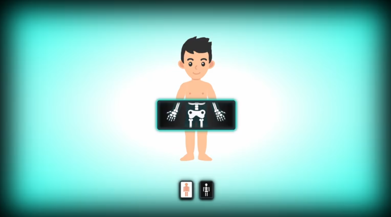
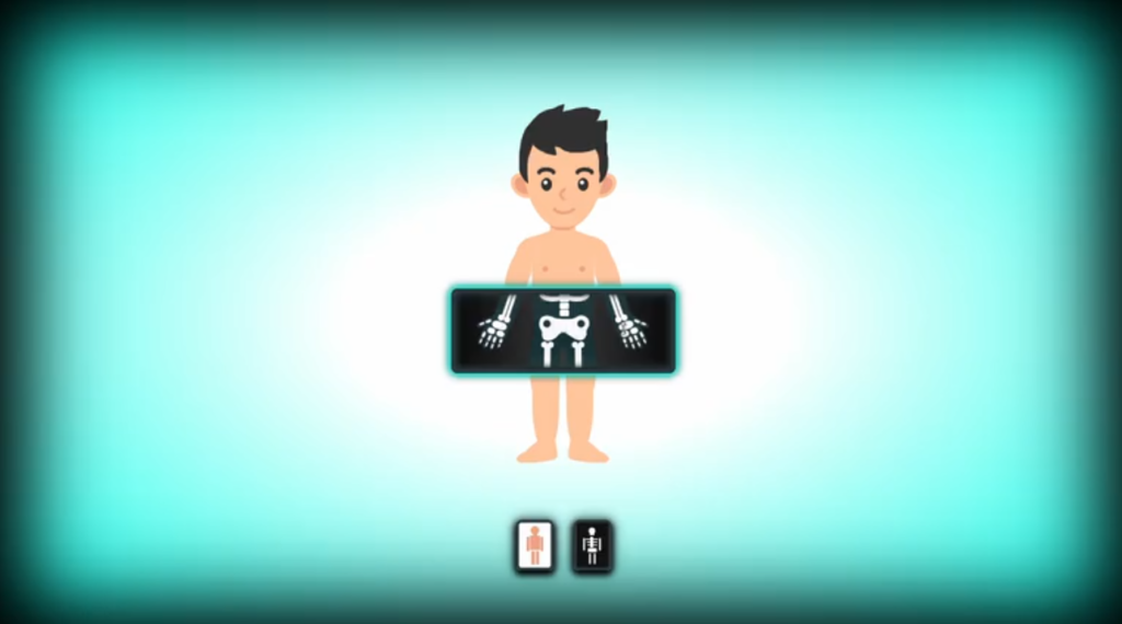
Demo
See the Pen X-Ray – Pure CSS by Josetxu (@josetxu) on CodePen.
HTML Code
Starter Template
<!doctype html>
<html lang="en">

<head>
    <!-- Required meta tags -->
    <meta charset="utf-8">
    <meta name="viewport" content="width=device-width, initial-scale=1">

    <!-- CSS -->
    <link rel="stylesheet" href="style.css">

    <title>X-Ray using HTML and CSS - Coding Torque</title>
</head>

<body>
    <!-- Further code here -->

    <script src="script.js"></script>
</body>

</html>
Paste the below code in your <body> tag.
<div class="no-scaner"></div>
<div class="big-scaner"></div>

<div class="content">

	<div class="x-ray"></div>
	<div class="x-ray"></div>
	<div class="x-ray"></div>
	<div class="x-ray"></div>
	<div class="x-ray"></div>
	<div class="x-ray"></div>
	<div class="x-ray"></div>
	<div class="x-ray"></div>
	<div class="x-ray"></div>
	<div class="x-ray"></div>
	<div class="x-ray"></div>
	<div class="x-ray"></div>
	<div class="x-ray"></div>
	<div class="x-ray"></div>
	<div class="x-ray"></div>
	<div class="x-ray"></div>
	<div class="x-ray"></div>
	<div class="x-ray"></div>
	<div class="x-ray"></div>
	<div class="x-ray"></div>

	<div class="human-body">
		<div class="hair"></div>
		<div class="ears"></div>
		<div class="head">
			<div class="eyes">
				<div class="eyebrows">
					<span></span>
					<span></span>
				</div>
			</div>
			<div class="nose"></div>
			<div class="mouth"></div>
		</div>
		<div class="neck"></div>
		<div class="torso"></div>
		<div class="arms">
			<div class="arm">
				<div class="hand"></div>
			</div>
			<div class="arm">
				<div class="hand"></div>
			</div>
		</div>
		<div class="pants"></div>
		<div class="legs">
			<div class="leg">
				<div class="foot">
				</div>
			</div>
			<div class="leg">
				<div class="foot">
				</div>
			</div>
		</div>
	</div>

	<div class="skeleton">
		<div class="ears"></div>
		<div class="head">
			<div class="cranium"></div>
			<div class="nose"></div>
			<div class="mouth"></div>
		</div>
		<div class="neck"></div>
		<div class="torso">
			<div class="pelvis"></div>
			<div class="column"></div>
			<div class="rib"></div>
			<div class="rib"></div>
			<div class="clavicle"></div>
		</div>
		<div class="arms">
			<div class="arm">
				<div class="bone"></div>
				<div class="bone"></div>
				<div class="hand">
					<div class="bone"></div>
					<div class="bone"></div>
					<div class="bone"></div>
					<div class="bone"></div>
					<div class="bone"></div>
					<div class="bone"></div>
				</div>
			</div>
		</div>
		<div class="legs">
			<div class="leg">
				<div class="bone"></div>
				<div class="bone"></div>
				<div class="bone ball"></div>
				<div class="foot">
					<div class="bone"></div>
					<div class="bone"></div>
					<div class="bone"></div>
				</div>
			</div>
			<div class="leg">
				<div class="bone"></div>
				<div class="bone"></div>
				<div class="bone ball"></div>
				<div class="foot">
					<div class="bone"></div>
					<div class="bone"></div>
					<div class="bone"></div>
				</div>
			</div>
		</div>
	</div>

	<div class="scaner"></div>

</div>
CSS Code
Create a file style.css and paste the code below.
:root {
	--hair : #303030;
	--mouth: #f0a282;
	--skin : #ffc49c;
	--scan : #2a393c;
	--shine: #00ff97;
	--shine: #00ffea;
	--fit: #fff;
	--spd: 0.25s;
}

body {
	margin: 0;
	padding: 0;
	width: 100vw;
	height: 100vh;
	overflow: hidden;
	display: flex;
	align-items: center;
	justify-content: center;
	background: radial-gradient(ellipse at 50% 50%,#fff 35vmin, var(--shine));
	box-shadow: 0 0 12vmin 5vmin #000 inset;
}

body:after {
	content: "";
	width: 18vmin;
	position: absolute;
	height: 9vmin;
	bottom: 9.5vmin;
	animation: block-btn 4s linear 0s 1;
	animation-fill-mode: forwards;
}

@keyframes block-btn {
	 0%,  50% { bottom: 9.5vmin; }
	51%, 100% { bottom: -10vmin; }
}

.content {
	width: 34vmin;
	height: 60vmin;
	background-size: cover;
	position: relative;
	margin-top: -10vmin;
}

.x-ray {
	height: 5%;
	box-sizing: border-box;
	position: relative;
	z-index: 4;
	cursor: n-resize;
}

.human-body, .skeleton {
	width: 100%;
	height: 100%;
	position: absolute;
	top: 0;
	z-index: 1;
	display: flex;
	justify-content: center;
}


/*** HUMAN BODY ***/

.human-body div {
	position: absolute;
}

.hair {
	width: 14.25vmin;
	height: 14vmin;
	top: 1vmin;
	background: var(--hair);
	border-radius: 4vmin;
	z-index: 1;
	clip-path: polygon(3% 100%, 4% 94%, 2% 88%, 1% 80%, 1% 74%, 1% 60%, 3% 46%, 5% 39%, 8% 32%, 12% 27%, 17% 21%, 23% 15%, 31% 11%, 39% 9%, 45% 6%, 48% 5%, 51% 4%, 49% 13%, 52% 12%, 57% 11%, 64% 9%, 71% 8%, 76% 8%, 81% 10%, 86% 10%, 91% 12%, 90% 16%, 88% 21%, 86% 23%, 90% 23%, 93% 23%, 97% 22%, 98% 22%, 98% 28%, 98% 33%, 97% 36%, 97% 38%, 97% 43%, 97% 47%, 98% 49%, 98% 53%, 98% 60%, 99% 65%, 99% 70%, 99% 75%, 98% 80%, 96% 86%, 93% 91%, 92% 95%, 92% 100%, 89% 91%, 90% 85%, 89% 79%, 89% 74%, 89% 68%, 88% 62%, 85% 55%, 80% 57%, 76% 58%, 69% 59%, 63% 59%, 58% 59%, 51% 57%, 45% 53%, 40% 52%, 42% 60%, 42% 63%, 42% 62%, 42% 62%, 39% 62%, 35% 61%, 31% 60%, 27% 58%, 23% 56%, 19% 53%, 16% 50%, 14% 56%, 13% 59%, 12% 62%, 11% 65%, 10% 72%, 10% 82%, 11% 93%);
}

.ears {
	width: 12.5vmin;
	height: 5vmin;
	top: 12.5vmin;
	left: 8.5vmin;
	z-index: -1;
}

.ears:before, .ears:after {
	content: "";
	position: absolute;
	background: radial-gradient(var(--mouth) 0 1.5vmin, var(--skin) calc(1.5vmin + 1px) 100%);
	width: 4.5vmin;
	height: 3.5vmin;
	top: 0.15vmin;
	left: 0;
	border-radius: 100%;
	transform: rotate(40deg);
}

.ears:after {
	transform: rotateY(180deg) rotate(40deg);
	right: 0;
	left: 100%;
}

.head {
	width: 13vmin;
	height: 17vmin;
	top: 4.25vmin;
	background: var(--skin);
	border-radius: 50% 50% 50% 50% / 34% 34% 66% 66%;
	z-index: 0;
}

.eyes {
	width: 13vmin;
	height: 5vmin;
	top: 7vmin;
}

.eyes:before, .eyes:after {
	content: "";
	position: absolute;
	width: 1.65vmin;
	height: 2vmin;
	top: 2vmin;
	left: 3vmin;
	border-radius: 100%;
	background: radial-gradient(circle at 40% 35%, #fff 0 0.25vmin, var(--hair) calc(0.25vmin + 1px) 100% );
}

.eyes:after {
	left: 8.75vmin;
}

.eyebrows {
	width: 13vmin;
	height: 2vmin;
	top: 0;
}

.eyebrows span {
	content: "";
	position: absolute;
	width: 2.25vmin;
	height: 1.5vmin;
	top: 0.35vmin;
	left: 2vmin;
	border-radius: 100%;
	border: 0.65vmin solid #fff0;
	border-top-color: var(--hair);
}

.eyebrows span:before, .eyebrows span:after {
	content: "";
	position: absolute;
	background: var(--hair);
	width: 0.65vmin;
	height: 0.65vmin;
	top: -0.2vmin;
	left: -0.3vmin;
	border-radius: 100%;
}

.eyebrows span:after {
	left: 1.95vmin;
}

.eyebrows span + span {
	left: 8vmin;
}

.nose {
	width: 2vmin;
	height: 1.75vmin;
	top: 10.65vmin;
	left: 5.75vmin;
	border-radius: 0.75vmin;
	border: 0.5vmin solid #fff0;
	box-sizing: border-box;
	border-left-color: var(--mouth);
	border-top-color: var(--mouth);
	transform: rotate(-48deg);
}

.mouth {
	width: 5vmin;
	height: 5vmin;
	top: 9.75vmin;
	left: 4vmin;
	border-radius: 100%;
	border: 0.5vmin solid #fff0;
	box-sizing: border-box;
	border-bottom-color: var(--mouth);
}

.mouth:before, .mouth:after {
	content: "";
	position: absolute;
	background: var(--mouth);
	width: 0.45vmin;
	height: 0.45vmin;
	bottom: 0.15vmin;
	left: 0.35vmin;
	border-radius: 100%;
}

.mouth:after {
	left: 3.375vmin;
}

.neck {
	width: 4vmin;
	height: 3vmin;
	background: var(--skin);
	top: 20vmin;
	margin-left: -0.25vmin;
}

.neck:before {
	content: "";
	position: absolute;
	width: 4vmin;
	height: 2vmin;
	top: -0.5vmin;
	left: 0;
	border-radius: 100%;
	border-bottom: 0.5vmin solid var(--mouth);
	box-sizing: border-box;
}

.torso {
	width: 10vmin;
	height: 16vmin;
	background:
		radial-gradient(circle at 50% 80%, var(--mouth) 0 0.3vmin, #fff0 calc(0.3vmin + 1px) 100%),
		radial-gradient(circle at 80% 38%, var(--mouth) 0 0.35vmin, #fff0 calc(0.35vmin + 1px) 100%),
		radial-gradient(circle at 22% 38%, var(--mouth) 0 0.35vmin, #fff0 calc(0.35vmin + 1px) 100%),
		linear-gradient(-88deg, var(--fit) 0 0.35vmin, #fff0 calc(0.35vmin + 1px) 100%),
		linear-gradient(88deg, var(--fit) 0 0.35vmin, #fff0 calc(0.35vmin + 1px) 100%),
		linear-gradient(200deg, #fff0 0 1vmin, var(--skin) calc(1vmin + 1px) 2vmin, #fff0 0 100%),
		linear-gradient(160deg, #fff0 0 1vmin, var(--skin) calc(1vmin + 1px) 2vmin, #fff0 0 100%),
		linear-gradient(180deg, #fff0 0 2vmin, var(--skin) 0 100%),
		linear-gradient(90deg, #fff0 0 3vmin, var(--skin) 0 7vmin, #fff0 0 100%),
		radial-gradient(circle at 77% 36%, var(--skin) 0 5vmin, #fff0 calc(5vmin + 1px) 100%),
		radial-gradient(circle at 23% 36%, var(--skin) 0 5vmin, #fff0 calc(5vmin + 1px) 100%);
	top: 21.5vmin;
	margin-left: -0.25vmin;
	z-index: 2;
}

.torso:after {
	content: "";
	width: calc(100% - 1vmin);
	height: 1.5vmin;
	background: var(--skin);
	position: absolute;
	bottom: -1.5vmin;
	left: 0.5vmin;
	z-index: -1;
}

.arms {
	width: 28vmin;
	height: 18vmin;
	top: 22.5vmin;
	z-index: 1;
}

.arm {
	background: linear-gradient(0deg, #fff0 0 5vmin, var(--skin) calc(5vmin + 1px) 50%);
	width: 3.4vmin;
	height: 20vmin;
	transform: rotate(19deg);
	left: 4.25vmin;
	top: -1vmin;
	border-radius: 10vmin 0 150% 0;
}

.arm:before {
	content: "";
	width: 2vmin;
	height: 7vmin;
	background: var(--skin);
	position: absolute;
	top: 3vmin;
	left: -0.25vmin;
	border-radius: 100%;
}

.hand {
	width: 5.5vmin;
	height: 6vmin;
	background: var(--skin);
	bottom: 0;
	left: -2.1vmin;
	clip-path: polygon(38% 0%, 33% 5%, 27% 13%, 23% 18%, 13% 26%, 5% 35%, 1% 41%, 2% 44%, 4% 47%, 7% 47%, 16% 44%, 22% 40%, 25% 36%, 26% 36%, 26% 38%, 24% 46%, 21% 60%, 20% 74%, 21% 81%, 23% 85%, 25% 87%, 28% 87%, 30% 84%, 34% 72%, 36% 60%, 37% 58%, 39% 58%, 39% 63%, 38% 72%, 37% 80%, 38% 88%, 40% 92%, 43% 93%, 45% 91%, 48% 88%, 51% 83%, 53% 70%, 53% 62%, 54% 59%, 56% 58%, 57% 60%, 56% 65%, 56% 74%, 56% 82%, 58% 88%, 60% 90%, 63% 92%, 65% 92%, 67% 89%, 70% 84%, 70% 74%, 70% 65%, 70% 61%, 71% 59%, 72% 60%, 74% 62%, 75% 69%, 75% 77%, 76% 81%, 78% 83%, 81% 82%, 83% 80%, 87% 66%, 92% 43%, 95% 23%, 97% 7%, 97% 0%);
	border-radius: 0 1.5vmin 0 0;
	z-index: -1;
}

.arm + .arm {
	transform: rotateY(180deg) rotate(19deg);
	left: 20vmin;
}

.pants {
	width: 10.5vmin;
	height: 6vmin;
	top: 35.5vmin;
	background: var(--hair);
	clip-path: polygon(2% 1%, 0% 92%, 8% 96%, 16% 97%, 21% 98%, 27% 97%, 33% 97%, 45% 94%, 46% 75%, 49% 73%, 51% 75%, 52% 99%, 52% 97%, 56% 97%, 60% 97%, 69% 97%, 90% 96%, 98% 93%, 95% 1%, 75% 4%, 61% 5%, 42% 5%);
	z-index: 3;
}

.legs {
	width: 15vmin;
	height: 21vmin;
	top: 37.5vmin;
	z-index: -1;
	margin-left: -0.2vmin;
}

.leg {
	background: var(--skin);
	width: 4.25vmin;
	height: 19vmin;
	transform: rotate(1deg);
	left: 2.65vmin;
	top: -1vmin;
	border-radius: 1px 1px 30% 40%;
}

.leg:before {
	content: "";
	width: 2vmin;
	height: 10vmin;
	background: var(--skin);
	position: absolute;
	top: 1vmin;
	left: -0.5vmin;
	border-radius: 100%;
}

.leg + .leg {
	transform: rotateY(180deg) rotate(1deg);
	left: 8vmin;
}

.foot {
	background: var(--skin);
	width: 7vmin;
	height: 4vmin;
	top: 18vmin;
	left: -2.75vmin;
	clip-path: polygon(90% 2%, 93% 2%, 98% 56%, 98% 56%, 97% 68%, 97% 68%, 92% 77%, 92% 77%, 77% 84%, 77% 84%, 45% 92%, 45% 92%, 24% 92%,  14% 92%, 8% 87%, 6% 76%, 10% 66%,  15% 57%, 24% 47%, 32% 34%, 48% 12%,  50% 10%, 55% 0%);
	clip-path: polygon(90% 2%, 93% 2%, 98% 56%, 98% 56%, 97% 68%, 97% 68%, 92% 77%, 92% 77%, 77% 84%, 77% 84%, 45% 92%, 45% 92%, 24% 92%,  14% 92%, 8% 85%, 6% 76%, 10% 66%,  15% 58%, 27% 47%, 34% 34%, 48% 12%,  50% 10%, 55% 0%);
	z-index: -1;
}


/*** SKELETON ***/

.skeleton {
	--hair: #0000;
	--skin: #163238; /*43b9d1*/
	--mouth: #163238;
	--fit: #242424;
	--bone: #fff;
	background: linear-gradient(90deg, #000, #333, #000);
	clip-path: polygon(0 47.5%, 100% 47.5%, 100% 67.5%, 0 67.5%);
	transition: clip-path var(--spd) ease 0s;
	animation: startup-skeleton 3s ease-in-out 0s 1;
	opacity: 0.965;
}

.skeleton div {
	position: absolute;
}

.cranium {
	background:
		linear-gradient(180deg, var(--bone) 0 55%, #fff0 0 90%, #fff 0 100%),
		radial-gradient(circle at 75% 73%, #fff0 0 1.75vmin, var(--bone) calc(1.75vmin + 1px) 4vmin, #fff0 0 100%),
		radial-gradient(circle at 25% 73%, #fff0 0 1.75vmin, var(--bone) calc(1.75vmin + 1px) 4vmin, #fff0 0 100%);
	width: 12vmin;
	height: 13vmin;
	left: 0.5vmin;
	top: 0.25vmin;
	border-radius: 6vmin 6vmin 4.5vmin 4.5vmin;
}

.cranium:before {
	content: "";
	position: absolute;
	width: 1.25vmin;
	height: 1.25vmin;
	bottom: -0.75vmin;
	left: 4.85vmin;
	background: var(--bone);
	border-radius: 100%;
	box-shadow: 1.25vmin 0 0 0 var(--bone);
}

.cranium:after {
	content: "";
	position: absolute;
	width: 5.25vmin;
	height: 1.5vmin;
	bottom: -0.95vmin;
	left: 3.5vmin;
	background:
		radial-gradient(circle at 90% 10%, var(--bone) 0 1vmin, #fff0 calc(1vmin + 1px) 100%),
		radial-gradient(circle at 10% 10%, var(--bone) 0 1vmin, #fff0 calc(1vmin + 1px) 100%);
	border-radius: 1vmin;
}


.skeleton .nose {
	background:
		radial-gradient(circle at 68% 60%, var(--skin) 0.5vmin, #fff0 calc(0.5vmin + 1px) 100%),
		radial-gradient(circle at 30% 60%, var(--skin) 0.5vmin, #fff0 calc(0.5vmin + 1px) 100%);
	border: 0;
	top: 10.25vmin;
	height: 2.25vmin;
	width: 2.4vmin;
	left: 5.4vmin;
	transform: rotate(0deg);
	border-radius: 1vmin;
}

.skeleton .nose:before {
	content: "";
	border: 1.2vmin solid #fff0;
	position: absolute;
	border-bottom-color: var(--skin);
	left: 0.035vmin;
	top: -1.1vmin;
	border-radius: 1vmin;
}

.skeleton .mouth {
	border-bottom-color: var(--bone);
	border-width: 0.75vmin;
	width: 11.75vmin;
	left: 0.6vmin;
	height: 15vmin;
	top: 0.85vmin;
	background:
		radial-gradient(circle at 35% 98%, var(--bone) 0 0.65vmin, #fff0 calc(0.65vmin + 1px) 100%),
		radial-gradient(circle at 45% 100%, var(--bone) 0 0.65vmin, #fff0 calc(0.65vmin + 1px) 100%),
		radial-gradient(circle at 55% 100%, var(--bone) 0 0.65vmin, #fff0 calc(0.65vmin + 1px) 100%),
		radial-gradient(circle at 65% 98%, var(--bone) 0 0.65vmin, #fff0 calc(0.65vmin + 1px) 100%);
	background-repeat: no-repeat;
}

.skeleton .mouth:before , .skeleton .mouth:after {
	background: var(--bone);
	width: 0.75vmin;
	height: 0.75vmin;
	left: 1.1vmin;
	bottom: 1vmin;
}

.skeleton .mouth:after {
	left: 8.45vmin;
}

.skeleton .neck {
	z-index: -1;
}

.skeleton .torso:before {
	background:
		radial-gradient(circle at 101% 23%, var(--bone) 0 0.45vmin, #fff0 calc(0.45vmin + 1px) 100%),
		radial-gradient(circle at -1% 23%, var(--bone) 0 0.45vmin, #fff0 calc(0.45vmin + 1px) 100%);
	content: "";
	position: absolute;
	width: 100%;
	height: 100%;
}

.pelvis {
	background:
		radial-gradient(circle at 82% 36%, #fff0 0.5vmin, var(--bone) calc(0.5vmin + 1px) 4vmin, #fff0 0 100%),
		radial-gradient(circle at 19% 36%, #fff0 0.5vmin, var(--bone) calc(0.5vmin + 1px) 4vmin, #fff0 0 100%);
	width: 8.5vmin;
	height: 4.5vmin;
	bottom: -1.5vmin;
	left: 0.9vmin;
	clip-path: polygon(9% 14%, 13% 10%, 19% 8%, 25% 10%, 29% 12%, 32% 15%, 34% 17%, 38% 18%, 46% 20%, 51% 20%, 58% 20%, 64% 20%, 71% 16%, 75% 11%, 81% 7%, 86% 8%, 91% 12%, 95% 19%, 97% 29%, 97% 42%, 95% 50%, 93% 56%, 92% 61%, 92% 69%, 92% 76%, 89% 86%, 86% 91%, 81% 94%, 78% 94%, 72% 90%, 67% 85%, 62% 79%, 57% 73%, 53% 67%, 49% 66%, 45% 68%, 41% 74%, 36% 84%, 31% 90%, 26% 94%, 20% 96%, 15% 93%, 12% 89%, 11% 84%, 10% 78%, 10% 72%, 10% 66%, 9% 59%, 7% 54%, 5% 45%, 4.5% 36%, 5% 30%, 6% 23%);
}

.column {
	width: 1.5vmin;
	height: 8.75vmin;
	background: var(--bone) ;
	border-radius: 0.25vmin;
	left: 4.45vmin;
	top: 2.5vmin;
}

.column:before, .column:after {
	content: "";
	position: absolute;
	background: var(--bone) ;
	border-radius: 0.25vmin;
	width: 100%;
	height: 1vmin;
	top: -1.25vmin;
	box-shadow: 0 -1.125vmin 0 0 var(--bone) , 0 -2.25vmin 0 0 var(--bone) ;
}

.column:after {
	top: 10vmin;
}

.rib {
	width: 8.5vmin;
	height: 2.75vmin;
	left: 1vmin;
	top: 9vmin;
}

.rib:before, .rib:after {
	content: "";
	position: absolute;
	width: 2.5vmin;
	height: 0.5vmin;
	background: #f0f0;
	border-radius: 100%;
	left: 0.3vmin;
	top: 0vmin;
	border: 0.85vmin solid var(--bone) ;
	border-top-color: #fff0;
	filter:
		drop-shadow(0px -1.5vmin 0 var(--bone) )
		drop-shadow(0px -1.5vmin 0 var(--bone) )
		drop-shadow(0px -1.5vmin 0 var(--bone) );
}

.rib:after {
	left: 4vmin;
}

.rib + .rib {
	top: 2.5vmin;
}

.rib + .rib:before, .rib + .rib:after {
	filter: none;
	width: 1.85vmin;
	left: 1vmin;
}

.rib + .rib:after {
	left: 4vmin;
}

.clavicle {
	width: 11vmin;
	height: 2.75vmin;
	left: -0.25vmin;
	top: 0vmin;
}

.clavicle:before, .clavicle:after {
	content: "";
	position: absolute;
	width: 2.75vmin;
	height: 0.1vmin;
	border-radius: 100%;
	left: -0.15vmin;
	top: 1.25vmin;
	border: 0.95vmin solid var(--bone) ;
	border-bottom-color: #fff0;
	transform: rotate(-12deg);
}

.clavicle:after {
	left: 6.35vmin;
	transform: rotate(12deg);
}


.skeleton .legs:before {
	content: "";
	position: absolute;
	width: 1vmin;
	height: 1.5vmin;
	left: 7vmin;
	top: 1.5vmin;
	background: radial-gradient(circle at 50% 100%, #fff0 0.5vmin, var(--skin) calc(0.5vmin + 1px) 100%);
	transform: scaleY(2);
}


/*** BONES ***/

.bone {
	background: var(--bone) ;
	width: 1vmin;
	height: 5vmin;
}

.bone:before, .bone:after {
	content: "";
	background: var(--bone) ;
	width: 1vmin;
	height: 1vmin;
	position: absolute;
	left: -0.5vmin;
	top: -0.5vmin;
	border-radius: 100%;
	box-shadow: 1vmin 0 0 0 var(--bone) ;
}

.bone:after {
	top: calc(100% - 0.5vmin);
}

.arm .bone {
	top: 3.125vmin;
	left: 1.25vmin;
}

.arm .bone + .bone {
	top: 9.125vmin;
	left: 1.2vmin;
	width: 0.5vmin;
	box-shadow: 0.65vmin 0 0 0 var(--bone) ;
}

.hand .bone {
	width: 1.75vmin;
	height: 1.25vmin;
	border-radius: 100%;
	box-shadow: 0.65vmin 0 0 0 var(--bone) ;
	top: 0.75vmin;
	left: 2.25vmin;
}
.hand .bone:before, .hand .bone:after {
	top: 1.325vmin;
	left: -0.35vmin;
	width: 1.25vmin;
	box-shadow: 1.5vmin 0 0 0 var(--bone) ;
}

.hand .bone + .bone {
	width: 0.5vmin;
	height: 1vmin;
	border-radius: 100%;
	box-shadow: 0 1.1vmin 0 -0.05vmin var(--bone) ;
	top: 0.8vmin;
	left: 1.35vmin;
	transform: rotate(50deg);
}

.hand .bone + .bone:before, .hand .bone + .bone:after {
	display: none
}

.hand .bone + .bone + .bone {
	width: 0.5vmin;
	height: 1vmin;
	box-shadow: 0 1.1vmin 0 -0.09vmin var(--bone) ;
	top: 3vmin;
	left: 1.4vmin;
	transform: rotate(6deg);
}

.hand .bone + .bone + .bone + .bone {
	top: 3.25vmin;
	left: 2.35vmin;
}

.hand .bone + .bone + .bone + .bone + .bone {
	top: 3.25vmin;
	left: 3.25vmin;
	transform: rotate(0deg);
}

.hand .bone + .bone + .bone + .bone + .bone + .bone {
	top: 3.25vmin;
	left: 4.25vmin;
	transform: rotate(0deg);
	width: 0.45vmin;
	height: 0.75vmin;
	box-shadow: 0 0.8vmin 0 -0.09vmin var(--bone) ;
}

.leg .bone {
	left: 1.75vmin;
	top: 3vmin;
	height: 6.5vmin;
}

.leg .bone + .bone {
	left: 1.75vmin;
	top: 11.75vmin;
	height: 6.75vmin;
	width: 0.5vmin;
	box-shadow: 0.65vmin 0 0 0 var(--bone) ;
}

.leg .bone.ball {
	width: 1.25vmin;
	height: 1.25vmin;
	top: 10vmin;
	border-radius: 100%;
	box-shadow: none;
}

.leg .bone.ball:before, .leg .bone.ball:after {
	display: none;
}

.foot .bone {
	width: 2.2vmin;
	height: 1.5vmin;
	border-radius: 1vmin 0.75vmin 1vmin 1vmin;
	top: 1.2vmin;
	left: 4vmin;
	transform: rotate(-15deg);
}

.foot .bone + .bone {
	width: 1vmin;
	height: 0.95vmin;
	top: 2vmin;
	left: 3vmin;
	box-shadow: -0.65vmin 0 0 -0.05vmin var(--bone) ;
}

.foot .bone + .bone + .bone {
	width: 0.65vmin;
	height: 0.65vmin;
	top: 2.75vmin;
	left: 1.25vmin;
	box-shadow: -0.5vmin 0 0 -0.1vmin var(--bone) , 0.45vmin 0 0 0.05vmin var(--bone) ;
}

.foot .bone:before, .foot .bone:after {
	display: none;
}


/*** HOVER SKELETON ***/

.x-ray:hover ~ .skeleton {
	transition: clip-path var(--spd) ease 0s;
}
.x-ray:nth-child(1):hover ~ .skeleton {
	clip-path: polygon(0 0, 100% 0, 100% 14.5%, 0 14.5%);
}
.x-ray:nth-child(2):hover ~ .skeleton {
	clip-path: polygon(0 0, 100% 0, 100% 17.5%, 0 17.5%);
}
.x-ray:nth-child(3):hover ~ .skeleton {
	clip-path: polygon(0 2.5%, 100% 2.5%, 100% 22.5%, 0 22.5%);
}
.x-ray:nth-child(4):hover ~ .skeleton {
	clip-path: polygon(0 7.5%, 100% 7.5%, 100% 27.5%, 0 27.5%);
}
.x-ray:nth-child(5):hover ~ .skeleton {
	clip-path: polygon(0 12.5%, 100% 12.5%, 100% 32.5%, 0 32.5%);
}
.x-ray:nth-child(6):hover ~ .skeleton {
	clip-path: polygon(0 17.5%, 100% 17.5%, 100% 37.5%, 0 37.5%);
}
.x-ray:nth-child(7):hover ~ .skeleton {
	clip-path: polygon(0 22.5%, 100% 22.5%, 100% 42.5%, 0 42.5%);
}
.x-ray:nth-child(8):hover ~ .skeleton {
	clip-path: polygon(0 27.5%, 100% 27.5%, 100% 47.5%, 0 47.5%);
}
.x-ray:nth-child(9):hover ~ .skeleton {
	clip-path: polygon(0 32.5%, 100% 32.5%, 100% 52.5%, 0 52.5%);
}
.x-ray:nth-child(10):hover ~ .skeleton {
	clip-path: polygon(0 37.5%, 100% 37.5%, 100% 57.5%, 0 57.5%);
}
.x-ray:nth-child(11):hover ~ .skeleton {
	clip-path: polygon(0 42.5%, 100% 42.5%, 100% 62.5%, 0 62.5%);
}
.x-ray:nth-child(12):hover ~ .skeleton {
	clip-path: polygon(0 47.5%, 100% 47.5%, 100% 67.5%, 0 67.5%);
}
.x-ray:nth-child(13):hover ~ .skeleton {
	clip-path: polygon(0 52.5%, 100% 52.5%, 100% 72.5%, 0 72.5%);
}
.x-ray:nth-child(14):hover ~ .skeleton {
	clip-path: polygon(0 57.5%, 100% 57.5%, 100% 77.5%, 0 77.5%);
}
.x-ray:nth-child(15):hover ~ .skeleton {
	clip-path: polygon(0 62.5%, 100% 62.5%, 100% 82.5%, 0 82.5%);
}
.x-ray:nth-child(16):hover ~ .skeleton {
	clip-path: polygon(0 67.5%, 100% 67.5%, 100% 87.5%, 0 87.5%);
}
.x-ray:nth-child(17):hover ~ .skeleton {
	clip-path: polygon(0 72.5%, 100% 72.5%, 100% 92.5%, 0 92.5%);
}
.x-ray:nth-child(18):hover ~ .skeleton {
	clip-path: polygon(0 77.5%, 100% 77.5%, 100% 97.5%, 0 97.5%);
}
.x-ray:nth-child(19):hover ~ .skeleton {
	clip-path: polygon(0 82.5%, 100% 82.5%, 100% 100%, 0 100%);
}
.x-ray:nth-child(20):hover ~ .skeleton {
	clip-path: polygon(0 87.5%, 100% 87.5%, 100% 100%, 0 100%);
}


/*** SCANER ***/

.scaner {
	border: 5px solid var(--scan);
	width: 100%;
	height: 20%;
	position: absolute;
	border-radius: 1vmin;
	top: 27%;
	top: 48%;
	z-index: 3;
	transition: all var(--spd) ease 0s;
	margin-top: -8px;
	margin-left: -5px;
	box-shadow:
		0 0 1vmin 0.4vmin var(--shine),
		0 0 1vmin 0.5vmin var(--scan) inset,
		0 0 0.25vmin 0.25vmin #000 inset,
		0vmin 0vmin 1.5vmin 0.125vmin #000;
	background-image:
		linear-gradient(90deg, #0c0c0c, #383838, #0c0c0c),
		linear-gradient(90deg, #0c0c0c, #383838, #0c0c0c);
	background-size: 100% 40%, 100% 40%;
	background-position: 50% -70%, 50% 170%;
	background-repeat: no-repeat;
	animation: startup-scaner 3s ease-in-out 0s 1;
}

.scaner:before {
	content: "JOSETXU";
	font-family: Arial, Helvetica, serif;
	color: #0008;
	font-size: 8px;
	text-shadow: 0 1px 0 #fff1;
	right: 12px;
	position: absolute;
	bottom: 6px;
}

.x-ray:hover ~ .scaner {
	transition: top var(--spd) ease 0s, background-position calc(var(--spd) / 2	) linear 0s;
}
.x-ray:nth-child(1):hover ~ .scaner {
	top: -5%;
	background-position: 50% 0%, 50% 170%;
}
.x-ray:nth-child(2):hover ~ .scaner {
	top: -2%;
	background-position: 50% -35%, 50% 170%;
}
.x-ray:nth-child(3):hover ~ .scaner {
	top: 3%;
}
.x-ray:nth-child(4):hover ~ .scaner {
	top: 8%;
}
.x-ray:nth-child(5):hover ~ .scaner {
	top: 13%;
}
.x-ray:nth-child(6):hover ~ .scaner {
	top: 18%;
}
.x-ray:nth-child(7):hover ~ .scaner {
	top: 23%;
}
.x-ray:nth-child(8):hover ~ .scaner {
	top: 28%;
}
.x-ray:nth-child(9):hover ~ .scaner {
	top: 33%;
}
.x-ray:nth-child(10):hover ~ .scaner {
	top: 38%;
}
.x-ray:nth-child(11):hover ~ .scaner {
	top: 43%;
}
.x-ray:nth-child(12):hover ~ .scaner {
	top: 48%;
}
.x-ray:nth-child(13):hover ~ .scaner {
	top: 53%;
}
.x-ray:nth-child(14):hover ~ .scaner {
	top: 58%;
}
.x-ray:nth-child(15):hover ~ .scaner {
	top: 63%;
}
.x-ray:nth-child(16):hover ~ .scaner {
	top: 68%;
}
.x-ray:nth-child(17):hover ~ .scaner {
	top: 73%;
}
.x-ray:nth-child(18):hover ~ .scaner {
	top: 78%;
}
.x-ray:nth-child(19):hover ~ .scaner {
	top: 83%;
	background-position: 50% -70%, 50% 135%;
}
.x-ray:nth-child(20):hover ~ .scaner {
	top: 88%;
	background-position: 50% -70%, 50% 100%;
}


/*** BIG SCANER ***/

.big-scaner, .no-scaner {
	position: absolute;
	bottom: 10vmin;
	background:
		conic-gradient(from 0deg at 0% 45%, #fff 25%, #fff0 0 100%),
		conic-gradient(from 0deg at 0% 45%, #fff 25%, #fff0 0 100%),
		conic-gradient(from 0deg at 0% 50%, #fff 25%, #fff0 0 100%),
		conic-gradient(from 0deg at 0% 50%, #fff 25%, #fff0 0 100%),
		conic-gradient(from 0deg at 0% 50%, #fff 25%, #fff0 0 100%),
		conic-gradient(from 0deg at 0% 45%, #fff 25%, #fff0 0 100%),
		conic-gradient(from 0deg at 0% 45%, #fff 25%, #fff0 0 100%),
		conic-gradient(from 0deg at 0% 45%, #fff 25%, #fff0 0 100%),
		conic-gradient(from 0deg at 0% 45%, #fff 25%, #fff0 0 100%),
		conic-gradient(from 0deg at 0% 45%, #fff 25%, #fff0 0 100%),
		radial-gradient(circle at 48% 18%, #fff 0 0.45vmin, #fff0 calc(0.45vmin + 1px) 100%), #111;
	width: 5vmin;
	height: 7vmin;
	border: 0.5vmin solid var(--scan);
	box-shadow: 0 0.5vmin 1vmin 0.25vmin #000, 0 0 2vmin 0 var(--scan);
	border-radius: 0.75vmin;
	background-size: 6% 63%, 6% 63%, 32% 6%, 32% 6%, 40% 6%, 6% 54%, 6% 54%, 28% 20%, 8% 53%, 15% 10%, 100% 100%;
	background-position: 22% 90%, 75% 90%, 49% 52%, 48% 44%, 46% 37%, 58% 148%, 42% 148%, 50% 71%, 48% 65%, 48% 26%, 0% 0%;
	background-repeat: no-repeat;
	margin-left: 9vmin;
}

.big-scaner:hover + .content .scaner,
.x-ray:active ~ .scaner {
	height: 112%;
	top: -5% !important;
	transition: all var(--spd) ease 0s;
	background: linear-gradient(90deg, #0c0c0c, #383838, #0c0c0c));
	background-size: 100% 6%, 100% 10%;
	background-position: 50% 0%, 50% 103% !important;
	background-repeat: no-repeat;
}

.big-scaner:hover + .content .skeleton,
.x-ray:active ~ .skeleton {
	clip-path: polygon(0 0, 100% 0, 100% 100%, 0% 100%) !important;
}


/*** NO SCANER ***/

.no-scaner {
	background:
		conic-gradient(from 0deg at 0% 50%, var(--mouth) 25%, #fff0 0 100%),
		conic-gradient(from 0deg at 0% 50%, var(--mouth) 25%, #fff0 0 100%),
		conic-gradient(from 0deg at 0% 50%, var(--mouth) 25%, #fff0 0 100%),
		conic-gradient(from 0deg at 0% 50%, var(--mouth) 25%, #fff0 0 100%),
		conic-gradient(from 0deg at 0% 100%, var(--mouth) 25%, #fff0 0 100%),
		conic-gradient(from 0deg at 0% 45%, var(--mouth) 25%, #fff0 0 100%),
		radial-gradient(circle at 50% 17%, var(--mouth) 0 0.6vmin, #fff0 calc(0.6vmin + 1px) 100%),
		#fdfdfd;
	background-size: 8% 63%, 10% 60%, 10% 60%, 8% 63%, 30% 32%, 13% 13%, 100% 100%;
	background-position: 73% 85%, 58% 156%, 43% 156%, 26% 85%, 50% 42%, 50% 28%, 0% 0%;
	background-repeat: no-repeat;
	margin-left: -9vmin;
}

.no-scaner:hover ~ .content .scaner {
	height: 2%;
	top: 50%;
	transition:
		all var(--spd) ease 0s,
		border-color var(--spd) ease 0.1s,
		box-shadow var(--spd) ease 0.1s,
		width calc(var(--spd) / 2) ease 0.25s,
		opacity calc(var(--spd) / 1.5) ease 0.3s,
		margin-left calc(var(--spd) / 2) ease 0.25s ;
	left: inherit;
	width: 0%;
	opacity: 0;
	margin-left: 48%;
}

.no-scaner:hover ~ .content .skeleton {
	clip-path: polygon(0 50%, 100% 50%, 100% 50%, 0 50%);
}


/*** STARTUP ANIMATION ***/

@keyframes startup-scaner {
	  0% { top: 3%;  }
	 65% { top: 78%; top: 83%; background-position: 50% -70%, 50% 135%; }
	100% { top: 48%; }
}

@keyframes startup-skeleton {
	  0% { clip-path: polygon(0 2.5%, 100% 2.5%, 100% 22.5%, 0 22.5%);  }
	 65% { clip-path: polygon(0 82.5%, 100% 82.5%, 100% 100%, 0 100%); }
	100% { clip-path: polygon(0 47.5%, 100% 47.5%, 100% 67.5%, 0 67.5%); }
}

.content:hover .skeleton, .content:hover .scaner {
	animation-duration: 0.1s;
}

.big-scaner:hover, .no-scaner:hover {
	border-color: var(--shine);
}

.big-scaner:hover ~ .content .skeleton, .big-scaner:hover ~ .content .scaner {
	transition-duration: var(--spd);
}
Final Output
Written by: Piyush Patil
Code Credits: https://codepen.io/josetxu/full/yLqWogR
If you found any mistakes or have any doubts please feel free to Contact Us
Hope you find this post helpful💖


