
Hello Guys! Welcome to Coding Torque. In this blog, we are going to make a 3D VR card using HTML, CSS, and JavaScript. You must create this if you are a beginner and learning HTML and CSS.
Before we start, here are some JavaScript Games you might like to create:
1. Snake Game using JavaScript
2. 2D Bouncing Ball Game using JavaScript
3. Rock Paper Scissor Game using JavaScript
4. Tic Tac Toe Game using JavaScript
5. Whack a Mole Game using JavaScript
I would recommend you don’t just copy and paste the code, just look at the code and type by understanding it.
HTML Code
Starter Template
<!doctype html>
<html lang="en">

<head>
    <!-- Required meta tags -->
    <meta charset="utf-8">
    <meta name="viewport" content="width=device-width, initial-scale=1">
    <title>3D VR Card using HTML, CSS and JavaScript - @codingtorque</title>

    <link rel="stylesheet" href="style.css">
    <link href="https://fonts.googleapis.com/css?family=Varela+Round" rel="stylesheet">
</head>

<body>
        <!-- further code in next block -->

        <!-- JQuery CDN -->
        <script src="https://code.jquery.com/jquery-3.6.1.js"
        integrity="sha256-3zlB5s2uwoUzrXK3BT7AX3FyvojsraNFxCc2vC/7pNI=" crossorigin="anonymous"></script>

        <script src="script.js"></script>
</body>

</html>
Paste the below code in your <body> tag
<div id="top">
<div class="perspective">
<div class="card">
<div class="thumb"
style="background-image: url(https://images.unsplash.com/photo-1478358161113-b0e11994a36b?ixlib=rb-0.3.5&ixid=eyJhcHBfaWQiOjEyMDd9&s=a11da19e81415e5a81029aade9df7774&auto=format&fit=crop&w=668&q=80)">
</div>
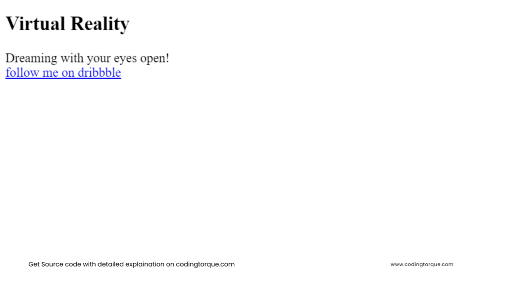
<h2>Virtual Reality</h2>
<span>Dreaming with your eyes open!</span>
</div>
</div>
</div>
<div class="dribbble">
<a href="https://dribbble.com/albanbujupaj" target="_blank">
<span class="icon"><img width="30" src="https://image.flaticon.com/icons/svg/179/179316.svg" alt=""></span><span
class="caption">follow me on dribbble</span></a>
</div>
Output Till Now
CSS Code
Create a file style.css and paste the code below.
body {
    background: linear-gradient(to right, #ffffff, #f8dce2);
    font-family: 'Varela Round', sans-serif;
    color: #fff;
    display: flex;
    align-items: center;
    justify-content: center;
    height: 100vh;
}

.perspective {
    width: 100%;
    perspective: 1000px;
}

#top {
    width: 100%;
    height: 100%;
    display: flex;
    align-items: center;
    justify-content: center;
    margin: auto;
}

.card {
    width: 270px;
    height: 413px;
    margin: auto;
    box-shadow: 0 70px 63px -60px #494848;
    transform-style: preserve-3d;
    transition: transform .05s linear;

    .thumb {
        background-size: cover;
        height: 100%;
        width: 100%;
        border-radius: 15px;

        &:after {
            background: inherit;
            content: '';
            display: block;
            position: absolute;
            left: -60px;
            top: 40px;
            width: 100%;
            height: 108%;
            z-index: -1;
            filter: blur(55px);
        }
    }

    h2 {
        position: absolute;
        top: 0;
        left: -60px;
        font-size: 40px;
        font-weight: 100;
        transform: translateZ(80px);
    }

    span {
        position: absolute;
        bottom: 40px;
        right: -280px;
        font-size: 37px;
        font-weight: 600;
        transform: translateZ(35px);
    }
}

.dribbble {
    position: fixed;
    top: 25px;
    right: 25px;

    & > a {
        font-size: 12px;
        text-transform: uppercase;
        text-decoration: none;
        color: #ec4989;
    }
}

img {
    margin: auto;
    display: block;
    border-radius: 15px;
}
Output Till Now

JavaScript Code
Create a file
script.js and paste the code below.var o = $(".card");
$("#top").on("mousemove", function (t) {
var e = -($(window).innerWidth() / 2 - t.pageX) / 30,
n = ($(window).innerHeight() / 2 - t.pageY) / 10;
o.attr("style", "transform: rotateY(" + e + "deg) rotateX(" + n + "deg);-webkit-transform: rotateY(" + e + "deg) rotateX(" + n + "deg);-moz-transform: rotateY(" + e + "deg) rotateX(" + n + "deg)")
})
Written by: Piyush Patil
Code Credits: @abujupaj
If you have any doubts or any project ideas feel free to Contact Us
Hope you find this post helpful💖


