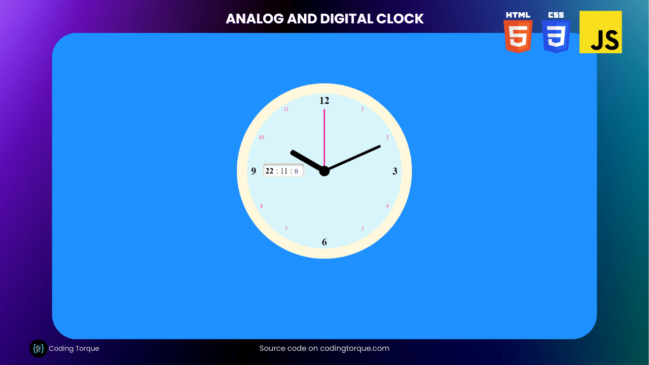
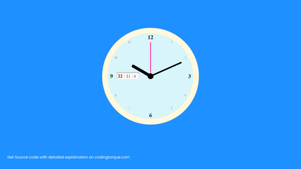
Are you interested in creating a functional and visually appealing clock using HTML, CSS, and JavaScript? Consider building an “Analog and Digital Clock” that displays both the current time in analog and digital formats. In this tutorial, we’ll show you step-by-step how to create an “Analog and Digital Clock” from scratch, using these three languages. You’ll learn how to create the clock face and hands using HTML and CSS, and how to use JavaScript to update the clock’s display in real-time. Plus, you’ll gain valuable experience in using CSS to create dynamic and responsive designs. By the end of this tutorial, you’ll have a functional and visually stunning “Analog and Digital Clock” that you can use to showcase your skills and engage your website visitors. So, let’s get started on creating a beautiful and functional clock using HTML, CSS, and JavaScript!
Before we start here are 50 projects to create using HTML CSS and JavaScript –
I would recommend you don’t just copy and paste the code, just look at the code and type by understanding it.
Demo
HTML Code
Starter Template
<!doctype html>
<html lang="en">

<head>
    <!-- Required meta tags -->
    <meta charset="utf-8">
    <meta name="viewport" content="width=device-width, initial-scale=1">

    <!-- CSS -->
    <link rel="stylesheet" href="style.css">

   <!-- fontawesome  -->
    <link rel="stylesheet" href="https://use.fontawesome.com/releases/v5.3.1/css/all.css">

    <title>Analog and Digital clock using HTML CSS and JavaScript - Coding Torque</title>
</head>

<body>
    <!-- Further code here -->

     <script src="script.js"></script>
</body>

</html>
Paste the below code in your <body> tag.
<div class="clock">
<div class="hourHand"></div>
<div class="minuteHand"></div>
<div class="secondHand"></div>
<div class="center"></div>
<div class="time"></div>
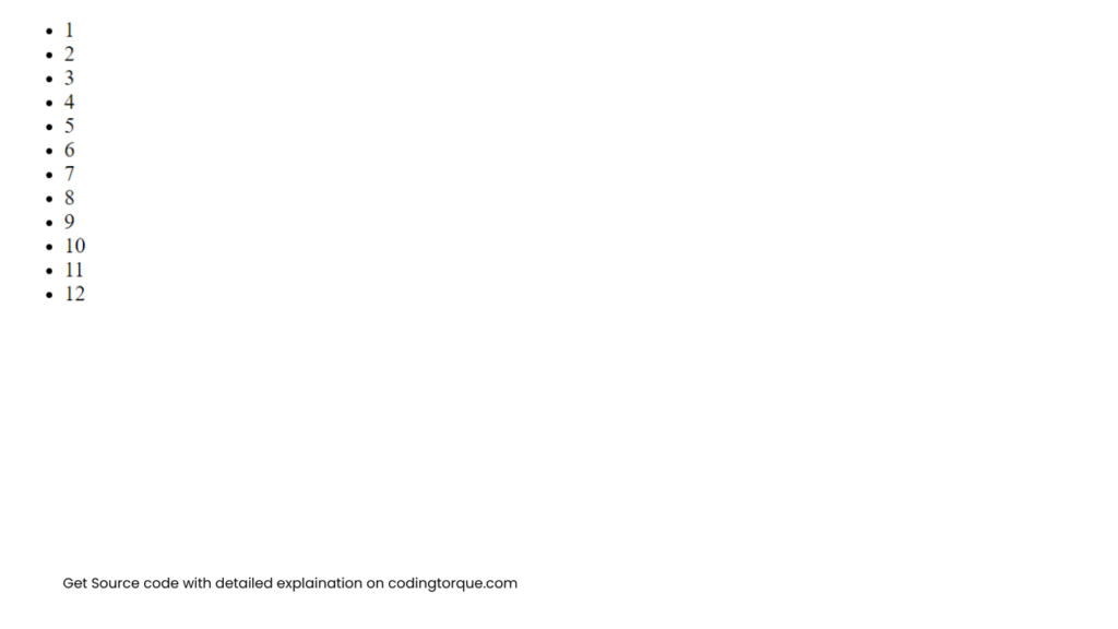
<ul>
<li><span>1</span></li>
<li><span>2</span></li>
<li><span>3</span></li>
<li><span>4</span></li>
<li><span>5</span></li>
<li><span>6</span></li>
<li><span>7</span></li>
<li><span>8</span></li>
<li><span>9</span></li>
<li><span>10</span></li>
<li><span>11</span></li>
<li><span>12</span></li>
</ul>
</div>Output Till Now
CSS Code
Create a file style.css and paste the code below.
body {
  background-color: dodgerblue;
  padding: 0;
  margin: 0;
}

.clock {
  width: 300px;
  height: 300px;
  border-radius: 50%;
  background-color: rgb(215, 245, 250);
  margin: 100px auto 0px auto;
  position: relative;
  border: 20px solid cornsilk;
}
.center {
  background-color: #000;
  position: absolute;
  left: calc(50% - 10px);
  top: calc(50% - 10px);
  width: 20px;
  height: 20px;
  border-radius: 50%;
  z-index: 20;
}
.hourHand {
  width: 10px;
  height: 75px;
  background-color: #000;
  transform-origin: bottom center;
  border-radius: 4px;
  position: absolute;
  top: 75px;
  left: 145px;
  z-index: 10;
  transition-timing-function: cubic-bezier(0.1, 2.7, 0.58, 1);
  transform: rotate(360deg);
}
.minuteHand {
  width: 5px;
  height: 120px;
  background-color: #000;
  transform-origin: bottom center;
  border-radius: 4px;
  position: absolute;
  top: 30px;
  left: 147px;
  z-index: 9;
  transition-timing-function: cubic-bezier(0.1, 2.7, 0.58, 1);
  transform: rotate(90deg);
}
.secondHand {
  width: 2px;
  height: 120px;
  background-color: deeppink;
  transform-origin: bottom center;
  border-radius: 4px;
  position: absolute;
  top: 30px;
  left: 149px;
  transition: all 0.06s;
  transition-timing-function: cubic-bezier(0.1, 2.7, 0.58, 1);
  z-index: 8;
  transform: rotate(360deg);
}
.time {
  position: absolute;
  top: 45%;
  left: 10%;
  border: 1px solid #fff8dc;
  background-color: #fff;
  padding: 5px;
  display: block;
  box-shadow: inset 0px 2px 5px rgba(0, 0, 0, 0.4);
  border-radius: 5px;
  min-width: 70px;
  height: 15px;
}
.time small {
  color: darkblue;
  transition: all 0.05s;
  transition-timing-function: cubic-bezier(0.1, 2.7, 0.58, 1);
}

.clock ul {
  list-style: none;
  padding: 0;
}
.clock ul li {
  position: absolute;
  width: 20px;
  height: 20px;
  text-align: center;
  line-height: 20px;
  font-size: 10px;
  color: deeppink;
}
.clock ul li:nth-child(1) {
  right: 22%;
  top: 6.5%;
}
.clock ul li:nth-child(2) {
  right: 6%;
  top: 25%;
}
.clock ul li:nth-child(3) {
  right: 1%;
  top: calc(50% - 10px);
  color: #000;
  font-size: 20px;
  font-weight: bold;
}
.clock ul li:nth-child(4) {
  right: 6%;
  top: 69%;
}
.clock ul li:nth-child(5) {
  right: 22%;
  top: 84%;
}
.clock ul li:nth-child(6) {
  right: calc(50% - 10px);
  top: calc(99% - 20px);
  color: #000;
  font-size: 20px;
  font-weight: bold;
}
.clock ul li:nth-child(7) {
  left: 22%;
  top: 84%;
}
.clock ul li:nth-child(8) {
  left: 6%;
  top: 69%;
}
.clock ul li:nth-child(9) {
  left: 1%;
  top: calc(50% - 10px);
  color: #000;
  font-size: 20px;
  font-weight: bold;
}
.clock ul li:nth-child(10) {
  left: 6%;
  top: 25%;
}
.clock ul li:nth-child(11) {
  left: 22%;
  top: 6.5%;
}
.clock ul li:nth-child(12) {
  right: calc(50% - 10px);
  top: 1%;
  color: #000;
  font-size: 20px;
  font-weight: bold;
}
JavaScript Code
Create a file script.js and paste the code below.
window.onload = function () {

    const hourHand = document.querySelector('.hourHand');
    const minuteHand = document.querySelector('.minuteHand');
    const secondHand = document.querySelector('.secondHand');
    const time = document.querySelector('.time');
    const clock = document.querySelector('.clock');
    const audio = document.querySelector('.audio');

    function setDate() {
        const today = new Date();

        const second = today.getSeconds();
        const secondDeg = ((second / 60) * 360) + 360;
        secondHand.style.transform = `rotate(${secondDeg}deg)`;

        audio.play();

        const minute = today.getMinutes();
        const minuteDeg = ((minute / 60) * 360);
        minuteHand.style.transform = `rotate(${minuteDeg}deg)`;

        const hour = today.getHours();
        const hourDeg = ((hour / 12) * 360);
        hourHand.style.transform = `rotate(${hourDeg}deg)`;

        time.innerHTML = '<span>' + '<strong>' + hour + '</strong>' + ' : ' + minute + ' : ' + '<small>' + second + '</small>' + '</span>';

    }

    setInterval(setDate, 1000);

}
Final Output
Written by: Piyush Patil
Code Credits: @ahmadbassamemran
If you found any mistakes or have any doubts please feel free to Contact Us
Hope you find this post helpful💖


