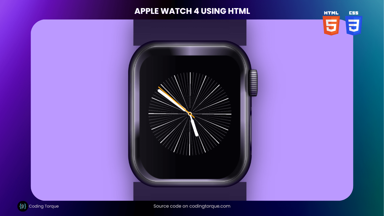
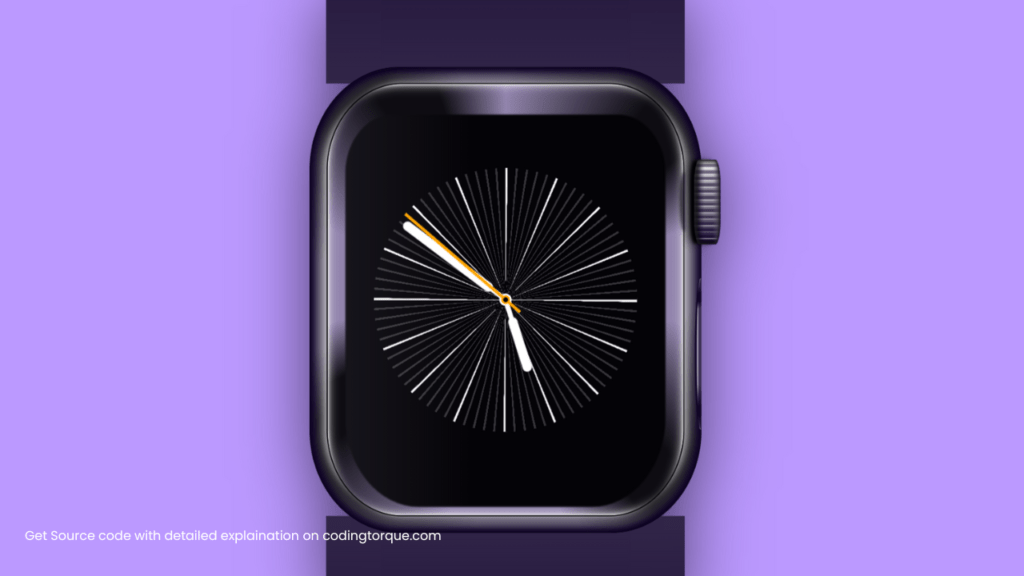
Are you looking for a fun and creative way to showcase your HTML and CSS skills? Consider building an “Apple Watch 4” using only these two languages. In this tutorial, we’ll show you step-by-step how to create an “Apple Watch 4” from scratch using HTML and CSS. You’ll learn how to create the watch face, add the watch hands, and style the design using CSS to create a realistic and detailed illustration. Plus, you’ll gain valuable experience in using CSS to create dynamic and responsive designs. By the end of this tutorial, you’ll have a functional and visually stunning “Apple Watch 4” that you can use to showcase your skills and impress your website visitors. So, let’s get started on creating a beautiful and intricate “Apple Watch 4” using HTML and CSS!
Before we start here are 50 projects to create using HTML CSS and JavaScript –
I would recommend you don’t just copy and paste the code, just look at the code and type by understanding it.
Demo
HTML Code
Starter Template
<!doctype html>
<html lang="en">

<head>
    <!-- Required meta tags -->
    <meta charset="utf-8">
    <meta name="viewport" content="width=device-width, initial-scale=1">

    <!-- CSS -->
    <link rel="stylesheet" href="style.css">

   <!-- fontawesome  -->
    <link rel="stylesheet" href="https://use.fontawesome.com/releases/v5.3.1/css/all.css">

    <title>Apple Watch 4 using HTML and CSS - Coding Torque</title>
</head>

<body>
    <!-- Further code here -->

     <script src="script.js"></script>
</body>

</html>
Paste the below code in your <body> tag.
<div class="Watch">
    <div class="Strap"></div>
    <div class="Screen">
        <div class="Crown"></div>
        <div class="Button"></div>
        <div class="Clock">
            <div class="Chrono"></div>
            <div class="Hand"></div>
            <div class="Hand" size="small"></div>
        </div>
    </div>
    <div class="Strap" reflect="true"></div>
</div>
CSS Code
Create a file style.css and paste the code below.
:root {
  --light-hue: 260deg;
  --light-saturation: 100%;
  --light-power: 80%;

  /* Commend this to disable auto color switch */
  animation: color 20s linear infinite;
}

/* Watch */
.Watch {
  --dimmer: clamp(10%, var(--light-power), 40%);
  --light: var(--light-hue) calc(var(--light-saturation) - 40%)
    calc(var(--light-power) + 35%);
  --light-dimmed: var(--light-hue) calc(var(--light-saturation) - 90%)
    var(--dimmer);
  --light-dark: var(--light-hue) var(--light-saturation)
    calc(var(--light-power) / 10);

  filter: drop-shadow(0 10px 50px hsl(0deg 0% 0% / 60%));
}

/* Strap */
.Strap {
  position: relative;
  box-shadow: inset 0 10vmax 2vmax -10vmax hsl(var(--light-hue) 50% 0% / 15%);
  background: linear-gradient(
      to bottom,
      hsl(0deg 0% 100% / 8%),
      hsl(var(--light) / 15%)
    ),
    hsl(var(--light-dark));
  height: 16vmax;
  width: 70%;
  margin: 0 auto;
  z-index: -2;
  border-radius: 50% 50% 0% 0% / 30% 30% 0 0;

  /* Reflect stripe */
  &[reflect="true"] {
    transform: scaleY(-1);
  }

  /* All straps */
  &::before,
  &::after {
    display: block;
    background: inherit;
    background-size: 100% 200%;
    background-position: 0 100%;
    position: absolute;
    bottom: 0.3vmax;
    width: 12vh;
    height: 9vmax;
    z-index: -1;
    transform: translateY(5px);
    mask-size: 100% 100%;
    mask-position: 0 24px;
    mask-repeat: no-repeat;
  }

  /* Top strap */
  &::before {
    right: 99.5%;
    mask-image: radial-gradient(
      ellipse farthest-corner at left top,
      transparent 70%,
      black 70.5%
    );
  }

  /* Bottom strap */
  &::after {
    left: 99.5%;
    mask-image: radial-gradient(
      ellipse farthest-corner at right top,
      transparent 70%,
      black 70.5%
    );
  }
}

/* Screen */
.Screen {
  --sub-reflection: var(--light-hue) calc(var(--light-saturation) / 5) 60%;
  --screen-color: hsl(
    var(--light-hue) clamp(0%, var(--light-saturation), 40%) 2%
  );

  position: relative;
  background-color: var(--screen-color);
  display: grid;
  place-items: center;
  width: 38vmax;
  height: 46vmax;
  border: 2px solid #000;
  border-radius: 21% 21% 21% 21% / 20% 20% 20% 20%;
  background-position: center center;
  background-size: 200%;
  box-shadow: 25px 0 10px -20px hsl(var(--light) / 60%),
    -25px 0 10px -20px hsl(var(--light) / 60%),
    0 20px 10px -20px hsl(var(--light) / 60%),
    0 -20px 10px -20px hsl(var(--light) / 60%), inset 0 125px 3px -125px white,
    inset 0 -125px 3px -125px white, inset 125px 0 3px -125px white,
    inset -125px 0 3px -125px white, inset 0 50px 5px -50px hsl(var(--light)),
    inset 0 -50px 5px -50px hsl(var(--light)),
    inset 50px 0 5px -50px hsl(var(--light)),
    inset -50px 0 5px -50px hsl(var(--light)),
    inset 0 50px 15px -50px hsl(var(--light)),
    inset 0 -50px 15px -50px hsl(var(--light)),
    inset 50px 0 15px -50px hsl(var(--light)),
    inset -50px 0 15px -50px hsl(var(--light));
  background-image: repeating-conic-gradient(
    hsl(var(--sub-reflection)),
    hsl(var(--sub-reflection) / 7%) 10%,
    hsl(var(--sub-reflection) / 7%) 14%,
    hsl(var(--sub-reflection)) 19%,
    hsl(var(--sub-reflection)) 27%,
    hsl(var(--sub-reflection) / 7%) 25%
  );

  /* External frame */
  &::before {
    position: absolute;
    box-shadow: inset 0 0.3vmax 0.7vmax -0.4vmax hsl(0deg 0% 0%),
      inset 0 -0.3vmax 0.7vmax -0.4vmax hsl(0deg 0% 0%),
      inset 0 0 0.7vmax 0.6vmax hsl(var(--light-dark));
    left: -5%;
    right: -5%;
    top: -4%;
    bottom: -4%;
    z-index: -1;
    border-radius: 23% 23% 23% 23% / 22% 22% 22% 22%;
    background: repeating-conic-gradient(
        transparent 0%,
        hsl(0deg 0% 0% / 60%) 10%,
        hsl(0deg 0% 0% / 60%) 14%,
        transparent 19%,
        transparent 26%,
        hsl(0deg 0% 0% / 60%) 25%
      ),
      hsl(var(--light-dimmed));
  }

  /* Screen mask */
  &::after {
    position: absolute;
    top: 7%;
    bottom: 2%;
    left: 5%;
    right: 5%;
    border-radius: 15% 15% 23% 23%;
    background: linear-gradient(
        to right,
        hsl(var(--light-dimmed) / 20%),
        transparent 40%
      ),
      var(--screen-color);
    filter: blur(1px);
  }
}

/* Digital Crown */
.Crown {
  position: absolute;
  top: 8vmax;
  left: 103%;
  width: 2.8vmax;
  height: 9vmax;
  border-radius: 20% 20% 20% 20% / 30% 30% 30% 30%;
  box-shadow: -0.5vmax 0 0.3vmax -0.1vmax black,
    -1vmax 0 1vmax -0.2vmax hsl(0deg 0% 0% / 60%),
    -0.5vmax 0 0.5vmax -1vmax hsl(var(--light-dark)),
    inset 1px 0 6px 2px hsl(var(--light) / 10%),
    inset 2px 0 6px 5px hsl(0deg 0% 0% / 80%),
    inset -2px 0 2px hsl(var(--light-dark) / 70%);
  background: linear-gradient(
      to right,
      hsl(var(--light-dark) / 50%) 10%,
      transparent 40% 70%,
      hsl(var(--light-dimmed) / 60%) 90%
    ),
    repeating-linear-gradient(
      transparent 2% 5%,
      hsl(var(--light-dark) / 50%) 5.1% 9%,
      hsl(var(--light)) 9.1% 9.5%,
      transparent 9.6%
    ),
    linear-gradient(
      to bottom,
      hsl(var(--light)),
      hsl(var(--light) / 30%),
      hsl(var(--light) / 10%),
      hsl(var(--light-dark))
    ),
    hsl(var(--light-dimmed));

  /* Crown reflection */
  &::before {
    position: absolute;
    top: 50%;
    left: -55%;
    transform: translateY(-50%);
    width: 20%;
    height: 70%;
    border-radius: 100% 0% 0% 100% / 50% 0% 0% 50%;
    filter: blur(0.15vw);
    opacity: 0.7;
    box-shadow: inset -2px 0 0 1px hsl(var(--light-dark));
    background-color: hsl(0deg 0% 0%);
  }
}

/* Home button */
.Button {
  width: 0.5vw;
  height: 35%;
  position: absolute;
  left: calc(100% + 5%);
  transform: translateX(-100%);
  bottom: 20%;
  border-radius: 100% 0% 0% 100% / 50% 50% 50% 50%;
  box-shadow: inset -0.8vmax 0 0 -0.5vmax hsl(var(--light-dark) / 70%),
    -0.1vmax 0 0 0.1vmax hsl(var(--light-dark));
  background-image: linear-gradient(
    to bottom,
    hsl(var(--light-dimmed)) 5%,
    hsl(var(--light-dark)) 10% 15%,
    hsl(var(--light) / 60%) 20% 70%,
    hsl(var(--light-dark)) 85% 90%,
    hsl(var(--light-dimmed))
  );
}

/* Clock */
.Clock {
  width: 28vmax;
  height: 28vmax;
  position: relative;
  z-index: 1;
  box-sizing: border-box;

  &::before {
    position: absolute;
    top: 0;
    left: 0%;
    width: 100%;
    height: 100%;
    border-radius: 100%;
    mask-image: radial-gradient(circle at center, transparent 66%, black 66.1%);
    background-image: repeating-conic-gradient(
        white 0 0.25%,
        transparent 0.26% 6.24%,
        white 6.25% 6.25%
      ),
      repeating-conic-gradient(
        hsl(0deg 0% 100% / 20%) 0% 0.25%,
        transparent 0.26% 1.25%,
        hsl(0deg 0% 100% / 20%) 1.25% 1.25%
      );
  }

  &::after {
    background-color: white;
    width: 1.3vmax;
    height: 1.3vmax;
    margin-top: -0.65vmax;
    margin-left: -0.65vmax;
    border-radius: 100%;
    position: absolute;
    left: 50%;
    top: 50%;
    mask-image: radial-gradient(circle at center, transparent 33%, black 33.1%);
  }
}

/* Clock hands */
.Hand {
  display: flex;
  align-items: center;
  justify-content: flex-end;
  width: 100%;
  padding: 0.5vmax;
  height: 100%;
  position: absolute;
  top: 0;
  left: 0;
  z-index: 1;
  transform-origin: 50% 50%;
  animation: rotation 10s linear infinite;

  &::after {
    background-color: white;
    border-radius: 200px;
    width: 11.7vmax;
    height: 1vmax;
    margin-left: -0.3vmax;
  }

  &::before {
    background-color: white;
    height: 0.5vmax;
    width: 1.7vmax;
    margin-left: -1.7vmax;
    display: block;
  }

  &[size="small"] {
    animation: rotation 30s linear infinite;
  }

  &[size="small"]::after {
    width: 6vmax;
    margin-right: 5.5vmax;
  }
}

/* Seconds hand*/
.Chrono {
  display: flex;
  align-items: center;
  justify-content: flex-end;
  position: absolute;
  left: 0;
  top: 0;
  height: 100%;
  width: 100%;
  z-index: 2;
  transform-origin: 50% 50%;
  animation: rotation 60s linear infinite;
  animation-timing-function: steps(80, start);

  &::before {
    height: 0.29vmax;
    width: 16vmax;
    background-color: orange;
    z-index: 1;
  }

  &::after {
    background-color: var(--screen-color);
    box-shadow: 0 0 0 0.2vmax orange;
    width: 0.5vmax;
    height: 0.5vmax;
    margin-top: -0.25vmax;
    margin-left: -0.25vmax;
    border-radius: 100%;
    position: absolute;
    left: 50%;
    top: 50%;
    z-index: 1;
  }
}

/* Hands animation */
@keyframes rotation {
  0% {
    transform: rotate(0deg);
  }

  100% {
    transform: rotate(1turn);
  }
}

html {
  block-size: 100%;
  inline-size: 100%;
  background: hsl(var(--light-hue) var(--light-saturation) var(--light-power));
  box-sizing: border-box;
}

*,
*::before,
*::after {
  box-sizing: inherit;
}

body {
  min-block-size: 100%;
  min-inline-size: 100%;
  box-sizing: border-box;
  display: grid;
  margin: 0;
  place-content: center;
  transform: scale(0.8);
}

input {
  margin-block-end: 1rem;

  &:last-of-type {
    margin-block-end: 4rem;
  }
}

@keyframes color {
  0% {
    --light-hue: 260deg;
    --light-saturation: 100%;
    --light-power: 80%;
  }
  20% {
    --light-hue: 360deg;
    --light-saturation: 100%;
    --light-power: 50%;
  }
  40% {
    --light-hue: 160deg;
    --light-saturation: 100%;
    --light-power: 80%;
  }
  60% {
    --light-hue: 160deg;
    --light-saturation: 0%;
    --light-power: 0%;
  }
  80% {
    --light-hue: 260deg;
    --light-saturation: 100%;
    --light-power: 80%;
  }
  100% {
    --light-hue: 200deg;
    --light-saturation: 0%;
    --light-power: 100%;
  }
}

*::before,
*::after {
  content: "";
}
Final Output
Written by: Piyush Patil
Code Credits: @equinusocio
If you found any mistakes or have any doubts please feel free to Contact Us
Hope you find this post helpful💖


