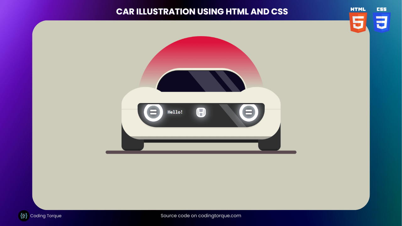
Are you looking for a fun and creative way to showcase your HTML and CSS skills? Consider building a “Car Illustration” using HTML and CSS. This design is perfect for showcasing your ability to create detailed and intricate illustrations using just HTML and CSS. In this tutorial, we’ll show you step-by-step how to create a “Car Illustration” from scratch, using only these two languages. You’ll learn how to create the car body, wheels, and other details using HTML, and style them using CSS to create a realistic and detailed illustration. Plus, you’ll gain valuable experience in using CSS to create dynamic and responsive designs. By the end of this tutorial, you’ll have a functional and visually stunning “Car Illustration” that you can use to showcase your skills and impress your website visitors. So, let’s get started on creating a beautiful and intricate car illustration using HTML and CSS!
Before we start here are 50 projects to create using HTML CSS and JavaScript –
I would recommend you don’t just copy and paste the code, just look at the code and type by understanding it.
Demo

HTML Code
Starter Template
<!doctype html>
<html lang="en">

<head>
    <!-- Required meta tags -->
    <meta charset="utf-8">
    <meta name="viewport" content="width=device-width, initial-scale=1">

    <!-- CSS -->
    <link rel="stylesheet" href="style.css">

   <!-- fontawesome  -->
    <link rel="stylesheet" href="https://use.fontawesome.com/releases/v5.3.1/css/all.css">

    <title>Car illustration using HTML and CSS - Coding Torque</title>
</head>

<body>
    <!-- Further code here -->

     <script src="script.js"></script>
</body>

</html>
Paste the below code in your <body> tag.
<div class="car-container">
    <div class="circle-bg"></div>
    <div class="main-body">
        <div class="cut"></div>
        <div class="mask">
            <div class="headlight headlight-left"></div>
            <div class="headlight headlight-right"></div>
            <div class="honda-logo">
                <div class="rect rect-left"></div>
                <div class="rect rect-center"></div>
                <div class="rect rect-right"></div>
            </div>
            <h1 class="message">Hello!</h1>
        </div>
        <div class="shadow"></div>
    </div>
    <div class="circle circle-left"></div>
    <div class="circle circle-right"></div>
    <div class="upper-body">
        <div class="window"></div>
    </div>
    <div class="wheel wheel-left"></div>
    <div class="wheel wheel-right"></div>
    <div class="car-shadow"></div>
</div>
<div class="road-container">
    <div class="road"></div>
</div>
CSS Code
Create a file style.css and paste the code below.
@import url("https://fonts.googleapis.com/css?family=Inconsolata:400,700");
* {
  margin: 0;
  padding: 0;
  box-sizing: border-box;
}
html,
body {
  width: 100%;
  height: 100%;
}
body {
  background: #cdcbba;
  overflow: hidden;
}
.car-container {
  position: absolute;
  margin: auto;
  top: 0;
  right: 0;
  bottom: 0;
  left: 0;
  width: 500px;
  height: 500px;
}
.car-container .circle-bg {
  position: absolute;
  margin: auto;
  top: 0;
  left: 0;
  right: 0;
  width: 400px;
  height: 400px;
  border-radius: 50%;
  background: linear-gradient(crimson 5%, transparent 40%);
  z-index: -1;
}
.car-container .main-body {
  position: absolute;
  margin: auto;
  top: 0;
  right: 0;
  bottom: 0;
  left: 0;
  width: 500px;
  height: 150px;
  background: #f1edde;
  border-top-left-radius: 40px;
  border-top-right-radius: 40px;
  border-bottom-left-radius: 60px;
  border-bottom-right-radius: 60px;
  overflow: hidden;
  z-index: 3;
}
.car-container .main-body .shadow {
  position: absolute;
  margin: auto;
  bottom: -10px;
  width: inherit;
  height: 20px;
  left: 0;
  background: black;
  opacity: 0.3;
  z-index: 4;
}
.car-container .main-body .cut {
  position: absolute;
  margin: auto;
  top: -40px;
  right: 0;
  bottom: 0;
  left: 0;
  width: inherit;
  height: 2px;
  background: #e0dccd;
  z-index: 5;
}
.car-container .main-body .mask {
  position: absolute;
  margin: auto;
  top: 0;
  right: 0;
  bottom: 0;
  left: 0;
  width: 400px;
  height: 80px;
  background: #303030;
  border-top-left-radius: 10px;
  border-top-right-radius: 10px;
  border-bottom-left-radius: 60px;
  border-bottom-right-radius: 60px;
  border-top: 4px solid #303030;
  border-bottom: 4px solid #e0dccd;
  z-index: 5;
  overflow: hidden;
}
.car-container .main-body .mask::after {
  content: "";
  position: absolute;
  margin: auto;
  top: -100px;
  right: 100px;
  width: 20px;
  height: 250px;
  background: white;
  opacity: 0.2;
  transform: rotate(-40deg);
}
.car-container .main-body .mask .honda-logo {
  position: absolute;
  margin: auto;
  top: -20px;
  right: 0;
  bottom: 0;
  left: 0;
  width: 30px;
  height: 30px;
  border: 4px solid white;
  border-top-left-radius: 8px;
  border-top-right-radius: 8px;
  border-bottom-left-radius: 12px;
  border-bottom-right-radius: 12px;
  box-shadow: 0 0 25px 0 #e1f0fc, inset 0 0 25px 0 #e1f0fc;
  overflow: hidden;
}
.car-container .main-body .mask .honda-logo .rect {
  position: absolute;
  margin: auto;
  width: 4px;
  height: 30px;
  background: white;
}
.car-container .main-body .mask .honda-logo .rect-left {
  left: 3px;
  transform: rotate(-5deg);
}
.car-container .main-body .mask .honda-logo .rect-right {
  right: 3px;
  transform: rotate(5deg);
}
.car-container .main-body .mask .honda-logo .rect-center {
  top: 0;
  left: 0;
  right: 0;
  bottom: 0;
  height: 10px;
  transform: rotate(90deg);
}
.car-container .main-body .mask .headlight {
  position: absolute;
  margin: auto;
  top: -5px;
  width: 60px;
  height: 60px;
  border: 10px solid white;
  border-radius: 50%;
  box-shadow: 0 0 25px 0 #e1f0fc, inset 0 0 25px 0 #e1f0fc;
}
.car-container .main-body .mask .headlight::before {
  content: "";
  position: absolute;
  margin: auto;
  top: -10px;
  right: 0;
  bottom: 0;
  left: 0;
  width: 20px;
  height: 5px;
  border-radius: 5px;
  background: white;
}
.car-container .main-body .mask .headlight::after {
  content: "";
  position: absolute;
  margin: auto;
  top: 0;
  right: 0;
  bottom: -10px;
  left: 0;
  width: 20px;
  height: 5px;
  border-radius: 5px;
  background: white;
}
.car-container .main-body .mask .headlight-left {
  left: 20px;
}
.car-container .main-body .mask .headlight-right {
  right: 20px;
}
.car-container .main-body .mask .message {
  position: absolute;
  margin: auto;
  top: -20px;
  right: 0;
  bottom: 0;
  left: -150px;
  font-family: "Inconsolata", monospace;
  width: 60px;
  height: 20px;
  font-size: 16px;
  color: white;
  text-shadow: 0 0 15px #e1f0fc;
}
.car-container .circle {
  position: absolute;
  margin: auto;
  top: -60px;
  bottom: 0;
  width: 150px;
  height: 120px;
  border-radius: 50%;
  background: #f1edde;
  z-index: 2;
}
.car-container .circle-left {
  left: 0;
}
.car-container .circle-right {
  right: 0;
}
.car-container .upper-body {
  position: absolute;
  margin: auto;
  top: -200px;
  right: 0;
  bottom: 0;
  left: 0;
  height: 100px;
  width: 290px;
  background: #f1edde;
  border-top-left-radius: 80px;
  border-top-right-radius: 80px;
  border-bottom-left-radius: 20px;
  border-bottom-right-radius: 20px;
  overflow: hidden;
  z-index: 1;
}
.car-container .upper-body .window {
  position: absolute;
  margin: auto;
  top: 0;
  right: 0;
  bottom: 0;
  left: 0;
  height: 85px;
  width: 280px;
  background: #0d0822;
  border-top-left-radius: 80px;
  border-top-right-radius: 80px;
  border-bottom-left-radius: 20px;
  border-bottom-right-radius: 20px;
  border: 2px solid #202020;
  z-index: 2;
  overflow: hidden;
}
.car-container .upper-body .window::before {
  content: "";
  position: absolute;
  margin: auto;
  top: -100px;
  right: 50px;
  width: 20px;
  height: 250px;
  background: white;
  opacity: 0.2;
  transform: rotate(-40deg);
}
.car-container .upper-body .window::after {
  content: "";
  position: absolute;
  margin: auto;
  top: -100px;
  right: 100px;
  width: 50px;
  height: 250px;
  background: white;
  opacity: 0.2;
  transform: rotate(-40deg);
}
.car-container .wheel {
  position: absolute;
  margin: auto;
  bottom: 140px;
  height: 100px;
  width: 70px;
  border-radius: 15px;
  background: #303030;
  overflow: hidden;
  z-index: 1;
}
.car-container .wheel::before {
  content: "";
  position: absolute;
  margin: auto;
  bottom: 0;
  width: 80px;
  height: 5px;
  background: #252525;
}
.car-container .wheel-left {
  left: 0;
}
.car-container .wheel-right {
  right: 0;
}
.car-container .car-shadow {
  position: absolute;
  margin: auto;
  top: 120px;
  right: 0;
  bottom: 0;
  left: 0;
  height: 50px;
  width: 400px;
  background: #202020;
  z-index: -2;
}
.road-container {
  position: absolute;
  margin: auto;
  top: 0;
  right: 0;
  bottom: 0;
  left: 0;
  width: 600px;
  height: 500px;
  overflow: hidden;
}
.road-container .road {
  position: absolute;
  margin: auto;
  top: 230px;
  right: 0;
  bottom: 0;
  height: 10px;
  width: 600px;
  border-radius: 10px;
  background: #5c4b51;
  z-index: 0;
}
Final Output
Written by: Piyush Patil
Code Credits: @AlbertFeynman
If you found any mistakes or have any doubts please feel free to Contact Us
Hope you find this post helpful💖


