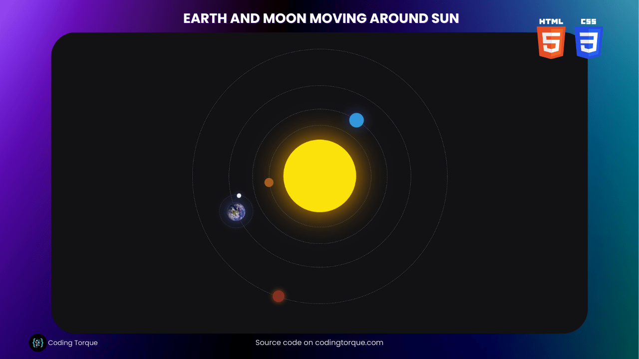
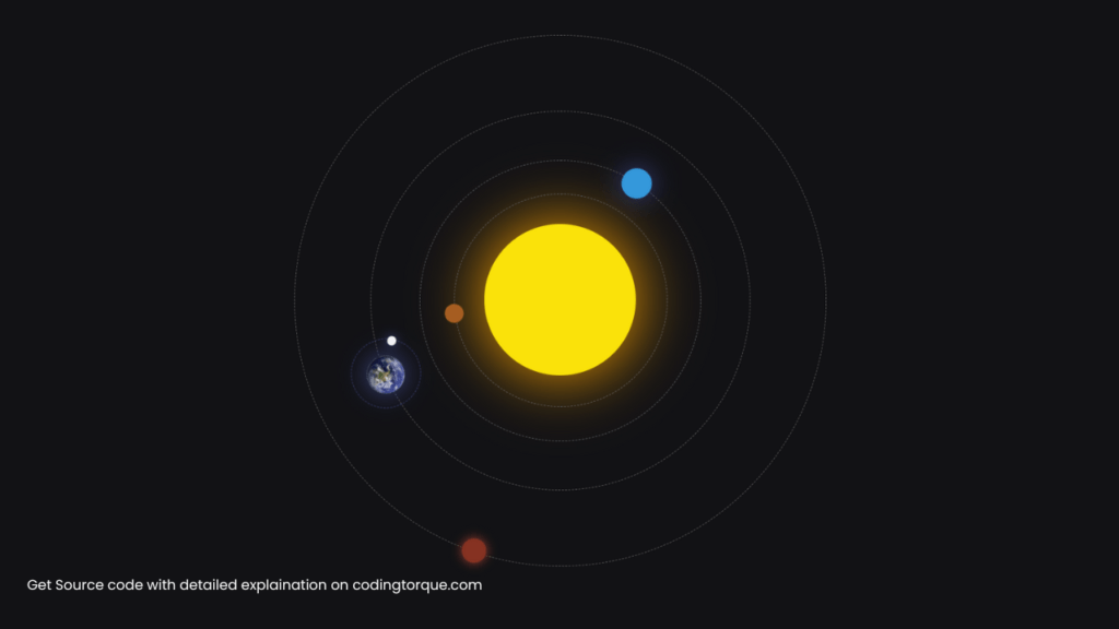
Are you interested in creating a visually stunning and educational animation using only HTML and CSS? Consider building an “Earth and Moon Moving Around Sun” animation. In this tutorial, we’ll show you step-by-step how to create this animation using HTML and CSS. You’ll learn how to use CSS keyframe animations to create a dynamic and engaging animation that showcases the movement of the Earth and Moon around the Sun. Plus, you’ll gain valuable experience in using CSS to create dynamic and responsive designs. By the end of this tutorial, you’ll have a functional and visually stunning “Earth and Moon Moving Around Sun” animation that you can use to showcase your skills and engage your website visitors. So, let’s get started on creating a beautiful and educational animation using HTML and CSS!
Before we start here are 50 projects to create using HTML CSS and JavaScript –
I would recommend you don’t just copy and paste the code, just look at the code and type by understanding it.
Demo
HTML Code
Starter Template
<!doctype html>
<html lang="en">

<head>
    <!-- Required meta tags -->
    <meta charset="utf-8">
    <meta name="viewport" content="width=device-width, initial-scale=1">

    <!-- CSS -->
    <link rel="stylesheet" href="style.css">

   <!-- fontawesome  -->
    <link rel="stylesheet" href="https://use.fontawesome.com/releases/v5.3.1/css/all.css">

    <title>Earth and Moon Moving Around Sun using HTML and CSS - Coding Torque</title>
</head>

<body>
    <!-- Further code here -->
</body>

</html>
Paste the below code in your <body> tag.
<div class="solar-system">
    <div id="sun"></div>

    <div class="orbit mercury-orbit"></div>
    <div class="mercury-spin">
        <div id="mercury"></div>
    </div>

    <div class="orbit venus-orbit"></div>
    <div class="venus-spin">
        <div id="venus"></div>
    </div>

    <div class="orbit earth-orbit"></div>
    <div class="earth-spin">
        <div class="orbit moon-orbit"></div>
        <div class="moon-spin">
            <div id="moon"></div>
        </div>

        <img id="earth"
            src="https://raw.githubusercontent.com/everdimension-personal/codepen-assets/master/earth_small_150.jpg" />
    </div>

    <div class="orbit mars-orbit"></div>
    <div class="mars-spin">
        <div id="mars"></div>
    </div>
</div>
CSS Code
Create a file style.css and paste the code below.
html,
body {
  /* width: 100%;
  height: 100%; */
  background-color: #121215;
}

.solar-system {
  position: relative;
  width: 780px;
  height: 780px;
  margin: auto;
  overflow: hidden;
}

/* Some positioning rules that are common for all objects */
.orbit {
  border: 1px dashed #666;
}

#sun,
.orbit,
.orbit + div,
.orbit + div > div {
  position: absolute;
}

#sun,
.orbit,
.orbit + div {
  top: 50%;
  left: 50%;
}
.orbit + div > div {
  top: 0;
  left: 50%;
}

.orbit,
.orbit + div div,
#earth {
  border-radius: 50%;
}

/* Individual objects rules. They are pretty much the same for
all objects and basically only vary in orbit size
and planet size. And colors :) */

#sun {
  /* Positions the top-left corner of the image to be *
	/* in the middle of the box */
  height: 200px;
  width: 200px;
  background-color: #fae20a;
  margin-top: -100px;
  margin-left: -100px;
  border-radius: 50%;
  box-shadow: 0 0 84px orange;
}

#earth {
  position: absolute;
  top: 0;
  left: 50%;
  height: 50px;
  width: 50px;
  margin-left: -25px;
  margin-top: -25px;
  border-radius: 50%;
  box-shadow: 0 0 34px #3a4385;
}

.earth-orbit,
.earth-spin {
  width: 500px;
  height: 500px;
  margin-left: -250px;
  margin-top: -250px;
}

#moon {
  margin-top: -6px;
  margin-left: -6px;
  height: 12px;
  width: 12px;
  border-radius: 50%;
  background: white;
  box-shadow: 0 0 14px #3a4385;
}
.moon-orbit,
.moon-spin {
  height: 90px;
  width: 90px;
  margin-top: -45px;
  margin-left: -45px;
  border-color: #447;
}

#venus {
  margin-top: -20px;
  margin-left: -20px;
  height: 40px;
  width: 40px;
  background-color: #3498db;
  box-shadow: 0 0 34px #3a4385;
}
.venus-orbit,
.venus-spin {
  margin-top: -185px;
  margin-left: -185px;
  width: 370px;
  height: 370px;
}

#mercury {
  margin-top: -13.5px;
  margin-left: -13.5px;
  height: 25px;
  width: 25px;
  background-color: #a65e22;
  /* box-shadow: 0 0 34px #3a4385; */
}

.mercury-orbit,
.mercury-spin {
  width: 280px;
  height: 280px;
  margin-left: -140px;
  margin-top: -140px;
}

#mars {
  margin-top: -16px;
  margin-left: -16px;
  height: 32px;
  width: 32px;
  background-color: #863222;
  box-shadow: 0 0 14px #a64232;
}

.mars-orbit,
.mars-spin {
  width: 700px;
  height: 700px;
  margin-left: -350px;
  margin-top: -350px;
}

/* Spinning animations */

@keyframes spin-right {
  100% {
    transform: rotate(360deg);
  }
}

.earth-spin {
  animation: spin-right 36.5s linear infinite;
}
.moon-spin {
  animation: spin-right 3s linear infinite;
}
.venus-spin {
  animation: spin-right 22s linear infinite;
}
.mercury-spin {
  animation: spin-right 8.8s linear infinite;
}
.mars-spin {
  animation: spin-right 68.7s linear infinite;
}
Final Output
Written by: Piyush Patil
Code Credits: @everdimension
If you found any mistakes or have any doubts please feel free to Contact Us
Hope you find this post helpful💖


