
Welcome, fellow coders, to an exciting journey of creating stunning 3D cards using HTML and CSS! Whether you’re a beginner or a seasoned web developer, this blog post will help you master the art of designing and animating fancy 3D cards that will make your web pages stand out. With the power of HTML and CSS, you can create eye-catching 3D effects that will captivate your audience and leave a lasting impression. So get ready to unleash your creativity and learn some cool techniques to make your web designs come alive!
Before we start here are some more projects you might like to create –
- Deploying a MERN App with Multiple Domain Names on VPS
- 3D CSS Logo with Pure CSS
- 3D Santa using HTML and CSS Only
- Crafting a 3D Police Squad Car with Pure CSS
- Crafting a 3D Printer with HTML and Pure CSS
I would recommend you don’t just copy and paste the code, just look at the code and type by understanding it.
HTML Code
Starter Template
<!doctype html>
<html lang="en">

<head>
    <!-- Required meta tags -->
    <meta charset="utf-8">
    <meta name="viewport" content="width=device-width, initial-scale=1">

    <!-- Font Awesome CDN  -->
    <link rel="stylesheet" href="https://cdnjs.cloudflare.com/ajax/libs/font-awesome/5.14.0/css/all.min.css"
        integrity="sha512-1PKOgIY59xJ8Co8+NE6FZ+LOAZKjy+KY8iq0G4B3CyeY6wYHN3yt9PW0XpSriVlkMXe40PTKnXrLnZ9+fkDaog=="
        crossorigin="anonymous" />

    <!-- CSS -->
    <link rel="stylesheet" href="style.css">

    <title>Fancy 3D Flip Cards using HTML & CSS - Coding Torque</title>
</head>

<body>
    <!-- Further code here -->
</body>

</html>
Paste the below code in your <body> tag.
<div class="box-container">
<div class="box-item">
<div class="flip-box">
<div class="flip-box-front text-center"
style="background-image: url('https://s25.postimg.cc/frbd9towf/cta-2.png');">
<div class="inner color-white">
<h3 class="flip-box-header">Custom Domains</h3>
<p>A short sentence describing this callout is.</p>
<img src="https://s25.postimg.cc/65hsttv9b/cta-arrow.png" alt="" class="flip-box-img">
</div>
</div>
<div class="flip-box-back text-center"
style="background-image: url('https://s25.postimg.cc/frbd9towf/cta-2.png');">
<div class="inner color-white">
<h3 class="flip-box-header">Custom Domains</h3>
<p>A short sentence describing this callout is.</p>
<button class="flip-box-button">Learn More</button>
</div>
</div>
</div>
</div>
<div class="box-item">
<div class="flip-box">
<div class="flip-box-front text-center"
style="background-image: url('https://s25.postimg.cc/hj4c4qnov/cta-3.png');">
<div class="inner color-white">
<h3 class="flip-box-header">Never Sleeps</h3>
<p>A short sentence describing this callout is.</p>
<img src="https://s25.postimg.cc/65hsttv9b/cta-arrow.png" alt="" class="flip-box-img">
</div>
</div>
<div class="flip-box-back text-center"
style="background-image: url('https://s25.postimg.cc/hj4c4qnov/cta-3.png');">
<div class="inner color-white">
<h3 class="flip-box-header">Never Sleeps</h3>
<p>A short sentence describing this callout is.</p>
<button class="flip-box-button">Learn More</button>
</div>
</div>
</div>
</div>
<div class="box-item">
<div class="flip-box">
<div class="flip-box-front text-center filter-"
style="background-image: url('https://s25.postimg.cc/l2q9ujy4f/cta-4.png');">
<div class="inner color-white">
<h3 class="flip-box-header">Dedicated</h3>
<p>A short sentence describing this callout is.</p>
<img src="https://s25.postimg.cc/65hsttv9b/cta-arrow.png" alt="" class="flip-box-img">
</div>
</div>
<div class="flip-box-back text-center"
style="background-image: url('https://s25.postimg.cc/l2q9ujy4f/cta-4.png');">
<div class="inner color-white">
<h3 class="flip-box-header">Dedicated</h3>
<p>A short sentence describing this callout is.</p>
<button class="flip-box-button">Learn More</button>
</div>
</div>
</div>
</div>
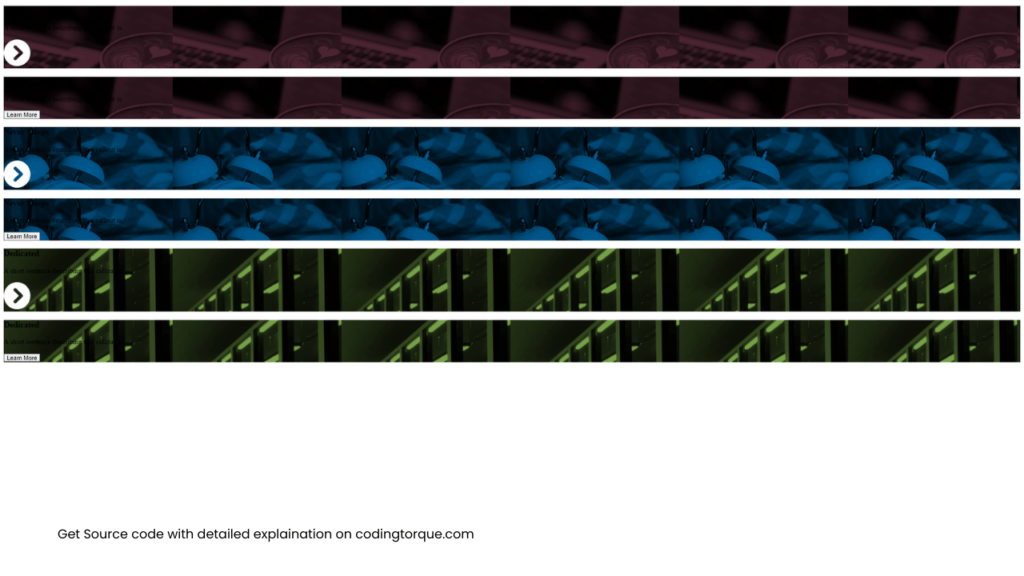
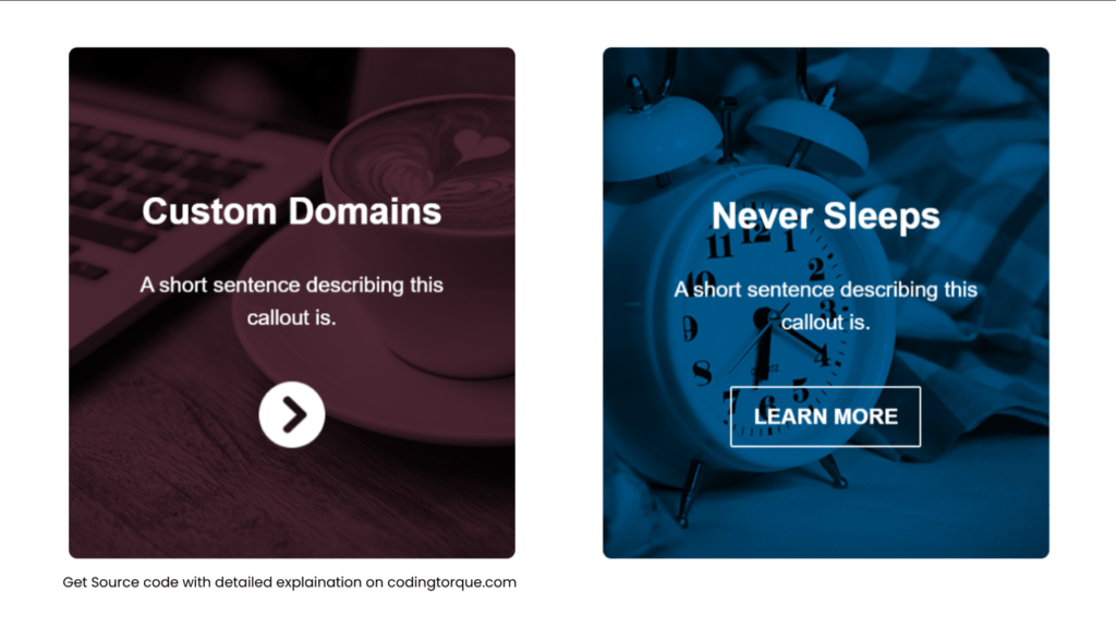
</div>Output Till Now
CSS Code
Create a file style.css and paste the code below.
html {
  font-family: sans-serif;
  box-sizing: border-box;
}

*,
*:before,
*:after {
  box-sizing: inherit;
}

.text-center {
  text-align: center;
}

.color-white {
  color: #fff;
}

.box-container {
  align-items: center;
  display: flex;
  flex-direction: column;
  justify-content: space-around;
  padding: 35px 15px;
  width: 100%;
}

@media screen and (min-width: 1380px) {
  .box-container {
    flex-direction: row;
  }
}

.box-item {
  position: relative;
  -webkit-backface-visibility: hidden;
  width: 415px;
  margin-bottom: 35px;
  max-width: 100%;
}

.flip-box {
  -ms-transform-style: preserve-3d;
  transform-style: preserve-3d;
  -webkit-transform-style: preserve-3d;
  perspective: 1000px;
  -webkit-perspective: 1000px;
}

.flip-box-front,
.flip-box-back {
  background-size: cover;
  background-position: center;
  border-radius: 8px;
  min-height: 475px;
  -ms-transition: transform 0.7s cubic-bezier(0.4, 0.2, 0.2, 1);
  transition: transform 0.7s cubic-bezier(0.4, 0.2, 0.2, 1);
  -webkit-transition: transform 0.7s cubic-bezier(0.4, 0.2, 0.2, 1);
  -webkit-backface-visibility: hidden;
  backface-visibility: hidden;
}

.flip-box-front {
  -ms-transform: rotateY(0deg);
  -webkit-transform: rotateY(0deg);
  transform: rotateY(0deg);
  -webkit-transform-style: preserve-3d;
  -ms-transform-style: preserve-3d;
  transform-style: preserve-3d;
}

.flip-box:hover .flip-box-front {
  -ms-transform: rotateY(-180deg);
  -webkit-transform: rotateY(-180deg);
  transform: rotateY(-180deg);
  -webkit-transform-style: preserve-3d;
  -ms-transform-style: preserve-3d;
  transform-style: preserve-3d;
}

.flip-box-back {
  position: absolute;
  top: 0;
  left: 0;
  width: 100%;

  -ms-transform: rotateY(180deg);
  -webkit-transform: rotateY(180deg);
  transform: rotateY(180deg);
  -webkit-transform-style: preserve-3d;
  -ms-transform-style: preserve-3d;
  transform-style: preserve-3d;
}

.flip-box:hover .flip-box-back {
  -ms-transform: rotateY(0deg);
  -webkit-transform: rotateY(0deg);
  transform: rotateY(0deg);
  -webkit-transform-style: preserve-3d;
  -ms-transform-style: preserve-3d;
  transform-style: preserve-3d;
}

.flip-box .inner {
  position: absolute;
  left: 0;
  width: 100%;
  padding: 60px;
  outline: 1px solid transparent;
  -webkit-perspective: inherit;
  perspective: inherit;
  z-index: 2;

  transform: translateY(-50%) translateZ(60px) scale(0.94);
  -webkit-transform: translateY(-50%) translateZ(60px) scale(0.94);
  -ms-transform: translateY(-50%) translateZ(60px) scale(0.94);
  top: 50%;
}

.flip-box-header {
  font-size: 34px;
}

.flip-box p {
  font-size: 20px;
  line-height: 1.5em;
}

.flip-box-img {
  margin-top: 25px;
}

.flip-box-button {
  background-color: transparent;
  border: 2px solid #fff;
  border-radius: 2px;
  color: #fff;
  cursor: pointer;
  font-size: 20px;
  font-weight: bold;
  margin-top: 25px;
  padding: 15px 20px;
  text-transform: uppercase;
}
Output Till Now
Written by: Piyush Patil
If you found any mistakes or have any doubts please feel free to Contact Us
Hope you find this post helpful💖


