Hello Guys! In this blog, I’m going to explain to you how to make a Glassmorphism Login Form using CSS. This will be a step-by-step guide including HTML and CSS. Let’s get started 🚀.
We can convert any simple design into a Glassmorphism design. For this, we need to change a little bit of code. First we use background color semi-transparent such as rgba(255,255,255,0.1.5). Then, we need to use backdrop-filter: blur (10px) to blur the background a bit. In the end, we need to use a border to enhance its beauty.
Before we start, here are some more JavaScript Games you might like to create:
1. Snake Game using JavaScript
2. 2D Bouncing Ball Game using JavaScript
3. Rock Paper Scissor Game using JavaScript
4. Tic Tac Toe Game using JavaScript
5. Whack a Mole Game using JavaScript
I would recommend you don’t just copy and paste the code, just look at the code and type by understanding it.
HTML Code
<!doctype html>
<html lang="en">
<head>
<!-- Required meta tags -->
<meta charset="utf-8">
<meta name="viewport" content="width=device-width, initial-scale=1">
<link rel="preconnect" href="https://fonts.googleapis.com">
<link rel="preconnect" href="https://fonts.gstatic.com" crossorigin>
<link href="https://fonts.googleapis.com/css2?family=Poppins&display=swap" rel="stylesheet">
<title>Login Form with Glassmorphism CSS - @code.scientist x @codingtorque</title>
</head>
<body>
<div class="container">
<div class="circle"></div>
<div class="circle"></div>
<div class="card">
<h4 class="title">Login</h4>
<div class="form-input">
<label for="username">Username</label>
<input type="email" id="username" placeholder="Email">
</div>
<div class="form-input">
<label for="password">Password</label>
<input type="password" id="password" placeholder="Password">
</div>
<button class="login-btn">Log in</button>
</div>
</div>
</body>
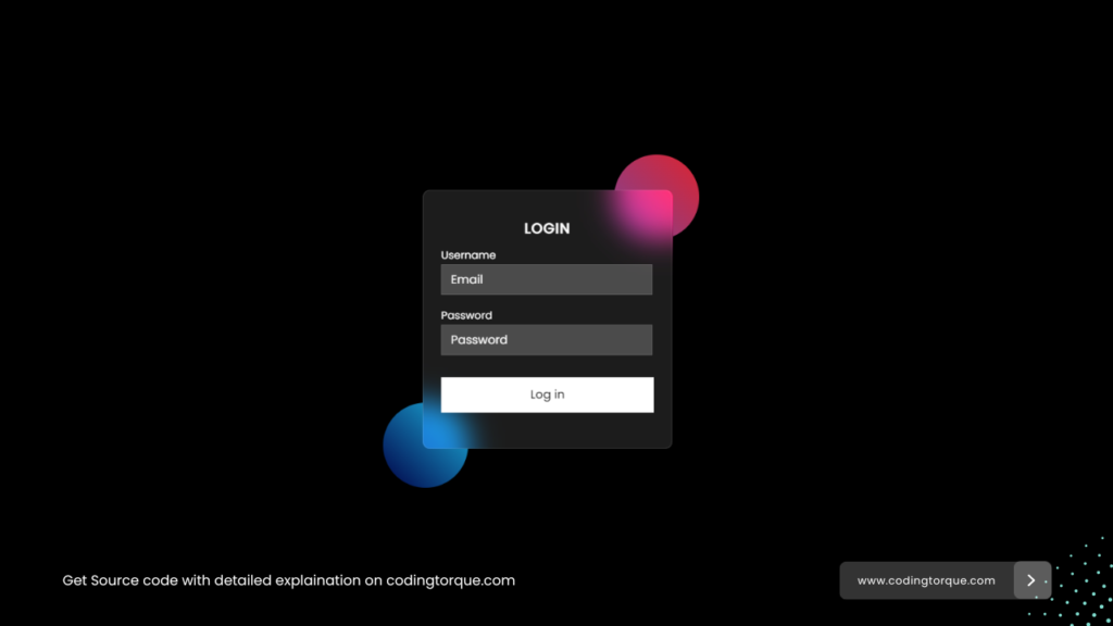
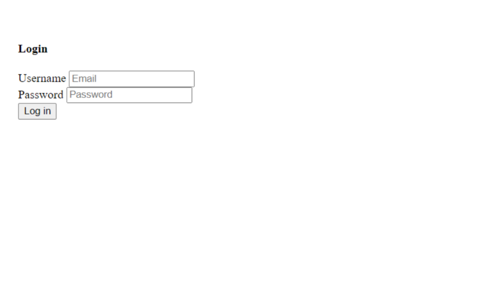
</html>Output Till Now
CSS Code
Create a file style.css and paste the code below.
* {
    margin: 0;
    padding: 0;
    font-family: 'Poppins', sans-serif;
}

body {
    background: black;
    color: white;
    display: flex;
    align-items: center;
    justify-content: center;
    padding-top: 15rem;
}

.container {
    position: relative;
}

.circle {
    width: 6rem;
    height: 6rem;
    background: linear-gradient(45deg, #7b4397, #dc2430);
    border-radius: 50%;
    z-index: -1;
    position: absolute;
    top: -40px;
    right: -30px;
}

.circle:nth-child(2) {
    top: 240px;
    left: -45px;
    background: linear-gradient(45deg, #000046, #1CB5E0);
}

.card {
    backdrop-filter: blur(16px) saturate(180%);
    background-color: rgb(255 255 255 / 11%);
    border-radius: 8px;
    border: 1px solid rgba(255, 255, 255, 0.125);
    display: flex;
    flex-direction: column;
    align-items: center;
    width: 15rem;
    padding: 20px 20px;
    padding-top: 20px;
}


.title {
    text-transform: uppercase;
    letter-spacing: 1px;
    margin-top: 10px;
}

.form-input {
    margin: 5px 0;
}

.form-input label {
    font-size: 12px;
}

.form-input input {
    backdrop-filter: blur(16px) saturate(180%);
    background-color: rgb(255 255 255 / 11%);
    border: 1px solid rgba(255, 255, 255, 0.125);
    width: 90%;
    padding: 6px 10px;
    color: white;
    outline: none;
}

.form-input input::placeholder {
    color: white;
}

.login-btn {
    background-color: white;
    color: black;
    width: 100%;
    padding: 10px 0;
    margin: 20px 0;
    cursor: pointer;
    border: none;
}
Output Till Now