
Welcome to Coding Torque, fellow coders! In today’s blog post, we will be delving into the world of color and creativity as we build an HSL color generator using HTML, CSS, and JavaScript. By the end of this tutorial, you will have a useful tool for generating and experimenting with a wide range of colors, making it easier to find the perfect color scheme for your next web development project. So grab your favorite beverage and let’s get started!
Before we start, here are some JavaScript Games you might like to create:
1. Snake Game using JavaScript
2. 2D Bouncing Ball Game using JavaScript
3. Rock Paper Scissor Game using JavaScript
4. Tic Tac Toe Game using JavaScript
5. Whack a Mole Game using JavaScript
I would recommend you don’t just copy and paste the code, just look at the code and type by understanding it.
HTML Code
Starter Template
<!doctype html>
<html lang="en">

<head>
    <!-- Required meta tags -->
    <meta charset="utf-8">
    <meta name="viewport" content="width=device-width, initial-scale=1">

    <!-- CSS -->
    <link rel="stylesheet" href="style.css">

    <title>HSL Color Generator using JavaScript - @code.scientist x @codingtorque</title>
</head>

<body>
    <!-- Further code here -->

    <script src="https://code.jquery.com/jquery-3.6.3.js"
        integrity="sha256-nQLuAZGRRcILA+6dMBOvcRh5Pe310sBpanc6+QBmyVM=" crossorigin="anonymous"></script>

    <script src="script.js"></script>
</body>

</html>
Paste the below code in your <body> tag
<section>
    <div class="range">
        <input id="hue" max="360" min="0" step="1" type="range" />
    </div>
    <div class="range">
        <input id="saturation" max="100" min="0" step="0" type="range" />
    </div>
    <div class="range">
        <input id="lightness" max="100" min="0" step="0" type="range" />
    </div>
    <p id="hslcode"></p>
</section>
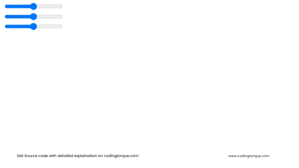
Output Till Now
CSS Code
Create a file style.css and paste the code below.
body {
  overflow: hidden;
  position: absolute;
  top: 50%;
  left: 50%;
  transform: translate(-50%, -50%);
}

section {
  width: 350px;
  background: #fff;
  padding: 8px;
  box-shadow: 6px 6px 0px 0px rgba(0, 0, 0, 0.3);
}

.range {
  margin: 10px;
  border-radius: 18px;
  background: linear-gradient(rgba(0, 0, 0, 0.1), rgba(255, 255, 255, 0));
  box-shadow: 0 0.1em 0.4em -0.2em rgba(0, 0, 0, 0.2) inset;
  padding: 8px 11px 8px 11px;
}

input[type="range"] {
  -webkit-appearance: none;
  width: 100%;
  border-radius: 10px;
  outline: none;
}

input[type="range"]::-webkit-slider-thumb {
  -webkit-appearance: none;
  margin-top: -5px;
  border: none;
  cursor: pointer;
  width: 1.9em;
  height: 1.9em;
  border-radius: 50%;
  background: linear-gradient(#f5f5f5 10%, #eeeeee);
  box-shadow: 0 0.1em 0.9em -0.05em rgba(255, 255, 255, 0.9) inset,
    0 0.2em 0.5em -0.1em rgba(0, 0, 0, 0.3);
}

input[type="range"]::-webkit-slider-runnable-track {
  border-radius: 10px;
  height: 1.3em;
  box-shadow: inset 0 1px 2px rgba(0, 0, 0, 0.5);
  cursor: pointer;
}

#hue::-webkit-slider-runnable-track {
  background: linear-gradient(
    to right,
    hsl(0, 50%, 50%) 0%,
    hsl(60, 50%, 50%) 16.67%,
    hsl(120, 50%, 50%) 33.33%,
    hsl(180, 50%, 50%) 50%,
    hsl(240, 50%, 50%) 66.67%,
    hsl(320, 50%, 50%) 83.33%,
    hsl(360, 50%, 50%) 100%
  );
}

.appear {
  opacity: 1;
  transform: scale(1);
}

#hslcode {
  text-align: center;
}
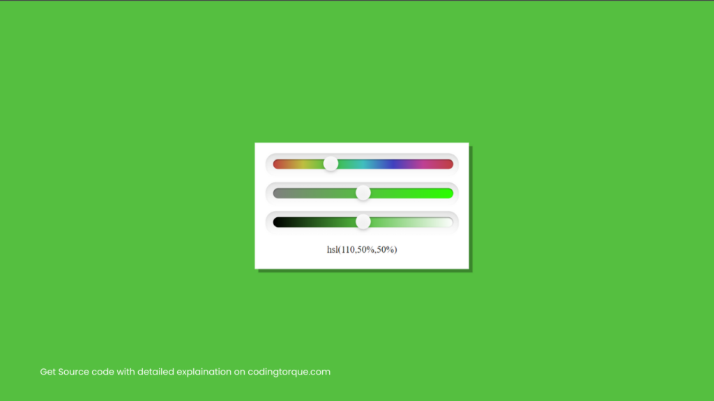
Output Till Now
JavaScript Code
script.js and paste the code below.hue.oninput = changeColor;
saturation.oninput = changeColor;
lightness.oninput = changeColor;
changeColor();
function changeColor() {
var color = 'hsl(' +
hue.value + ',' +
saturation.value + '%,' +
lightness.value + '%)';
$("body").css({
"background": color
});
$("#saturation").css({
"background": 'linear-gradient(to right, hsl(' +
hue.value + ', 0%, 50%) 0%, hsl(' +
hue.value + ', 100%, 50%) 100%)'
});
$("#lightness").css({
"background": 'linear-gradient(to right, hsl(' +
hue.value + ', 100%, 0%) 0%, hsl(' +
hue.value + ', ' +
saturation.value + '%, 50%) 50%, hsl(' +
hue.value + ', 100%, 100%) 100%)'
});
hslcode.innerHTML = color;
}


