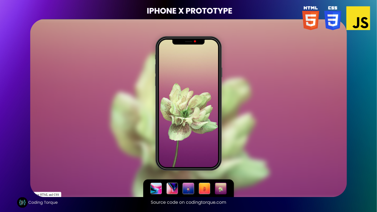
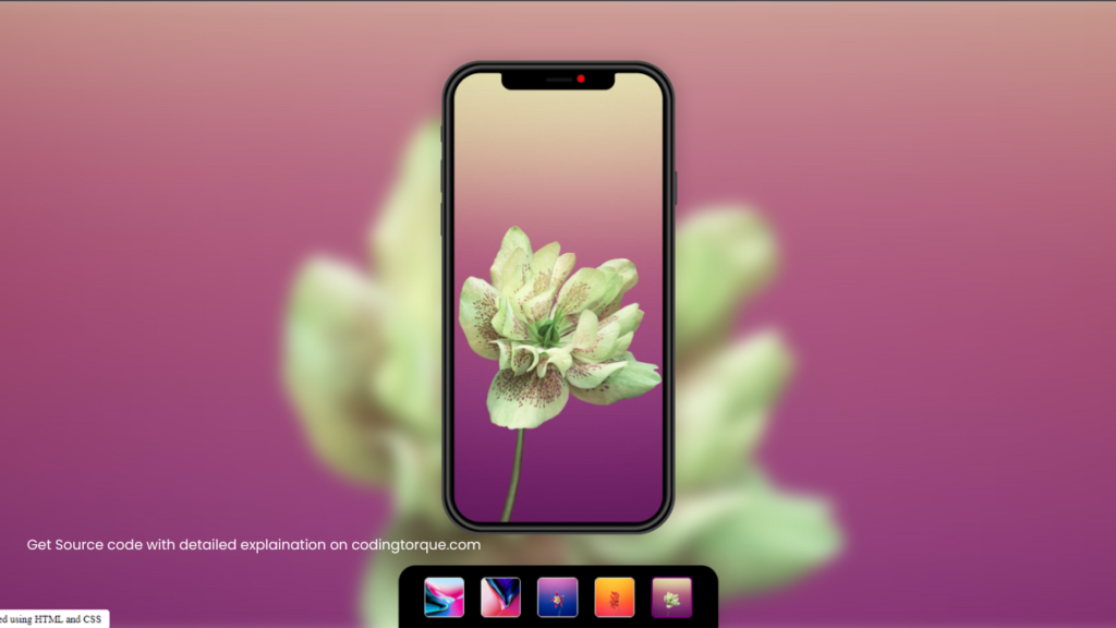
Are you a web developer looking to enhance your skills by taking on a new challenge? Why not try creating an iPhone X design using HTML, CSS, and JavaScript? In this tutorial, we’ll show you step-by-step how to build a replica of the iPhone X using these three languages. With its sleek and modern design, the iPhone X is the perfect device to recreate, and you’ll learn a lot about web development along the way. You’ll learn how to create the rounded edges, the camera notch, and the overall layout of the iPhone X. Plus, you’ll gain valuable experience in using CSS to create dynamic and responsive designs, and JavaScript to add interactive elements to your project. So, if you’re ready to take your web development skills to the next level, let’s get started on creating an iPhone X design!
Before we start here are some more projects you might like to create –
- Neomorphic Tic Tac Toe Game using HTML and CSS Only
- Duck Hunt Game using HTML and CSS
- 3D CSS Cards with Hover Effect
- CSS Glassmorphism Cards with Hover Effects
I would recommend you don’t just copy and paste the code, just look at the code and type by understanding it.
Demo
HTML Code
Starter Template
<!doctype html>
<html lang="en">

<head>
    <!-- Required meta tags -->
    <meta charset="utf-8">
    <meta name="viewport" content="width=device-width, initial-scale=1">

    <!-- CSS -->
    <link rel="stylesheet" href="style.css">

    <title>IPhone X Design using HTML, CSS and JavaScript - Coding Torque</title>
</head>

<body>
    <!-- Further code here -->

     <script src="script.js"></script>
</body>

</html>
Paste the below code in your <body> tag.
<div class="workspace">
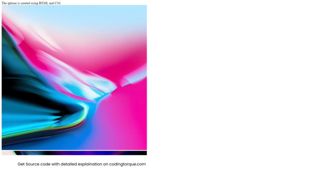
<div class="note">The iphone is created using HTML and CSS</div>
<div class="bg-content"></div>
<div class="mobile-body">
<div class="top-bar">
<div class="camera"></div>
<div class="speaker"></div>
</div>
<div class="button volume-up"></div>
<div class="button volume-down"></div>
<div class="button silent"></div>
<div class="button power"></div>
<div class="layer-2"></div>
<div class="layer-1"></div>
<div class="layer-gradient-1"></div>
<div class="layer-gradient-2"></div>
</div>
<div class="gallery-content">
<div class="gallery-content__img active"
data-img="https://s3-us-west-2.amazonaws.com/s.cdpn.io/830072/bg-1.jpg">
<img src="https://s3-us-west-2.amazonaws.com/s.cdpn.io/830072/bg-1.jpg" rel="preload">
</div>
<div class="gallery-content__img" data-img="https://s3-us-west-2.amazonaws.com/s.cdpn.io/830072/bg-2.jpg">
<img src="https://s3-us-west-2.amazonaws.com/s.cdpn.io/830072/bg-2.jpg" rel="preload">
</div>
<div class="gallery-content__img" data-img="https://s3-us-west-2.amazonaws.com/s.cdpn.io/830072/bg-3.jpg">
<img src="https://s3-us-west-2.amazonaws.com/s.cdpn.io/830072/bg-3.jpg" rel="preload">
</div>
<div class="gallery-content__img" data-img="https://s3-us-west-2.amazonaws.com/s.cdpn.io/830072/bg-4.jpg">
<img src="https://s3-us-west-2.amazonaws.com/s.cdpn.io/830072/bg-4.jpg" rel="preload">
</div>
<div class="gallery-content__img" data-img="https://s3-us-west-2.amazonaws.com/s.cdpn.io/830072/bg-5.jpg">
<img src="https://s3-us-west-2.amazonaws.com/s.cdpn.io/830072/bg-5.jpg" rel="preload">
</div>
</div>
</div>Output Till Now
CSS Code
Create a file style.css and paste the code below.
html {
  font-size: 62.5%;
}
body {
  background: lightgray;
  font-size: 1.4rem;
}
.workspace {
  display: flex;
  height: 100vh;
  justify-content: center;
  align-items: center;
  background-color: white;
}
.workspace.active .gallery-content {
  transform: translateY(0);
}
.workspace.active .mobile-body {
  transform: scale(1);
  opacity: 1;
  box-shadow: 0 0 2rem 1rem rgba(0, 0, 0, 0.1);
}
.bg-content {
  position: absolute;
  left: -1rem;
  right: -1rem;
  top: -1rem;
  bottom: -1rem;
  background-image: url("https://s3-us-west-2.amazonaws.com/s.cdpn.io/830072/bg-1.jpg");
  background-size: cover;
  background-position: center;
  background-repeat: no-repeat;
  filter: blur(1rem);
  transition: all 0.5s;
}
.gallery-content {
  position: fixed;
  bottom: 0;
  border-top-left-radius: 2rem;
  border-top-right-radius: 2rem;
  box-shadow: 0 0 2rem rgba(0, 0, 0, 0.2);
  z-index: 1;
  background-color: black;
  height: 7.5rem;
  display: flex;
  align-items: center;
  padding: 0 3rem;
  justify-content: space-between;
  align-items: center;
  transform: translateY(7.5rem);
  transition: all 1s;
  overflow: auto;
}
.gallery-content__img {
  width: 4.5rem;
  height: 4.5rem;
  flex-shrink: 0;
  margin-right: 2rem;
  border: 0.1rem solid white;
  cursor: pointer;
  transition: all 0.5s;
  border-radius: 0.5rem;
  overflow: hidden;
}
.gallery-content__img.active {
  border-width: 0.2rem;
  border-color: purple;
}
.gallery-content__img:last-child {
  margin-right: 0;
}
.gallery-content__img img {
  width: 100%;
  height: 100%;
  object-fit: cover;
}
.mobile-body {
  position: relative;
  flex-shrink: 0;
  width: 35.6rem;
  height: 72.2rem;
  border-radius: 6rem;
  display: flex;
  justify-content: center;
  background-image: url("https://s3-us-west-2.amazonaws.com/s.cdpn.io/830072/bg-1.jpg");
  background-position: center;
  background-size: cover;
  background-repeat: no-repeat;
  user-select: none;
  transform: scale(0.9);
  opacity: 0;
  box-shadow: none;
  transition: all 1s;
  margin-bottom: 7.5rem;
}
.mobile-body:hover {
  box-shadow: none !important;
  transform: scale(0.95) !important;
}
.mobile-body .layer-1 {
  position: absolute;
  left: 0;
  right: 0;
  top: 0;
  bottom: 0;
  border: 0.4rem solid #484848;
  border-radius: 6rem;
}
.mobile-body .layer-2 {
  position: absolute;
  left: 0.3rem;
  right: 0.3rem;
  top: 0.3rem;
  bottom: 0.3rem;
  border: 1.6rem solid #000;
  border-radius: 5.6rem;
}
.mobile-body .layer-gradient-1 {
  position: absolute;
  left: 1.1rem;
  right: 1.1rem;
  top: 1.1rem;
  bottom: 1.1rem;
  border: 0.3rem solid #484848;
  border-radius: 5rem;
  filter: blur(1px);
  opacity: 0.5;
}
.mobile-body .layer-gradient-2 {
  position: absolute;
  left: 0.7rem;
  right: 0.7rem;
  top: 0.7rem;
  bottom: 0.7rem;
  border: 0.4rem solid #bcbcbc;
  border-radius: 5.6rem;
  opacity: 0.5;
  filter: blur(1px);
}
.mobile-body .top-bar {
  width: 17.3rem;
  height: 2.8rem;
  background-color: #000;
  position: absolute;
  top: 1.7rem;
  left: 9.1rem;
  border-bottom-left-radius: 1.5rem;
  border-bottom-right-radius: 1.5rem;
}
.mobile-body .top-bar:before {
  content: "";
  position: absolute;
  bottom: 1.25rem;
  left: -0.9rem;
  width: 0.8rem;
  height: 0.8rem;
  border: 0.4rem solid transparent;
  border-top: 0.4rem solid black;
  border-right: 0.4rem solid black;
  border-top-right-radius: 0.6rem;
  transform: rotate(28deg);
}
.mobile-body .top-bar:after {
  content: "";
  position: absolute;
  bottom: 1.25rem;
  right: -0.9rem;
  width: 0.8rem;
  height: 0.8rem;
  border: 0.4rem solid transparent;
  border-top: 0.4rem solid black;
  border-left: 0.4rem solid black;
  border-top-right-radius: 0.6rem;
  transform: rotate(-28deg);
}
.mobile-body .camera {
  position: absolute;
  bottom: 1.1rem;
  right: 4.5rem;
  right: 4.5rem;
  width: 1rem;
  height: 1rem;
  background-color: red;
  border-radius: 50%;
  border: 0.2rem solid #1e1f22;
  background-image: linear-gradient(right, #091528, #2363a6);
}
.mobile-body .speaker {
  position: absolute;
  bottom: 1.3rem;
  right: 6.5rem;
  width: 4rem;
  height: 0.6rem;
  background-color: #161616;
  border-radius: 0.2rem;
}
.mobile-body .button {
  width: 0.3rem;
  height: 2.5rem;
  background-color: #484848;
  position: absolute;
  left: -0.2rem;
  border-top-left-radius: 0.3rem;
  border-bottom-left-radius: 0.3rem;
  border: 0.1rem solid rgba(0, 0, 0, 0.1);
  border-right: none;
}
.mobile-body .button.silent {
  top: 9.8rem;
}
.mobile-body .button.volume-up {
  top: 15rem;
  height: 5rem;
}
.mobile-body .button.volume-down {
  top: 21.6rem;
  height: 5rem;
}
.mobile-body .button.power {
  top: 16.9rem;
  height: 5rem;
  right: -0.3rem;
  left: auto;
  transform: rotate(180deg);
}
@media (max-width: 600px) {
  .gallery-content {
    width: 100%;
    border-radius: 0;
  }
  .mobile-body {
    transform: scale(0.65) !important;
  }
  .mobile-body:hover {
    transform: scale(0.6) !important;
  }
  .gallery-content__img:last-child {
    margin-right: 2rem !important;
  }
}
@media (max-height: 800px) {
  .mobile-body {
    transform: scale(0.77) !important;
  }
  .mobile-body:hover {
    transform: scale(0.68) !important;
  }
}
@media (max-height: 630px) {
  .mobile-body {
    transform: scale(0.53) !important;
  }
  .mobile-body:hover {
    transform: scale(0.48) !important;
  }
}
.note {
  position: absolute;
  bottom: 0;
  left: 0;
  z-index: 10;
  padding: 5px 10px;
  background: white;
  border-radius: 4px;
  font-size: 12px;
}
JavaScript Code
Create a file script.js and paste the code below.
window.onload = function () {
    document.querySelector('.workspace').classList.add('active')
}

const gallery = document.querySelectorAll('.gallery-content__img'),
    mobileBody = document.querySelector('.mobile-body'),
    bg = document.querySelector('.bg-content')

gallery.forEach(g => {
    g.addEventListener('click', function () {
        const imgSrc = this.dataset.img,
            activeGallery = document.querySelector('.gallery-content__img.active')

        activeGallery.classList.remove('active')
        this.classList.add('active')
        bg.style.backgroundImage = `url('${imgSrc}')`
        mobileBody.style.backgroundImage = `url('${imgSrc}')`
    })
})
Final Output
Written by: Piyush Patil
Code Credits: @mohamedabusrea
If you found any mistakes or have any doubts please feel free to Contact Us
Hope you find this post helpful💖


