Are you looking for a fun and easy project to improve your HTML and CSS skills? Look no further than creating a Rock Paper Scissors game using only these two languages! In this tutorial, we’ll walk you through the step-by-step process of building your own version of this classic game. With just a few lines of code, you can create a fully functional game that you can play with friends and family. Plus, you’ll gain valuable experience working with HTML and CSS, which are essential skills for any web developer. So, let’s get started and see how to create this game from scratch!
Before we start here are some more games you might like to create using css only –
- Neomorphic Tic Tac Toe Game using HTML and CSS Only
- Whac a mole game using HTML and CSS Only
- Plankman Game using HTML and CSS Only
- Rock Paper Scissor Game using HTML and CSS Only
- Carnival Target Practice Game using HTML and CSS Only
I would recommend you don’t just copy and paste the code, just look at the code and type by understanding it.
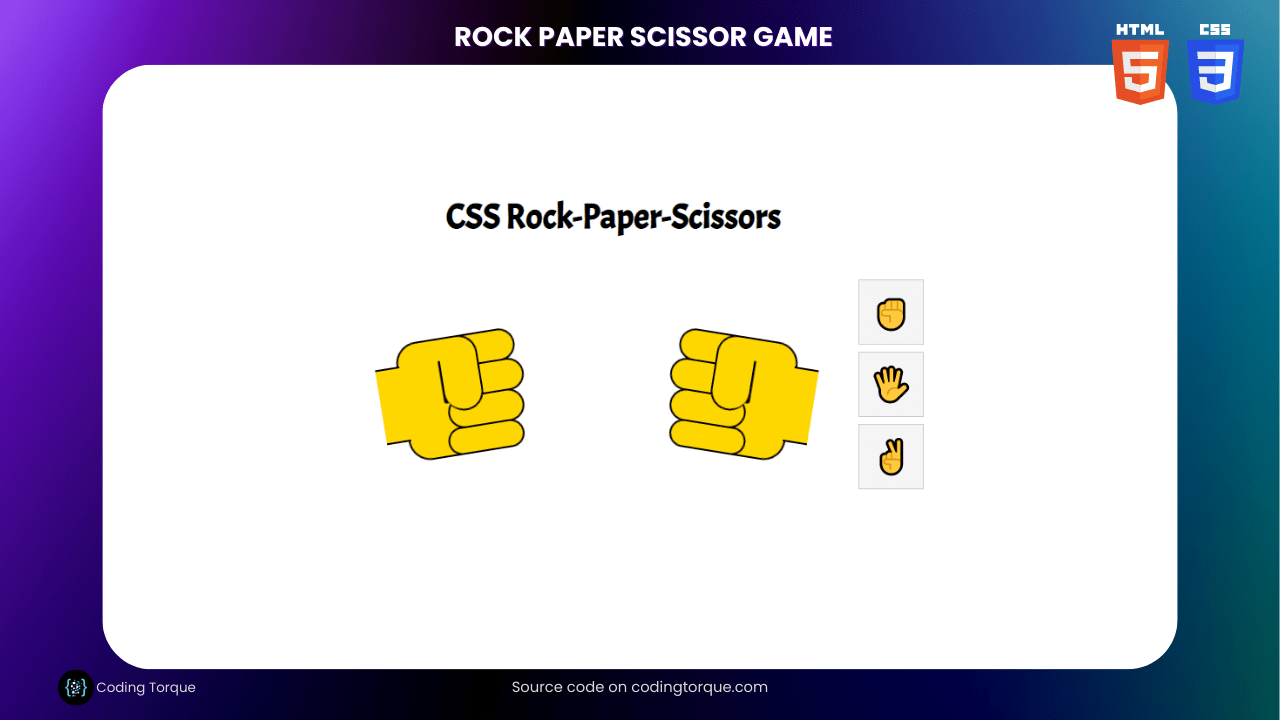
Demo
HTML Code
Starter Template
<!doctype html>
<html lang="en">

<head>
    <!-- Required meta tags -->
    <meta charset="utf-8">
    <meta name="viewport" content="width=device-width, initial-scale=1">

    <!-- CSS -->
    <link rel="stylesheet" href="style.css">

    <title>Rock Paper Scissor Game using HTML and CSS Only - Coding Torque</title>
</head>

<body>
    <!-- Further code here -->
</body>

</html>
Paste the below code in your <body> tag.
<form>

  <input type="radio" id="rock-rock" name="rock-paper-scissors">
  <input type="radio" id="rock-paper" name="rock-paper-scissors">
  <input type="radio" id="rock-scissors" name="rock-paper-scissors">
  <input type="radio" id="paper-rock" name="rock-paper-scissors">
  <input type="radio" id="paper-paper" name="rock-paper-scissors">
  <input type="radio" id="paper-scissors" name="rock-paper-scissors">
  <input type="radio" id="scissors-rock" name="rock-paper-scissors">
  <input type="radio" id="scissors-paper" name="rock-paper-scissors">
  <input type="radio" id="scissors-scissors" name="rock-paper-scissors">

  <div>
    <h1>CSS Rock-Paper-Scissors</h1>
    <div id="hands">
      <div class="hand" id="computer-hand">
        <div class="fist"></div>
        <div class="finger finger-1"></div>
        <div class="finger finger-2"></div>
        <div class="finger finger-3"></div>
        <div class="finger finger-4"></div>
        <div class="thumb"></div>
        <div class="arm"></div>
      </div>

      <div class="hand" id="user-hand">
        <div class="fist"></div>
        <div class="finger finger-1"></div>
        <div class="finger finger-2"></div>
        <div class="finger finger-3"></div>
        <div class="finger finger-4"></div>
        <div class="thumb"></div>
        <div class="arm"></div>
      </div>

      <div id="icons">
        <div>
          <label for="rock-rock">✊</label>
          <label for="paper-rock">✊</label>
          <label for="scissors-rock">✊</label>
        </div>
        <div>
          <label for="rock-paper">🖐️</label>
          <label for="paper-paper">🖐️</label>
          <label for="scissors-paper">🖐️</label>
        </div>
        <div>
          <label for="rock-scissors">✌</label>
          <label for="paper-scissors">✌</label>
          <label for="scissors-scissors">✌</label>
        </div>
      </div>
    </div>
  </div>

  <div id="message">
    <h2></h2>
    <input type="reset" value="Refresh Round" />
  </div>

</form>
CSS Code
Create a file style.css and paste the code below.
@import url('https://fonts.googleapis.com/css?family=Acme&display=swap');
@keyframes changeOrder {
from { z-index: 9;}
to { z-index: 1; }
}
@keyframes handShake {
0%,100% { transform: rotate(10deg); }
50% { transform: rotate(-10deg); }
}
@keyframes handShake2 {
0%,100% { transform: rotateY(180deg) rotate(10deg); }
50% { transform: rotateY(180deg) rotate(-10deg); }
}
html, body {
margin: 0;
padding: 0;
border: 0;
line-height: 1;
font-family: Acme, Arial, sans-serif;
}
form {
position: absolute;
top: 0;
right: 0;
bottom: 0;
left: 0;
display: flex;
align-items: center;
justify-content: center;
flex-direction: column;
}
h1 {
text-align: center;
}
#hands {
text-align: center;
}
input:checked ~ div .hand {
animation: none !important;
}
.hand {
margin: 20px;
width: 200px;
height: 200px;
position: relative;
transform: rotate(10deg);
display: inline-block;
animation: handShake 2s infinite;
}
.hand > div {
position: absolute;
box-sizing: border-box;
border: 2px solid black;
background: gold;
transition: all 0.1s;
}
.fist {
height: 110px;
left: 40px;
top: 50px;
width: 90px;
border-radius: 20px 0 0 20px;
}
.finger {
width: 70px;
height: 30px;
border-radius: 20px;
left: 80px;
transform-origin: 0 50%;
}
.finger-1 { top: 50px; --dif: 0px; }
.finger-2 { top: 78px; left: 84px; --dif: 4px; }
.finger-3 { top: 106px; --dif: 0px; }
.finger-4 { top: 134px; height: 26px; left: 76px; --dif: -8px; }
div.thumb {
width: 35px;
height: 70px;
border-radius: 0 20px 20px 20px;
top: 50px;
left: 80px;
border-left: 0 solid;
box-shadow: -17px 6px 0 -15px black;
}
div.arm {
width: 22px;
height: 70px;
left: 20px;
top: 70px;
border: 0;
border-top: 2px solid black;
border-bottom: 2px solid black;
}
#user-hand {
transform: rotateY(180deg);
animation: handShake2 2s infinite;
position: relative;
}
input[type="radio"] {
position: absolute;
top: -1000in;
left: -1000in;
}
input[id$="scissors"]:checked ~ div #user-hand .finger-1,
input[id^="scissors"]:checked ~ div #computer-hand .finger-1 {
width: 130px;
transform:rotate(-5deg);
}
input[id$="scissors"]:checked ~ div #user-hand .finger-2,
input[id^="scissors"]:checked ~ div #computer-hand .finger-2 {
width: 130px;
transform:rotate(5deg);
}
input[id$="paper"]:checked ~ div #user-hand .finger-1,
input[id$="paper"]:checked ~ div #user-hand .finger-2,
input[id$="paper"]:checked ~ div #user-hand .finger-3,
input[id$="paper"]:checked ~ div #user-hand .finger-4,
input[id^="paper"]:checked ~ div #computer-hand .finger-1,
input[id^="paper"]:checked ~ div #computer-hand .finger-2,
input[id^="paper"]:checked ~ div #computer-hand .finger-3,
input[id^="paper"]:checked ~ div #computer-hand .finger-4 {
left: 124px;
left: calc(124px + var(--dif));
width: 80px;
border-left: 0;
border-radius: 0 20px 20px 0;
}
#rock-rock:checked ~ div h2::before,
#paper-paper:checked ~ div h2::before,
#scissors-scissors:checked ~ div h2::before {
content: "You Tied!"
}
#rock-paper:checked ~ div h2::before,
#paper-scissors:checked ~ div h2::before,
#scissors-rock:checked ~ div h2::before {
content: "You Win!"
}
#rock-scissors:checked ~ div h2::before,
#paper-rock:checked ~ div h2::before,
#scissors-paper:checked ~ div h2::before {
content: "Computer Wins!"
}
#message {
text-align: center;
display: none;
}
input:checked ~ #message {
display: block;
}
#hands {
display: flex;
align-items: center;
justify-content: center;
}
#icons {
width: 30px;
height: 200px;
display: inline-flex;
flex-direction: column;
}
#icons > div {
flex: 1;
align-items: center;
justify-content: center;
width: 60px;
height: 60px;
overflow: hidden;
position: relative;
}
label:active {
position:static;
margin-left: 60px;
}
label:active::before {
content: "";
position: absolute;
top: 0;
left: 0;
width: 60px;
z-index: 10;
height: 60px;
}
label {
animation: changeOrder 0.45s infinite linear;
background: #f5f5f5;
border: 1px solid #ccc;
box-sizing: border-box;
cursor: pointer;
display: block;
height: 60px;
width: 60px;
line-height: 60px;
font-size: 2rem;
position: absolute;
top: 0;
left: 0;
user-select: none;
}
label:nth-of-type(1) { animation-delay: -0.00s; }
label:nth-of-type(2) { animation-delay: -0.15s; }
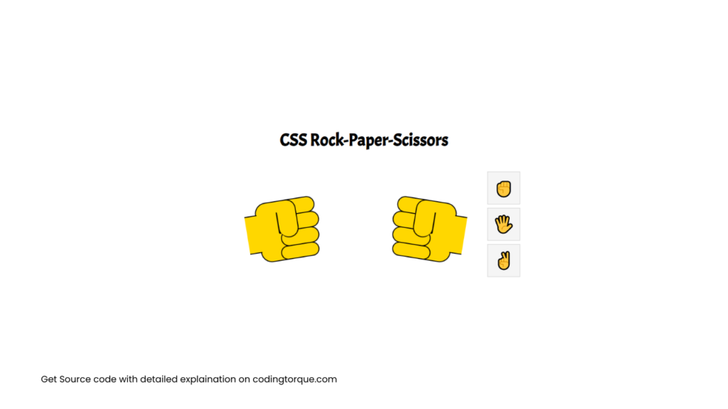
label:nth-of-type(3) { animation-delay: -0.30s; }Output Till Now
Written by: Piyush Patil
Code Credits: @alvaromontoro
If you found any mistakes or have any doubts please feel free to Contact Us
Hope you find this post helpful💖


