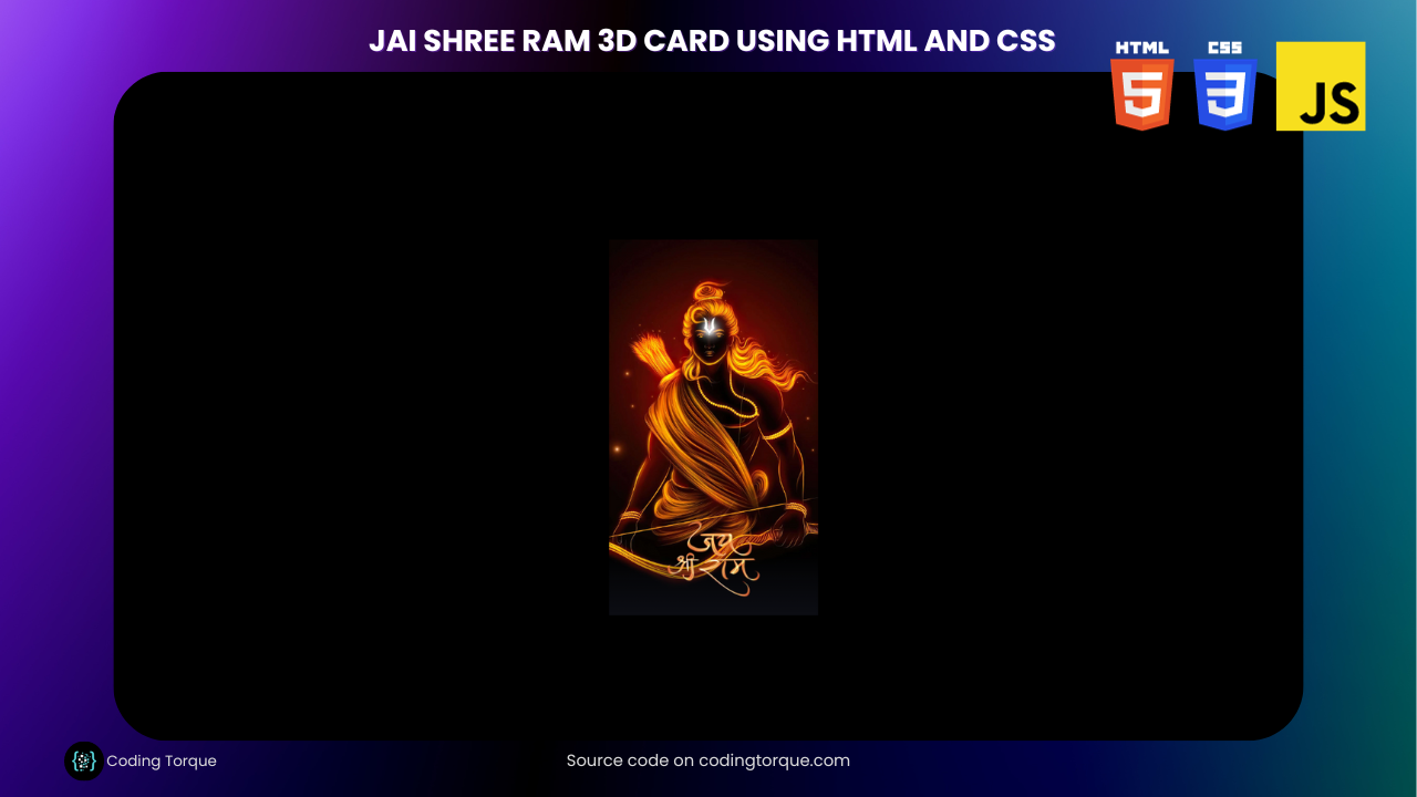
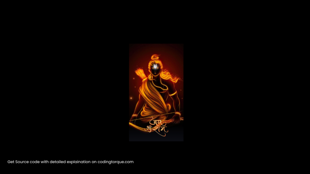
Greetings, dear readers! As the auspicious day of the Ayodhya inauguration approaches, there’s a palpable sense of excitement and devotion in the air. In celebration of this momentous occasion, I am thrilled to share with you a special creation – the Jai Shree Ram 3D Card crafted using the artistic magic of HTML and CSS.

I would recommend you don’t just copy and paste the code, just look at the code and type by understanding it.
Demo
HTML Code
Starter Template
<!doctype html>
<html lang="en">

<head>
    <!-- Required meta tags -->
    <meta charset="utf-8">
    <meta name="viewport" content="width=device-width, initial-scale=1">

    <!-- CSS -->
    <link rel="stylesheet" href="style.css">

    <title>Jai Shree Ram 3D Card using HTML and CSS - Coding Torque</title>
</head>

<body>
    <!-- Further code here -->

    <script src="script.js"></script>
</body>

</html>
Paste the below code in your <body> tag.
<div class="card">
    <div class="wrapper">
        <img src="https://w0.peakpx.com/wallpaper/837/578/HD-wallpaper-jay-shri-ram-golden-art-work-lord-god-bhakti.jpg" class="cover-image" />
    </div>
    <img src="https://res.cloudinary.com/freecodez/image/upload/v1698112176/images/qmdfgphh69jhwkjjgbsm.webp" class="title" />
    <img src="https://www.godpng.com/uploads/png/shree-ram-photo-png.png" class="character" />
</div>
CSS Code
Create a file style.css and paste the code below.
:root {
	--card-height: 300px;
	--card-width: 150px;
}

* {
	box-sizing: border-box;
}

body {
	width: 100vw;
	height: 100vh;
	margin: 0;
	display: flex;
	justify-content: center;
	align-items: center;
	background: black;
}

.card {
	width: var(--card-width);
	height: var(--card-height);
	position: relative;
	display: flex;
	justify-content: center;
	align-items: flex-end;
	padding: 0 36px;
	perspective: 2500px;
	margin: 0 50px;
	cursor: pointer;
}

.cover-image {
	width: 100%;
	height: 100%;
	object-fit: cover;
}

.wrapper {
	transition: all 0.5s;
	position: absolute;
	width: 100%;
	z-index: -1;
}

.card:hover .wrapper {
	transform: perspective(900px) translateY(-5%) rotateX(25deg) translateZ(0);
	box-shadow: 2px 35px 32px -8px rgba(0, 0, 0, 0.75);
	-webkit-box-shadow: 2px 35px 32px -8px rgba(0, 0, 0, 0.75);
	-moz-box-shadow: 2px 35px 32px -8px rgba(0, 0, 0, 0.75);
}

.wrapper::before,
.wrapper::after {
	content: "";
	opacity: 0;
	width: 100%;
	height: 80px;
	transition: all 0.5s;
	position: absolute;
	left: 0;
}

.wrapper::before {
	top: 0;
	height: 100%;
	background-image: linear-gradient(to top,
			transparent 46%,
			rgba(12, 13, 19, 0.5) 68%,
			rgba(12, 13, 19) 97%);
}

.wrapper::after {
	bottom: 0;
	opacity: 1;
	background-image: linear-gradient(to bottom,
			transparent 46%,
			rgba(12, 13, 19, 0.5) 68%,
			rgba(12, 13, 19) 97%);
}

.card:hover .wrapper::before,
.wrapper::after {
	opacity: 1;
}

.card:hover .wrapper::after {
	height: 120px;
}

.title {
	width: 100%;
	transition: transform 0.5s;
}

.card:hover .title {
	transform: translate3d(0%, -50px, 100px);
}

.character {
	width: 100%;
	opacity: 0;
	transition: all 0.5s;
	position: absolute;
	z-index: -1;
}

.card:hover .character {
	opacity: 1;
	transform: translate3d(0%, -30%, 100px);
}
Final Output
Written by: Piyush Patil
Code Credits: https://codepen.io/Codewithshobhit/pen/ZEwYoam
If you found any mistakes or have any doubts please feel free to Contact Us
Hope you find this post helpful💖


