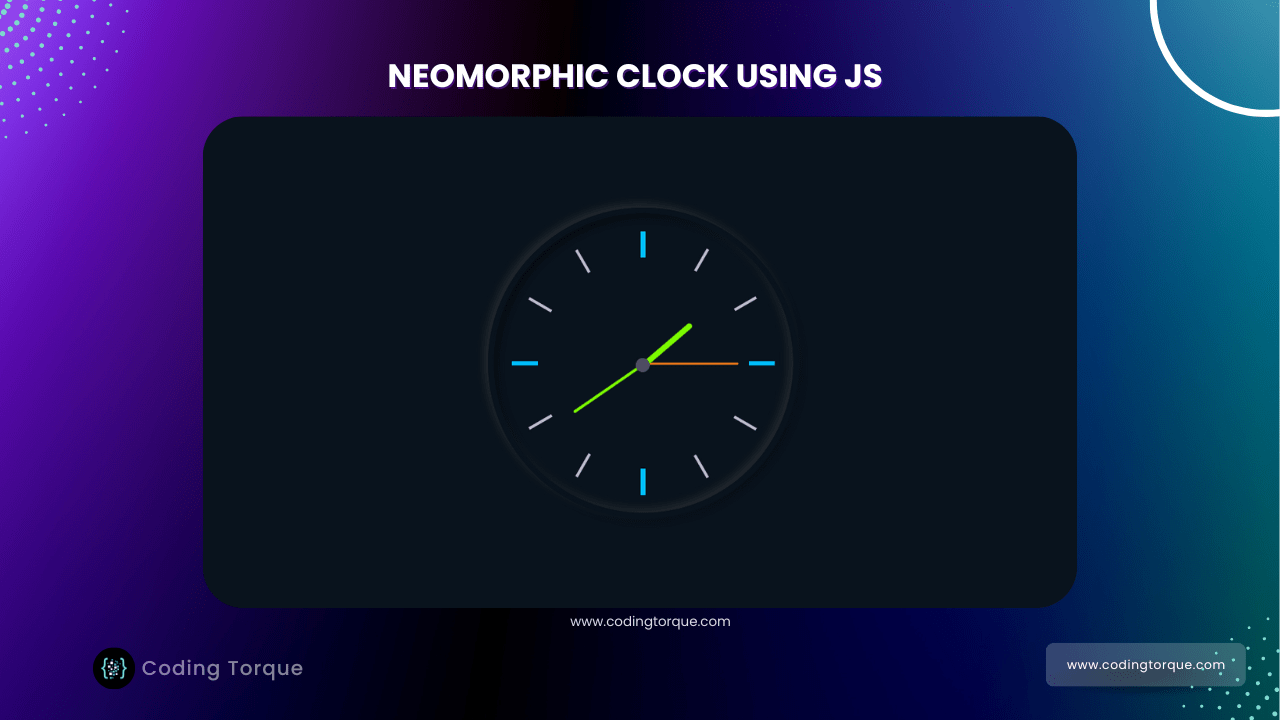
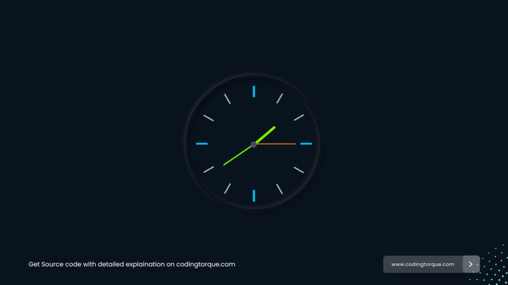
Hello Guys! In this blog, I’m going to explain to you how to make a Neomorphic analog clock using HTML, CSS, and JavaScript. We can build this project to showcase your CSS skills. This will be a step-by-step guide. Let’s get started 🚀.
Before we start, here are some JavaScript Games you might like to create:
1. Snake Game using JavaScript
2. 2D Bouncing Ball Game using JavaScript
3. Rock Paper Scissor Game using JavaScript
4. Tic Tac Toe Game using JavaScript
5. Whack a Mole Game using JavaScript
I would recommend you don’t just copy and paste the code, just look at the code and type by understanding it.
HTML Code
<!DOCTYPE html>
<html lang="en">

<head>
    <!-- Required meta tags -->
    <meta charset="utf-8">
    <meta name="viewport" content="width=device-width, initial-scale=1">

    <!-- Font Awesome Icons  -->
    <link rel="stylesheet" href="https://cdnjs.cloudflare.com/ajax/libs/font-awesome/5.15.1/css/all.min.css"
        integrity="sha512-+4zCK9k+qNFUR5X+cKL9EIR+ZOhtIloNl9GIKS57V1MyNsYpYcUrUeQc9vNfzsWfV28IaLL3i96P9sdNyeRssA=="
        crossorigin="anonymous" />

    <!-- Google Fonts  -->
    <link rel="preconnect" href="https://fonts.googleapis.com">
    <link rel="preconnect" href="https://fonts.gstatic.com" crossorigin>
    <link href="https://fonts.googleapis.com/css2?family=Poppins&display=swap" rel="stylesheet">

    <title>Neomorphic Analog Clock using JavaScript - @code.scientist x @codingtorque</title>
</head>

<body>
<div class="clock">
    <div class="outer-clock-face">
        <div> class="marking marking-one"></div>
        <div> class="marking marking-two"></div>
        <div> class="marking marking-three"></div>
        <div> class="marking marking-four"></div>
        <div class="inner-clock-face">
            <div> class="hand hour-hand"></div>
            <div> class="hand min-hand"></div>
            <div> class="hand second-hand"></div>
        </div>
    </div>
</div>

</body>

</html>
CSS Code
Create a file style.css and paste the code below.
html {
    background: #09131d;
    text-align: center;
    font-size: 10px;
}

body {
    margin: 0;
    font-size: 2rem;
    display: flex;
    flex: 1;
    min-height: 100vh;
    align-items: center;
}

.clock {
    width: 30rem;
    height: 30rem;
    border: 7px solid #09131d;
    box-shadow: -4px -4px 10px rgba(67, 67, 67, 0.5),
        inset 4px 4px 10px rgba(0, 0, 0, 0.5),
        inset -4px -4px 10px rgba(67, 67, 67, 0.5),
        4px 4px 10px rgba(0, 0, 0, 0.3);
    border-radius: 50%;
    margin: 50px auto;
    position: relative;
    padding: 2rem;

}

.outer-clock-face {
    position: relative;
    width: 100%;
    height: 100%;
    border-radius: 100%;
    background: #09131d;


    overflow: hidden;
}

.outer-clock-face::after {
    -webkit-transform: rotate(90deg);
    -moz-transform: rotate(90deg);
    transform: rotate(90deg)
}

.outer-clock-face::before,
.outer-clock-face::after,
.outer-clock-face .marking {
    content: '';
    position: absolute;
    width: 5px;
    height: 100%;
    background: deepskyblue;
    z-index: 0;
    left: 49%;
}

.outer-clock-face .marking {
    background: #bdbdcb;
    width: 3px;
}

.outer-clock-face .marking.marking-one {
    -webkit-transform: rotate(30deg);
    -moz-transform: rotate(30deg);
    transform: rotate(30deg)
}

.outer-clock-face .marking.marking-two {
    -webkit-transform: rotate(60deg);
    -moz-transform: rotate(60deg);
    transform: rotate(60deg)
}

.outer-clock-face .marking.marking-three {
    -webkit-transform: rotate(120deg);
    -moz-transform: rotate(120deg);
    transform: rotate(120deg)
}

.outer-clock-face .marking.marking-four {
    -webkit-transform: rotate(150deg);
    -moz-transform: rotate(150deg);
    transform: rotate(150deg)
}

.inner-clock-face {
    position: absolute;
    top: 10%;
    left: 10%;
    width: 80%;
    height: 80%;
    background: #09131d;
    -webkit-border-radius: 100%;
    -moz-border-radius: 100%;
    border-radius: 100%;
    z-index: 1;
}

.inner-clock-face::before {
    content: '';
    position: absolute;
    top: 50%;
    left: 50%;
    width: 16px;
    height: 16px;
    border-radius: 18px;
    margin-left: -9px;
    margin-top: -6px;
    background: #4d4b63;
    z-index: 11;
}

.hand {
    width: 50%;
    right: 50%;
    height: 6px;
    background: lawngreen;
    position: absolute;
    top: 50%;
    border-radius: 6px;
    transform-origin: 100%;
    transform: rotate(90deg);
    transition-timing-function: cubic-bezier(0.1, 2.7, 0.58, 1);
}

.hand.hour-hand {
    width: 30%;
    z-index: 3;
}

.hand.min-hand {
    height: 3px;
    z-index: 10;
    width: 40%;
}

.hand.second-hand {
    background: #ee791a;
    width: 45%;
    height: 2px;
}
Output Till Now
JavaScript Code
Create a file
script.js and paste the code below.const secondHand = document.querySelector('.second-hand');
const minsHand = document.querySelector('.min-hand');
const hourHand = document.querySelector('.hour-hand');
function setDate() {
const now = new Date();
const seconds = now.getSeconds();
const secondsDegrees = ((seconds / 60) * 360) + 90;
secondHand.style.transform = `rotate(${secondsDegrees}deg)`;
const mins = now.getMinutes();
const minsDegrees = ((mins / 60) * 360) + ((seconds / 60) * 6) + 90;
minsHand.style.transform = `rotate(${minsDegrees}deg)`;
const hour = now.getHours();
const hourDegrees = ((hour / 12) * 360) + ((mins / 60) * 30) + 90;
hourHand.style.transform = `rotate(${hourDegrees}deg)`;
}
setInterval(setDate, 1000);
setDate();Written by: Piyush Patil
If you have any doubts or any project ideas feel free to Contact Us
Hope you find this post helpful💖


