Before we start, here are some cards you might like to create:
I would recommend you don’t just copy and paste the code, just look at the code and type by understanding it.
HTML Code
Starter Template
<!doctype html>
<html lang="en">
<head>
<!-- Required meta tags -->
<meta charset="utf-8">
<meta name="viewport" content="width=device-width, initial-scale=1">
<!-- Font Awesome CDN -->
<link rel="stylesheet" href="https://cdnjs.cloudflare.com/ajax/libs/font-awesome/5.14.0/css/all.min.css"
integrity="sha512-1PKOgIY59xJ8Co8+NE6FZ+LOAZKjy+KY8iq0G4B3CyeY6wYHN3yt9PW0XpSriVlkMXe40PTKnXrLnZ9+fkDaog=="
crossorigin="anonymous" />
<!-- CSS -->
<link rel="stylesheet" href="style.css">
<title>Simple Product Card UI - Coding Torque</title>
</head>
<body>
<!-- Further code here -->
</body>
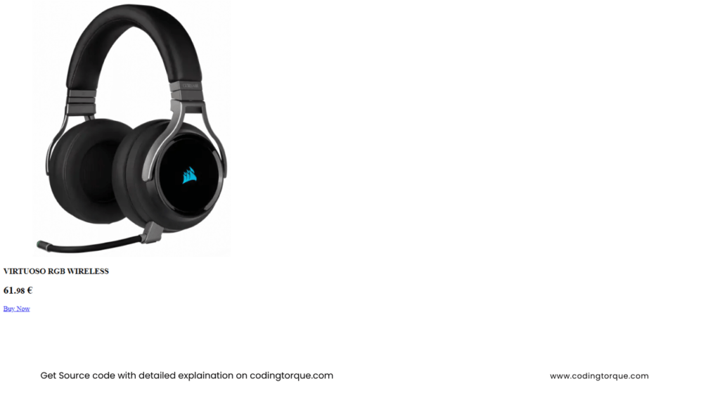
</html>Paste the below code in your <body> tag.
<div class="card">

    <div class="imgBox">
        <img src="https://www.corsair.com/ww/en/medias/sys_master/images/images/hb5/h6b/9597775020062/CA-9011185-NA/Gallery/VIRTUOSO_CARBON_01/-CA-9011185-NA-Gallery-VIRTUOSO-CARBON-01.png_515Wx515H"
            alt="mouse corsair" class="mouse">
    </div>

    <div class="contentBox">
        <h3>VIRTUOSO RGB WIRELESS</h3>
        <h2 class="price">61.<small>98</small> €</h2>
        <a href="#" class="buy">Buy Now</a>
    </div>

</div>
Output Till Now
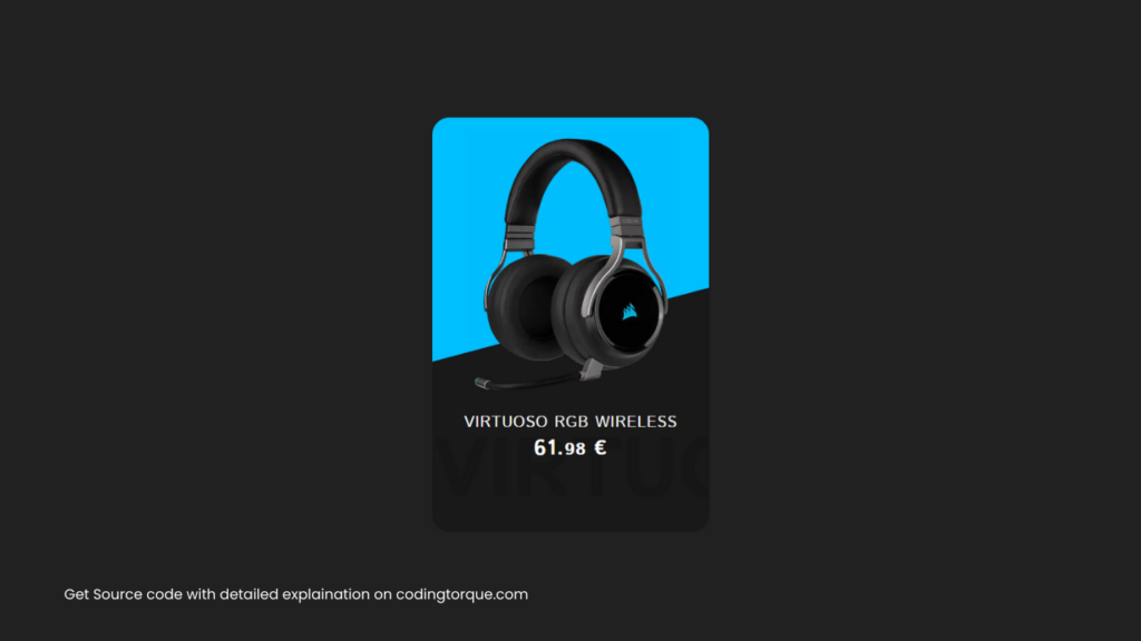
CSS Code
Create a file style.css and paste the code below.
@import url("https://fonts.googleapis.com/css2?family=Istok+Web:wght@400;700&display=swap");

* {
  margin: 0;
  padding: 0;
  font-family: "Istok Web", sans-serif;
}

body {
  display: flex;
  justify-content: center;
  align-items: center;
  min-height: 100vh;
  background: #212121;
}

.card {
  position: relative;
  width: 320px;
  height: 480px;
  background: #191919;
  border-radius: 20px;
  overflow: hidden;
}

.card::before {
  content: "";
  position: absolute;
  top: -50%;
  width: 100%;
  height: 100%;
  background: deepskyblue;
  transform: skewY(345deg);
  transition: 0.5s;
}

.card:hover::before {
  top: -70%;
  transform: skewY(390deg);
}

.card::after {
  content: "VIRTUOSO";
  position: absolute;
  bottom: 0;
  left: 0;
  font-weight: 600;
  font-size: 6em;
  color: rgba(0, 0, 0, 0.1);
}

.card .imgBox {
  position: relative;
  width: 100%;
  display: flex;
  justify-content: center;
  align-items: center;
  padding-top: 20px;
  z-index: 1;
}

.card .contentBox {
  position: relative;
  padding: 20px;
  display: flex;
  justify-content: center;
  align-items: center;
  flex-direction: column;
  z-index: 2;
}

.card .contentBox h3 {
  font-size: 18px;
  color: white;
  font-weight: 500;
  text-transform: uppercase;
  letter-spacing: 1px;
}

.card .contentBox .price {
  font-size: 24px;
  color: white;
  font-weight: 700;
  letter-spacing: 1px;
}

.card .contentBox .buy {
  position: relative;
  top: 100px;
  opacity: 0;
  padding: 10px 30px;
  margin-top: 15px;
  color: #000000;
  text-decoration: none;
  background: deepskyblue;
  border-radius: 30px;
  text-transform: uppercase;
  letter-spacing: 1px;
  transition: 0.5s;
}

.card:hover .contentBox .buy {
  top: 0;
  opacity: 1;
}

.mouse {
  height: 300px;
  width: auto;
}
Output Till Now
Written by: Piyush Patil
If you have any doubts or any project ideas feel free to Contact Us
Hope you find this post helpful💖


