Greetings, fellow coders! Are you tired of bland loading screens on your web pages that leave your users feeling bored and frustrated? In this blog post, we are going to take your web development skills to the next level by creating an eye-catching Skeleton Loading Animation using HTML and CSS. By the end of this tutorial, you will have a dynamic loading animation that will keep your users engaged and give your website a polished and professional feel. So get ready to elevate your web development game and let’s get started!
Here are some more loaders with source code –
21 Glowing Effect using HTMl and CSS
I would recommend you don’t just copy and paste the code, just look at the code and type by understanding it.
HTML Code
Starter Template
<!doctype html>
<html lang="en">

<head>
    <!-- Required meta tags -->
    <meta charset="utf-8">
    <meta name="viewport" content="width=device-width, initial-scale=1">

    <!-- Font Awesome CDN  -->
    <link rel="stylesheet" href="https://cdnjs.cloudflare.com/ajax/libs/font-awesome/5.14.0/css/all.min.css"
        integrity="sha512-1PKOgIY59xJ8Co8+NE6FZ+LOAZKjy+KY8iq0G4B3CyeY6wYHN3yt9PW0XpSriVlkMXe40PTKnXrLnZ9+fkDaog=="
        crossorigin="anonymous" />

    <!-- CSS -->
    <link rel="stylesheet" href="style.css">

    <title>Skeleton Loading Animation using HTML & CSS - Coding Torque</title>
</head>

<body>

   <!-- Further code here -->

</body>

</html>
Paste the below code in your <body> tag.
<div class="card">
    <div class="header">
        <div class="img"></div>
        <div class="details">
            <span class="name"></span>
            <span class="about"></span>
        </div>
    </div>
    <div class="description">
        <div class="line line-1"></div>
        <div class="line line-2"></div>
        <div class="line line-3"></div>
    </div>
    <div class="btns">
        <div class="btn btn-1"></div>
        <div class="btn btn-2"></div>
    </div>
</div>
CSS Code
Create a file style.css and paste the code below.
* {
margin: 0;
padding: 0;
box-sizing: border-box;
}
body {
display: flex;
align-items: center;
justify-content: center;
min-height: 100vh;
}
header {
position: fixed;
left: 0;
right: 0;
margin: auto;
top: 0.5rem;
text-align: center;
color: #222;
}
header .social li {
margin-top: 20px;
list-style: none;
}
header .social li > a {
position: relative;
font-size: 20px;
color: #222;
margin: 10px;
text-decoration: none;
transition: all 0.3s;
}
header .social li > a:last-child {
border: 1px solid #222;
padding: 0 5px;
}
header .social li > a:hover {
color: red;
}
header .social li > a:before {
content: "";
position: absolute;
bottom: -1rem;
left: 0;
background-color: #222;
width: 20px;
height: 4px;
opacity: 0;
transition: all 0.3s;
}
header .social li > a:hover:before {
opacity: 1;
}
.card {
max-width: 350px;
width: 100%;
background: #fff;
padding: 30px;
border-radius: 10px;
border: 1px solid #d9d9d9;
}
.card .header {
display: flex;
align-items: center;
}
.header .img {
height: 75px;
width: 75px;
background: #d9d9d9;
border-radius: 50%;
position: relative;
overflow: hidden;
}
.header .details {
margin-left: 20px;
}
.details span {
display: block;
background: #d9d9d9;
border-radius: 10px;
overflow: hidden;
position: relative;
}
.details .name {
height: 15px;
width: 100px;
}
.details .about {
height: 13px;
width: 150px;
margin-top: 10px;
}
.card .description {
margin: 25px 0;
}
.description .line {
background: #d9d9d9;
border-radius: 10px;
height: 13px;
margin: 10px 0;
overflow: hidden;
position: relative;
}
.description .line-1 {
width: calc(100% - 15%);
}
.description .line-3 {
width: calc(100% - 40%);
}
.card .btns {
display: flex;
}
.card .btns .btn {
height: 45px;
width: 100%;
background: #d9d9d9;
border-radius: 25px;
position: relative;
overflow: hidden;
}
.btns .btn-1 {
margin-right: 8px;
}
.btns .btn-2 {
margin-left: 8px;
}
.header .img::before,
.details span::before,
.description .line::before,
.btns .btn::before {
position: absolute;
content: "";
height: 100%;
width: 100%;
background-image: linear-gradient(
to right,
#d9d9d9 0%,
rgba(0, 0, 0, 0.05) 20%,
#d9d9d9 40%,
#d9d9d9 100%
);
background-repeat: no-repeat;
background-size: 450px 400px;
animation: shimmer 1s linear infinite;
}
.header .img::before {
background-size: 650px 600px;
}
.details span::before {
animation-delay: 0.2s;
}
.btns .btn-2::before {
animation-delay: 0.22s;
}
@keyframes shimmer {
0% {
background-position: -450px 0;
}
100% {
background-position: 450px 0;
}
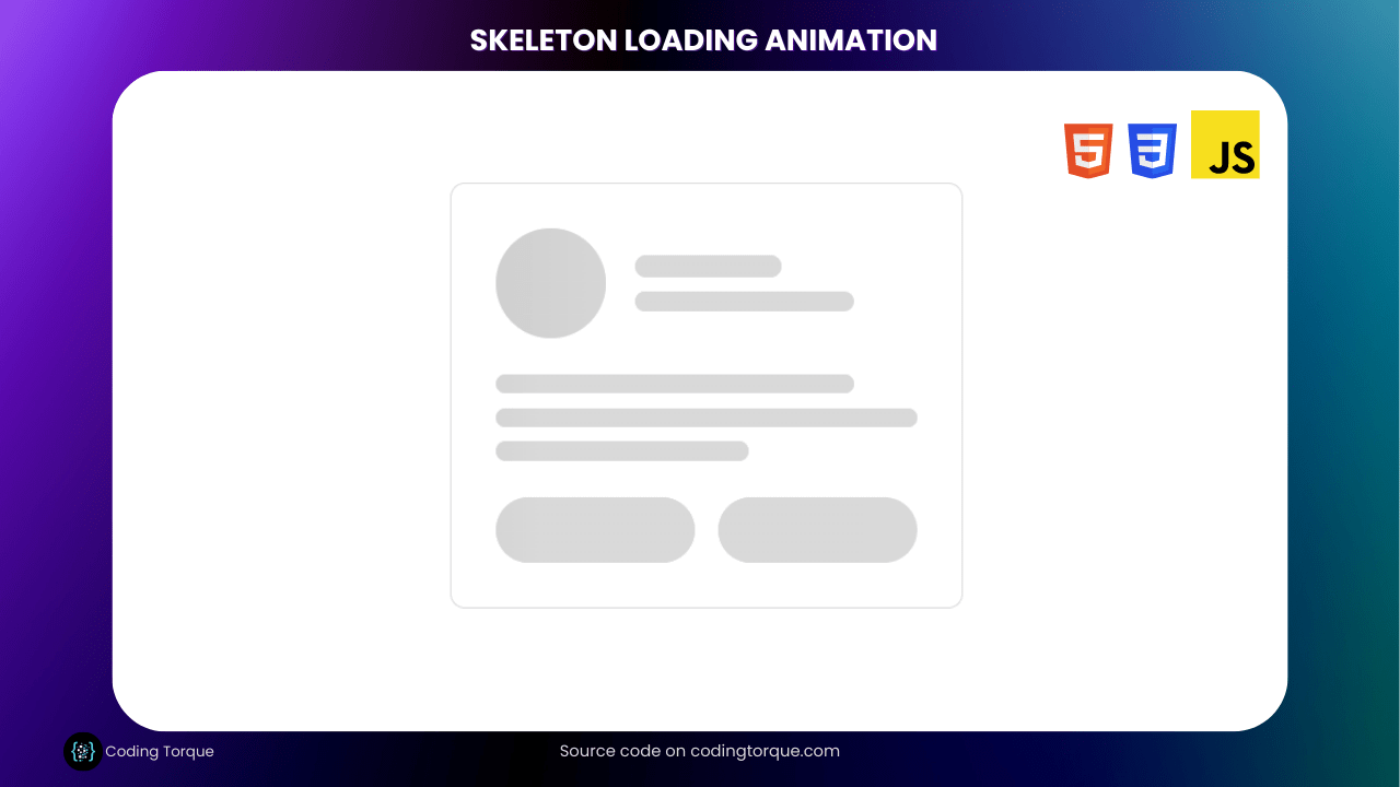
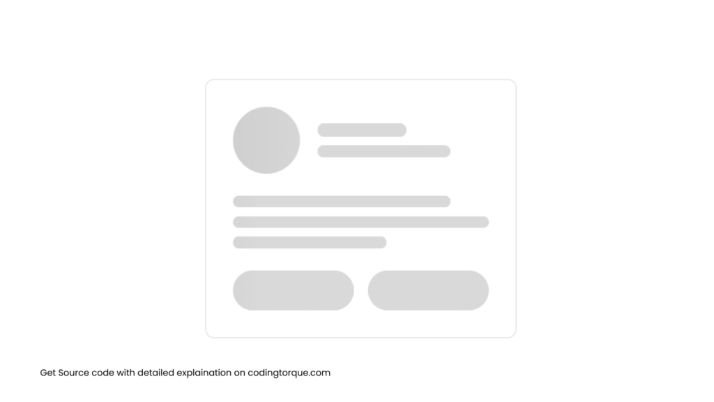
}Output Till Now
Written by: Piyush Patil
Code Credits: @danishlaeeq
If you have any doubts or any project ideas feel free to Contact Us
Hope you find this post helpful💖


