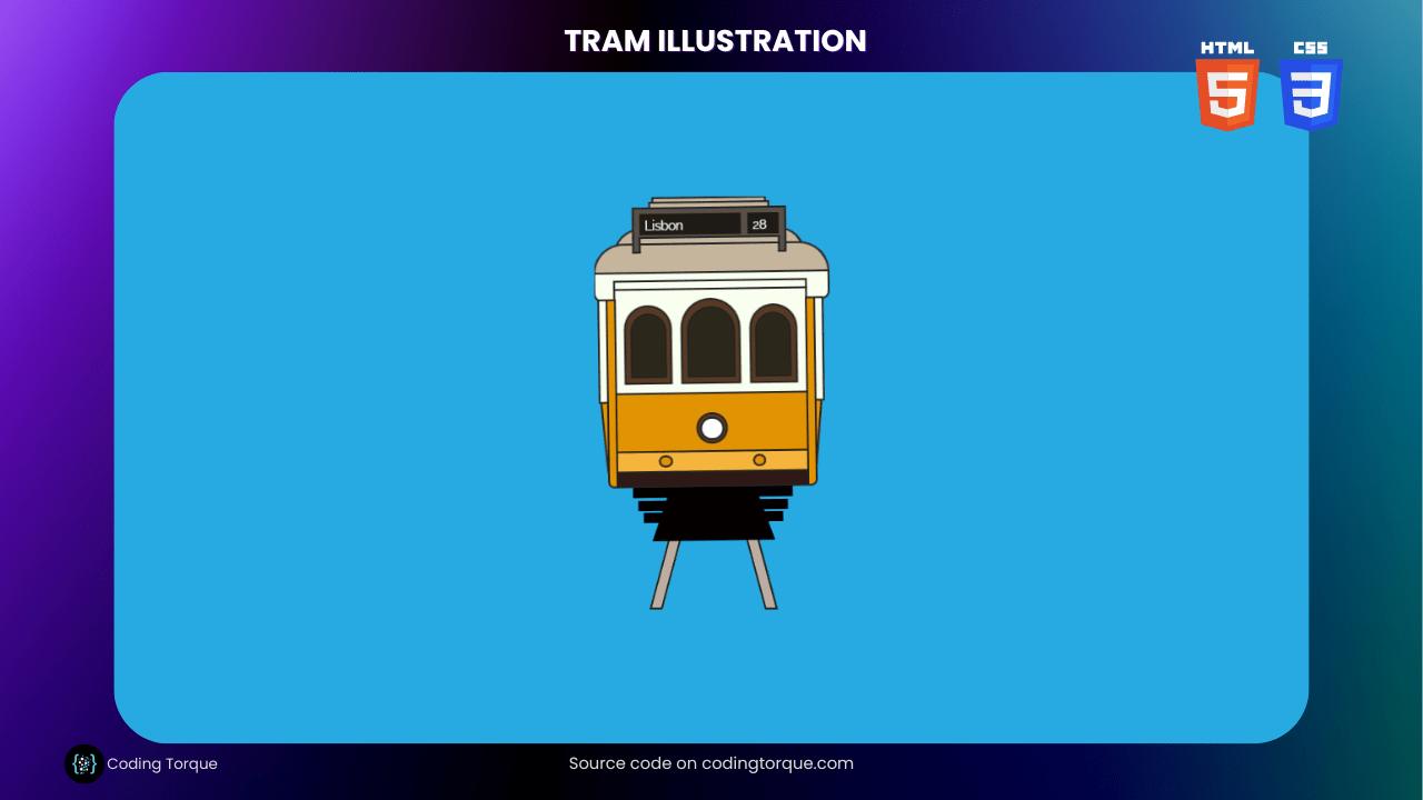
If you’re looking to improve your HTML and CSS skills, creating an illustration is a great way to put them to use. In this tutorial, we’ll show you how to create a visually stunning and interactive “Tram Illustration” using only HTML and CSS. You’ll learn how to use HTML to create the structure of the tram and style it with CSS to give it a unique and appealing appearance. We’ll also cover how to add interactive animations to make your tram come to life. By the end of this tutorial, you’ll have a fully-functional “Tram Illustration” that you can use to showcase your skills and engage your website visitors. So, let’s get started on creating a beautiful and unique “Tram Illustration” using HTML and CSS!
Before we start here are 50 projects to create using HTML CSS and JavaScript –
I would recommend you don’t just copy and paste the code, just look at the code and type by understanding it.
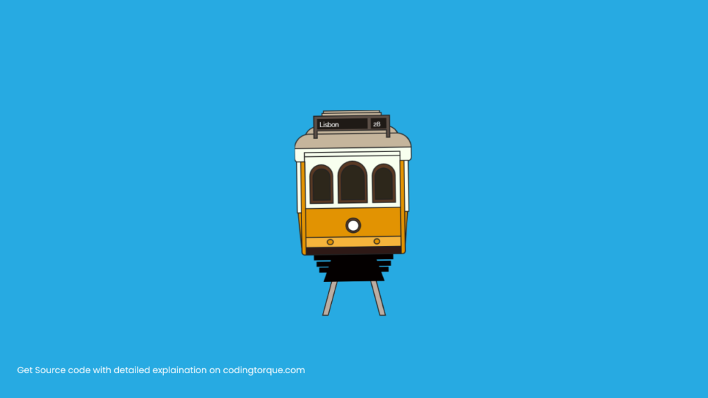
Demo
HTML Code
Starter Template
<!doctype html>
<html lang="en">

<head>
    <!-- Required meta tags -->
    <meta charset="utf-8">
    <meta name="viewport" content="width=device-width, initial-scale=1">

    <!-- CSS -->
    <link rel="stylesheet" href="style.css">

    <title>Tram Illustration using HTML and CSS - Coding Torque</title>
</head>

<body>
    <!-- Further code here -->
</body>

</html>
Paste the below code in your <body> tag.
<div class="stage">
    <div class="animation">
        <div class="tram-top p-absolute">
            <div class="tram-top-one bg-one p-absolute center-horizontal border"></div>
            <div class="tram-top-two bg-one p-absolute center-horizontal border"></div>
            <div class="tram-top-three bg-two p-absolute center-horizontal border">
                <div class="tram-top-three-left bg-two p-absolute border"></div>
                <div class="tram-top-three-right bg-two p-absolute border"></div>
            </div>
            <div class="tram-top-four bg-one p-absolute center-horizontal border"></div>
            <div class="tram-top-five bg-one p-absolute border"></div>
            <div class="tram-top-six bg-three p-absolute border"></div>
        </div>
        <div class="tram-front p-absolute center-horizontal">
            <div class="tram-front-one bg-three p-absolute border"></div>
            <div class="tram-front-two bg-three p-absolute border">
                <div class="tram-front-two-left bg-seven p-absolute border"></div>
                <div class="tram-front-two-middle bg-seven p-absolute center-horizontal border"></div>
                <div class="tram-front-two-right bg-seven p-absolute border"></div>
            </div>
            <div class="tram-front-three bg-four p-absolute border">
                <div class="tram-front-three-middle p-absolute center-horizontal"></div>
            </div>
            <div class="tram-front-four bg-five p-absolute border">
                <div class="tram-front-four-left p-absolute bg-four border"></div>
                <div class="tram-front-four-right p-absolute bg-four border"></div>
            </div>
            <div class="tram-front-five bg-six p-absolute border"></div>
        </div>
        <div class="tram-left p-absolute">
            <div class="tram-left-one bg-four p-absolute border"></div>
            <div class="tram-left-two bg-three p-absolute border"></div>
            <div class="tram-left-three bg-four p-absolute border"></div>
        </div>
        <div class="tram-right p-absolute">
            <div class="tram-right-one bg-four p-absolute border"></div>
            <div class="tram-right-two bg-three p-absolute border"></div>
            <div class="tram-right-three bg-four p-absolute border"></div>
        </div>
        <div class="tram-bottom p-absolute center-horizontal">
            <div class="tram-bottom-one bg-eight p-absolute center-horizontal"></div>
            <div class="tram-bottom-two bg-eight p-absolute center-horizontal"></div>
            <div class="tram-bottom-three bg-eight p-absolute center-horizontal"></div>
            <div class="tram-bottom-four p-absolute center-horizontal border"></div>
        </div>
    </div>
    <div class="tram-rail p-absolute center-horizontal">
        <div class="tram-rail-left bg-nine p-absolute border"></div>
        <div class="tram-rail-right bg-nine p-absolute border"></div>
    </div>
</div>
CSS Code
Create a file style.css and paste the code below.
/* IMPORTS */
@import url("https://fonts.googleapis.com/css?family=Raleway");

/* USEFULL CLASSES */
.bg-one {
  background-color: #c5b59c;
}
.bg-two {
  background-color: #5c4f47;
}
.bg-three {
  background-color: #f8ffef;
}
.bg-four {
  background-color: #e29302;
}
.bg-five {
  background-color: #f5b43c;
}
.bg-six {
  background-color: #2e1916;
}
.bg-seven {
  background-color: #593924;
}
.bg-eight {
  background-color: #040000;
}
.bg-nine {
  background-color: #bbada2;
}

.p-absolute {
  position: absolute;
}
.border {
  border: 2px solid #222;
}

.center-horizontal {
  left: 50%;
  -webkit-transform: translateX(-50%);
  transform: translateX(-50%);
}

/*  GENERAL SETTINGS */
* {
  box-sizing: border-box;
}

.link-article {
  position: absolute;
  bottom: 20px;
  right: 30px;
  animation: pulse 5000ms ease-out infinite alternate;
}

@keyframes pulse {
  0% {
    transform: translateY(0);
  }

  5% {
    transform: translateY(-10px);
  }

  10% {
    transform: translateY(0);
  }

  15% {
    transform: translateY(-10px);
  }

  20% {
    transform: translateY(0);
  }

  100% {
    transform: translateY(0);
  }
}

a,
a:link,
a:visited {
  color: #fff;
  text-decoration: none;
  display: block;
  transition: transform 170ms ease-out;
  background-color: rgba(0, 0, 0, 0.2);
  height: 40px;
  padding: 0 15px;
  border-radius: 4px;
  display: flex;
  align-items: center;
}

a:hover {
  transform: scale(1.1);
}

html,
body {
  margin: 0;
  padding: 0;
  height: 100%;
  overflow: hidden;
  font-family: "Raleway", sans-serif;
}

body {
  background-color: #27aae2;
  display: -webkit-box;
  display: -webkit-flex;
  display: -ms-flexbox;
  display: flex;
  -webkit-box-pack: center;
  -webkit-justify-content: center;
  -ms-flex-pack: center;
  justify-content: center;
  -webkit-box-align: center;
  -webkit-align-items: center;
  -ms-flex-align: center;
  align-items: center;
}

.stage {
  width: 230px;
  height: 400px;
  position: relative;
  overflow: hidden;
}

.animation {
  height: 332px;
  position: relative;
  z-index: 2;
  animation: tramAnim 1800ms cubic-bezier(0.58, 0.04, 0.12, 0.92) 600ms forwards,
    tranAnimStop 400ms linear infinite alternate 2850ms;
  will-change: transform;
  opacity: 0;
  transform-origin: bottom center;
}

@keyframes tramAnim {
  0% {
    transform: translateY(-80px) scale(0.5) translateZ(0);
    opacity: 0;
  }

  10% {
    transform: translateY(-80px) scale(0.5) translateZ(0);
    opacity: 0;
  }

  30% {
    opacity: 1;
  }

  100% {
    transform: translateY(0px) scale(1) translateZ(0) rotate(-1deg);
    opacity: 1;
  }
}

@keyframes tranAnimStop {
  0% {
    transform: rotate(-1deg);
  }
  50% {
    transform: rotate(0deg);
  }
  100% {
    transform: rotate(0.3deg);
  }
}

/* Main Area - Top */
.tram-top {
  top: 0;
  left: 0;
  width: 100%;
  height: 100px;
}

.tram-top-one {
  top: 0;
  left: 50%;
  height: 8px;
  width: 110px;
}

.tram-top-two {
  top: 4px;
  left: 50%;
  height: 10px;
  width: 116px;
}

.tram-top-three {
  top: 10px;
  height: 30px;
  width: 148px;
  z-index: 2;
}

.tram-top-three:before {
  content: "Lisbon";
  position: absolute;
  color: #fff;
  background-color: #1f1a16;
  font-size: 12px;
  padding: 4px 56px 2px 5px;
  left: 5px;
  bottom: 2px;
}

.tram-top-three:after {
  content: "28";
  position: absolute;
  color: #fff;
  background-color: #1f1a16;
  font-size: 12px;
  padding: 4px 12px 2px 5px;
  right: 5px;
  bottom: 2px;
}

.tram-top-three-left {
  bottom: -16px;
  left: -2px;
  width: 8px;
  height: 16px;
  border-top: 0;
}

.tram-top-three-right {
  bottom: -16px;
  right: -2px;
  width: 8px;
  height: 16px;
  border-top: 0;
}

.tram-top-four {
  top: 30px;
  left: 50%;
  height: 26px;
  width: 184px;
  border-radius: 100px 100px 0 0;
}

.tram-top-five {
  bottom: 26px;
  height: 30px;
  left: 3px;
  right: 0px;
  /* width: 100%; */
  border-radius: 100px 100px 0 0;
}

.tram-top-six {
  bottom: 0px;
  height: 28px;
  left: 3px;
  right: 0;
  border-radius: 0 0 8px 8px;
}

/* Main Area - Front */
.tram-front {
  top: 80px;
  width: 186px;
  height: 200px;
}

.tram-front-one {
  width: 100%;
  height: 10px;
  top: 0;
  left: 0;
}

.tram-front-two {
  width: 100%;
  height: 102px;
  top: 8px;
  left: 0;
}

.tram-front-two-left {
  width: 46px;
  top: 14px;
  left: 8px;
  bottom: 8px;
  border-radius: 100px 100px 0 0;
}

.tram-front-two-left:before {
  content: "";
  position: absolute;
  background-color: #2d271b;
  border-radius: 100px 100px 0 0;
  border: 2px solid #222;
  top: 6px;
  left: 4px;
  bottom: 4px;
  right: 4px;
}

.tram-front-two-middle {
  width: 58px;
  top: 8px;
  bottom: 8px;
  border-radius: 100px 100px 0 0;
}

.tram-front-two-middle:before {
  content: "";
  position: absolute;
  background-color: #2d271b;
  border-radius: 100px 100px 0 0;
  border: 2px solid #222;
  top: 6px;
  left: 4px;
  bottom: 4px;
  right: 4px;
}

.tram-front-two-right {
  width: 46px;
  top: 14px;
  right: 8px;
  bottom: 8px;
  border-radius: 100px 100px 0 0;
}

.tram-front-two-right:before {
  content: "";
  position: absolute;
  background-color: #2d271b;
  border-radius: 100px 100px 0 0;
  border: 2px solid #222;
  top: 6px;
  left: 4px;
  bottom: 4px;
  right: 4px;
}

.tram-front-three {
  top: 108px;
  width: 100%;
  left: 0;
  height: 58px;
}

.tram-front-three-middle {
  width: 30px;
  height: 30px;
  bottom: 6px;
  border-radius: 0;
  background-color: #5a3a25;
  border-radius: 50%;
  border: 2px solid #222;
}

.tram-front-three-middle:after {
  content: "";
  background-color: #fff;
  border: 2px solid #222;
  border-radius: 50%;
  top: 2px;
  bottom: 2px;
  left: 2px;
  right: 2px;
  position: absolute;
}

.tram-front-four {
  width: 100%;
  bottom: 14px;
  left: 0;
  height: 22px;
}

.tram-front-four-left {
  width: 13px;
  height: 12px;
  border-radius: 50%;
  top: 3px;
  left: 40px;
}

.tram-front-four-right {
  width: 12px;
  height: 12px;
  border-radius: 50%;
  top: 3px;
  right: 40px;
}

.tram-front-five {
  width: 100%;
  bottom: 0;
  left: 0;
  height: 16px;
}

/* Main Area - Left */
.tram-left {
  top: 98px;
  left: 0px;
  width: 22px;
  height: 182px;
}

.tram-left-one {
  height: 100%;
  top: 0;
  right: -2px;
  width: 10px;
  z-index: 2;
  border-radius: 0 0 0 6px;
}

.tram-left-two {
  height: 100px;
  top: 0;
  right: 6px;
  width: 10px;
}

.tram-left-three {
  height: 68px;
  bottom: 16px;
  right: 3px;
  width: 8px;
  transform: rotate(-5deg);
}

/* Main Area - Right */
.tram-right {
  top: 98px;
  right: 0px;
  width: 22px;
  height: 182px;
}

.tram-right-one {
  height: 100%;
  top: 0;
  left: -2px;
  width: 10px;
  border-radius: 0 0 6px 0;
  z-index: 2;
}

.tram-right-two {
  height: 100px;
  top: 0;
  right: 6px;
  width: 10px;
}

.tram-right-three {
  height: 68px;
  bottom: 16px;
  left: 3px;
  width: 8px;
  transform: rotate(5deg);
}

/* Main Area - Bottom */
.tram-bottom {
  bottom: 0;
  width: 186px;
  height: 52px;
  z-index: 2;
}

.tram-bottom-one {
  top: 0;
  height: 10px;
  width: 154px;
}

.tram-bottom-two {
  top: 12px;
  height: 10px;
  width: 144px;
}

.tram-bottom-three {
  top: 24px;
  height: 10px;
  width: 134px;
}

.tram-bottom-four {
  top: 2px;
  border-bottom: 50px solid #040000;
  border-left: 18px solid transparent;
  border-right: 18px solid transparent;
  border-top: 0;
  height: 0;
  width: 118px;
}

.tram-rail {
  height: 170px;
  bottom: 0;
  width: 186px;
}

.tram-rail-left {
  height: 100%;
  width: 12px;
  z-index: 2;
  top: 0;
  opacity: 0;
  left: 54px;
  -webkit-transform: translateY(-2px) skew(-15deg);
  transform: translateY(-2px) skew(-15deg);
  animation: tramRailAnimLeft 1750ms cubic-bezier(0.58, 0.04, 0.12, 0.92) 250ms
    forwards;
}

.tram-rail-right {
  height: 100%;
  width: 12px;
  z-index: 2;
  top: 0;
  opacity: 0;
  right: 54px;
  -webkit-transform: translateY(-2px) skew(15deg);
  transform: translateY(-2px) skew(15deg);
  animation: tramRailAnimRight 1750ms cubic-bezier(0.58, 0.04, 0.12, 0.92) 250ms
    forwards;
}

@keyframes tramRailAnimLeft {
  0% {
    transform: translateY(300px) translateX(-100px) skew(-15deg);
    opacity: 1;
  }

  100% {
    transform: translateY(-2px) translateX(0px) skew(-15deg);
    opacity: 1;
  }
}

@keyframes tramRailAnimRight {
  0% {
    transform: translateY(300px) translateX(100px) skew(15deg);
    opacity: 1;
  }

  100% {
    transform: translateY(-2px) skew(15deg);
    opacity: 1;
  }
}
Final Output
Written by: Piyush Patil
Code Credits: @JoseRosario
If you found any mistakes or have any doubts please feel free to Contact Us
Hope you find this post helpful💖


